")


Hey there!
After so many requests, we’re finally back with another store review article and this time it’s a general store. I thought it would be nice to review a general store this time so you can learn what you should and shouldn’t do.
The general store I’m going to review this time is ebuys24 – https://ebuys24.com/ and I’ll make sure to dive deep this time to catch any possible errors that were made.
If you plan opening a one product store or a niche store, make sure to check my last store review articles before you jump into it. I reviewed 2 one-product stores and one niche store so you’ll find there a lot of useful tips.

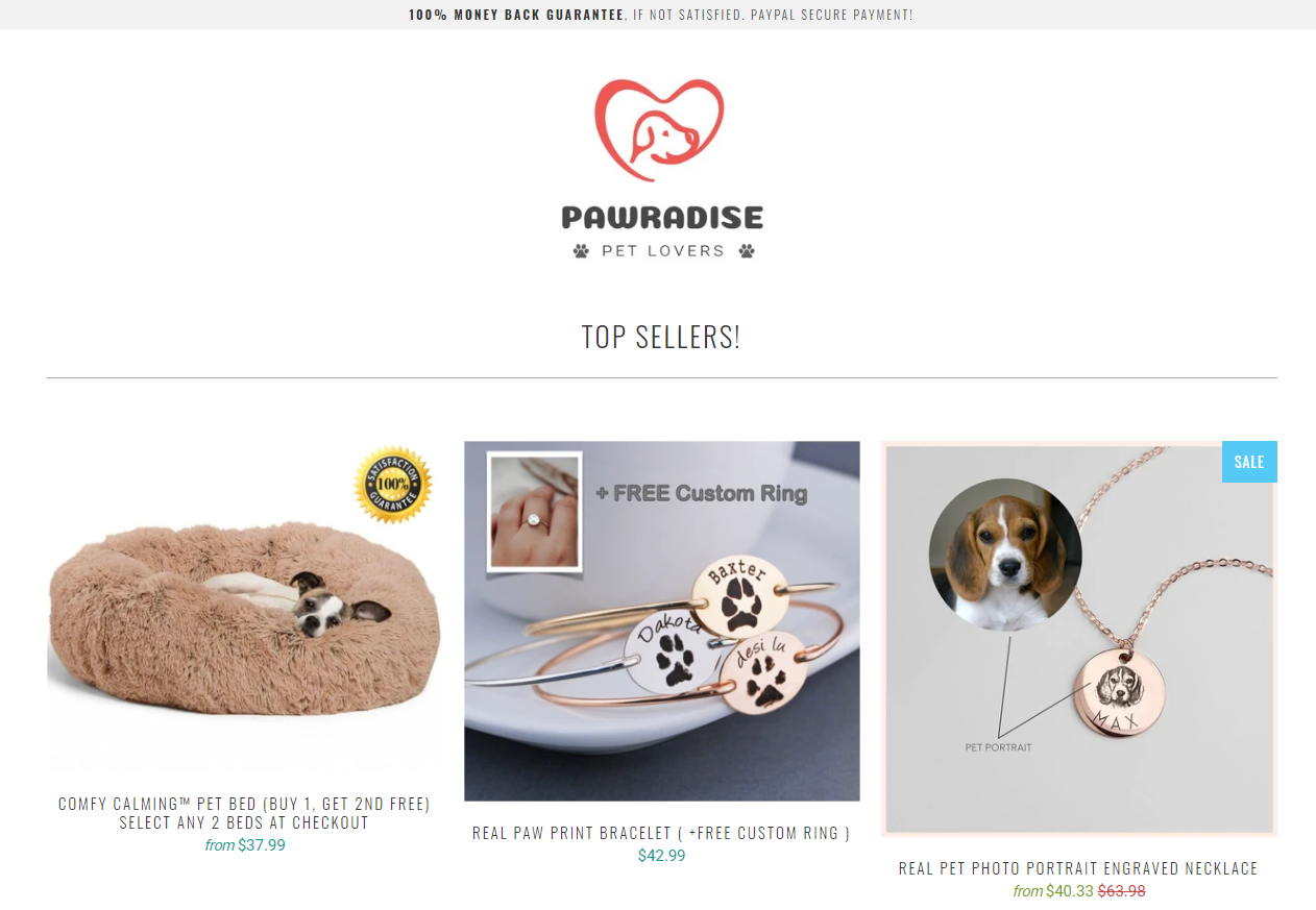
1. The Front Page
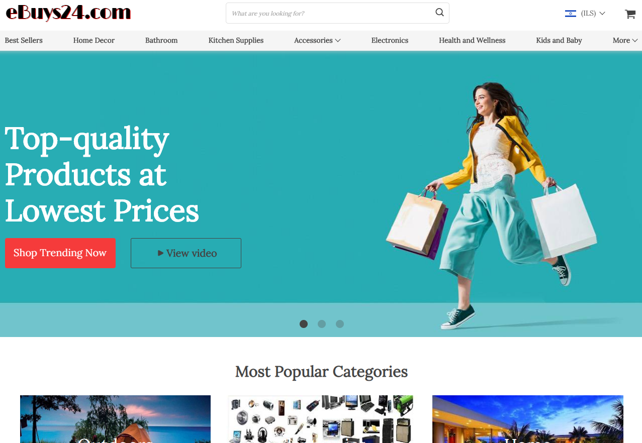
I feel like the main plan was to make a small version of Ebay/Amazon with best selling products and hope people will browse your store and checkout with a bunch of products in their cart. This dream new dropshippers have is a big waste of time!
You need to understand that our main focus as dropshippers is to first sell one single product. If you can add some related upsells or quantity discounts to increase the AOV, that’s good too. But in the end, we focus on selling one product and we shouldn’t expect customers to browse our store like it was Amazon.
Even with the available automatic tools out there like Oberlo, it will still take a lot of time to import so many products. If you plan on opening a general store, importing 3-5 products is more than enough! You’ll be driving traffic to a certain product page from where your customers will buy your product if everything else is alright.
Note:
It’s a whole different story if you advertise your store with Influencers or solely on Instagram where in most cases, your customers will land on the main page. In this case, you need to make sure your main page has all the best selling products displayed for your visitors to quickly notice them and hopefully buy them too.
But this store isn’t even ready for that:
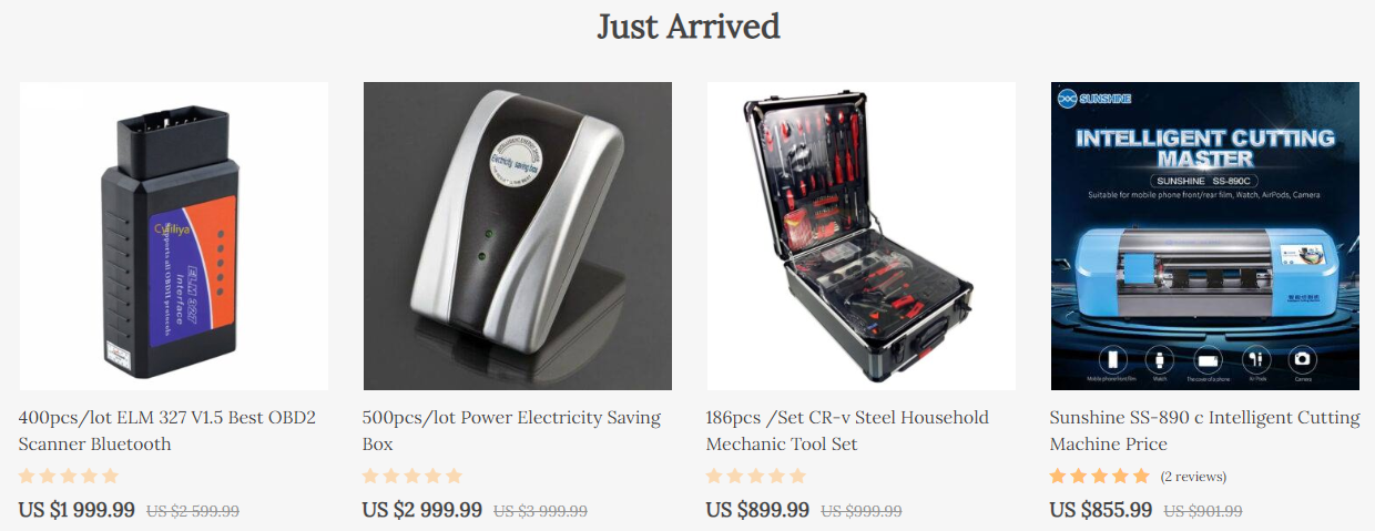
For some reason, these are displayed before the face masks and other trending products… No one in their right mind will buy these so I have no idea why even waste your time to import these products.
Store Name & Logo:
I rarely say anything bad about the store name but in this case I don’t have a choice. The store name feels like a cheap version of Ebay, the logo design is hideous with a font that no one ever uses, so please change it ASAP because this will definitely hurt your sales!
Announcement Bar:
![]()
Good thing to let people know there may be some delays due to COVID-19 but don’t go telling there will be also tracking issues. This message will make you lose any potential sale because customers want to be able to track their orders. If you can’t do that, they’ll just shop somewhere else.
And it’s better to use the announcement bar to promote deals and stuff like that. You can write about possible shipping delays on your product page and that will be enough.
Weird Buttons?
I have no idea who thought this would be a great idea but if you have a Youtube channel, please don’t use a computer to read your stuff. This whole operation is SUPER AMATEUR… If you can’t make normal videos for your store, it’s better to just not do it at all.
The Banners:
Simple stock photo banners to advertise your deals are okayish I guess… Some of them have weird button texts but other than that it’s fine. I usually keep the front page without any banners for my customers to quickly see the top selling products.
Pages:
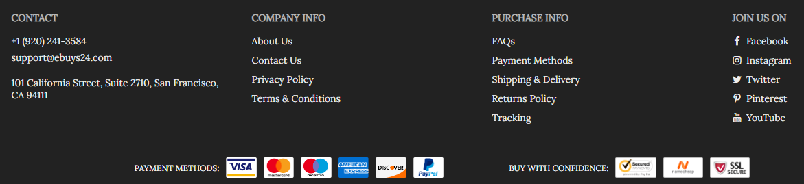
The store has all the necessary pages like Privacy Policy and a tracking page so this part is perfect. Good job!
2. The Product Page
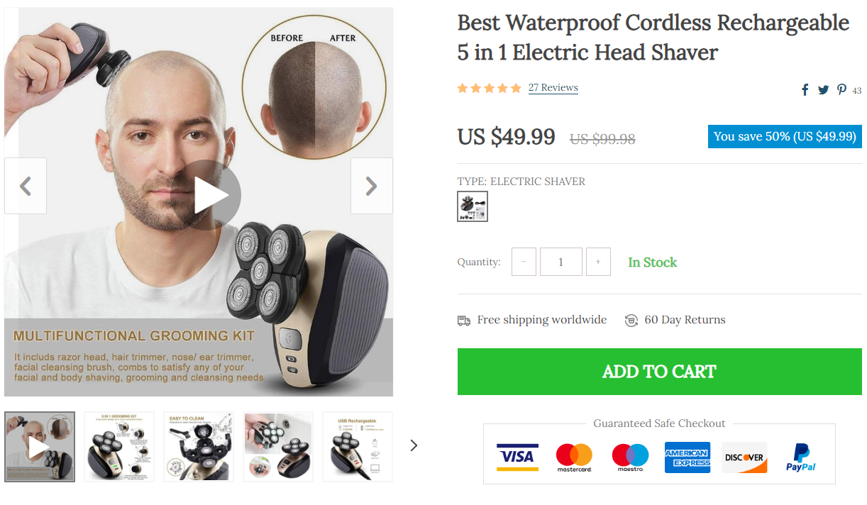
After reviewing the font page, I must say that the product pages are surprisingly good 🙂
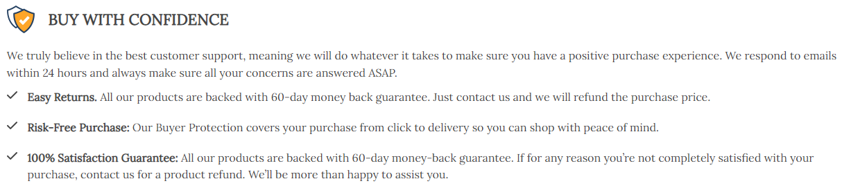
You have trust badges which many forget to display on the product page. On top of that, important messages like “Free Shipping” and “60 day returns” can be easily seen without having to scroll down too much.
The product details have no typos on them and the pictures seem to be fine:
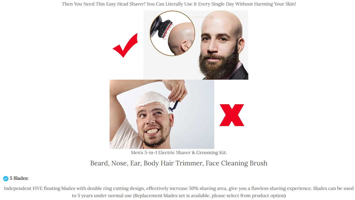
Everything small detail about the product is mentioned and you even have your store guarantees in the end which is perfect.
Good job!
The Reviews:
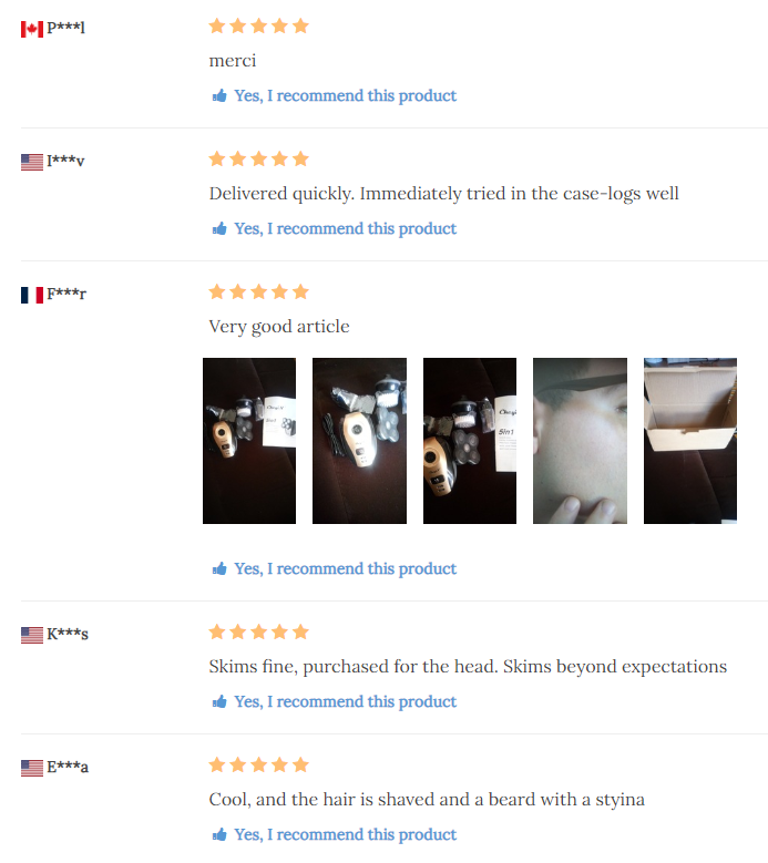
The reviews display isn’t the best and there are other apps that can do a better job, but I’ve seen worse review pages so compared to others yours is fine. These are imported straight from Aliexpress so make sure to go through them all to fix the typos.
The Mistakes:
I can’t possibly go through every product on your store so I picked a few random ones and searched for possible mistakes.
1. Estimated Delivery Messages
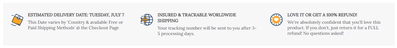
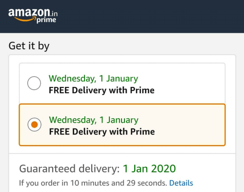
A great way to get charge backs and pissed customer emails asking about their order. Unless you’re shipping from the states, you can’t give such estimates… Remove that delivery date estimate message from every product on your store. Keep the insured shipping and the 100% refund messages only.
2. Slow Loading Times On Some Product Pages
One of the products I checked had a GIF in the description which made the product page load really slow. If you add GIFs to your product page, make sure they don’t slow down your store.
3. Ships From
Some sellers have warehouses in USA, Europe, etc… So when you import products like these from Aliexpress, keep the warehouse location hidden and don’t make it an active variant. Let your customers order and you make the decision from where to ship it.
4. Too Many Options
Some products have way too many options which can hurt your conversion rate. It’s good to have some diversity but too much of it will make it hard for your customer to choose. Tone it down and keep only the popular options. Offering 20 colors is too much!
5. You May Also Like
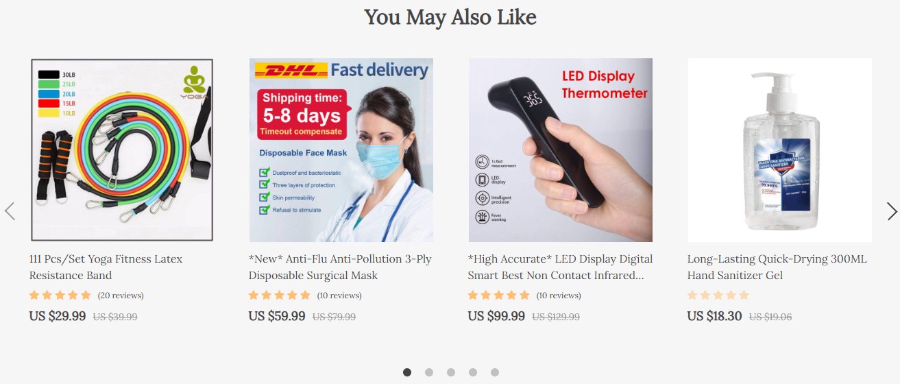
Like I previously said, our main focus is to get the customer to buy our product fast without too much thinking. This “You may also like” product suggestions will make your customers stop and think if they want any more products… And eventually they’ll leave your store without buying a thing.
So remove it and focus on getting a quick sale without any interruptions.
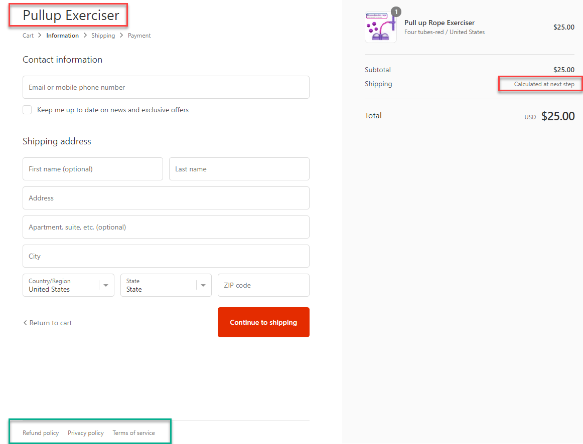
3. The Checkout Page
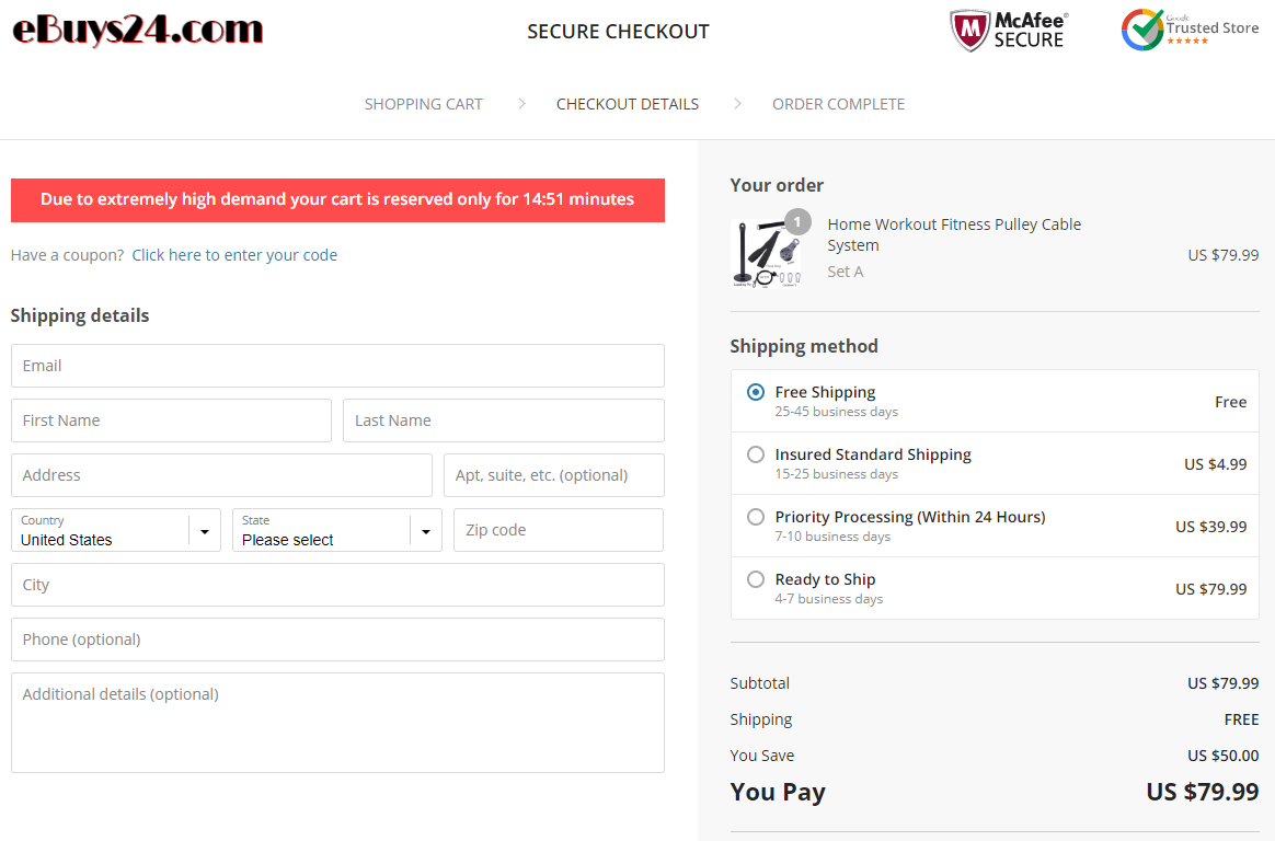
It’s funny… I didn’t realize it wasn’t a Shopify store only till I got to the checkout page. It’s a wordpress general store so the checkout process is different from what we’re used to on Shopify. I reviewed the most important parts already so if you want to see how a Shopify checkout looks, check my other store reviews.
But keep reading because there are some important points to discuss here which are also true for Shopify store owners.
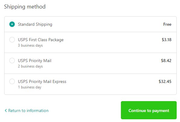
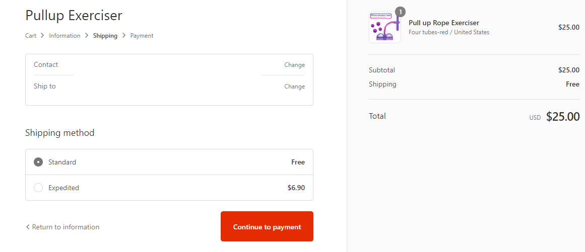
1. Shipping
On your product page, the deal shown is Free & Insured shipping. Here you break this promise and charge extra $5 for it to be insured. This is a big NO-NO and you will lose a lot of sales because of this move.
Other than that, the shipping times are too long and it can also push customers away. 25-45 business days is scary and you better write something like “2-4 weeks”. There are shipping companies out there that can get your order to the states in less than 14 days so make sure you work with them during these times.
The premium shipping costs are INSANE and no one is going to even look at the other shipping options. You better remove them or make a change and charge your customers max $10 for a much faster shipping.
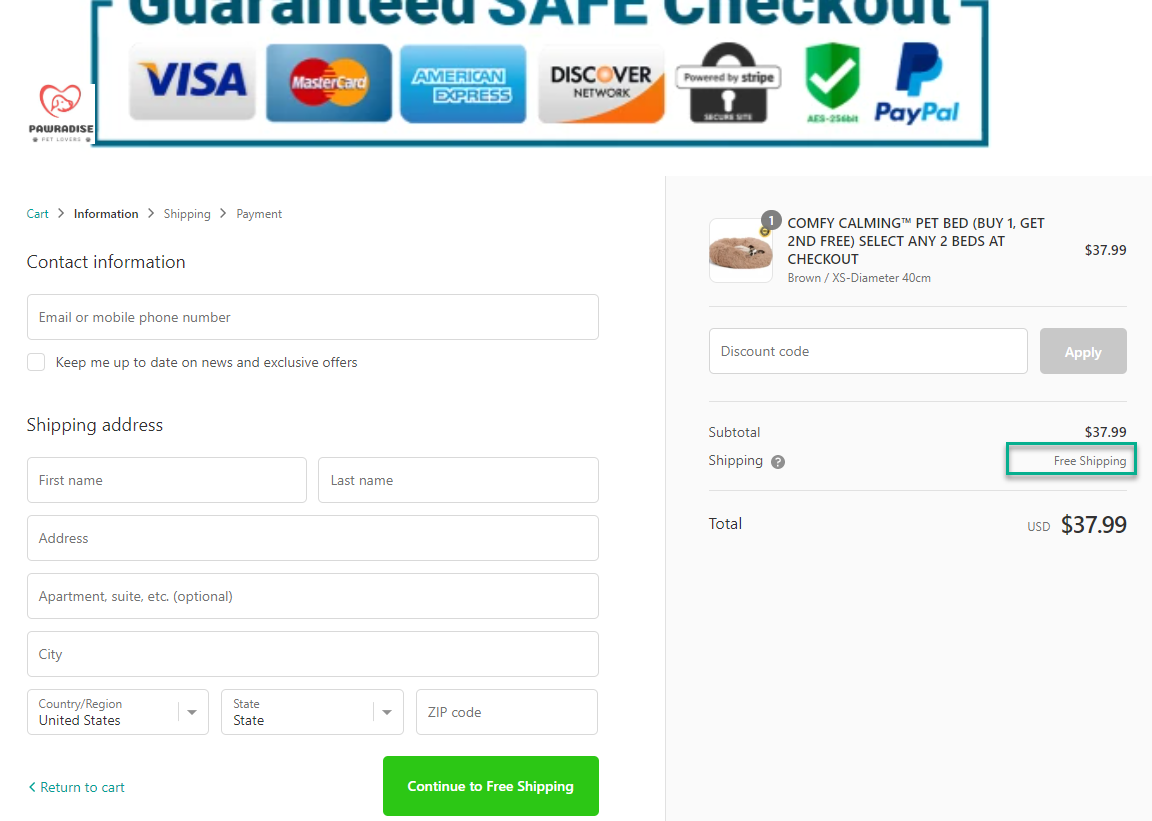
Other than that, the checkout page is perfect. You have trust badges, checkout timer, guarantees and all the other needed stuff in one place. We can only wish Shopify will someday offer this kind of checkout page by default…
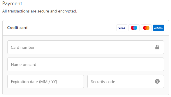
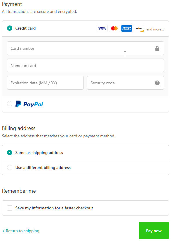
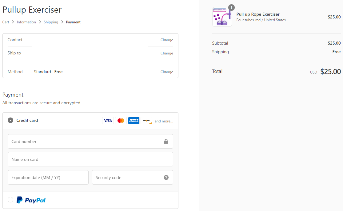
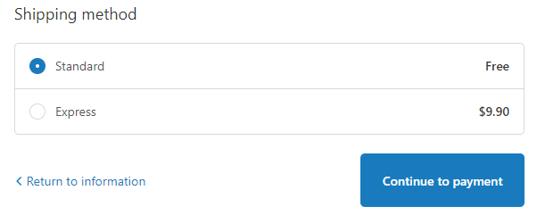
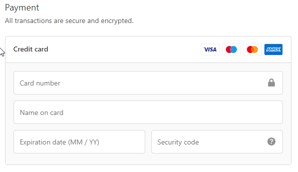
2. Payment
You only accept credit cards but there’s no PayPal option – PayPal is very popular so try and offer them as a payment option to increase your store’s conversion rate. If you can’t accept PayPal then don’t worry too much about it… Your conversion rate will be slightly lower but that doesn’t mean you can’t scale and make some good numbers with this store 🙂
To Sum It Up:
It took some time for me to notice this wasn’t a Shopify store but it doesn’t change too much. The front page, the product page, all look the same so both Shopify and WordPress store owners can learn from this store review.
I hope you liked this review and if you want your store reviewed then let me know in the comments. Maybe your store will be the next one I review 😉
Good luck.
Struggling to find good products to sell? Not sure who’s your target audience? Tired of losing money on products you were sure were “winners”?
Then Ecomhunt is what you need! Find hot winning products that are added daily, spy on their ads & stores and import them into your store in 1 click and Start Selling Today!


")