")


On the last week’s video, we asked our subscribers to post their store link if they want their store to be reviewed. Unfortunately, Serban can’t cover all the stores so he will pick only 3 to review for his next video.
So for this week’s article, I decided to pick a random store from the comments and do written review here with pictures and examples. This is a one product fitness exerciser store and it doesn’t take long to spot A LOT of mistakes…
One product stores, if done right, usually convert much better than general stores so the decision to take this product and brand it is understandable. But for this to work and to get some sales, you have to do it the right way. If you ever thought of building a one product store, make sure to first read this article so you don’t make the same mistakes!

1. The Front Page
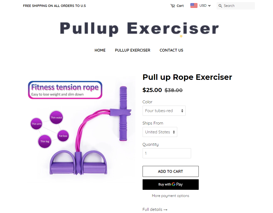
Even if you have a one product store, it’s the same as with all other stores where you still drive traffic to the product page and not to the front page. The front page of a one product store is there to act as a “loop” – If the customer decides to move to the front page, he will once again see the same product on the front page too. And if he clicks on a button, he will be transferred to the same product page again he first visited. Like a loop, all there is to discover is the only product you sell on your store.
But for this to work, you have to give the front page a much better look. Most one product stores I’ve seen have at least 3 pictures of the product with descriptions on them and a call to action button. The also have a beautifully designed banner on top with a short description + call to action button.
In this case, you only have a product preview with Add to Cart button and that’s basically it… There’s a Full Details button to transfer customers to the product page with more details but this just isn’t enough. If you’re creating a one product store, give the front page much more thought.
It’s a brand store so treat it like one. Even if it’s a fake one.
2. The Logo
![]()
If you’re one of my dedicated readers, you already know what I think about logos. You shouldn’t invest more than $50 on a logo and I usually pay about $30 to $35 for one with almost unlimited revisions. Even if it’s a one product store which require much more thought on the branding, you still don’t need to pay absurd amounts like $300 or even more. You even don’t need a designer and you can use services like Placeit to get your own logo done for basically the monthly cost.
In this case, the logo is just the name of a product with a free Microsoft font and it just doesn’t look good at all… Zero thought and zero effort when it comes to the logo and if you expect your store to get sales with a logo like that then keep dreaming.
3. The Store Links

The links in your store have 2 purposes:
- To cover you from unjust refunds and other unjust actions by explaining the rules of your store to your visitors.
- To build trust and make the customer feel safe when he shops from your store.
So right away I can see the regular policies like Refund and Privacy are missing. It takes 5 minutes to automatically generate them so please don’t forget to include these in your store because it just makes you look amateur. On top of that, if you plan to advertise your store without these page then Facebook will simply reject your ads.
No “About Us” page too which is a must on any store and especially on a one product store. This is a trust building page where you should tell a quick story about your store and your mission to make your shoppers more comfortable.
4. The Product Page
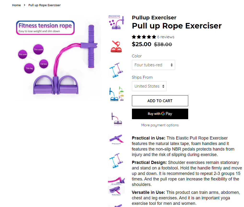
I would expect to see some trust badges and messages about Free US Shipping but that’s nowhere to be found. If you think the announcement bar on top is enough for people to understand that shipping is free, then you got it wrong.
The customer needs a constant reminder everywhere he goes about your deals – If there’s a free shipping deal on the entire store it should be on the announcement bar, on the product page, one the cart page, and on every page till the checkout.
This product Ships from the USA but it isn’t necessary to put it down as a variant so just mention it on the product page and that will be enough.
Trust badges:
Unfortunately, these are missing and it’s really a shame because it can really lower your conversion rate. It’s so easy and also free to put some trust badges so please don’t forget to put these on your store. There’s even a Shopify app called “Ultimate Sales Boost” where the free version is kind enough to add some messages + trust badges on your product page with no limits.
Product Description:
It’s boring and has no pictures or GIFs. I’m not saying text descriptions don’t work but a description with pictures or some GIFs will really make you standout and look much more professional. It also doesn’t take too much time to make a good looking product page so it’s just being lazy if you don’t do that.
Also make the description a bit more interesting. This description just states some facts about the product and doesn’t have any cool promo texts like “Looking to remove the extra pounds you made during quarantine? Our home exerciser will help you with that at the comfort of your home!”. Give your product description a bit more thought and Love ?
5. The Product Reviews
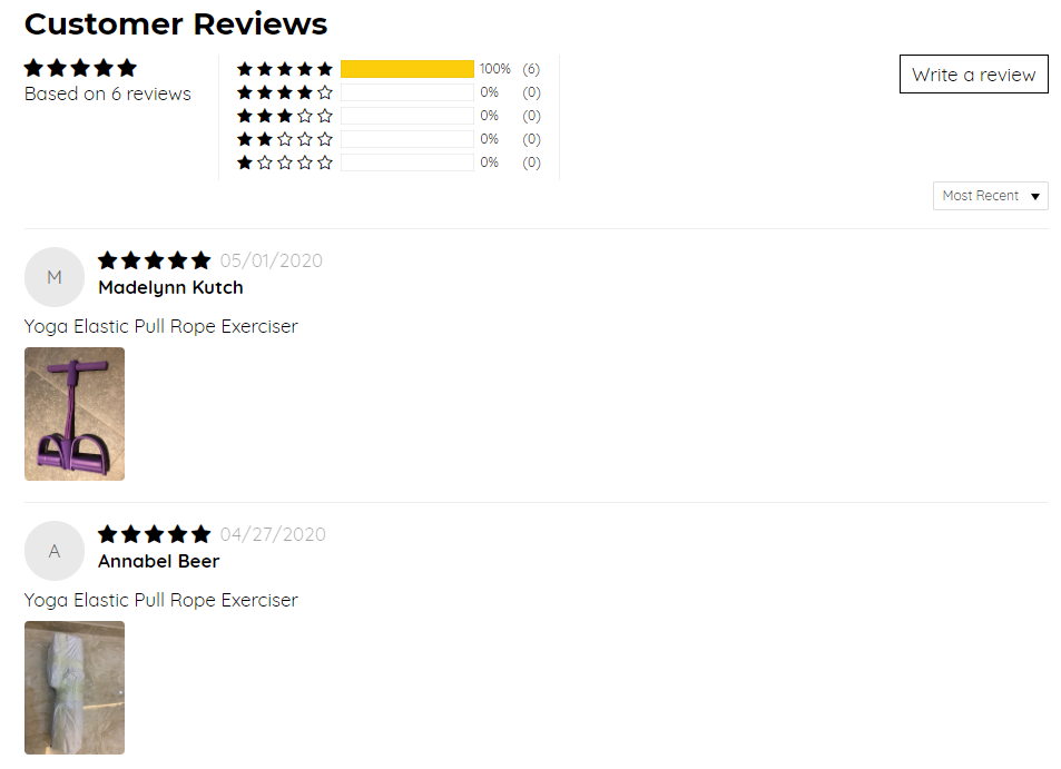
I have no idea what review app the store owner is using but in my opinion, there are better looking review apps out there to use instead of this one. The design doesn’t stand out and it’s really not an app I would use to display my reviews.
And why only 6 reviews? Maybe this is a limit for the free version but I suggest displaying at least 20 reviews with pictures and text on them. Also make sure to pin the best ones so when the customer scrolls down, he sees the best review first.
6. The Cart Page
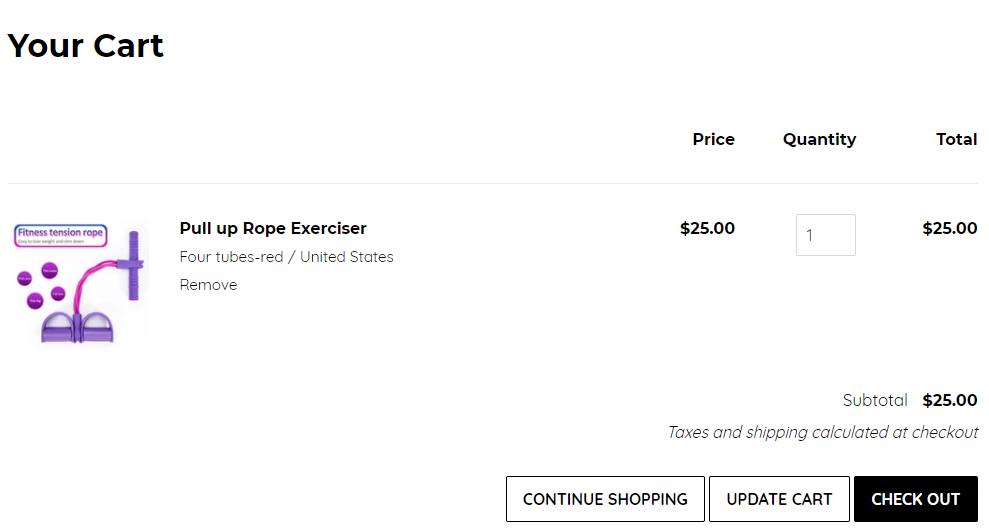
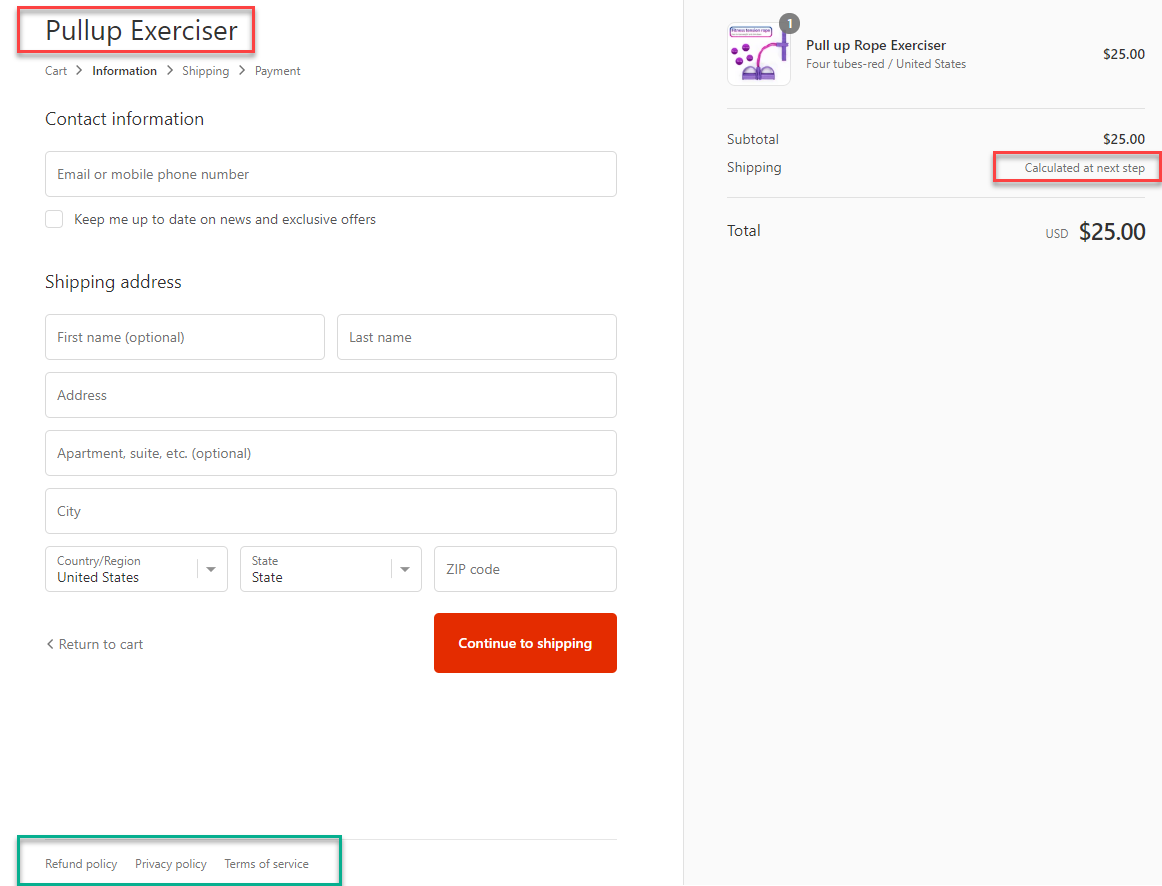
Clicking on the Add to Cart button transferred me straight to the cart page which is how it should be. The only issue is the “Taxes and shipping calculated at checkout” text which can confuse people because just a second ago, there was a message about Free US Shipping. So what’s going on? Is it a scam?
If you offer free shipping on your entire store, please just make sure to change these text too so it doesn’t confuse your customers.
7. The Checkout Page
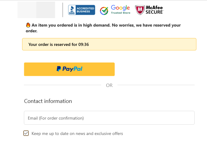
My main problem here is the lack of a normal logo + trust badges – I usually edit the checkout logo and include trust badges with it so it looks more professional. If you have an app that includes also a reservation timer + a short message, that’s good too!
Example of a checkout logo + trust badges:
From the right you can see the message that shipping is calculated at the next step which should be changed to “free”. And it looks like he actually generated and saved the policy links because they appear at the bottom of the checkout page. The store owner simply forgot to add them to the “important links” section in the footer.
8. The Shipping Page
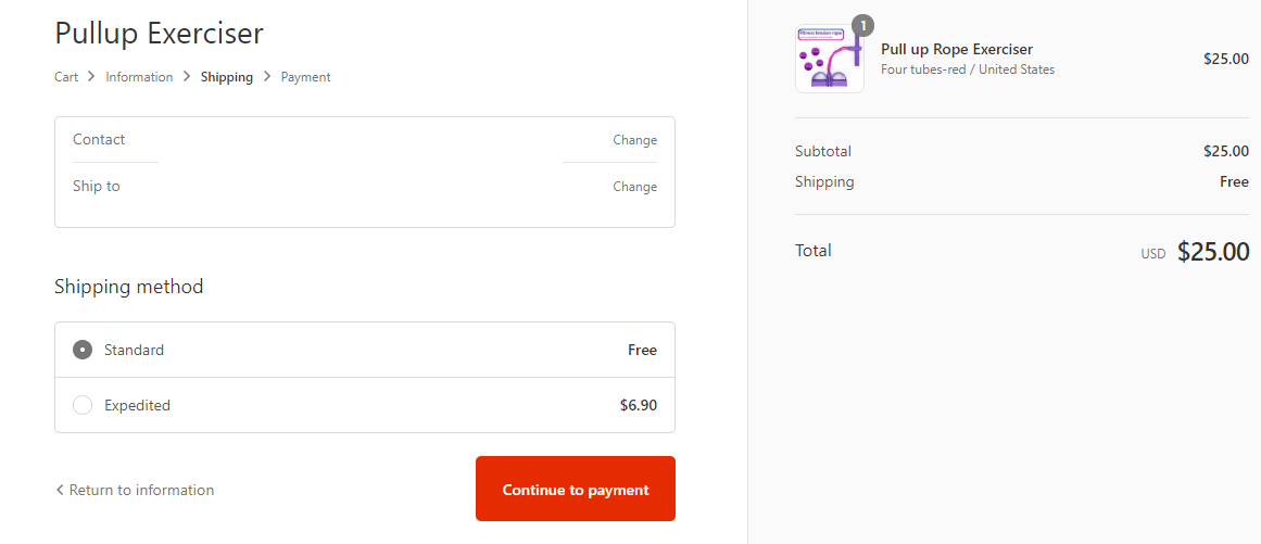
It looks like the owner offers also expedited shipping but he forgets to mention the time it will take to arrive… People don’t even know how much time the regular shipping will take so how will they know how much faster is the expedited one? If you’re looking to confuse your customers to the point they decide to leave your store without buying, this is how it’s done!
If you offer expedited shipping, please add the shipping times.
9. The Payment Page
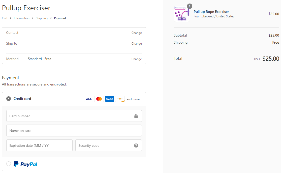
Looks like both PayPal and credit cards are accepted so no real issues here. The only issue I have is the default button text which is “Pay Now”:
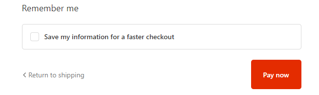
I always find it a bit too aggressive and prefer changing it to “Complete your order”. Also the red button color is too strong and I prefer using the good old green one 🙂
To Sum It Up:
Stores like these are what I like to call “money burners” – No matter the budget, you won’t land a single sale and you will just burn your money and help Mark Z get richer. This is a good example on how to not build a one product store.
I covered almost everything about this store and pointed the biggest mistakes so I hope that by reading this article, you will learn from it and make a better job on the next store you build.
If you want your store reviewed then let me know in the comments, and maybe your store will be the next one I review.
Good luck 🙂
Struggling to find good products to sell? Not sure who’s your target audience? Tired of losing money on products you were sure were “winners”?
Then Ecomhunt is what you need! Find hot winning products that are added daily, spy on their ads & stores and import them into your store in 1 click and Start Selling Today!
Must Read Articles:
- How Much Ads Money Do You Really Need To Start Dropshipping?
- Free Ads Review – Learn How To Review Your Facebook Ads Like A Pro
- How To Use Ecomhunt On Steroids – Unleash Ecomhunt’s Full Potential To Take Your Dropshipping Business To The Next Level

Daniel Aloni is one of the leading mentors in the Ecomhunt family. Daniel is a highly experienced Print On Demand seller with multiple 6 figures successful launches.


")


Looks good, great inspiration….once my store is ready I will submit it for review
C est vraiment très intéressant. Je m’intéresse à cela
Modeteher.com
Very useful review thank you! Would love it you could please review my store!!!
Great article. I’m trying g to figure out a lot of things before I can launch any product or even set up my store on Shopify but articles like this will help the less experienced ones like myself make less mistakes in the first place. Appreciate your hard work and you sharing all your invaluavable knowledge and experience with us ! ??
Great article. We would love our store to be reviewed as well.
http://www.pawradiseshop.com
We are a pet online store
Hey Amit! I chose your store to be reviewed so go check it out 🙂
Your store review article – https://blog.ecomhunt.com/2020/06/02/ecomhunt-store-reviews-a-pawsome-pet-niche-store-review/
Good Luck!
Hello ecomhunt team,
I would like my store to be reviewed 🙂
Would appreciate your comment on the following shop : brightthings.fr
Hi
Would love for you to review my 1 product store.
http://www.digiflask.co.uk
Hey Kris!
I just reviewed your store 🙂
Here’s the review article – https://blog.ecomhunt.com/2020/06/10/ecomhunt-store-reviews-this-is-how-a-one-product-store-should-look-like-almost-perfect/