")


")
The first store I reviewed here was a really bad one-product Shopify store. It looked like the person who created it gave up on making sales even before launching his first Facebook campaign… You can check this article here.
So for this week’s store review article, I wanted to see if there’s someone with a normal looking one-product store who asked for a review. Fortunately for me, there was such person and this is his Digital Flask one-product store – https://digiflask.co.uk/
Kris, the owner of this store, did a pretty good job and the store looks nice! BUT there are still some mistakes to be fixed and I think this will be a great lesson to anyone who thinks of opening a one-product store 🙂

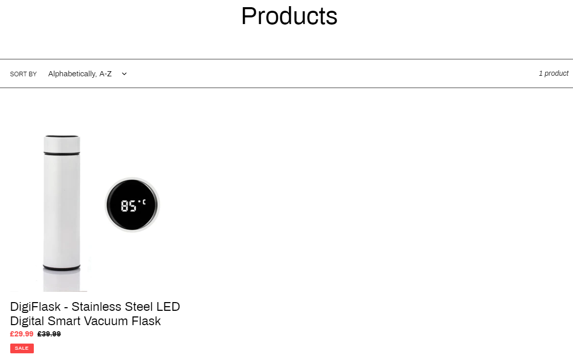
1. The Front Page
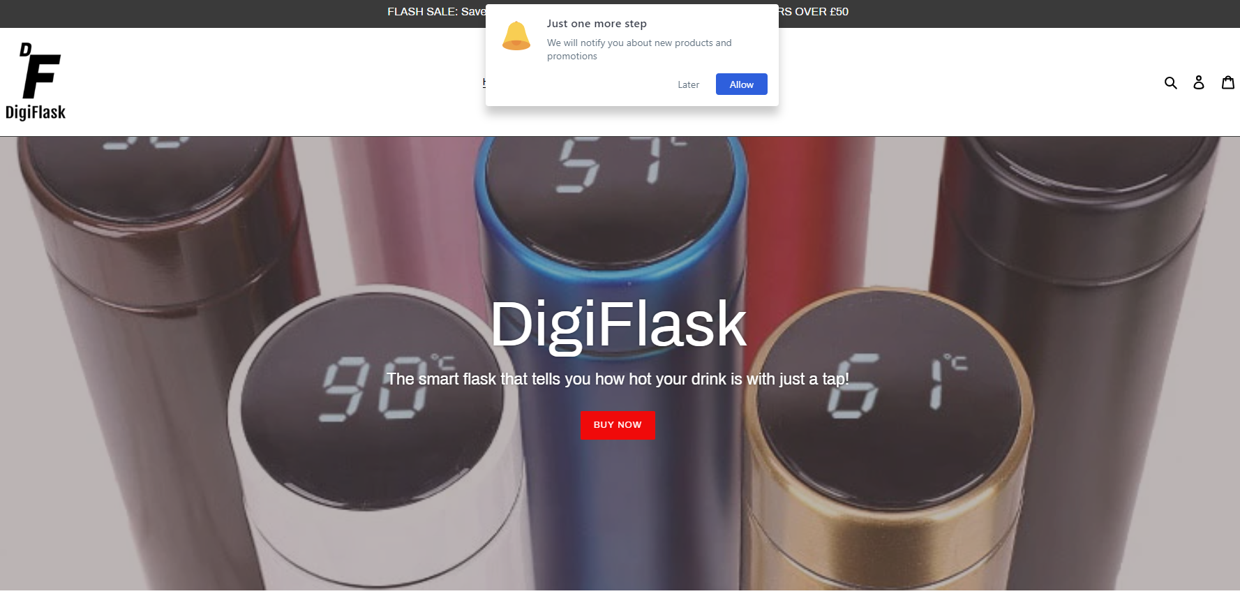
Right off the bat there’s that annoying notification popup which EVERYONE hates! This is the wrong way to welcome your customers and it’s just isn’t worth it… Customers hate these kind of popups and it can just push them away from your store on the spot.
If you want to introduce some kind of popups to collect emails do it after certain amount of time spent on the site, and preferably with some kind of immediate discount. Messages like “Subscribe now and get 10% on your order” are fine. Future discounts, that no one knows when they’ll get them, substantially lower the chance of getting new subscribers.
Other than that, I like the name you gave to the store and the domain name is cool. The logo is cute, the fonts are fine, the front page banner is looking good with a short description and a buy now button. So far so good 🙂
Scrolling down we have a detailed explanation about the product:
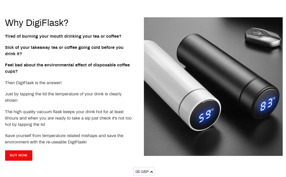
The photo used is high quality and there’s a buy now button to click when you finish reading. Looks good to me and clearly explains what this product is about.
Next are the product features:
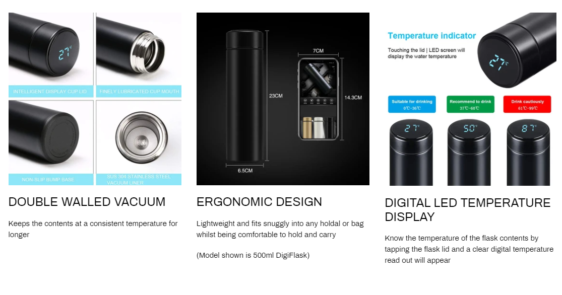
Nothing to add here! Everything that needs to be covered about this flask is shown here.
And to finish it, we have some reviews:
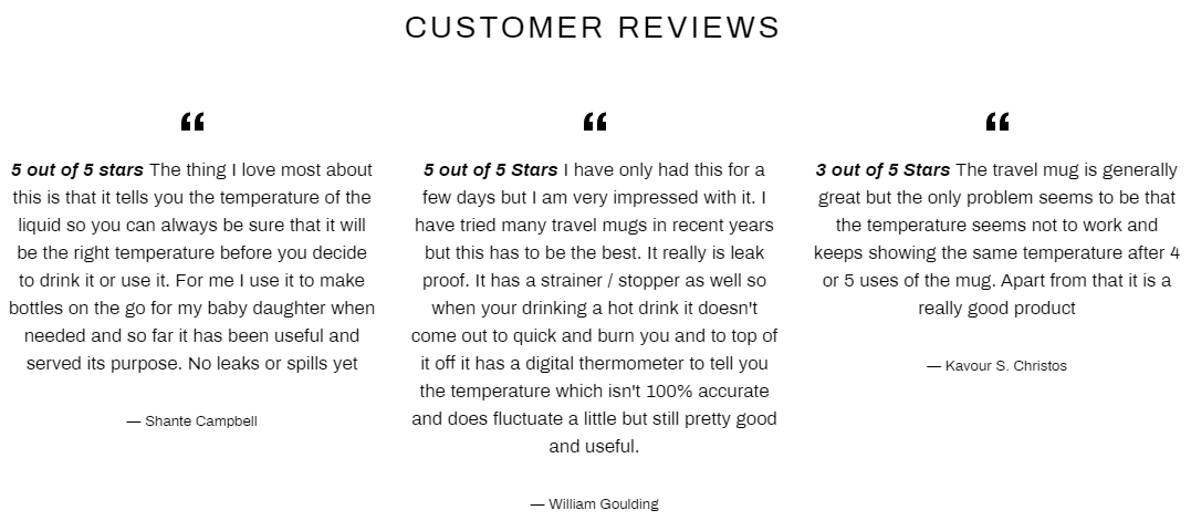
The reviews are really detailed and it’s important to showcase only the best ones and not just random ones. Still, there’s a small problem with the third review on the right side which isn’t very positive… It basically says the mug doesn’t work so remove this one 😉
Remember to showcase only the good and the most detailed reviews. You can have 4 stars review with like small complaints in them but not something like we see here.
Notes:
1. When clicking on the Buy Now button, it transfers the customer to the collections page and not to the product page as it should.
You have to click again on the product to go to the product page so make sure to fix that. Same goes for “SHOP DIGIFLASK” button in the header.
2. Change the color button from red to green – It’s not like the theme of your store is red and usually green will work and look better on buttons than red. *OPTIONAL*
3. Currency converter doesn’t automatically change the currency depending on the region. If you also target Worldwide, you should show the right currency right away. Upgrade the app or keep it as it is if you plan on targeting only the UK.
2. Store Links
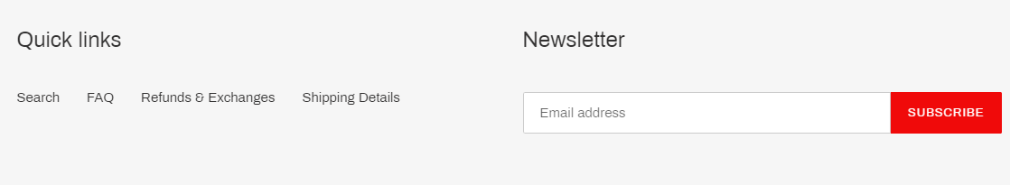
Privacy policy is missing so add it ASAP and some short text under the Newsletter. All the other pages are fine except the tracking one which doesn’t work for some reason. Make sure to fix it because it just looks bad…
Add a “About Digi Flask” page too and explain a bit again about the product + some regular stuff about your mission.
3. The Product Page
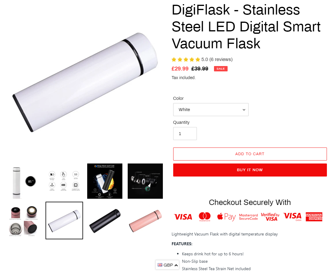
I understand everything about this product is explained on the front page but it doesn’t mean the product page can be left almost empty. Use some of the texts from the front page and put some pictures in the description.
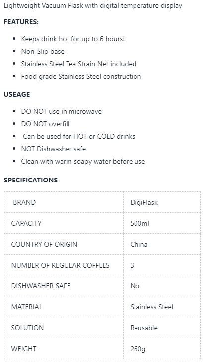
Remember that customers have a short-term memory and if one of them wants to see how the anti-slip base looks like, he shouldn’t need to scroll the pics or go back to the front page just to see it. Give your customer the option to scroll down the product page to see all the necessary data and pictures.
On top of that, I didn’t see any details about the charging process in the product page description or on the front page. There’s only one picture on the product page that shows it’s rechargeable(probably USB) and this isn’t good.
You can’t miss a single detail about a product – No matter how good your product, ad, or store, the customer won’t purchase if he doesn’t know all the details.
Also remove COUNTRY OF ORIGIN from the specification box. People understand that most of the items purchased today are made in China but that doesn’t mean you have to point it at their face.
The trust badges are good although the color is a bit strange. Red isn’t a color I would use for my product page trust badges but it’s fine if you don’t want to touch it.
4. Product Reviews
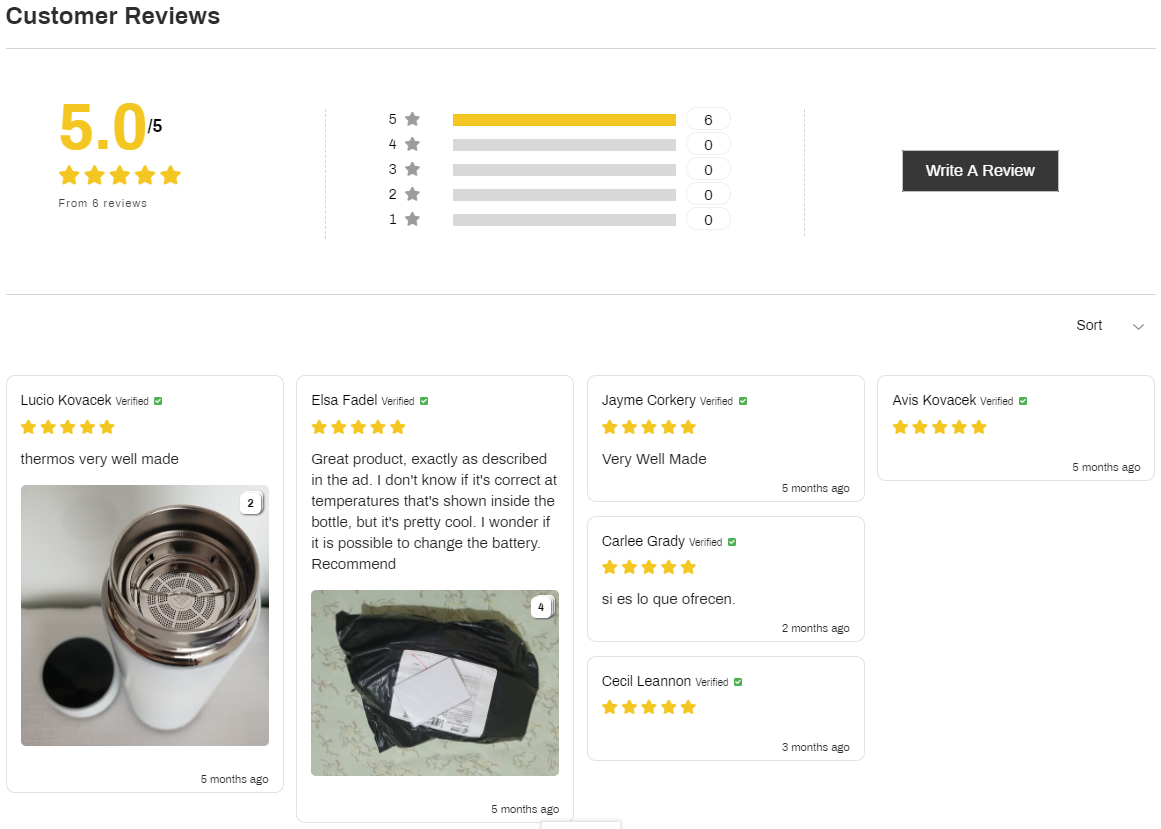
For some reason you have only 5 reviews on your product page when you have 6 on the front page. And the six reviews there are all different from what I see here… I always recommend importing at least 20~30 reviews so fix it somehow. Find a seller on aliexpress with the same product and import more reviews.
And here’s a quick fact from BrightLocal about reviews:
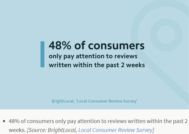
Most of your reviews are 5 months old and it looks bad! A Customer checking out the reviews will wonder why there’s almost no reviews and why they’re so old. This just shows the product ain’t popular and he might skip it. So here’s another thing for you to fix.
5. Cart Page
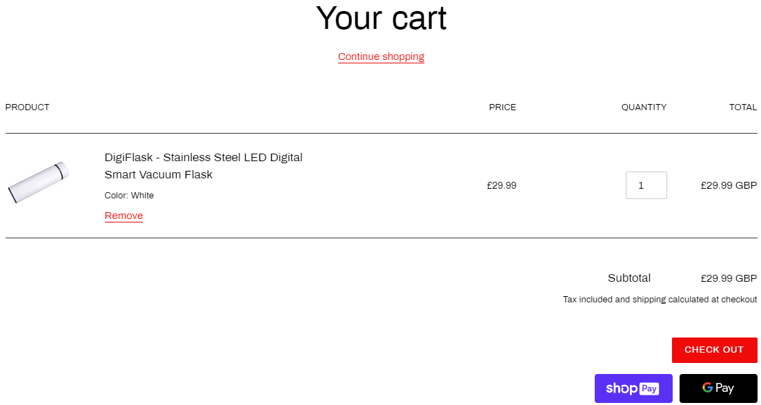
Before I talk about the cart page, please, for the LOVE OF GOD, transfer customers STRAIGHT to the cart page after clicking the Add to Cart button. Especially if it’s a one-product store where there’s no reason to “Continue shopping”.
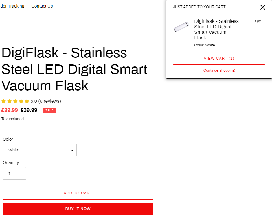
Focus on getting the customer to checkout as fast as possible!
The cart page is fine and I like it’s good that you mention the price is tax included. I think it’s important to mention if you sell in the UK because of VAT.
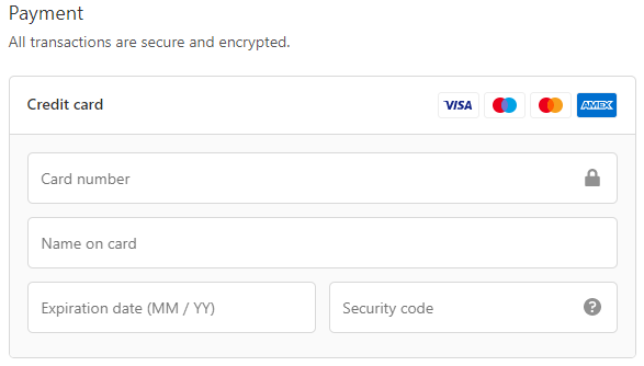
6. Checkout Page
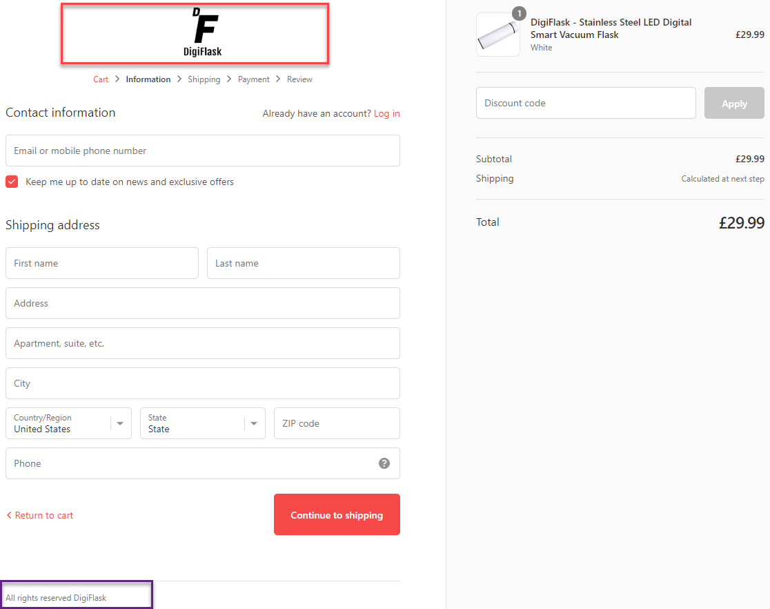
The checkout page has 2 main issues:
- There are no policy links in the footer – To display them, simply go to settings and generate the 3 pages with Shopify and click save.
- There are no trust badges next to the logo – Just having the logo isn’t enough and you should add some trust badges right next to it like in the photo below.
![]()
And there’s also the issue with the phone and second address field:
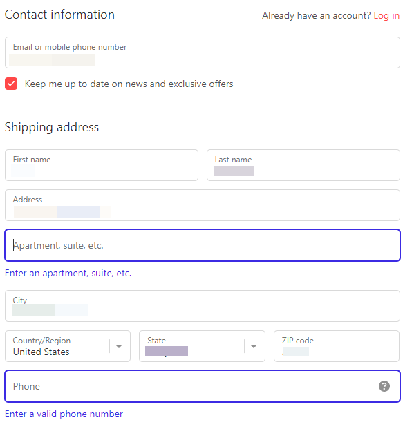
I’ve seen stores where the phone number is required because the payment company is asking for it to process payments. I explained about this in detail in my last article here so make sure to check it out and see if you can make the phone number optional.
But I’ve never seen the secondary address field as required on any store I reviewed, so this is the first time really. If it’s a UK thing and it’s needed then I get it, but if you plan on selling to USA and other countries this will definitely hurt your sales.
Adding extra steps and forcing information on customers is a big NO-NO.
7. Shipping Page
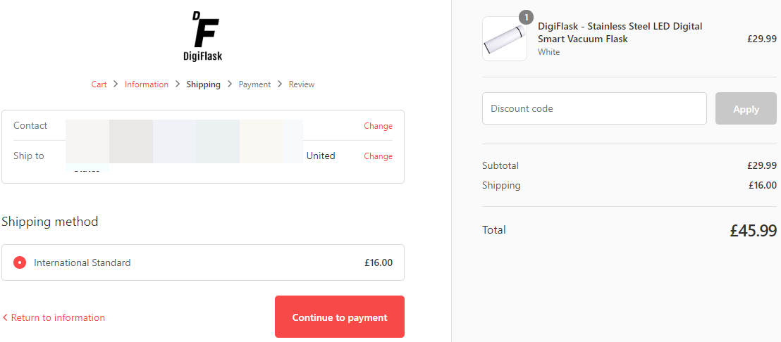
From the shipping price to the USA and the domain I understand this is mostly targeted to the UK. If you bought some stock and now ship from the UK then the shipping price is logical although 8 pounds inside the UK is still a bit high.
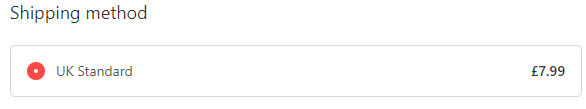
If you dropship from china then I suggest editing your shipping prices because both UK and US are too high. Keep the shipping around $5 max.
Another thing is the announcement bar with a 10% discount flash sale:
![]()
It’s better to apply the discount code automatically on the checkout page. Don’t expect customers to remember the discount code or copy it on their mobile phone. Customer checking out can suddenly remember there was a 10% discount code advertised so he’ll try to go back and copy it.
This just prolongs the checkout process and in the end, he’ll leave your store without buying. Also it’s pretty cool to see a sudden 10% discount applied on the checkout page and it surely will help you get more sales 😉
8. Payment Page
I guess you’re from the UK so I really don’t understand why you only accept a credit card and don’t offer PayPal as well. Being from the UK, most of the payment methods should be open for you and you should allow people to choose there preferred payment method.
Maybe you have bad history with PayPal and you don’t want to use them at all, but consider fixing it and adding PayPal because there are enough people in the UK that like to pay only with PayPal.
To Sum It Up:
You have some mistakes here and there but overall it’s a pretty good one-product store with decent branding. I hope this review helps you out to perfect your store and others will surely learn from it as well.
If you want your store reviewed then let me know in the comments. Maybe your store will be the next one I review 😉
Good luck.
Struggling to find good products to sell? Not sure who’s your target audience? Tired of losing money on products you were sure were “winners”?
Then Ecomhunt is what you need! Find hot winning products that are added daily, spy on their ads & stores and import them into your store in 1 click and Start Selling Today!
Must Read Articles:
- 5 Small Changes To Your Shopify Store You Probably Forgot Doing
- New To Dropshipping? Here’s Why You Should Start With A General Store And Not A Niche Store
- Trending Product Drill Down – Sell This Winning Product Right Now!

Daniel Aloni is one of the leading mentors in the Ecomhunt family. Daniel is a highly experienced Print On Demand seller with multiple 6 figures successful launches.


Hey can you check out and review my store as well?
Its not a one product store that you normally do its a niche store focusing on beauty & fitness. Do pick me if you want to review the store. Thanks amd you are doing a wonderful job. I’ll leave the store url in the website column so that its easy for you to find.
Please review my store?
Hey legends!
Love your reviews, some very handy info.
I would be super stoked if you reviewed our page.
http://www.qonipets.com
Thanks!
Please review my store. Thanks
Good review. I have learned something new.
Can you review my site please!
https://ebuys24.com
I reviewed your store 🙂
Check it here – https://blog.ecomhunt.com/2020/06/30/ecomhunt-store-reviews-a-general-store-with-lots-of-products/
Good Luck!
Sir, can you please review my store: https://kerlysbox.com/
Hi Daniel, a great review, could you please cover another 1-product store at http://www.ulla.io next time? Thanks!
Bom dia, acompanho suas matérias toda a semana, sou iniciante no dropshipp, estou aprendendo bastante com os conteúdos da ECOMHUNT.
LOVE WHAT YOU’VE DONE WITH THE ONE PRODUCT STORE. I HAVE A GENERAL STORE AND WOULD LIKE TO KNOW WHO CAN HELP ME CONVERT MINE TO THE CLEAN LOOK YOU DONE ON THE SAMPLE STORE ABOVE.
NOMOSTORE.COM
HOW CAN I GET HELP DEVELOPING MY STORE TO LOOK LIKE THE ONE YOU SHOWED US AS AN EXAMPLE?