")


You guys LOVED my last article where I reviewed a one product store so I decided to pick yet another store from the comments and do a full review. This time, it’s a pet niche store with really cool personalized products – https://www.pawradiseshop.com/
It looks like this niche store was built with care and love, but it still has some issues… If you ever thought of creating a niche store, then make sure to check out this review so you don’t do any of the mistakes mentioned here.

1. The Front Page
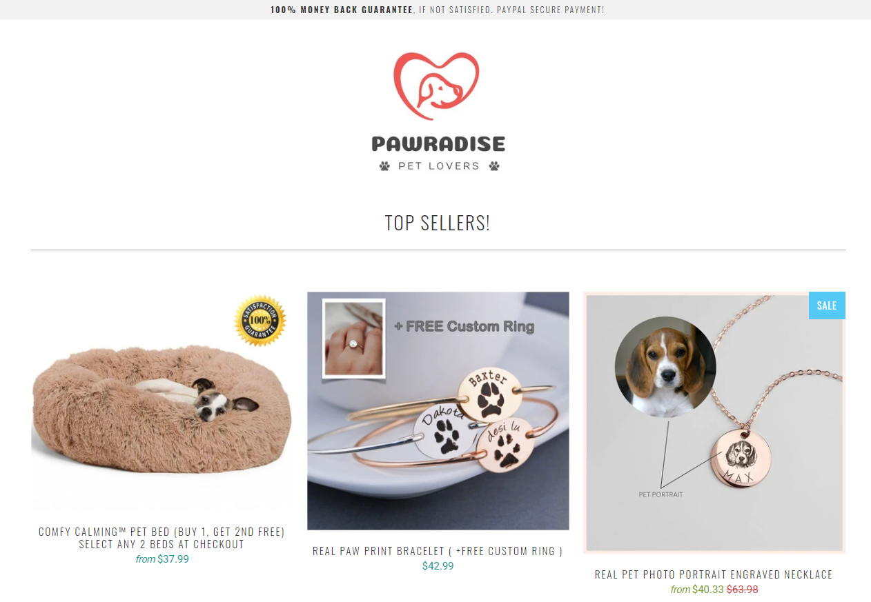
A simple and clean looking front page and I love it. Some people think the front page must have moving banners in it, especially if it’s a niche store, but this isn’t a MUST. Keeping it clean and displaying the top selling products like that is enough. Remember that most of the traffic will land straight on the product page so don’t go too crazy about the front page 🙂
The logo is really well made and it fits the theme of this store. The logo is a dog head although you also sell cat products but I don’t think this will be an issue… If it were me, I would’ve gone for a more general logo to fit both cats and dogs.
The promotional banner on top is one thing that needs a quick change:
![]()
Most people announce some sort of deal on their site like free shipping, but here you see a 100% money back guarantee message followed by “if not satisfied”. In this case, it doesn’t really help you build any trust.
This message can do the opposite and make your visitors question the quality of your products – Keep it simple, advertise some other deal you’re currently running and that’s it.
For example: “Free US Shipping on all orders!”
Important Note:
I am reviewing this store on my desktop so I might miss some stuff which appear only on mobile. On desktop, the logo is a bit too big and you should reduce the size a bit. There are also some spaces that can be reduced between the announcement bar, the logo, and the top sellers section.
2. Store Links
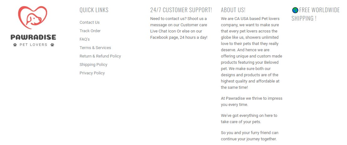
Perfection!
You didn’t miss a thing and made sure every must page is on your store. The contact us and tracking page are looking great, all the necessary policy pages are here too, and there’s a nice About Us text for your store.
I think the About Us text needs to be changed because it sounds a bit amateur and not so “USA/CA” based. No idea where’s your store is really based, but the About Us text gives me Indian/Pakistani vibes haha. Some really small typos here and there so make sure to also go through your other pages and see if there are more typos to be fixed ?
Good job!
3. The Product Page
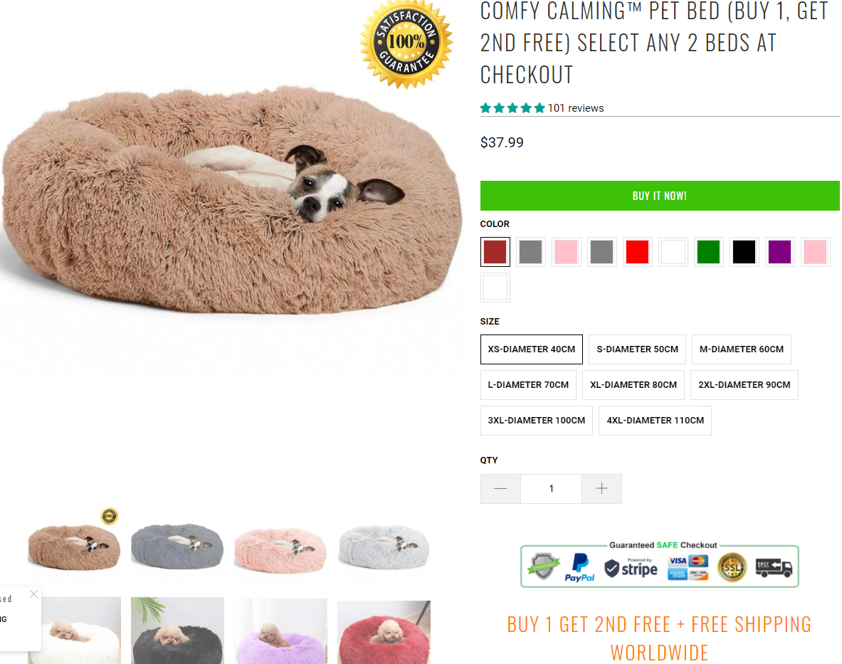
This isn’t a one product store so I had to quickly check all other product pages and give some general tips. I’ll start with saying that your product pages are almost fine with no major, conversion killing issues.
You’re using the good old green color for your buy buttons and it looks good on your store. You also have trust badges although the one you’re using is a bit too “crowded”. Too many symbols and icons, my advice is to keep it simple. Check the trust badges “Ultimate Sales Booster” app offers in the free version(no need for a paid one).
Your discounts on this product and on other products are a bit weird tho… No idea if this works good for you but I would’ve just reduced the price of the product and offer the second product for 50% OFF.
I don’t remember how much this pet bed costs on aliexpress but I think you’re working with really low profit margins which isn’t good. If you’re driving traffic with Facebook ads, you need bigger profit margins. I think the same pet bed was selling on a different store for about $50 and here you sell one for $38 and offer another one for free. On top of that, you also have free shipping which I think leaves you with non-existent profit.
Go through your numbers and adjust your price + deals.
The rest of your product description looks fine and you have everything there – Description about the product, sizes, shipping times and guarantees. Although this part in the end just ruins the flow of your product description.
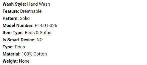
This is the description import straight from aliexpress and you either delete it or re-arrange it so it looks normal. People don’t need any model numbers and they surely understand this isn’t a smart device.
It looks like some of your products are photo and text personalized but you don’t offer anyway for your customer to upload an image or write a text:
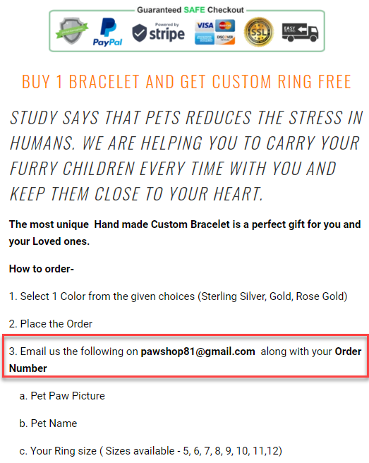
I have some experience selling personalized products and in every case, I had a custom field option. If it’s a personalized photo product, my customers will first upload their picture and only then proceed to checkout. This whole aliexpress “email your text & picture” style makes the whole process much longer and can lead to the customer deciding not to purchase from your store because of that.
Maybe I’m wrong here and you’re getting amazing sales but I suggest you somehow A/B test it to see which one converts better. Duplicate the same product on your store but this time use an app to add the needed custom fields and drive traffic to it. Check which one brings better conversions and stick to the method that works the best 🙂
And like I said earlier, go over all your texts to fix the typos so they make an actual sense.
Another important advice about product variants:
Offering too many options like colors can hurt your conversions. Customers will have tough time to decide which color they should choose thus leaving your store without buying a thing… Learn more about this phenomenon here:
The paradox of choice by Barry Schwartz is a MUST watch video for every e-com seller out there!
4. Product Reviews
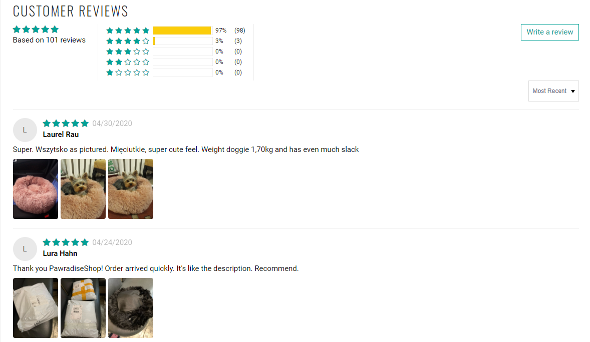
A good amount of text + photo reviews for each product which is good. I think you should go through the reviews to fix the typos and re-write some of them so it makes sense in English. Some of the reviews are auto translated into English and it doesn’t look good when your 5 star reviews are gibberish.
And like I said on my previous article, this one review app isn’t one of my favorites but don’t go looking for other apps just because I don’t like it. Reviews are being displayed in a normal looking way and that’s what really matters.
5. Cart Page
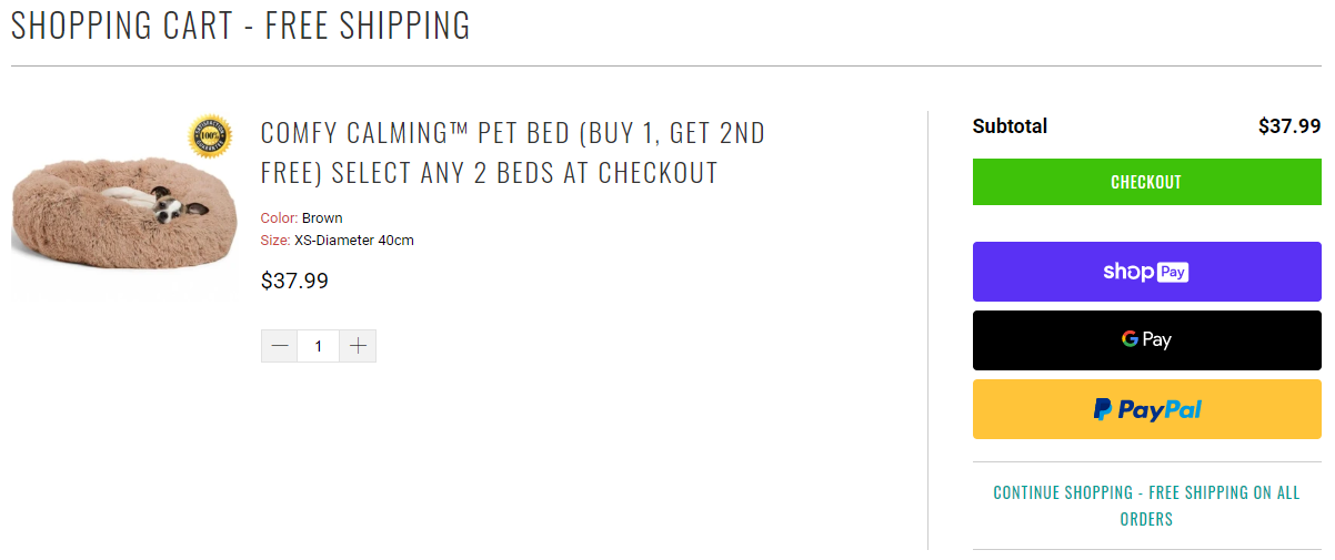
The cart page looks fine and reminds the customer he has free shipping which is good. I would remove the “continue shopping” button from the cart page if that’s possible because it’s better to first focus on getting that first sale. Later when we already have this customer in our pocket, we can start thinking about selling him more stuff.
Remember that converting an already existing customer is much easier than getting a new one!
6. Checkout Page
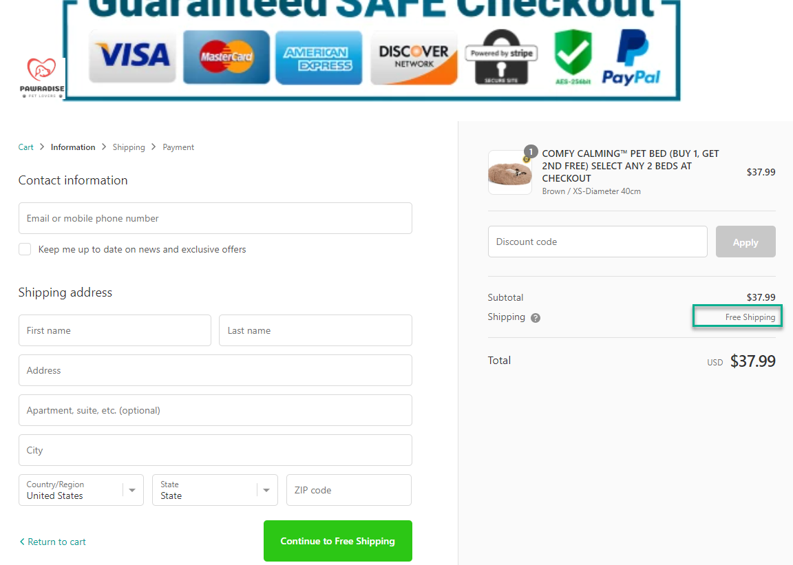
The checkout page clearly needs some adjustments with the logo and trust badges so make sure to quickly fix it up 🙂
I love that you changed the regular shipping text “calculated at next step” to “Free Shipping”. The policy links are also in place at the bottom of the checkout page so just make sure to fix this HUGE logo bug and you’re good to go 🙂
7. Shipping Page
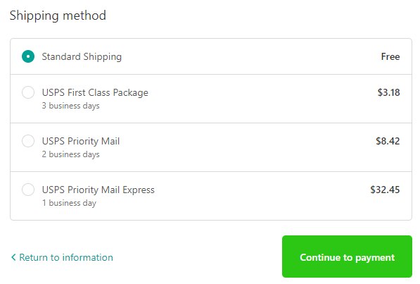
Sometimes too many options can lead to the customer abandoning the checkout process – In this case, there are too many options with almost no difference between them so I’m sure he will have hard time deciding the shipping method.
It’s better to just keep one of the options like the 3 business days package on top of the free one and that’s it. Or just offer the 3 business days shipping option as the free option which is going to increase your total conversion rate. 3 business days shipping is a HUGE conversion boost!
If you still want to offer a paid shipping option, at least let the customers know how much time the free one will take so they can compare and choose the one that suits them best.
8. Payment Page
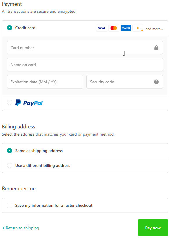
PayPal and credit cards are accepted, looks fine and the one thing I would change is the button text. “Pay now” is a bit aggressive and I really have no idea why this is the default button text on every new Shopify store…
Change it to something that sounds nicer like “Complete your order”.
To Sum It Up:
Overall, a really good looking pet niche store with some small issues here and there. This store was made with love and it’s time for you to finally perfect it so you can drive traffic and get some sales!
If you want your store reviewed then let me know in the comments. Maybe your store will be the next one I review 😉
Good luck.
Struggling to find good products to sell? Not sure who’s your target audience? Tired of losing money on products you were sure were “winners”?
Then Ecomhunt is what you need! Find hot winning products that are added daily, spy on their ads & stores and import them into your store in 1 click and Start Selling Today!
Must Read Articles:
- How Much Ads Money Do You Really Need To Start Dropshipping?
- Ecomhunt Dropshipping Tips – Start Selling Summer Products Right Now!
- Use These 2 Methods To Get Traffic And Sales For Free – Zero Investment Dropshipping

Daniel Aloni is one of the leading mentors in the Ecomhunt family. Daniel is a highly experienced Print On Demand seller with multiple 6 figures successful launches.


")


Thanks so much for the review. You have pointed out good points for us to fix.
Hi Daniel, awesome review! Really loved the detail about the checkout and cart page!
Can you please review my page too? I’d really appreciate that!
The link for my website is: http://www.tylergreenshop.com
Hey there, i had keen interest in this review
I also have a pet store, a review will be well appreciated please
Another awesome read!
I’d love to get my store reviewed, I”m a bloke angling at the women’s tech, home and beauty space and am new to dropshipping!
Compare at price
Please kindly review my store with my sincere thanks and appreciation to you
Dear sir,
Can you check my store, i can’t selling for now
Great review.
Appreciate you will be looking for stores from different Niches to review, to keep it varied and interesting for all your followers.
But if you do have time to review another Pet Niche store please take a look at mine.
http://www.FurBabies-Meow.com