Home Blog Page 78

The Ultimate E-Commerce Hacks For Dropshippers – Optimizing Your Shopify Store For Conversions (Part 1)

4
The Ultimate E-Commerce Hacks For Dropshippers - Optimizing Your Shopify Store For Conversions (Part 1)

These 5 e-commerce hacks will increase your online store’s conversion rate by removing unnecessary steps that slow the checkout process. Offer a much smoother checkout experience and will ease the mind of your customers.

Welcome to the first part of the ultimate e-commerce hacks for dropshippers blog series which will show you how to do it like the pros. The first part is all about Store optimization which will be shown on a Shopify store, but can be replicated on every online store no matter the platform.

Enjoy!

find winning products to dropship


1. Disabling Add to Cart Notification – Transferring Customers Straight To The Cart Page

One of the first things every new dropshipper must realize is that his store isn’t Amazon or Ebay. No customer out there is going to walk in, add a bunch of random products to the cart page, and then proceed to checkout. In most cases, it’s going to be a single item purchase and maybe an upsell.

How can you be so sure this is what happens in most cases?

  1. Experience – We’ve been dropshipping for years now and spent millions on ads to get paying customers to our stores. Customers visit your store due to one item they saw and really liked on Facebook so their aim is to just buy it and that’s it. If you want them to spend more, you should aim for a cool and relevant upsell or offer a sweet deal like quantity discounts on multiple item purchase.
  2. A random dropshipping store isn’t a place for a shopping spree – When looking to buy new clothes, would you go rather go to a nameless clothing store or visit the mall where the big brands are? I bet most of you will go to the mall if you need to update your wardrobe. Same happens with online stores… If you need to buy a bunch of stuff, most of the times you’ll go straight to Amazon, Ebay, and other big online shops and do your shopping there. The only time you’ll actually buy from a small online store is ONLY if you find something that you didn’t know you needed.

And this is exactly how dropshipping works – You run ads for a winning product and show it to a relevant audience you think will find this product useful. You catch them off guard with an awesome ad and convince them they need this product right now. Once they click on your link and visit your store, your mission is to seal the deal as fast as possible without any unnecessary interruptions.

When you finally get that sale, this is when you can think about getting more money from your customer. Email marketing, retargeting ads for new products, SMS marketing, etc… It’s much easier to sell again to an existing customer than getting a new one.

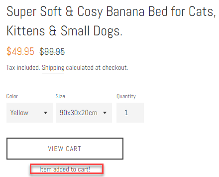
So as you probably understand, showing Add to Cart notification is just going to prolong the checkout process:

You give your customer “time to think” about his purchase and the ability to start browsing your store. To avoid this, we will transfer our customer straight to the cart page to keep a healthy checkout flow.

How to disable Add to Cart Notification and transfer customers straight to the cart page

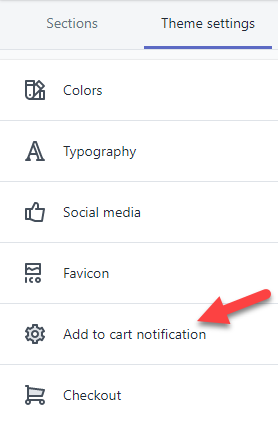
1. Go to your theme settings and click on “Add to cart notification”:

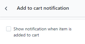
2. Uncheck the box that says “Show notification when item is added to cart”:

That’s it! Your customers will no longer stay on the product page when clicking the Add to Cart button, and they will be redirected to the cart page instead. The Add to Cart notification is enabled by default in most free themes I’ve seen so don’t forget to disable it.


2. Disabling Product Recommendations

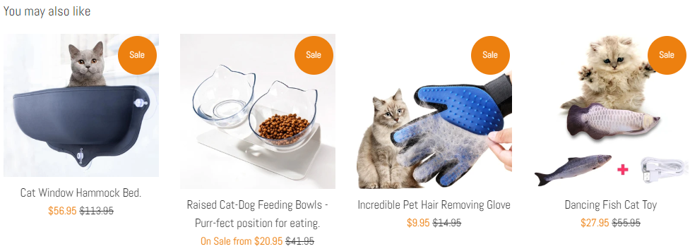
The same logic as with the Add to Cart notification is also applied here. The “you may also like” section may work well on Amazon and increase the AOV(Average Order Value) for each customer, but in our case it will probably do more harm than good.

New dropshippers think that the customer is going to click on a product, add it to cart if he likes it, and then proceed to checkout when he has more items in his cart. In reality, he will click on one product, then on a different one, and after 30 seconds he will forget the reason why he visited your store in the first place…

And do you know what happens next? He will leave your store without buying a thing! Yes, there’s a chance he will actually proceed to checkout with some extra items in his cart but the chances of that are pretty low. Like I said, it’s more likely he will get lost and leave your store without buying.

So I prefer first to focus on getting that single sale as fast as possible and as simple as possible. For that, I ALWAYS disable the product recommendations and keep my product page clean from other products. A simple & clean product page without any suggestions that will make my customer “think”.

How to disable Product Recommendations to keep our product page clean

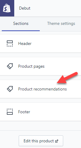
1. Go to your theme editor and click on a random product in your store. You will see the sections change and new options will appear. Click on “Product recommendations”.

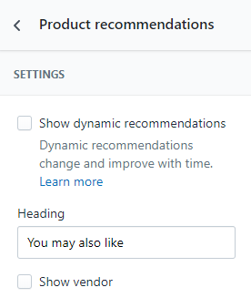
2. Uncheck the box that says “Show dynamic recommendations”:

That’s it! Your product page is now be clean from other products and your customer will only see the product he originally came for.


3. Changing Button Colors – Both On Product & Checkout Pages

There’s a hole science behind color psychology in e-commerce and this means that the colors people see on your online store will have an impact. So if you want to maximize your online store’s conversion rate, you need to choose the colors you use carefully.

I understand that if your logo color is purple, it can be cool to have your theme colors match it so your store design looks better. Personally, like other big dropshipping stores, I stick with a single color for all my buttons which is green.

I don’t care if my logo color is mostly blue with some red stripes, I always keep my buttons green. Why green you ask? If you read about it online, you’ll see how green color is one of the best to calm your buyers and it’s the easiest for the eyes to process.

Taken from https://www.ecommerce-nation.com/color-psychology-for-ecommerce/ – Click the link to learn more about color psychology. So no matter what, I keep my buttons green on all of our dropshipping stores.

Changing the buttons color is pretty easy and can be quickly done in your theme editor.

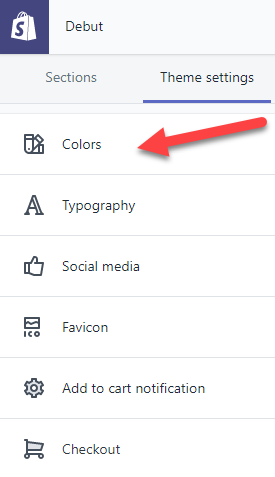
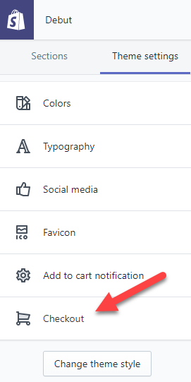
1. Go to your theme settings(in the editor) and click on Colors:

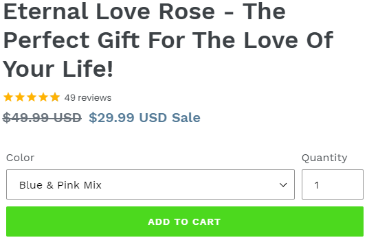
2. Click on Primary buttons and then change it to green:

New dropshippers think this will change all the button colors to green, where, in fact, this will change the buttons color on your product page and cart page only. If you want to change the buttons color on the checkout page(and you should), you’ll need to:

1. Click on Checkout in Theme settings

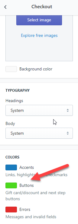
2. Scroll down till you see colors and change the buttons color to green again

Only after you change the buttons color on theme settings too, you’ll be done with it. By default, the checkout buttons are usually blue so don’t forget to edit the colors on your next or existing Shopify store.


4. Adding Trust Badges On Product & Checkout Pages + Guarantees

A customer visiting your store needs to feel safe purchasing from you every step of the way. When your customer clicks on your link and lands on the advertised product page, he will need to have some guarantees that his money will be secured. On top of that, he will also needs some guarantees the item he’s going to purchase will actually arrive.

If your customer visits a store with no trust badges and guarantees, just a blank product page with a short description, he will probably leave the store without buying a thing. No matter how good the product or the ad are, he needs to trust you before everything else!

So here’s what your customers need to see:

1. Product Page

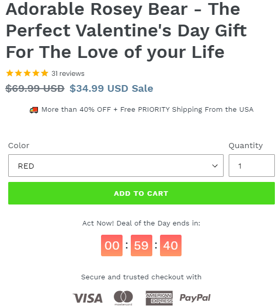
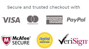
Right below the Add to Cart button, there should be secured payment trust badges. Visa/PayPal/American Express symbols with a short line of text above or below the icons.

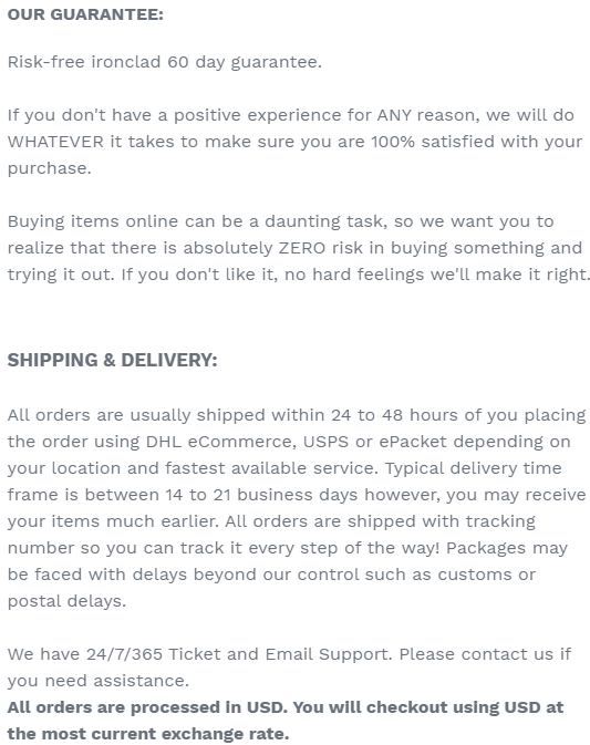
Finish your product description with Risk & Shipping/Delivery guarantees. Copy from someone else’s store or write your own, just don’t promise something you can’t do like 7 day delivery when you dropship from China. In most cases, this will keep your customers calm and you don’t have to worry about sudden mass refunds because you offered free 30-60 day refunds.

And at the bottom, right after the above guarantees, add some more trust badges.

Every product page for every product we have on our dropshipping stores is structured the same way with the same exact badges and texts. This should be enough to make your customers trust you and buy from you.

2. Checkout Page

Your logo will only appear on your front pages and if you want it to appear on the checkout pages too(you should), you will have to upload it again. Navigate to checkout settings in the theme editor and upload your logo.

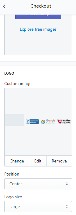
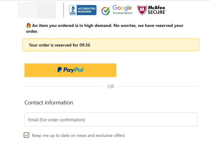
Now to make your store look more trustful, especially on the checkout pages, we always add trust badges to our logo. It can be easily done on photoshop so the final version should look something like that:

The logo and the trust badges will be shown on all checkout pages.

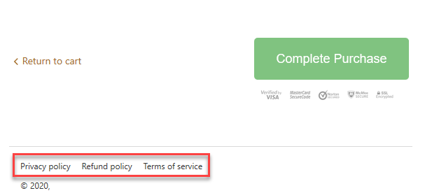
In addition, we’ll also need to show the policy, refund, and term of service links on the checkout pages.

For these links to appear on the checkout pages, you will first need to generate them in your Shopify store settings.

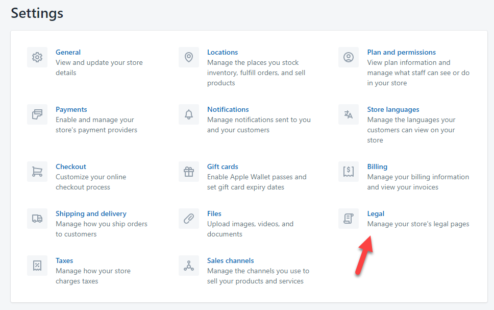
1. Go to Settings and click on Legal:

2. There you will see a generate button which will automatically generate all the policy pages needed for your store. Shopify by default uses your store settings like legal business name and physical address so feel free to edit them in the generated text box. Once you save the generated pages, they will automatically appear on the checkout pages.

Note:

For these links to appear in the footer of your store, next to all your other pages, you will have to manually add them.

Important:

It will really help the customers to trust your store if you have a well written About Us page and a built-in tracking page. A built-in tracking page can be done by downloading a tracking app in the Shopify app store and it will help customers track their package without leaving your store. This will help them feel safe that the product they’re going to buy can be actually tracked 🙂

And of course let’s not forget the reviews for every product you dropship on your store. Import good reviews with photos to boost your conversion rate! Make sure their are no weird typos and import only good, 4 & 5 star reviews.


5. Editing Default Texts On Cart & Checkout Pages – Especially Important For “Free Shipping” Dropshipping Stores


It’s important for your customer to always know exactly what he’s getting – If you offer some kind of a deal, like a free shipping one, then it should be clear on EVERY page he visits. Having an announcement bar with a “free shipping on all orders” text on the product page, and then showing “taxes and shipping are calculated at checkout” can make you lose sales.

Contradicting your offers will confuse your customers and because of that some of them might leave without buying…

Imagine adding a product on Amazon where it says free shipping only to see that offer disappear on the cart page. Would you proceed with your order? In my case, I would go back to the previous page to see if I missed a small detail about the free shipping deal. Other people might think it’s a trick to make them add the product to the cart so they eventually buy it, and because of that they will leave without placing any order.

So how can we avoid confusing our customers? It’s simple. We will simply change the default Shopify texts to suit our needs better.

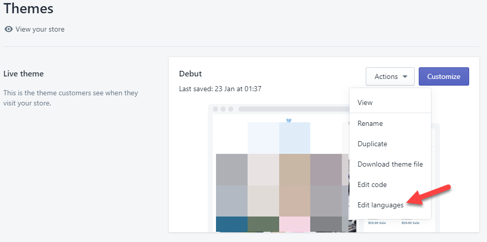
1. On Shopify go to Themes, click on Actions, and choose Edit languages from the dropdown list.

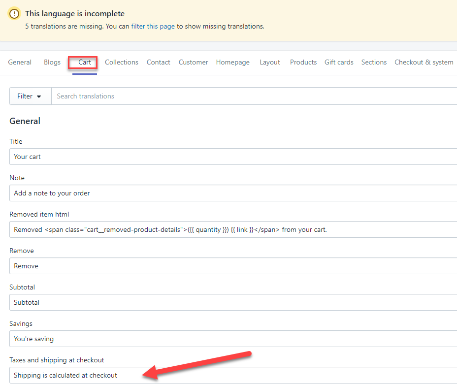
2. Next click on the Cart tab to get access to all the default texts that appear on the cart page.

Our first mission is to change the default text to one that suits our store better. So if you offer free shipping on all your order, you can change the default text to something like “Free Shipping is automatically applied for this order”. Of course, if you don’t offer a free shipping deal on all your orders, then you can leave the text as it is.

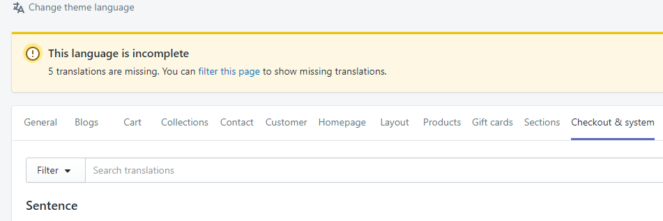
3. And let’s not forget the texts on the checkout pages.

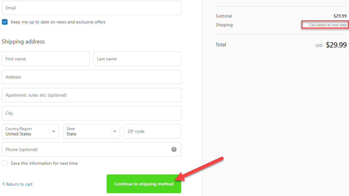
In this tab, we have the option to change any default text that appears on the checkout pages(contact information, shipping, and payment) to something more suitable for our store. For example, if you have a free shipping store, then you can change the following on your contact information page.

The text value under Shipping which is “calculated at next step” can be changed to “Free shipping applied”. The button with the text “Continue to shipping method” can be changed to “Continue & apply free shipping”. Minor changes that necessary to not confuse our customers(And it will also increase the amount of people who will proceed to the next step).

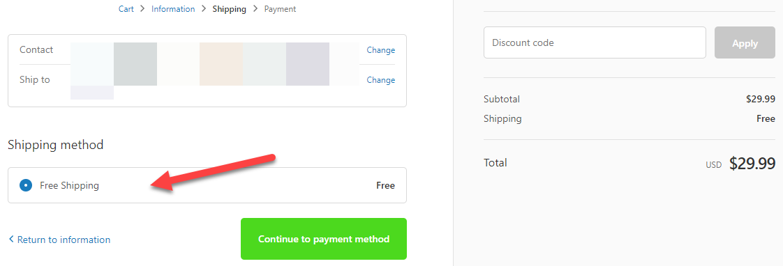
On the next page, which is the shipping page, you should also change some texts.

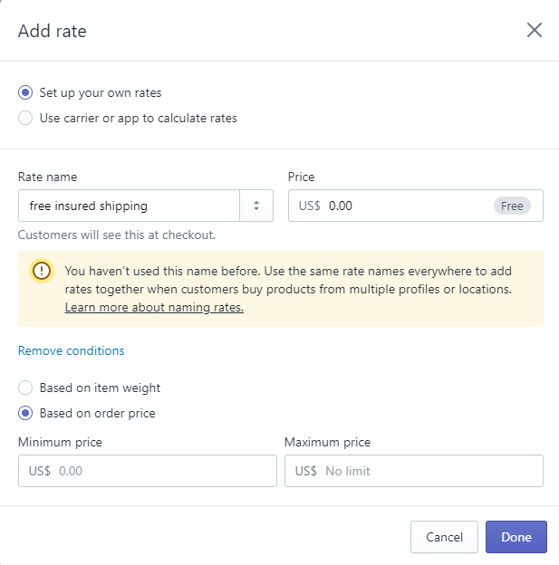
Like the Shipping method which says “Free Shipping” to “Free insured shipping” to ease the mind of your customers. This change will ensure that more people will proceed to the next and final checkout page which is the payment page.

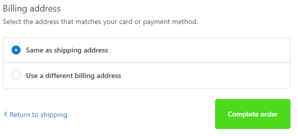
The only thing that I change on the payment page is the button text from “Pay now” which is the default text on Shopify, and a bit too aggressive in my opinion, to “Complete your order” or just “Complete order” which looks much better and has a more positive vibe to it.

Quick tip:

When changing the default texts in the checkout & system tab, please do not scroll manually till you find the text you’re looking for… The page is too long to be manually scrolled so just hold CTRL+F buttons and type the default text that you need to change. This will quickly find you the text box you need ?

And that’s basically it for the texts that you need to change… Remember that customers have a short termed memory so showing a deal once on the front page isn’t enough. It has to follow them almost every step of the way till the final checkout page.


To Sum It Up:

These 5 hacks will guarantee a much smoother experience for your customers on your store and increase your conversion rate. I suggest implementing these hacks on every new store you open in the future to increase your chances of getting quick sales.

I hope you liked the first part of this blog series and see you on the next article with the second one!

Good luck.


Struggling to find good products to sell? Not sure who’s your target audience? Tired of losing money on products you were sure were “winners”?

Then Ecomhunt is what you need! Find hot winning products that are added daily, spy on their ads & stores and import them into your store in 1 click and Start Selling Today!

Must Read Articles:

Ecomhunt Store Reviews – A Not So Purrfect Cat Niche Store

6
Ecomhunt Store Reviews – A Not So Purrfect Cat Niche Store

Hey there!

We’re once again back with another store review article and this time it’s a cat niche store. This store is clearly made by a new dropshipper so I thought it would be nice to point some of the mistakes he did for you to learn from it.

The cat niche store I’m going to review is FurBabies Meow – https://furbabies-meow.com/

If you plan opening a niche store in the near future, this store review article is for you!

find winning products to dropship


1. The Front Page

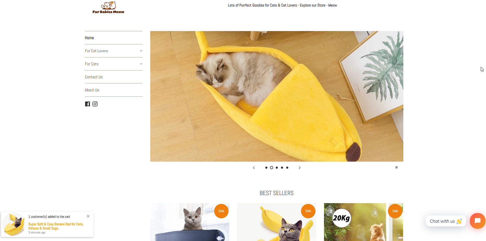
First of all, I’ll start with the banners as it’s the first thing I see when visiting the front page. Both on Desktop and mobile, the banners are simply pictures with no text or call-to-action button on them. If you’re including banners in your store, make sure to add a button & some text as well.

You can’t even click on any of the photos so it’s just a waste of space… If you don’t have anything good to display, it’s better to remove the banners completely and just start by showing your products. We had and still have stores with no banners at all on the front page and we have no problem getting sales.

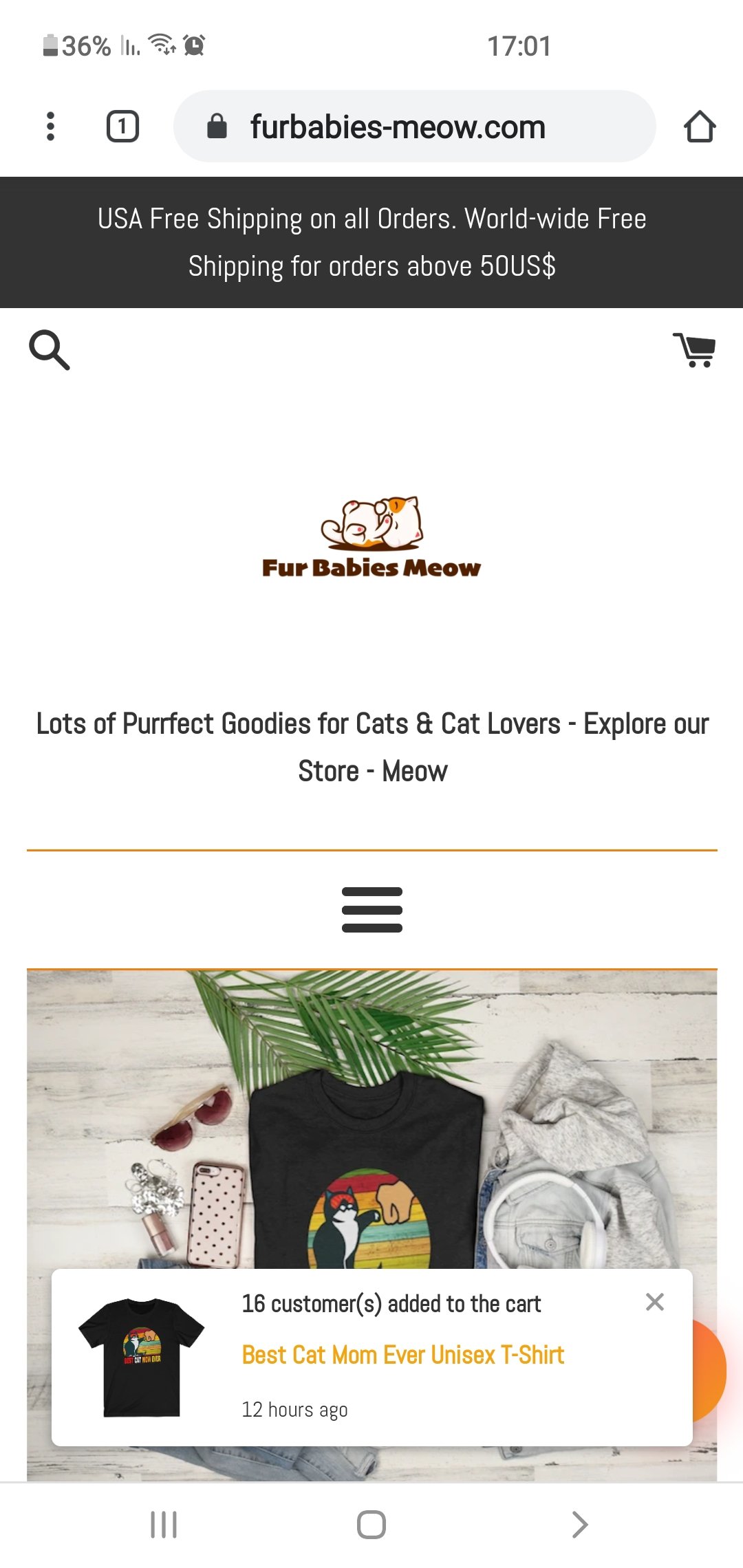
The next thing I want to talk about is the logo – It’s a bit small on desktop so I would make it a bit bigger. On mobile, there’s too much space between the announcement bar, the logo, and the rest of the site so you should have less spaces.

Removing the text below the logo can fix the spacing issue and you can then make the logo a bit bigger on mobile too.

On top of that, there’s the random “someone added to cart” notification which I think doesn’t really help with sales when you don’t have a good amount of traffic. With new stores, I prefer keeping it clean because these notification can be a bit annoying and can drive some of your customers away.

If you’re starting a new store, it doesn’t matter if it’s a general or a niche store, just keep it clean and focus first on the product and your ads.

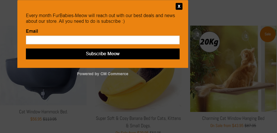
This random product notification brings me back to the next issue which is the newsletter popup.

The 3 main issues with this newsletter popup are:

  1. It’s a popup – Customers hate popups and they just want to browse a clean store for once. If you want popups on your store, go for exit popups because these can actually help you recover some lost sales. Once you have enough traffic each month, you can think about ways to signup people to your newsletter.
  2. Bad design – If you’re already including a popup on your store, then at least make sure it looks good. Include a funny picture or some cool design… You need to grab you visitors attention with something cool for them to subscribe to your newsletter.
  3. Colors – Know your colors! An orange background with black text on it doesn’t look good. If you’re not sure what colors to use, then just check other online store and copy from them.

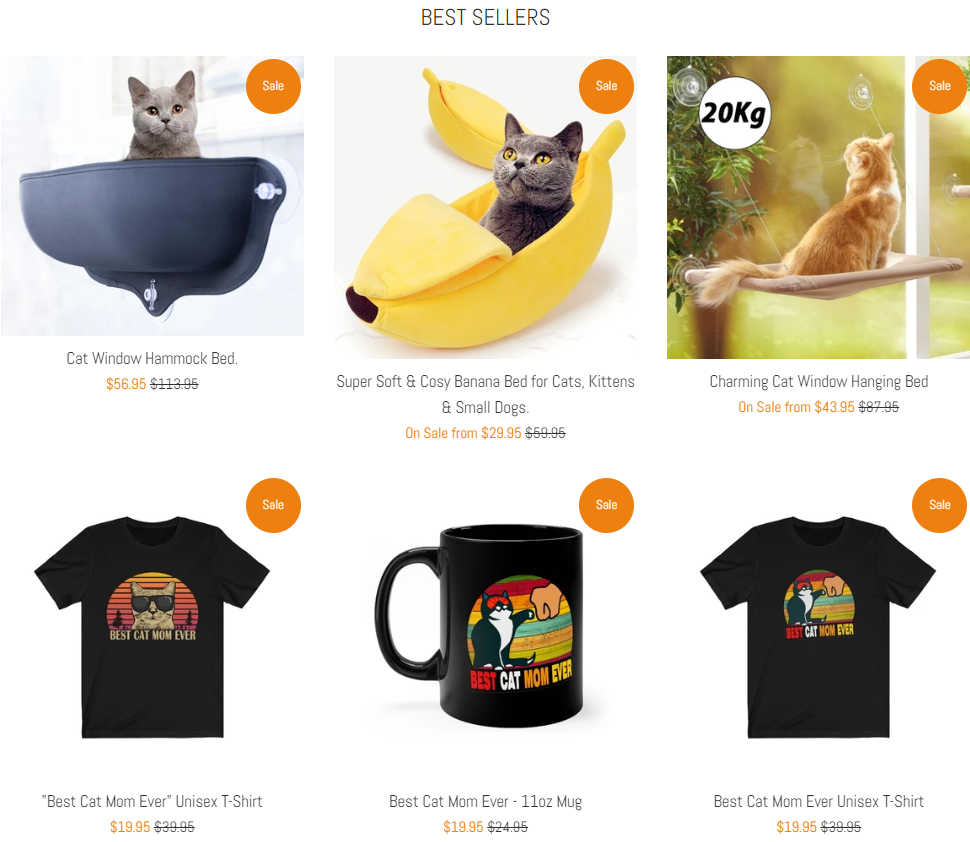
The next issue with the front page is that every product you see in “on sale”:

When every product on your store in on sale, it just makes it look cheap. Consider removing the sale notification from some products so it looks a bit more legit.

Store links:

There’s no need for Account Login or Cart links so remove them from your store’s footer. All the other links and the text inside them are good and well written, the only thing which I’m missing is the “Track Order” page.

You need to have a Track Your Order page for your customers to quickly track their package. This page will make your customers trust you more and you won’t have to deal with too many support emails about order tracking.

Things to consider changing(optional):

  1. The domain name – In my opinion, it’s a bit weird. Maybe even a bit childish… Something like furbabiesshop.com is much more solid than furbabies-meow.com. I know this niche has a lot of competition which makes it super hard to find a normal domain name. But still, consider changing the name or at least remove the “-“(furbabiesmeow.com) from it.
  2. The theme – There are much better free themes out there, like Venture or Debut, so consider using one of them instead of the Simple theme.


2. The Product Page

Things are a bit better here but there are still some stuff missing:

  1. Pictures in the description – The description text is well written with all the necessary information about the product BUT there aren’t any pictures or GIFs in the description. When scrolling, it’s always best to display relevant product pictures in the description. Pictures that show how the product works, different colors, different features, etc.
  2. Secure checkout icons – The secured checkout is displayed as text at the bottom of the product description which is fine but it’s better to display it as icons.
  3. No product reviews – You can’t have a dropshipping store without any reviews. I explained the reason in a lot of my past articles so please install a review app and import at least 20 reviews from aliexpress for each product you sell.

Also remove the product suggestions at the bottom of your product page:

Our mission is to convert our visitors into customers as fast as possible. Why? Because we’re not Amazon and the customers aren’t going to add a bunch of products to their cart and continue to checkout. This is why we first have to convert them fast and later we can get them back to buy more stuff.

Remember that it’s much easier to convert an already existing customer than getting a new one.

The next issue is with having too many variants for a single product:

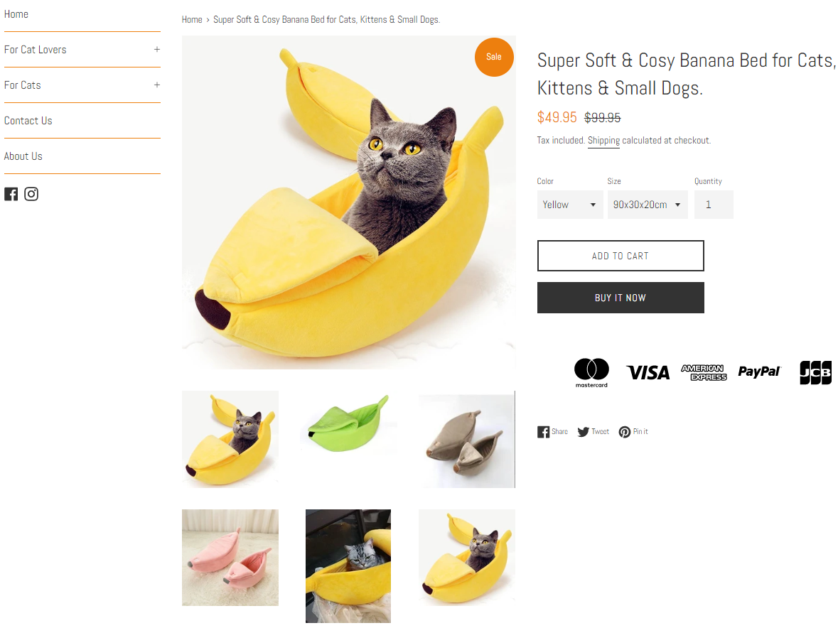
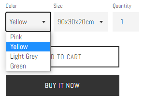
Take for example the banana bed for cats – It has 4 colors and 3 available sizes which is totally unnecessary. Having too many options will hold your customers from proceeding to checkout because they will have a hard time choosing.

Instead of 4 colors, keep only 2(yellow + green). And instead of 3 sizes, just stick with 2 or even 1(I believe there’s an average bed size every cat can fit). Less options = faster checkout.


3. Cart Page

Before I review the cart page, there’s a much bigger issue and that’s the cart notification. When a customer clicks on the add to cart button, the theme’s default is to keep the customer on the same page instead of transferring him to the cart page.

Go to your theme settings and make sure the cart notification is no longer active in the cart theme settings. The checkout process needs to be fast so we need to transfer the customer straight to the cart page and not keep him on the same page.

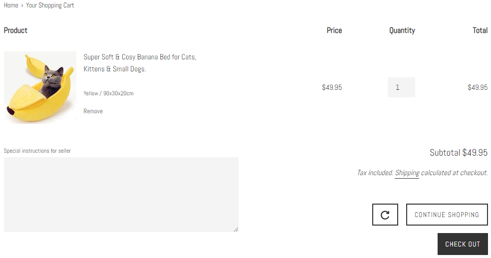
The cart page is fine and I would only remove the “special instructions” box. With this text box on the cart page, customers will have to scroll a bit to find the checkout button which isn’t something we want to happen.


4. Checkout Page

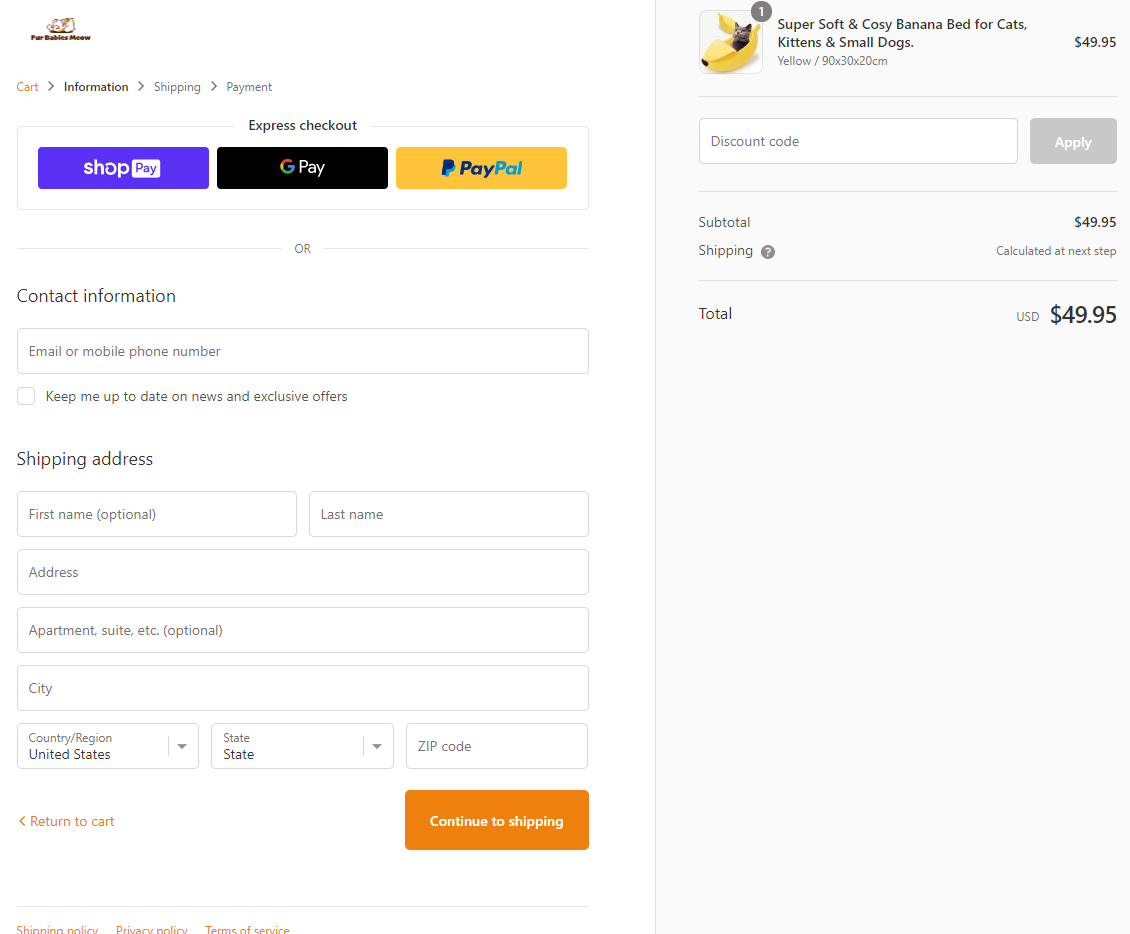
The checkout page needs some trust badges displayed near your logo.

Like this:

Other than that, everything is perfect.


5. Shipping Page

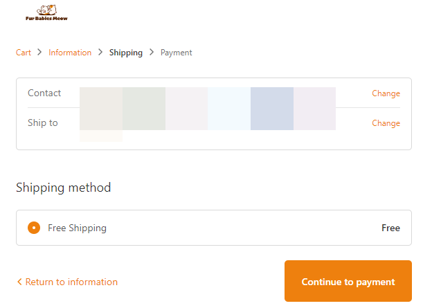
I checked to see if the “free shipping over $50” promotion works and it did. Everything’s good here.


6. Payment Page

Both PayPal and Credit Cards are accepted which will keep your conversion rate at a maximum. The only thing that needs to change is the button text which is a bit aggressive. Instead of “Pay now”, change it to “Complete your order”.

Also change the colors of your checkout buttons from orange to green.


To Sum It Up:

I wrote this review article to show you just how many mistakes can be made in a single dropshipping store. Even if you have the perfect product with a perfect ad, with a store like this it would be hard to get sales going.

I hope you liked this review and if you want your store reviewed then let me know in the comments. Maybe your store will be the next one I review 😉

Good luck.


Struggling to find good products to sell? Not sure who’s your target audience? Tired of losing money on products you were sure were “winners”?

Then Ecomhunt is what you need! Find hot winning products that are added daily, spy on their ads & stores and import them into your store in 1 click and Start Selling Today!

Must Read Articles:


3 Important Things You Can Learn & Discover From A Viral Facebook Ad

2
3 Important Things You Can Learn & Discover From A Viral Facebook Ad

Most dropshippers who see a viral video ad on Facebook check the store and the product price and that’s basically it. They later decide if they want to jump in and sell the same(or similar) product as well and make some money too.

But my POD(Print on Demand) research days have taught me a few more tricks which help me learn a lot more about the ad, discover new niches and even hot products I can sell. In this week’s article, I’ll show you what you can learn & discover from a viral Facebook video ad.

find winning products to dropship

For this to work, you will need to find a viral video ad on Facebook with good amount of comments and shares. You can do it by solo searching for one on Facebook which will take some time or use the easiest method which is Ecomhunt.

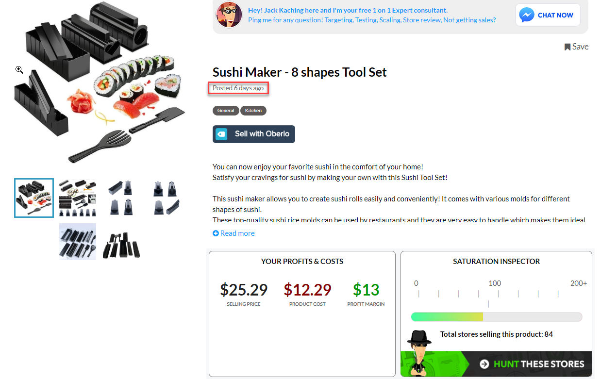
I’m all about saving time for the important stuff so I found my viral video ad on Ecomhunt. A cool sushi maker product that was posted 6 days ago caught my eye and fortunately for me, this product is currently going viral.

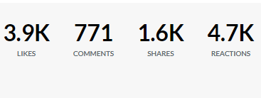
When it was first posted on Ecomhunt, the ad had almost 4k likes and 770 comments:

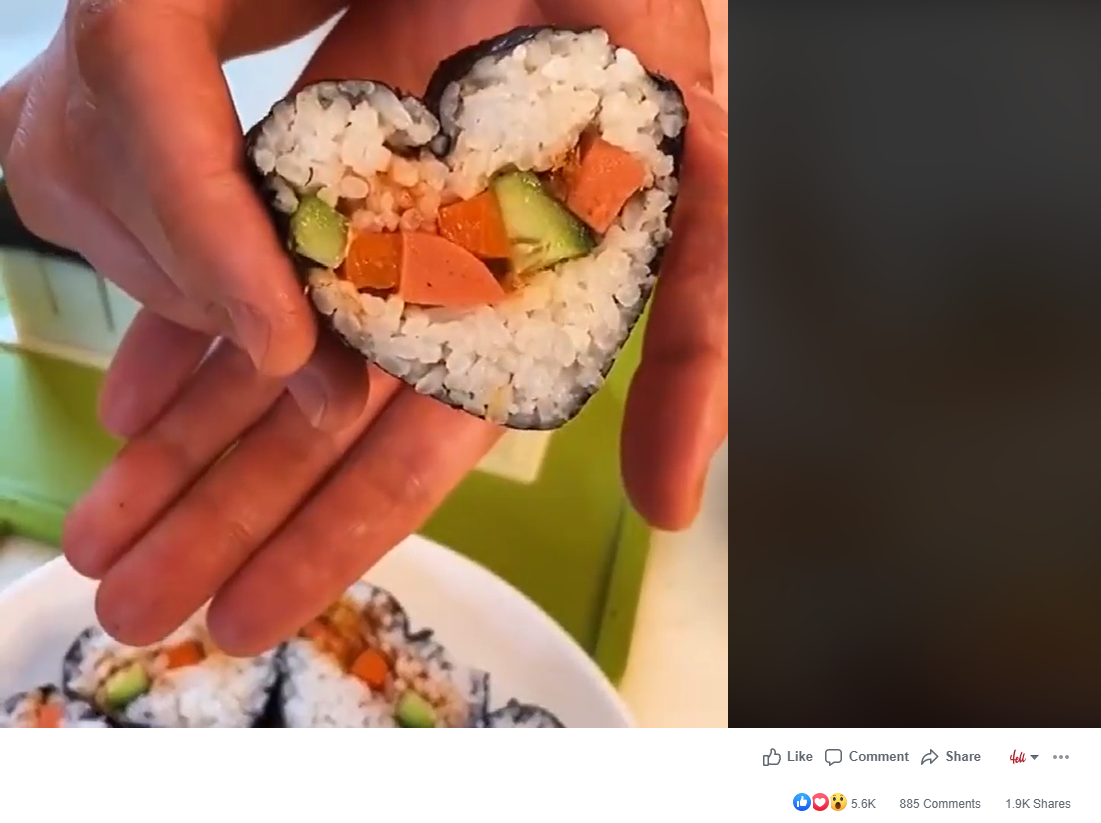
And now it has over 5.6k likes and almost 900 comments:

The original seller definitely made some good sales on this product but it looks like something made him stop his ads. By checking the comments, I saw they had some delivery issues so it’s probably because of that.

When dropshipping, you have to remember that there’s still shipping issues out there and not every seller on Aliexpress can deliver the products in time. This is why you have to use a Chinese agent or work with a fulfillment company.

There’s an article about it which I wrote in the midst of this epidemic so make sure to check it out – How to dropship during COVID-19.

Important:

There are enough sellers on Aliexpress who can deliver the products in a timely manner. BUT if you’re making a good amount of sales, it’s much better to work with a fulfillment company or use a Chinese agent.

Note:

This sushi maker product has a lot of potential and I believe there’s a lot more sales to be made. So create new ads and try selling it too ?


1. Find New Products On Profiles Of People Who Shared The Original Ad

Back in my POD(Print on Demand) days, this was one of my main methods to find hot t-shirt designs. I knew that people with open profiles who shared a viral ad post are sharing other posts so there’s a chance I can find another hot product(new t-shirt designs in my case).

Now the same thing I did to find viral POD products can be done for dropshipping products.

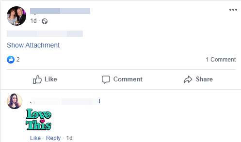
In the screenshot above, you can see a random shared comment I chose from all the public shares on the sushi product ad. She shared this ad on her profile and tagged her friend who replied back with “Love this”.

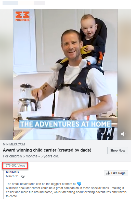
The next step is to go through her profile and hopefully find new dropshipping ad posts she shared. It didn’t take me too much time to find this awesome child carrier on her profile which has a lot of views.

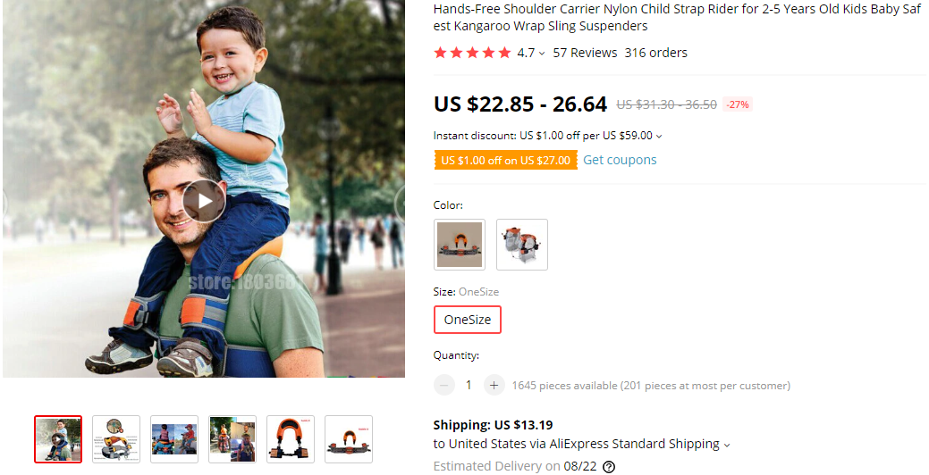
A quick search on Aliexpress gave me this product which is pretty similar to the one we see in the original ad. Remember that the product doesn’t have to be exactly the same so just work with what you find. Sometimes you can even find an upgraded version of the product you seek which increases your chances of making sales.

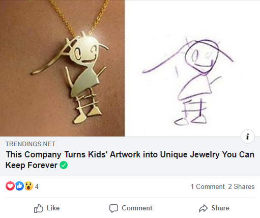
I kept searching for a bit more and I also found this article she shared on her profile:

It’s about a company that turns kids drawings into unique jewelry and a quick search on Aliexpress will show you tons of sellers who can do the same exact thing. A few months ago I thought about dropshipping this product but didn’t really have the time for it.

I truly believe you can create a child drawing jewelry themed store and make bank if marketed correctly.

Here’s a few more examples of ad posts I found by spying on a different profile – This one had a lot more shares on the profile and I quickly found new products you can dropship.

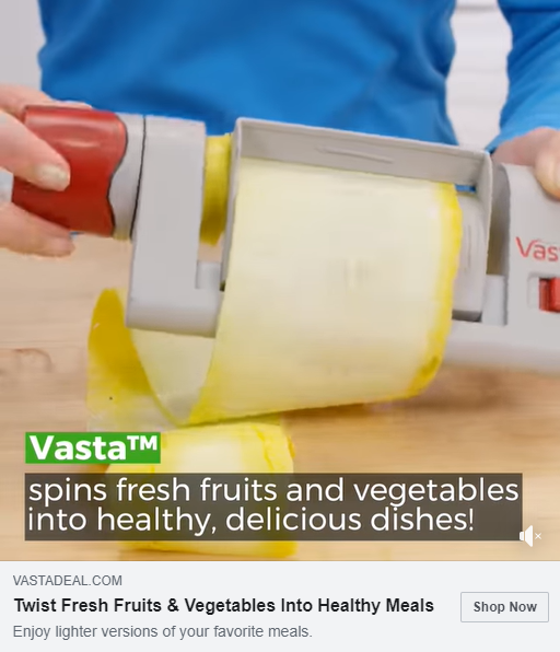
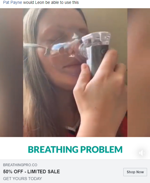
A cool kitchen product to make healthy dishes and an asthma product. Both products were shared about 2-3 days ago on her profile and it looks like the asthma product just started selling and could really blow up in a week or two.

It took me approximately 10 minutes to find these awesome products – A really powerful manual research method you should all be using!


2. Discover The Potential Of Advertised Products

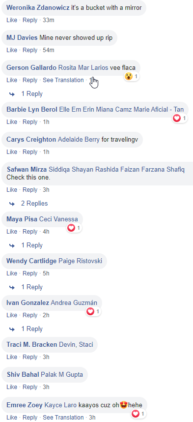
One of the first things I usually do when finding an ad on Facebook is checking the recent comments on it. This is not to spy on profiles but just to see how good the ad really is. If I find it has lots of recent comments, as you can see in the screenshot above, it’s a good indication the product is simply exploding!

This means the original seller is probably scaling his campaign and it just tells me the product I’m looking at has a HUGE potential. About 12 comments of people tagging their friends in 3 hours is a super good indication the product is doing really well and sales are coming in HOT.

So if you ever find a product with many recent comments, my advice is to try and sell it too. It can be your chance to make a lot of money!

Important:

This is just an assumption and we can’t really know how much sales the product is making or how much money the original seller is spending on his ads. You can find a product with lots of recent comments making average sales. While a different product with less recent comments is making much more sales.

You can never know until you test it…


3. Discover New Niches & Interesting Products By Spying On Liked Facebook Pages

One of the fastest methods to discover niche pages and top selling products is by spying on liked pages of people who interacted with an ad. Most of the times public profiles will show the liked pages and interests for everyone to see. If a profile doesn’t have liked pages displayed, then move to a different one.

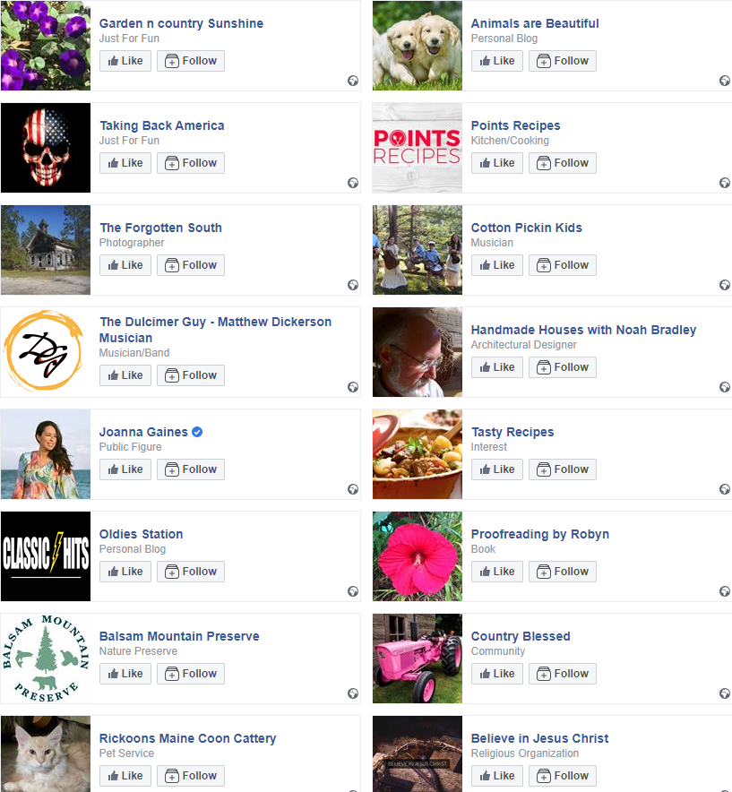
In the screenshot above, you can see the liked pages of a certain random profile I chose. We can see animal pages, Christian pages, and such… I usually spy on liked pages of people for 3 main reasons:

  1. If I’m going to sell the same product or a different product in the same niche, I want to know what interests/pages I should target – By checking the interests/pages she liked, I will hopefully find a good page I can target with like-minded people.
  2. Get ideas for new niches I can target – There’s a chance I will find a very passionate niche not so many dropshippers sell in and make some good money.
  3. Find interesting products to dropship – There’s usually at least one page that sells stuff so I can spy on them and get some ideas.

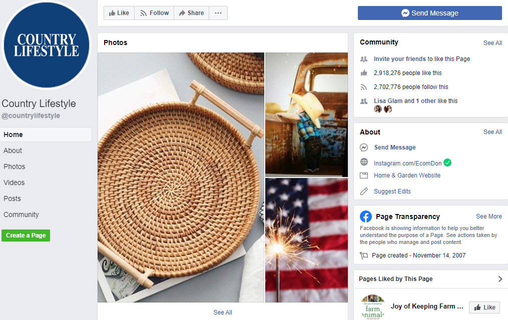
Here’s a quick example of a page I found by checking the liked pages on a random profile:

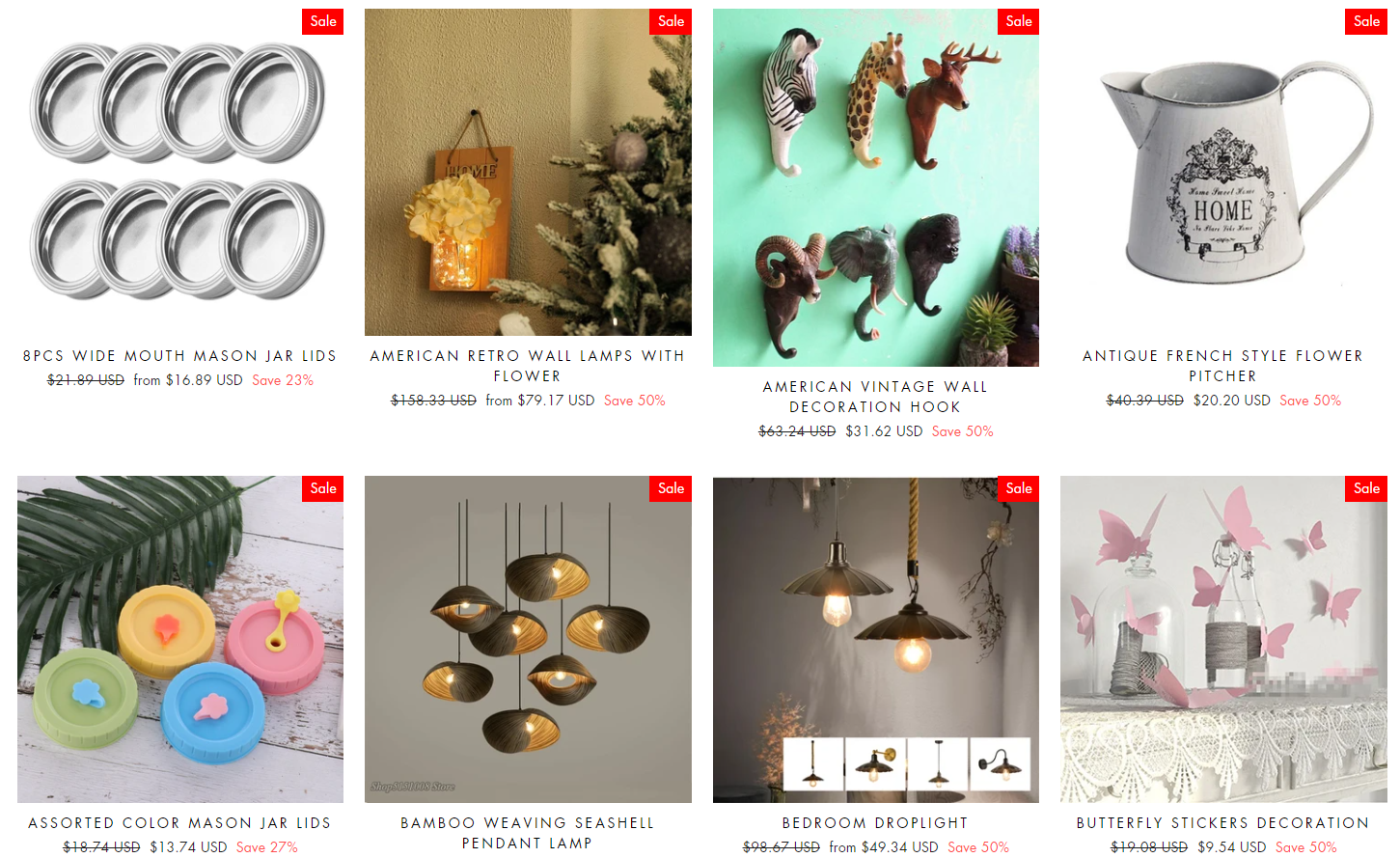
It’s a country page with a very passionate audience which also sells really cool stuff on their private store. If you click on their store link, you’ll find some really cool products you can sell to people in this niche.

You can filter by best selling product or just follow their posts to see which product is selling the best and find the same or similar product on Aliexpress.

And don’t forget to check the small pages too – Sometimes a page with 500 likes can be selling tons of stuff and you can easily check what they’re selling in the ad library. So don’t just check the big pages with millions of likes.


To Sum It Up:

A 10 minute manual research on 2 Facebook profiles led to the discovery of 4 hot products I can dropship right now. And the best part is that all these products are making sales so all I need is to create a good video ad and try and sell them too.

I hope this week’s article will help you discover your next winner and if there’s something you don’t understand, feel free to ask me in the comments.

Good Luck!


Struggling to find good products to sell? Not sure who’s your target audience? Tired of losing money on products you were sure were “winners”?

Then Ecomhunt is what you need! Find hot winning products that are added daily, spy on their ads & stores and import them into your store in 1 click and Start Selling Today!

Must Read Articles:

Ecomhunt Trending Products – 3 Products You Should Dropship Right Now!

12
Ecomhunt Trending Products - 3 Products You Should Dropship Right Now!

For this week’s article, I found 3 trending products on Ecomhunt you should sell right now! These products are doing some great numbers right now and this is your opportunity to jump in and sell them too.

On top of some general tips and the reasons why these products are worth testing, I will also give my own targeting suggestions for each product to make it easier for you to launch ads. Nothing stops you from selling these too so import them to your store, create a good video ad, and launch your own ads!

find winning products to dropship


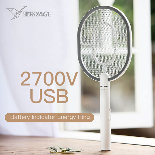
1. Mosquito & Summer Fly Electric Swatter

People will be looking for this kind of products to get rid of all the annoying summer bugs and mosquitoes. It can be the anti-mosquito LED USB lamp that blows up in sales almost every year or this cool electric racket.

There are 2 reasons why I chose this product over dozens of other products with the same purpose:

  1. It’s just cool – An electric racket that removes bugs with satisfying noises, and all you have to do is plug it in. Same as all the mosquito LED lamps but this one is way cooler and has a different shape.
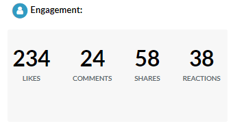
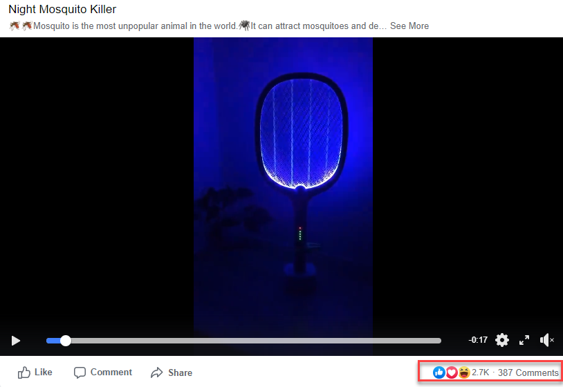
  2. It’s making sales – This product was posted on Ecomhunt about 4 weeks ago and it barely had 240 likes. If you check it now, it has almost 3k likes and the original seller is still running ads for this product.

Engagement when it was first posted:

Engagement today:

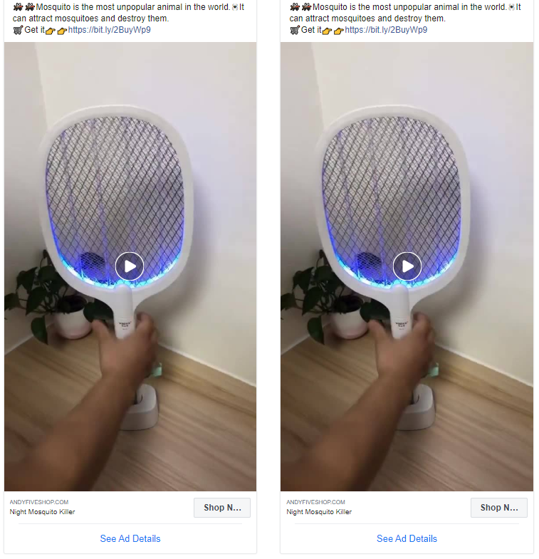
And here’s a screenshot from the ad library(can be found in page transparency) which shows they’re still running ads:

The video ad they’re using is a pretty simple one that shows the product in action. Seems like it’s working for them but if you’re going to sell this product, I strongly suggest you create a much better ad with some text in it.

Aliexpress has some cool footage you can use and if you check other sellers, you’ll find more videos for this product. Combine it all into a one video ad and it will blow up!

Targeting suggestion:

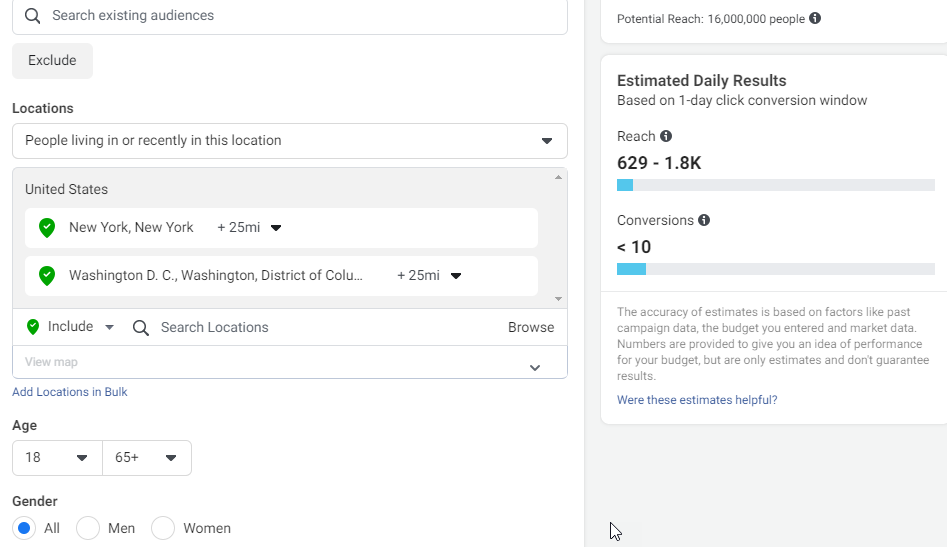
One of the strategies you should definitely test is targeting locations in the USA, states or cities, with the most mosquitoes every year. A simple Google search has shown me that people who live in New York and Washington suffer the most from mosquitoes.

So targeting them can work really well:

You can add some relevant interests if you want to but just targeting these cities should work well if you have a good ad. Don’t forget other countries exist too… Germany, France, Canada, Australia, etc, are countries where you can sell a lot in so do some research and test this product there too.

You can find this product and all the relevant data like Facebook ad, more targeting suggestions, price suggestion, relevant Influencers, and more on Ecomhunt here.


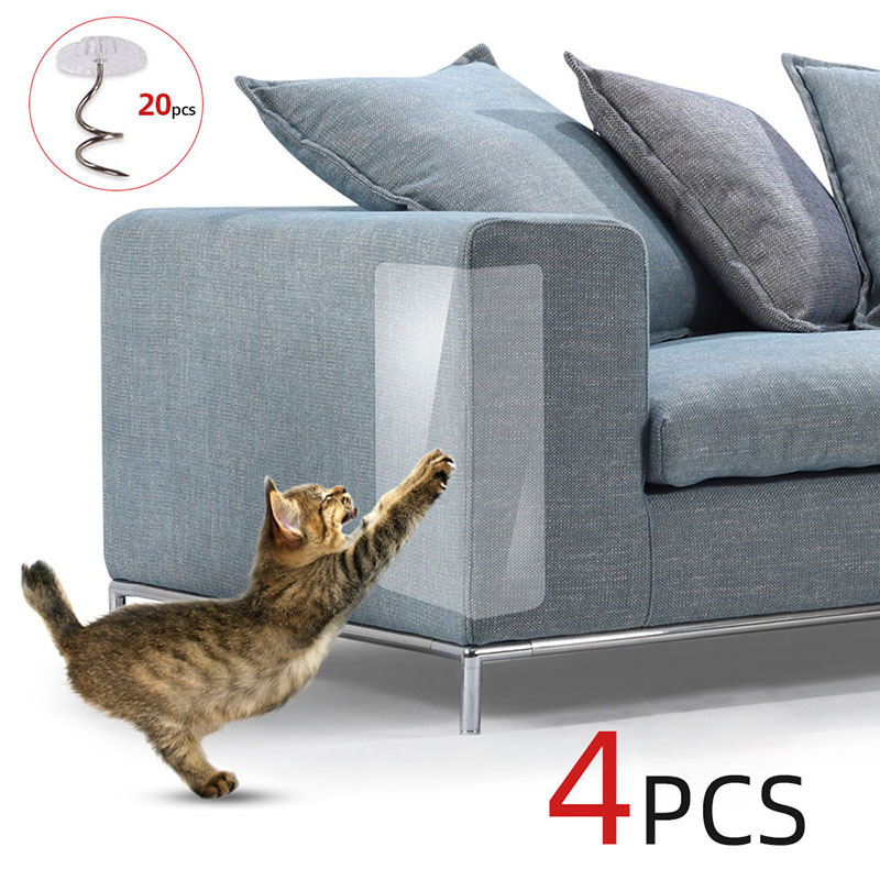
2. Anti Cat Scratch Stick-On Shield

As a guy with 2 cats, I’m definitely ordering this when I get a new sofa. Buying multiple scratching posts didn’t help at all and my cats tore down the sofa completely… I didn’t care too much because it’s an old one but once I get a new one, no way in hell I’m going to allow this!

Another thing I like in this product is the sticky feature which means you don’t have to stick it with small nails. Other similar products require you to stick it to the sofa with small nails and some people don’t like that.

I chose this product because it solves a problem many cat owners like me have AND it’s making sales. The ads for this product are still running and there’s much more engagement than when it was first posted on Ecomhunt.

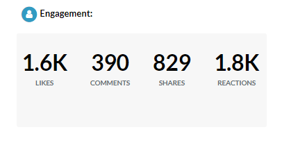
This product was posted on Ecomhunt about a week ago with 1.6k likes:

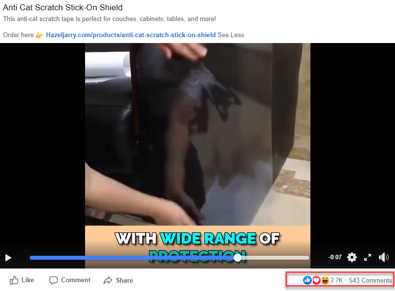
And today’s engagement on the video already has almost 3k likes, much more comments, and this product is still going strong!

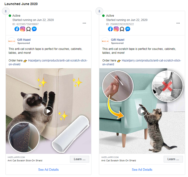
I always check the ad library for that page to see if they’re still running ads just to be sure:

As you can see they have 2 ads running since June 22nd and each ad has a different thumbnail. I must say they did a really great job on their thumbnails – If you ever wondered how a good thumbnail looks like, here’s 2 great examples.

And the ad library is also a great place to see what else they sell:

Some of the ads started running only 2 days ago so keep an eye on these products ?

Their video ad is very good as it shows cat tearing down sofas and this is something a lot of cat owners can relate too. It’s an instant attention grabber followed by instructions on how to use this product. A short but effective ad and I won’t be surprised if it explodes and gets much more viral.

There’s some great videos on the Aliexpress link you can use so nothing stops you from making a much better ad and sell this product too.

Targeting suggestion:

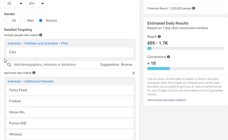
When targeting cat owners, I usually go for older women (ages 35+) and combine it with cat food interests as you see in the screenshot above. You can combine it with other pet care companies, pet insurance companies, cat shelters, cat celebrities, and more.

Plenty of interests you can use and a HUGE audience that will buy your product, especially if it solves a problem.

You can find this product and all the relevant data like Facebook ad, more targeting suggestions, price suggestion, relevant Influencers, and more on Ecomhunt here.


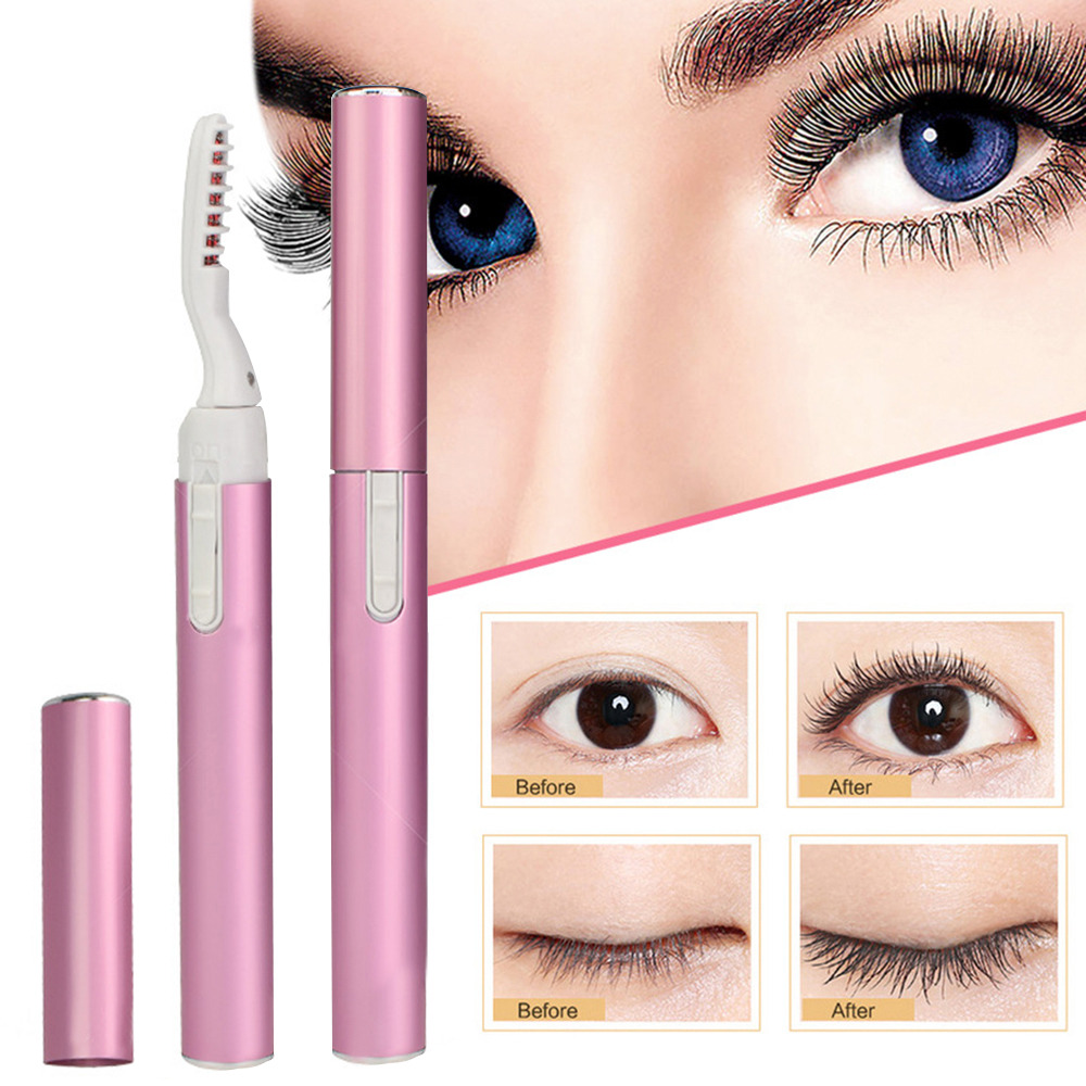
3. Eyelash Pro

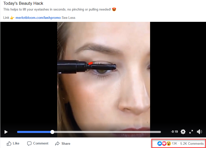
The beauty niche really blew up during this pandemic and looks like this product is the next big hit! I suggest you start testing this product first because the ad is SUPER VIRAL right now getting tons of engagement.

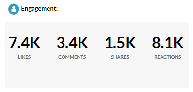
It was posted less than one week ago on Ecomhunt with already some serious engagement on it:

And since then, it has gained another 5k likes and almost 2k new comments!

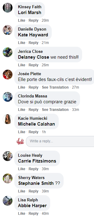
I usually check the comments to see how much are there every hour and if I see a lot(like in this case), I understand that the product I’m looking at has a big potential.

Their video ad is a pretty simple one with no text on it. It just shows different shots of women using the product and that’s basically it. Take some time to create a better video ad with text that explains a bit about this product. I believe the sellers on Aliexpress have some footage you can use so send them a message and ask for product videos.

Targeting suggestion:

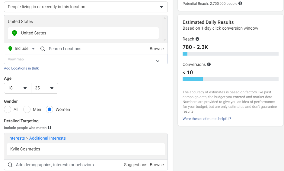
Pretty simple to target the beauty niche – Beauty companies, magazines, beauty gurus, etc, are all good targeting options. As you can see in the picture above, I chose young women (35 max) who like Kylie Cosmetics. A very popular beauty brand and a targeting option I suggest testing.

You can find this product and all the relevant data like Facebook ad, more targeting suggestions, price suggestion, relevant Influencers, and more on Ecomhunt here.


To Sum It Up:

Remember that if USA doesn’t work, you can always target different countries. Or offer a better discount or a cool bundle the original seller didn’t offer. Be creative and think of a way to make a better ad or offer a better deal so you can take your ad to the next level and make some bank.

Hope you loved this week’s article and feel free to ask questions in the comments.

Good Luck!


Struggling to find good products to sell? Not sure who’s your target audience? Tired of losing money on products you were sure were “winners”?

Then Ecomhunt is what you need! Find hot winning products that are added daily, spy on their ads & stores and import them into your store in 1 click and Start Selling Today!

Must Read Articles:

5 Shopify Apps Every Dropshipper Must Have In 2020

0
5 Shopify Apps Every Dropshipper Must Have In 2020

I’ve received many requests to write about the apps I use, which one I personally recommend and for what purpose. So for this week’s article, I decided to finally answer your call and share 5 Shopify apps every dropshipper must have on his store in 2020.

These apps should cover you from all sides by boosting your sales, recovering lost customers, and making your store look legit and trustworthy. Most of them will cost you money but with the amount of sales it will bring you, these apps will cover the cost in no time.

find winning products to dropship


1. Tracking Genie

Having a tracking page on your store has become a must and a lot of that thanks to COVID-19. If before this outbreak you could open a store without having a tracking page, nowadays it’s an absolute must because people are more nervous about their packages.

It’s no secret that it takes a bit longer now for your package to arrive, even if you use an agent or a good fulfillment company(Unless you have a warehouse in the country you’re selling in). So people tend to worry a bit more now about their packages and they want to be sure it will arrive in time.

This is why a tracking app is a must on your store because it will not only save you a lot of time answering support emails, but it will also keep your customers from leaving. Once a customer sees he has a way to track his order on your store, he will worry less about packages not being delivered or lost.

The Shopify app I recommend is Tracking Genie by Yousef Khalidi which lets you completely customize your tracking page, set up estimated delivery dates, and show your customers their tracking status without any chinese letters. A great app for a fair price with 2 days free trial.


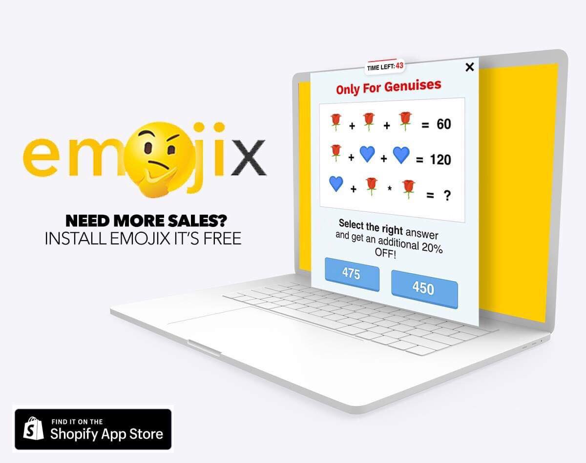
2. Emojix

A gamification exit popup quiz to get more emails and sales
Emojix Shopify App

It doesn’t matter where you advertise, Google or Facebook, the cost per click on every ad platform out there will eventually rise. With each new day, more businesses are joining the e-com world and decide to advertise their business online.

This means that you need to have the perfect product, the perfect ad, and make sure every click to your store isn’t wasted. And by wasted, I mean that you had a ready to buy customer on your store but you lost him because of a random reason.

For example:

A customer liked your product, he clicked on your link, but he received an important work email before he could proceed to checkout. Or the same customer that clicked on your store is a bit short on money and he would buy it if it was only 10% cheaper.

So if you have no exit popup app to try and keep the customer a bit more time on your store, you just lost a sale… This is why an exit popup app is a must on your store no matter how much traffic you gain. Even if it’s 100 visitors a day, you can still recover some lost sales with an exit popup app.

The app I recommend using is Emojix Shopify app mainly because of the emoji quiz game – It’s like a quick IQ challenge where if you’re not careful, you’ll choose the wrong answer. You can completely customize the quiz emojis to choose ones that suit your store theme better, set a timer, auto-apply discount at checkout, and other cool features.

This app comes with a 14-days free trial which gives you plenty of time to see it in action 🙂


3. Ali Reviews or Loox

If you’re dropshipping a product with existing reviews on Aliexpress, you can’t just import it without any reviews. Especially when it takes about 15 minutes of work to import 20-30 reviews and make sure there are no typos.

You have to remember that people are ALWAYS looking for reviews, especially photo ones, because they’re not sure about your product, your store, etc. By importing good reviews with photos on them, your customers are guaranteed to proceed to checkout if everything else is alright too.

One of the mistakes new dropshippers make(aside not importing reviews at all), is to import 5-10 random text reviews thinking this is going to be enough. And usually this is because they’re using the free version of a review app which limits you a lot.

Review apps are not the cheapest out there, I know that… Ali Reviews & Loox cheapest plans are $10/month and it can reach up to $100 depends on the traffic/orders and other features. But trust me when I say that installing one of these apps is much better for you than using a free one with tons of limits.

You want to show your customers photo reviews, have it all organized in a nice way, and this is something you can’t achieve with a free version. So the next time you import a product, make sure you also import 20-40 reviews with photos too to ease your customer’s mind.


4. Ultimate Sales Boost

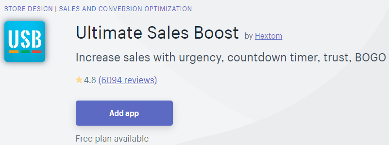
An all-in-one scarcity/urgency creation app with trust features as well you can use both on your product page and cart page too. And the best thing about this app is the free plan which is enough for beginners and has almost no limitations.

You can use the free plan to create a basic timer, add stock countdown, add badges, and display promo messages right below your product. I’ve been using this app for a long time now and I’m really liking the free plan. You can upgrade to the paid plan when you get enough traffic and sales to maximize your results.

Just remember that scarcity apps are good but don’t abuse the sh*t out of it… Countdown timers, stock counters, promo messages, all of it together will make your store look spammy. You want to boost your sales and not drive your customer away right? So don’t activate all the scarcity features on a single product.

You can download & install the app here.


5. Abandonment Protector

And last but not least is the Abandonment Protector Shopify app to reduce abandoned checkouts with fully customizable emails. This is something that can be manually done on the email service platform you’re currently in, but I prefer saving my time and doing it with this app.

Like I said before in this article and on other posts on this blog, customers tend to leave the checkout for various reasons. It can be that something popped up and they had to quickly leave the house, or it’s not urgent enough so they prefer to wait a bit and maybe buy it later. All of this can be easily solved with a nice followup email or two with a “one time” discount and just like that you will bring them back to complete their purchase.

For $8 a month and a crazy long 30 day trial, this is a no brainer! It will take you about 30 minutes to understand how everything works and explore all the other options, but once you’re done you won’t have to worry about a thing. This app will run on a complete auto-pilot and hopefully bring a lot of customers back to complete their purchase 🙂

Important tips:

  • If you’re a beginner, I recommend keeping the default settings and not play with the email sent times. If the first email is set to be sent after 3 hours by default, then keep it that way.
  • On top of recovery emails, set up a welcome and thank you email with one time discounts.
  • Test every email before going LIVE.
  • Offer nice 10%, 15% or even 20% discounts. Don’t be greedy and offer 5% discounts…


To Sum It Up:

Don’t let the numbers scare you – $10/month on one app, $7/month on a different one, it all adds up and can be a bit scary… BUT the amount of value you will get back is worth every penny!

Hope you liked this week’s article, feel free to ask me questions in the comments 🙂

Good Luck!


Struggling to find good products to sell? Not sure who’s your target audience? Tired of losing money on products you were sure were “winners”?

Then Ecomhunt is what you need! Find hot winning products that are added daily, spy on their ads & stores and import them into your store in 1 click and Start Selling Today!

Must Read Articles:

3 Important Tips Every New Dropshipper Must Know

2
3 Important Tips Every New Dropshipper Must Know

Hey there!

For this week’s article, I decided to give you 3 super important tips that will make your dropshipping life much easier. Some will help you you increase your store’s conversion rate by pointing potential issues, and some will save you some money.

Trust me, this is the kind of article you wish you read before you opened your first store and started driving traffic. So if you haven’t opened a store yet or having issues with an existing one, this article is perfect for you!


find winning products to dropship


1. Installing Hotjar On Your Store

Even if you read every article I write in this blog, you can’t be 100% sure your store has no issues. Long loading times, bad constructed themes, etc, are all issues that can make you lose sales. And this is something we don’t want to happen on our stores.

The problem is that it can work without any issues for you but it will be a totally different experience for others.

Take for example a Print on Demand app I installed for my Family niche store which had a double order issue. This app was using their own product page for every new product I published and the issue was with the Add to Cart button.

Whenever a customer clicked the Add to Cart button, he was transferred to the cart page and saw x2 from what he ordered. So if he ordered only one necklace to his wife, in the cart page he would see 2 necklaces…

This was a bit confusing and time consuming to the customers because they had to remove one product before proceeding to the checkout page. And in many cases, they just left the store without buying.

So after checking out my stats for the items I were selling and seeing such a low conversion rate, I decided to check it out with Hotjar. It took me about 5 minutes to spot the issue with their customer recording feature and I quickly acted to fix it.

This is a personal example of how Hotjar helped me to spot an existing issue with my store which I didn’t even notice with my usual checks. There will be another example in the next tip ?

Now imagine you just installed a new theme and it messed up with your Add to Cart button, or there’s an issue with an app that doesn’t work properly and ruins your sales. You need to have a way to check your customer behavior so you don’t waste money for nothing.

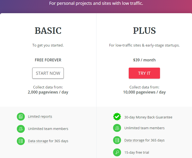
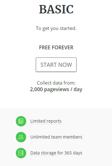
Fortunately for you, you won’t have to pay a dime so the Basic version is enough for beginners!

2,000 pageviews / day and 300 recordings are great and will show you any issues if such exist. To keep recording, you’ll have to delete the old ones and you can keep watching your customers. I advise taking the plus version only if you’re getting a decent amount of traffic to your store.

Learn how to Install Hotjar on Shopify or other platforms here.


2. Installing The Right File Upload Shopify App

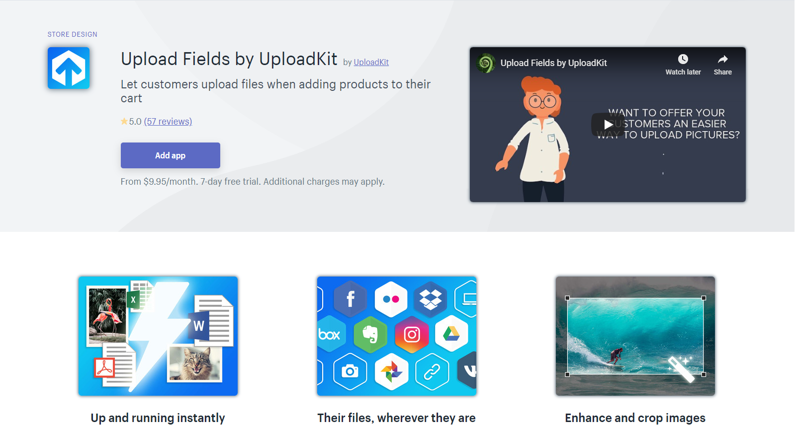
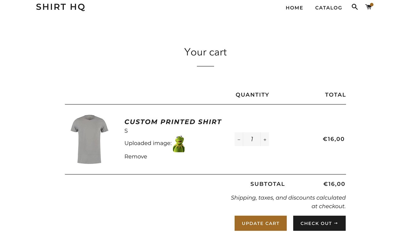
Image taken from Upload Fields by UploadKit Shopify app.

This is another tip coming straight from my personal experience and again Hotjar was the tool that helped me out here. As you probably know, selling personalized products in the Family niche(and other niches too) is working really well if you have the right product.

To sell personalized products, you have to allow your customers to enter their details on the product page. Asking them to email you, like it’s done on Etsy or Aliexpress, isn’t going to work well for us so we need to have custom fields.

When I first started selling personalized products, I started from text only products and for that I installed one of the big custom fields apps that exist for years now on Shopify. This app also allowed photo uploads so I quickly found photo products I could dropship and created a custom photo upload field.

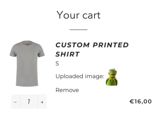
I was getting sales but nothing really crazy and I felt like something was wrong because too many people abandoned their cart… So after checking out with Hotjar, I found out that the uploaded photo is displayed as a link and there’s no preview at all. No preview on the product page and the cart page.

So did my customer do after uploading their photo? They clicked on the displayed link on the product page(and the cart page too) to check if it’s the one they uploaded. And each time they clicked on the link, it opened the photo in full size on their mobile phone.

The upload file field on this app was confusing my customers, they always had to double/triple check everything, and it made me lost sales!

So I found a MUCH better app to help me out with this issue and it’s the Upload Fields by UploadKit Shopify app. This app had a totally new and great looking interface which allowed my customers to choose if they want to upload the photo from their phone or from their social media channel like Instagram.

It showed a preview both on the product page and the cart page which finally gave my customers a peace of mind and they didn’t have to triple check everything. And if the customer clicked on the uploaded photo preview, it didn’t open in full size like it did with other apps.

So if you plan to sell personalized photo products, this is the one app I recommend after spending quite a lot of money.


3. Looking For Cheaper Shopify Apps Or Ones That Have What You Need For Free

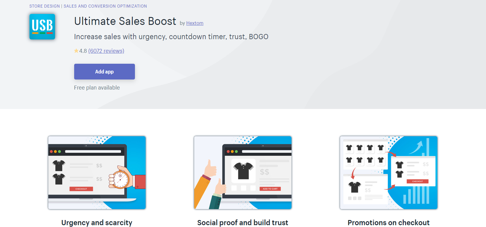
Image taken from Ultimate Sales Boost Shopify App.

The Shopify App Store is like any other marketplace out there where the users compete against each other for better visibility. The goal is to appear on the front page and in order to achieve that, you need a good app with many downloads and positive reviews. Or have a unique app and basically be the first one to offer the service(super hard!).

So when it comes to creating custom fields, countdown timers, etc, on your product page, there are a lot of apps that can do that for you and they compete against each other for you. Some will offer a more premium looking feature, some will have a reduced price, they’ll do everything they can to “seduce” you to install their app.

And when there’s competition, there’s opportunities!

This means that you don’t have to install the first app you see in the search results. Instead, you should keep browsing and find the one that does the same for a cheaper price and maybe even for FREE.

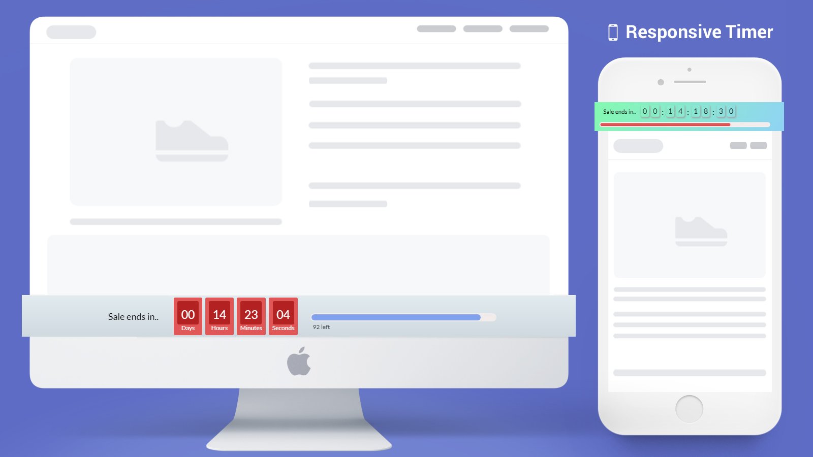
Take for example the Ultimate Sales Boost app I always recommend on my articles – The free version gives you access to countdown timer on the product & cart page, trust badges, inventory countdown, and much more totally for free with almost no limits.

So if you need a countdown timer on your store, you can find yourself installing a $10/month app when you can get it completely for free! OR you can find yourself overpaying for an app just because you didn’t scroll down to find what you need for much cheaper.

It’s no different from shopping on Amazon – Take your time and always look for a way to pay less.


To Sum It Up:

I hope this article will help you to increase your conversion rate, make more sales, and save some money. Don’t forget to install Hotjar because this tool can be a life saver!

Let me know if you have any questions in the comments and I’ll do my best to answer you all 🙂

Good Luck!


Struggling to find good products to sell? Not sure who’s your target audience? Tired of losing money on products you were sure were “winners”?

Then Ecomhunt is what you need! Find hot winning products that are added daily, spy on their ads & stores and import them into your store in 1 click and Start Selling Today!
Must Read Articles:

This Winning Product Was Posted Less Than 3 Weeks Ago And Now It’s Exploding In Sales!

0
This Winning Product Was Posted Less Than 3 Weeks Ago And Now It's Exploding In Sales!

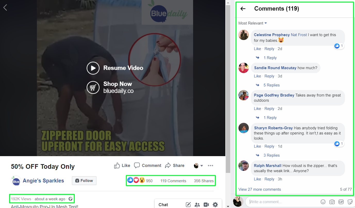
Less than 3 weeks ago, a fantastic new product was posted on Ecomhunt which is the Anti-Mosquito Pop-Up Mesh Tent. When it was first posted, the original ad on Facebook had less than 1k likes and a bit over 100 comments.

And when I checked this product today, July 7th, it already had over 16k likes and over 2.2k comments! And of course, tons of new views too. This product is currently exploding in sales and I don’t see it stopping soon.

The good news are that you have enough time to list it on your store, prepare some ads, and make some money too. The outdoor niche is HUGE with really passionate audience in it so don’t wait too much and get to work!

To make your life easier, I will review everything about this product – From the original Facebook ad to their store’s checkout page. I’ll point any mistakes if I find them and suggest improvements to increase the overall conversion rate.

So all you’ll have to do is follow my tips and start getting sales!

find winning products to dropship


1. Facebook Ad

The video ad is pretty cool actually and gives some old school vibes with the effects they used. It’s funny but these effects blend it pretty good and help display the advantages of this product even if you don’t have the needed footage. Stuff like the flying mosquitoes in the beginning of the video and the wind & rain effects.

They even added relevant sound effects and not just visual effects so it makes the video much better – I give this video a 10/10 score!

The ad copy:

The ad copy is SUPER simple and I don’t recommend doing the same when testing your products. This is a great product and the video ad is perfect BUT it could look much better if a bit more effort was put into the ad copy. I usually explain about the product in the first 2 lines and the next one is the call-to-action to get people to click on my link.

The title of the video, which is displayed next to the call-to-action button, is also a bit too short. Text like “50% OFF For A Limited Time – Order Yours Now” looks better than just “50% OFF Today Only”.

This ad really exploded since it was posted on Ecomhunt so don’t waste your time thinking too much and think how you can sell this product too.

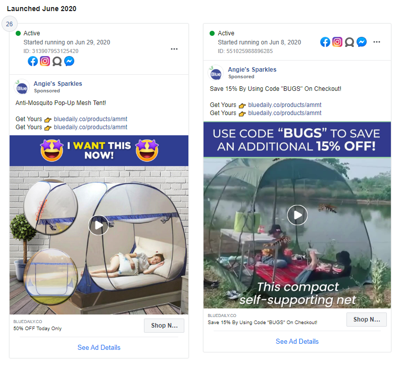
And this isn’t the single ad they’re currently running – They have 2 active ads which one of them is acting as a retargeting ad:

Different thumbnails and 2 different videos(taken from the page ad library). I love the fact that they used an easy to remember promo code like “BUGS” and not some random combination of numbers and letters. Remember that if you advertise a promo code, make it easy to remember for your users.


2. The Product Page

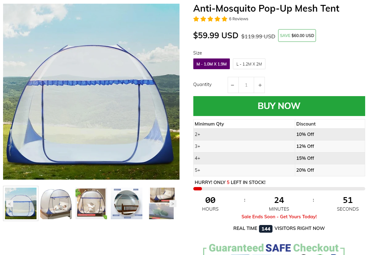
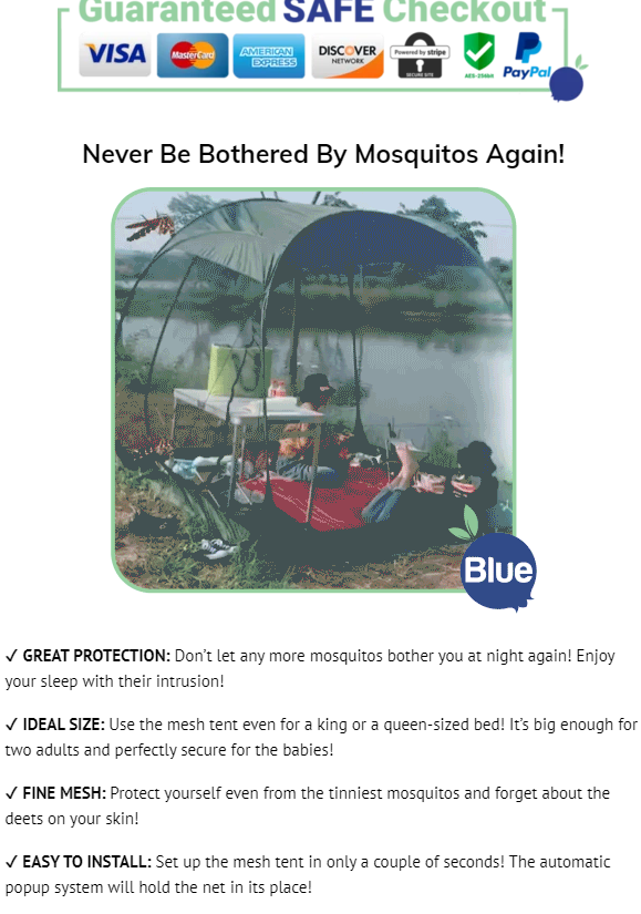
The product page is clean, loads fast, and has everything in place like trust badges, savings display, etc. But there’s one thing that bothers me a bit and it’s all the conversion booster features. You have a quantity counter, sale timer, fake real time visitors counter, and more which I think can make your store look a bit spammy…

I think the stock counter & sales timer are the biggest issues here and you should use only one of them and not both of them together. Some customers are already aware of these fake sale & stock counters so both of them together won’t help you by making more sales. One of these is more than enough.

The quantity discount is a good addition but the discounts are a bit too low in my opinion…  The profit margin on this product is high enough to offer a 15% off for 2 tents. And offering only 12% off for 3 tents is just too low. I also think the chances someone will actually buy 3 tents is super low so it’s better to focus on selling x2 tents with a bigger discount.

Here’s what I really liked about the product page and what you should do with every product with multiple options:

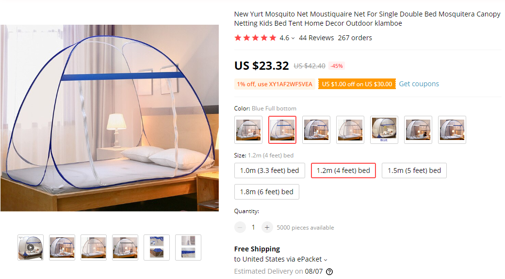
As you can see in the picture above, this product has A LOT of variants – It has different color option, different styles, and four different sizes. But the seller who’s making bank right now is offering only a single style with no color option, and only 2 different sizes.

This is a very smart move!

If the seller imported this product as it is and offered all the available styles and sizes, his conversion rate would be much lower than what it is right now. When offering too many options, people tend to think too much and some of them eventually leave without buying a thing.

On top of that, this isn’t just a color you need to pick but also the correct size, so it’s a bit more complicated than choosing a t-shirt color. So by offering only 2 sizes and one style, this seller made his and his customers life much easier.

If you want to know more about how too many options can affect your customers, watch the TED Talk video “The Paradox of Choice” by Barry Schwartz. Trust me, watch this 20 minute video and you’ll thank me later 😉

The product description:

The product description has everything the customers need to know about the product. It has two GIFs and one picture and I think it looks pretty nice. Just remember that if you use GIFs in your product page, make sure it doesn’t slow down your store.

One thing the product page is missing are the guarantees – Refund and Shipping guarantees to make the customers trust your store a bit more. There’s a short line about shipping there but it’s only about the time it will take to receive the product. So if you plan on selling this product, or any other product, add some guarantees at the bottom of your product page.


3. Product Reviews

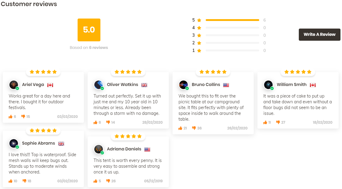
Only 6, text only reviews for this product is a pretty big mistake… I believe there are enough reviews you can import from Aliexpress, both text and pictures too, so I see no reason to display only 6 reviews.

Reviews have a HUGE impact on the conversion rate so I guess it’s a mistake from one of their employees maybe? I usually import at least 20-30 reviews and do my best to find ones with pictures in them. Also the best looking one will be pinned at the top.

The dates on these reviews are also a problem because customers tend to look more for recent reviews – All of these are 4 to 6 months old and it needs to be changed ASAP to more recent ones! Another mistake you should avoid doing.

And the final issue with these reviews are the amount of dislikes on them which again really hurt the conversion rate. With reviews like these, it’s better to not display them at all and sell the product with 0 reviews.


4. Pages

All the necessary pages are in place with a nice 24/7 support email message too. I would’ve been truly perfect if they had a tracking page which I think is a must for every online store nowadays. Save a lot of trouble and support emails 🙂


5. Cart Page

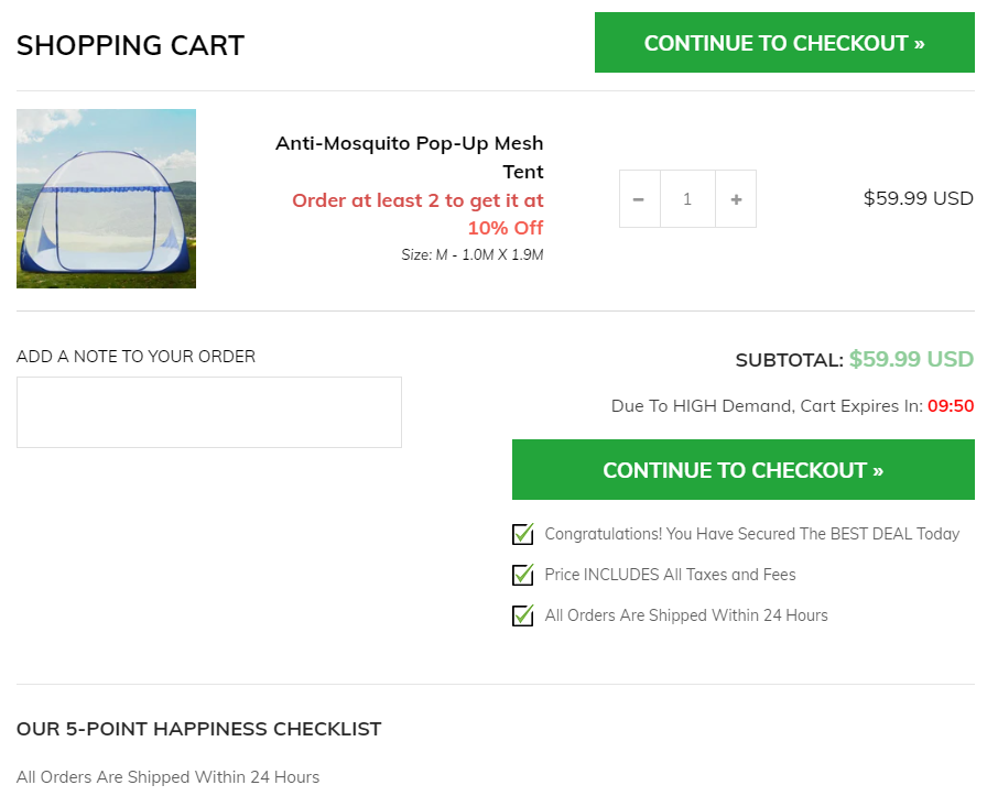
Probably the best Cart Page I have ever seen on a Shopify store ever! I really hope an app is responsible for such a great looking and optimized cart page(and not some custom coding), because I’m saving this page and will look how to do the same as they did here. ABSOLUTELY GORGEOUS!

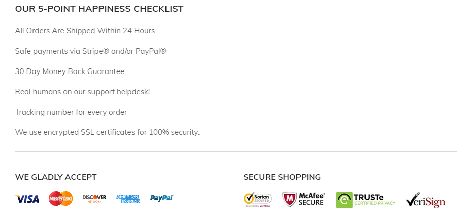
They have a cart timer, guarantees, discount reminder(for the quantity-based discounts), 2 buttons on top and bottom(on mobile, you have to sometimes scroll down to see the button), and more. I really love this cart page haha.

Note:

These guarantees below the cart page is what I was missing on the product page but at least it’s on the cart page 🙂


6. Checkout Page

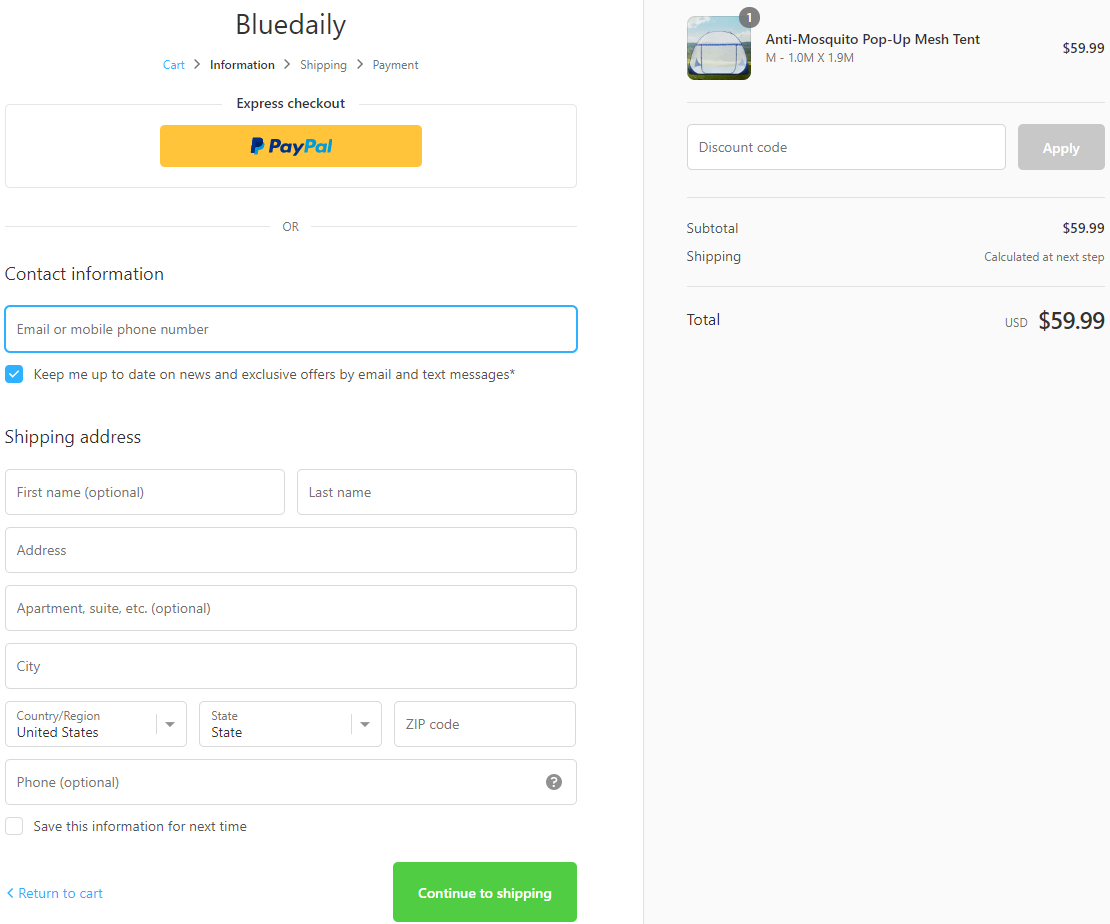
They forgot to add their logo so Shopify displays it as a text logo by default. Again, this is something I repeated A LOT of times already, the best thing is to have a logo + trust badges next to it on the checkout page.

On top of that, at the bottom of the checkout page they don’t have the policy and refund page links. They usually appear there if you create them on that page creation automatic tool, so it’s probably not there because the pages were created without using that automatic tool.

I usually create these pages by using Shopify and edit the information inside so I always have these links displayed on my checkout page.

All the rest like Phone which is optional are good.


7. Shipping Page

If it was me, I wouldn’t charge shipping at all and offer free shipping for this product but it’s their decision so they probably have a good reason for that. I like that it doesn’t just say “Standard Shipping” by default and they changed it to “insured shipping & handling”. A small psychological trick on the customers that always work 🙂

What I didn’t like is the Priority shipping option – The price is good BUT you have no idea how much time it takes to arrive. People want to know how faster the shipping will be by choosing the priority option and unfortunately it doesn’t answer their question.


8. Payment Page

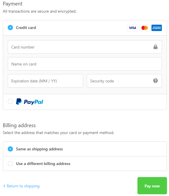
PayPal and Stripe are both active which is great! Always try to offer multiple payment options to get the maximum possible conversion rate. What I don’t like is the button text “Pay now” which is a bit too aggressive and I usually change it to “Complete your order”. Sounds better than “Pay now”.


To Sum It Up:

Almost a perfect store but they missed a few things here and there so it’s your chance to take this product and create a truly perfect product page for it. I also think this product can sell only with photo ads so try it out if you have hard time creating video ads.

Take some time to think about new marketing strategies, new audiences that may like this product, etc, to have a better chance to sell this product and scale big time.

Let me know if you have any questions in the comments and I’ll do my best to answer you all 🙂

Good Luck!


Struggling to find good products to sell? Not sure who’s your target audience? Tired of losing money on products you were sure were “winners”?

Then Ecomhunt is what you need! Find hot winning products that are added daily, spy on their ads & stores and import them into your store in 1 click and Start Selling Today!

Must Read Articles:

Ecomhunt Store Reviews – A General Store With LOTS Of Products

13
Ecomhunt Store Reviews – A General Store With LOTS Of Products

Hey there!

After so many requests, we’re finally back with another store review article and this time it’s a general store. I thought it would be nice to review a general store this time so you can learn what you should and shouldn’t do.

The general store I’m going to review this time is ebuys24 – https://ebuys24.com/ and I’ll make sure to dive deep this time to catch any possible errors that were made.

If you plan opening a one product store or a niche store, make sure to check my last store review articles before you jump into it. I reviewed 2 one-product stores and one niche store so you’ll find there a lot of useful tips.

find winning products to dropship


1. The Front Page

I feel like the main plan was to make a small version of Ebay/Amazon with best selling products and hope people will browse your store and checkout with a bunch of products in their cart. This dream new dropshippers have is a big waste of time!

You need to understand that our main focus as dropshippers is to first sell one single product. If you can add some related upsells or quantity discounts to increase the AOV, that’s good too. But in the end, we focus on selling one product and we shouldn’t expect customers to browse our store like it was Amazon.

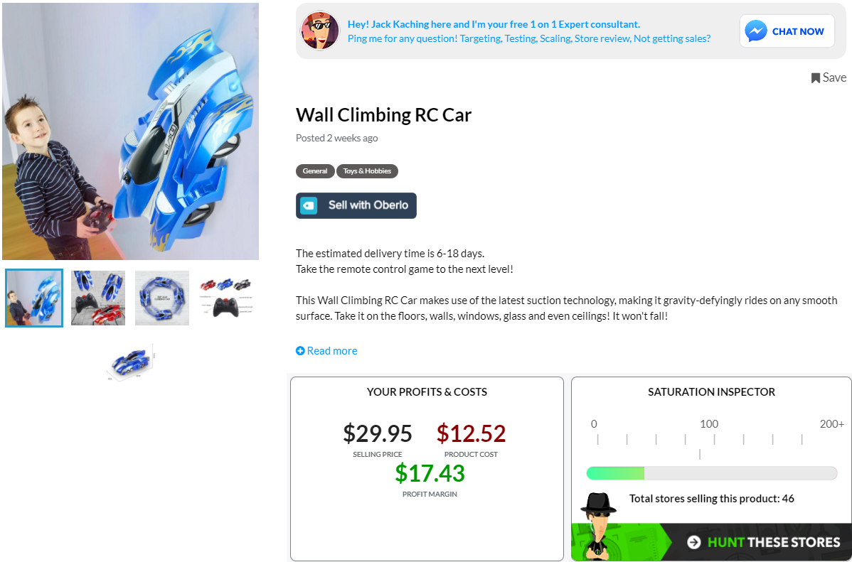
Even with the available automatic tools out there like Oberlo, it will still take a lot of time to import so many products. If you plan on opening a general store, importing 3-5 products is more than enough! You’ll be driving traffic to a certain product page from where your customers will buy your product if everything else is alright.

Note:

It’s a whole different story if you advertise your store with Influencers or solely on Instagram where in most cases, your customers will land on the main page. In this case, you need to make sure your main page has all the best selling products displayed for your visitors to quickly notice them and hopefully buy them too.

But this store isn’t even ready for that:

For some reason, these are displayed before the face masks and other trending products… No one in their right mind will buy these so I have no idea why even waste your time to import these products.

Store Name & Logo:

I rarely say anything bad about the store name but in this case I don’t have a choice. The store name feels like a cheap version of Ebay, the logo design is hideous with a font that no one ever uses, so please change it ASAP because this will definitely hurt your sales!

Announcement Bar:

Good thing to let people know there may be some delays due to COVID-19 but don’t go telling there will be also tracking issues. This message will make you lose any potential sale because customers want to be able to track their orders. If you can’t do that, they’ll just shop somewhere else.

And it’s better to use the announcement bar to promote deals and stuff like that. You can write about possible shipping delays on your product page and that will be enough.

Weird Buttons?

I have no idea who thought this would be a great idea but if you have a Youtube channel, please don’t use a computer to read your stuff. This whole operation is SUPER AMATEUR… If you can’t make normal videos for your store, it’s better to just not do it at all.

The Banners:

Simple stock photo banners to advertise your deals are okayish I guess… Some of them have weird button texts but other than that it’s fine. I usually keep the front page without any banners for my customers to quickly see the top selling products.

Pages:

The store has all the necessary pages like Privacy Policy and a tracking page so this part is perfect. Good job!


2. The Product Page

After reviewing the font page, I must say that the product pages are surprisingly good 🙂

You have trust badges which many forget to display on the product page. On top of that, important messages like “Free Shipping” and “60 day returns” can be easily seen without having to scroll down too much.

The product details have no typos on them and the pictures seem to be fine:

Everything small detail about the product is mentioned and you even have your store guarantees in the end which is perfect.

Good job!

The Reviews:

The reviews display isn’t the best and there are other apps that can do a better job, but I’ve seen worse review pages so compared to others yours is fine. These are imported straight from Aliexpress so make sure to go through them all to fix the typos.

The Mistakes:

I can’t possibly go through every product on your store so I picked a few random ones and searched for possible mistakes.

1. Estimated Delivery Messages

A great way to get charge backs and pissed customer emails asking about their order. Unless you’re shipping from the states, you can’t give such estimates… Remove that delivery date estimate message from every product on your store. Keep the insured shipping and the 100% refund messages only.

2. Slow Loading Times On Some Product Pages

One of the products I checked had a GIF in the description which made the product page load really slow. If you add GIFs to your product page, make sure they don’t slow down your store.

3. Ships From

Some sellers have warehouses in USA, Europe, etc… So when you import products like these from Aliexpress, keep the warehouse location hidden and don’t make it an active variant. Let your customers order and you make the decision from where to ship it.

4. Too Many Options

Some products have way too many options which can hurt your conversion rate. It’s good to have some diversity but too much of it will make it hard for your customer to choose. Tone it down and keep only the popular options. Offering 20 colors is too much!

5. You May Also Like

Like I previously said, our main focus is to get the customer to buy our product fast without too much thinking. This “You may also like” product suggestions will make your customers stop and think if they want any more products… And eventually they’ll leave your store without buying a thing.

So remove it and focus on getting a quick sale without any interruptions.


3. The Checkout Page

It’s funny… I didn’t realize it wasn’t a Shopify store only till I got to the checkout page. It’s a wordpress general store so the checkout process is different from what we’re used to on Shopify. I reviewed the most important parts already so if you want to see how a Shopify checkout looks, check my other store reviews.

But keep reading because there are some important points to discuss here which are also true for Shopify store owners.

1. Shipping

On your product page, the deal shown is Free & Insured shipping. Here you break this promise and charge extra $5 for it to be insured. This is a big NO-NO and you will lose a lot of sales because of this move.

Other than that, the shipping times are too long and it can also push customers away. 25-45 business days is scary and you better write something like “2-4 weeks”. There are shipping companies out there that can get your order to the states in less than 14 days so make sure you work with them during these times.

The premium shipping costs are INSANE and no one is going to even look at the other shipping options. You better remove them or make a change and charge your customers max $10 for a much faster shipping.

Other than that, the checkout page is perfect. You have trust badges, checkout timer, guarantees and all the other needed stuff in one place. We can only wish Shopify will someday offer this kind of checkout page by default…


2. Payment

You only accept credit cards but there’s no PayPal option – PayPal is very popular so try and offer them as a payment option to increase your store’s conversion rate. If you can’t accept PayPal then don’t worry too much about it… Your conversion rate will be slightly lower but that doesn’t mean you can’t scale and make some good numbers with this store 🙂


To Sum It Up:

It took some time for me to notice this wasn’t a Shopify store but it doesn’t change too much. The front page, the product page, all look the same so both Shopify and WordPress store owners can learn from this store review.

I hope you liked this review and if you want your store reviewed then let me know in the comments. Maybe your store will be the next one I review 😉

Good luck.


Struggling to find good products to sell? Not sure who’s your target audience? Tired of losing money on products you were sure were “winners”?

Then Ecomhunt is what you need! Find hot winning products that are added daily, spy on their ads & stores and import them into your store in 1 click and Start Selling Today!

Must Read Articles:

5 Small Changes To Your Shopify Store You Probably Forgot Doing – Part 2

2
5 Small Changes To Your Shopify Store You Probably Forgot Doing - Part 2

You asked for it and we delivered – Welcome to the second part of “5 Small Changes To Your Shopify Store You Probably Forgot Doing” article. In this article, I’ll show you another 5 changes you should do to increase your conversion rate, and save you some time & money.

If you missed the first part, you can read it by clicking on this link => https://blog.ecomhunt.com/2020/06/09/5-small-changes-to-your-shopify-store-you-probably-forgot-doing/

Enjoy!

find winning products to dropship


1. Auto Converting Your Store’s Currency Based On Your Customer’s Location

picture taken from Best Currency Converter Shopify app page.

Your customer needs to checkout as fast as possible – Don’t shove “related products” to his face. Always transfer to the cart page after clicking on the Add to Cart button. And don’t let him do any thinking.

If your store main currency is in USD and you target worldwide without having an automatic currency converter app, your customers will have to calculate how much your product costs in their own currency.

The customer needs to have ALL the information in front of his eyes… If he’s from UK, it’s not his job to convert your $50 product to 39.90 pounds. This is an “extra step” that stops the checkout flow for a few seconds and in that time frame, he can decide to leave your store without buying.

You’re spending your hard earned money to drive traffic to your store, so make sure there aren’t any “extra steps” that can slow down the checkout process.


2. Adding On-Site Tracking Page

Picture taken from Tracking Genie Shopify app.

Time is money so don’t spend your time answering unnecessary support emails – A lot of these “where is my order” emails can be avoided by installing a simple tracking app on your store. If a customer wants to know the status of his order, he will try to track it on your site first before sending a support email.

On top of saving precious time, having a tracking page on your store makes it look MUCH more professional and trusted. Customers will feel much safer knowing they can track future orders on your site. These tracking apps also display the status in English so there won’t be any scary Chinese letters no one understands 😉

Use your time wisely to test more items, scale your ads, create different creatives, anything that will help you make more money. Don’t waste it on time consuming stuff like support emails, especially if a big chunk of them can be avoided!


3. Fixing Typos On Imported Product Pictures From Aliexpress

It’s one of the most common mistakes I find on dropshipping stores I review and it just makes your store look really unprofessional. No matter how much time and money you spent perfecting your store, if you import pictures with typos on them it’s going to make you look bad.

Take for example this portable vacuum cleaner for cars I found on Aliexpress – It looks great and has some of the best looking high quality product photos BUT the English description on them is horrendous!

Some have typos and some don’t make any sense… If you import the pictures as they are on Aliexpress, I guarantee it will spook some customers away. A 5-minute Photoshop work is all that needed to make these pics look good and the description on them to make sense.

Note:

It’s not only the English description that needs to be fixed. Some pics have weird borders and effects on them so remember to always check the pictures you import to edit them if needed.


4. Unrealistic Delivery Guarantees

Do not guarantee any specific delivery dates – Unless you’re Amazon, which you’re obviously not. I have no idea why this certain app has become so popular, but a lot of new dropshippers are using it and you will have a lot of pissed customers if you keep at it.

These “order now and get it before Wednesday” type of apps can increase your conversion rate BUT it won’t last long because there will be a lot of refunds and opened cases against you. And in worst case scenario, you can get your PayPal account limited or even banned.

So please just be real with your customers. Go with the regular “2 to 4 weeks, with easy tracking” type of texts and trust me that if your product and ad are good, people will buy it and won’t have any problem waiting for the product.


5. Paying For Features You Can Get For Free Or For Much Cheaper

Picture taken from Ultimate Sales Boost Shopify App.

People install Shopify apps for many reasons: To boost the conversion rate, to allow customers upload files, to try and stop customers from leaving the store without buying, and so on… It’s also pretty easy to find an app that does what you want so in most cases, people just install the first app they see and pay for it.

Instead, you can save A LOT of money every month if you take some time and test the different apps that do the same work and not just jump on the first one. Take for example the Ultimate Sales Boost Shopify app:

The started plan, which is completely free, offers quite a lot of features other apps offer only for money. Features like promo messages below your product, simple timer, trust badges, cart notifications, and more. All of these features are free and come with almost no limits so you can use them on any product you have on your store!

Other apps offer these features only in a paid plan so if you don’t look around, you can be paying extra $10 or even more every month when you can get it all for free.

Another trick is to look beyond the first page. Sometimes you can find an app that does exactly what you need only for $3 a month instead of $10 a month. And if you’re not sure it works the wy you want, you can always install it and test it on your store. Almost every app there offers some kind of free trial so you won’t pay anything if you delete it in time.

If you go shopping and there’s a store that offers the same product but considerably cheaper, you will buy from it even if it’s a bit far correct? You’ll make an extra effort to walk a greater distance because you save money. Same goes when you search for an app on the Shopify app store – Take your time and find the one for a cheaper price.


To Sum It Up:

Make your checkout process fast and simple, Don’t blindly import pictures from Aliexpress, save money when you can, and make sure your business looks professional and trustworthy.

I hope you liked this week’s article and let me know if you have any questions in the comments below.

Good luck 🙂


Struggling to find good products to sell? Not sure who’s your target audience? Tired of losing money on products you were sure were “winners”?

Then Ecomhunt is what you need! Find hot winning products that are added daily, spy on their ads & stores and import them into your store in 1 click and Start Selling Today!

Must Read Articles:

How To Design Your Shopify Store Almost For Free

3
How To Design Your Shopify Store Almost For Free

One of things you need to have for a successful dropshipping business is a great looking store. A great logo with some nice banners and pictures will make your store standout and look professional, but this doesn’t mean you have to go “All in” and spend top dollar for a few designs.

Having a great looking store is only a small part of what you actually need to achieve success in this field. You’ll need to pay for your apps, Shopify’s subscription, traffic, ads, and for more stuff along the way.

This is why you need to play it smart and not spend hundreds or even thousands of dollars on design for a new store that didn’t even bring a single sale…

In this week’s article, I’ll help you with getting the needed designs for free or for almost no money at all so you have enough money left to continue with your dropshipping journey.

find winning products to dropship


1. The Banners

When it comes to banners, I see ABSOLUTELY no reason to pay for it when you have so many free pictures available to use. You have free images for almost any category out there so there’s really no need to go out of your way and order banner designs for hundreds of dollars.

You can access these when you try to upload a new picture for your banner. Simply click on “Free images” tab and find the one that suits you best. As you can see in the first picture above, this “for her” banner looks absolutely good and on mobile it looks absolutely stunning.

Another reason to why you should not pay for any banner designs is that in most cases we send traffic straight to the product page. The product page doesn’t have any banners displayed and all the customer sees are the logo, product pictures, and the description + reviews. The next step is for the customer to click on the add to cart button and he will go to the cart page and hopefully complete the checkout process.

When I send a customer to a product page I expect him to add the product to his cart and buy my product. And in most cases, this is exactly what happens… So when creating a store I don’t give too much attention to my front page and just keep it decent.

When should I give more attention to my front page?

  1. If you drive traffic straight to your front page – Some people are using Influencers and some promote their store on Instagram so in this case, the customer is always going to land on the front page. This is a situation that requires more work on the front page and investing a bit more than usual on the design will be a smart move.
  2. If your store is doing great – A simple general dropshipping store can turn into a money machine if you know what you’re doing. So, in this case, upgrading your store and making it look more professional will only help your business.


2. The Logo

Unlike the banners, the logo is going to appear everywhere on your Shopify store. Customers will see from the moment they visit your store to the last step of the checkout process. This means we need to give more attention to the logo and make sure it looks good. But again, it doesn’t mean we have to spend hundreds and even thousands on a single logo…

I have no idea where it comes from, but a lot of store owners, especially the new ones, think that the logo is what is going to bring them sales. They spend way too much time on the logo, sometimes ordering dozens of samples from different designers till they get the one they like.

I find it VERY WRONG because how can you spend so much time & money when you didn’t bring a single visitor to your store? Driving traffic and testing products is much more important, but for some reason many dropshippers spend less time on that than on the logo.

So to make it clear and to save you money, I’ll give you some personal tips about Logo design:

  1. Have a clear picture of a logo before you order one – Don’t just blindly order a logo design! A designer isn’t a mind reader and there’s a big chance he will deliver something totally different from what you pictured in your head. Do some research and check for logos in your niche. This will give you some ideas about how you want your logo to look, and only then get a designer to make it for you.
  2. Don’t overpay(especially if you’re a beginner) – I never paid more than $50 for a logo and in most cases, it was about $30 in average which is a good and fair price. You’re not in a position to afford paying hundreds of dollars for a single logo.
  3. Know your colors – Imagine how your store will look like and even test in the theme editor. If you picture your store color theme with a lot of black, a white&black logo won’t fit. Decide on the colors before you place your order.

Note:

The tips and the suggestions here are mostly for beginners to not spend more than they’re capable of. If you have a successful store or you’re building a store for a big brand, then a big investment is, of course, needed.


3. The Theme

A free Shopify theme is more than enough – Almost every store we own had used and still uses a free theme. You will get the same clean look and have almost all the features a paid theme has so there’s no real reason to pick the premium one.

But some of you are going to say “But Daniel, the premium themes on Shopify look way better than the free ones… How come you say they have almost he same look?”.

The answer to that is pretty simple:

Yes, the premium theme does look better and more professional but that’s true for the desktop version. On mobile, both free and premium themes have almost the same look because you don’t have that much space to play with. And when most traffic today comes from mobile, I don’t see a reason to get a premium theme only for the desktop users.

So this is why I always recommend using free themes instead of paid ones.

Take a look at Kylie cosmetics Shopify Store:

On first look, it may seem like she’s using some super premium theme with tons of custom coding but this isn’t the case. It’s a premium theme alright but all she has are beautifully designed banners with buttons on them. You can do exactly the same on a free theme like Debut.

The only thing you can’t have is the product slider which is a feature available only to premium themes. Same goes with the Instagram display feature but she doesn’t use that on her store at all.

This product slider or the Instagram display isn’t what will bring me to buy a premium theme and I hope it’s the same for you now. I just wanted to show that if given enough time, I can almost replicate her entire store while using a totally free theme.


Where Do I Create A Logo Or Find A Designer?

You don’t have to look much to find a good designer to make you a logo. You can find many of them on various POD(Print on Demand) groups like Teespring, Gearbubble, Shineon, etc, and they won’t charge you too much for a logo. I believe it will be a minimum of $15 to a maximum of $40 for a single logo with unlimited revisions.
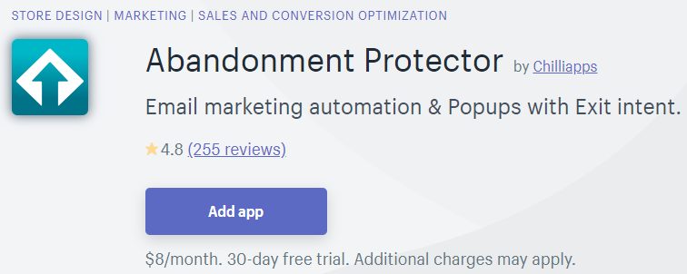
And trust me, these designers are no less talented than the ones found on those “hire a professional” websites. The only difference will be the amount of money you will pay… Instead of paying $40, you’ll end up paying $250.

Here’s a quick example of one of the messages I received when I asked for a logo design on Reddit:

I bet he’s a good guy and a professional designer but I would only approach this guy if I was designing a store for a real, big, money making machine store. For a new dropshipping store that just popped up, I see no reason to spend so much money.

And how much of a difference there would be between this designer and the one I hired for $35? It’s not like the $450 logo is going to make my customers all itchy to spend their money buying all my stock. Most of them can’t tell a difference between a professional $5,000 logo and one that was create for $35.

Another way is to use websites like Placeit which have logo generators:

You can edit them live till you stumble upon a variation you like then just buy it from that website. On Placeit it should be about $20 if you have a membership and on other websites it probably costs a bit more, but nowhere near the price you will pay by hiring a professional designer.

And in the end, the logo created on Placeit work just fine. We have a general store using one of Placeit’s logo and we have absolutely no problem getting sales.


To Sum It Up:

I hope this article will put an end to the endless questions about store design and how much one should spend. If you follow the tips in this article, you’ll be able to save a lot of money and use what you save on the important stuff like ads and getting traffic.

Good Luck!


Struggling to find good products to sell? Not sure who’s your target audience? Tired of losing money on products you were sure were “winners”?

Then Ecomhunt is what you need! Find hot winning products that are added daily, spy on their ads & stores and import them into your store in 1 click and Start Selling Today!

Must Read Articles: