")


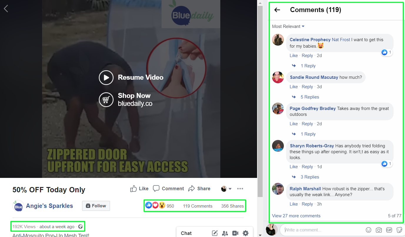
Less than 3 weeks ago, a fantastic new product was posted on Ecomhunt which is the Anti-Mosquito Pop-Up Mesh Tent. When it was first posted, the original ad on Facebook had less than 1k likes and a bit over 100 comments.
And when I checked this product today, July 7th, it already had over 16k likes and over 2.2k comments! And of course, tons of new views too. This product is currently exploding in sales and I don’t see it stopping soon.
The good news are that you have enough time to list it on your store, prepare some ads, and make some money too. The outdoor niche is HUGE with really passionate audience in it so don’t wait too much and get to work!
To make your life easier, I will review everything about this product – From the original Facebook ad to their store’s checkout page. I’ll point any mistakes if I find them and suggest improvements to increase the overall conversion rate.
So all you’ll have to do is follow my tips and start getting sales!

1. Facebook Ad

The video ad is pretty cool actually and gives some old school vibes with the effects they used. It’s funny but these effects blend it pretty good and help display the advantages of this product even if you don’t have the needed footage. Stuff like the flying mosquitoes in the beginning of the video and the wind & rain effects.
They even added relevant sound effects and not just visual effects so it makes the video much better – I give this video a 10/10 score!
The ad copy:
The ad copy is SUPER simple and I don’t recommend doing the same when testing your products. This is a great product and the video ad is perfect BUT it could look much better if a bit more effort was put into the ad copy. I usually explain about the product in the first 2 lines and the next one is the call-to-action to get people to click on my link.
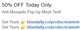
The title of the video, which is displayed next to the call-to-action button, is also a bit too short. Text like “50% OFF For A Limited Time – Order Yours Now” looks better than just “50% OFF Today Only”.
This ad really exploded since it was posted on Ecomhunt so don’t waste your time thinking too much and think how you can sell this product too.
And this isn’t the single ad they’re currently running – They have 2 active ads which one of them is acting as a retargeting ad:
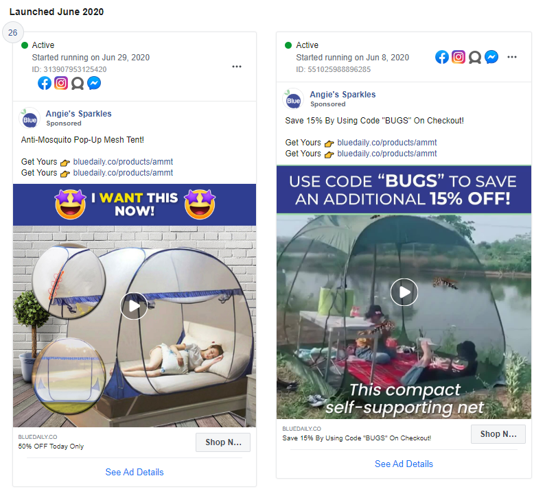
Different thumbnails and 2 different videos(taken from the page ad library). I love the fact that they used an easy to remember promo code like “BUGS” and not some random combination of numbers and letters. Remember that if you advertise a promo code, make it easy to remember for your users.
2. The Product Page
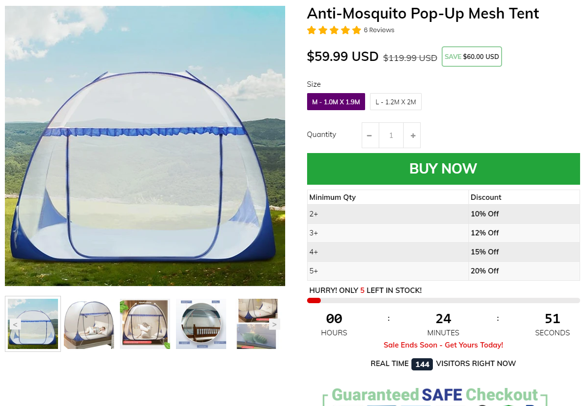
The product page is clean, loads fast, and has everything in place like trust badges, savings display, etc. But there’s one thing that bothers me a bit and it’s all the conversion booster features. You have a quantity counter, sale timer, fake real time visitors counter, and more which I think can make your store look a bit spammy…
I think the stock counter & sales timer are the biggest issues here and you should use only one of them and not both of them together. Some customers are already aware of these fake sale & stock counters so both of them together won’t help you by making more sales. One of these is more than enough.
The quantity discount is a good addition but the discounts are a bit too low in my opinion… The profit margin on this product is high enough to offer a 15% off for 2 tents. And offering only 12% off for 3 tents is just too low. I also think the chances someone will actually buy 3 tents is super low so it’s better to focus on selling x2 tents with a bigger discount.
Here’s what I really liked about the product page and what you should do with every product with multiple options:
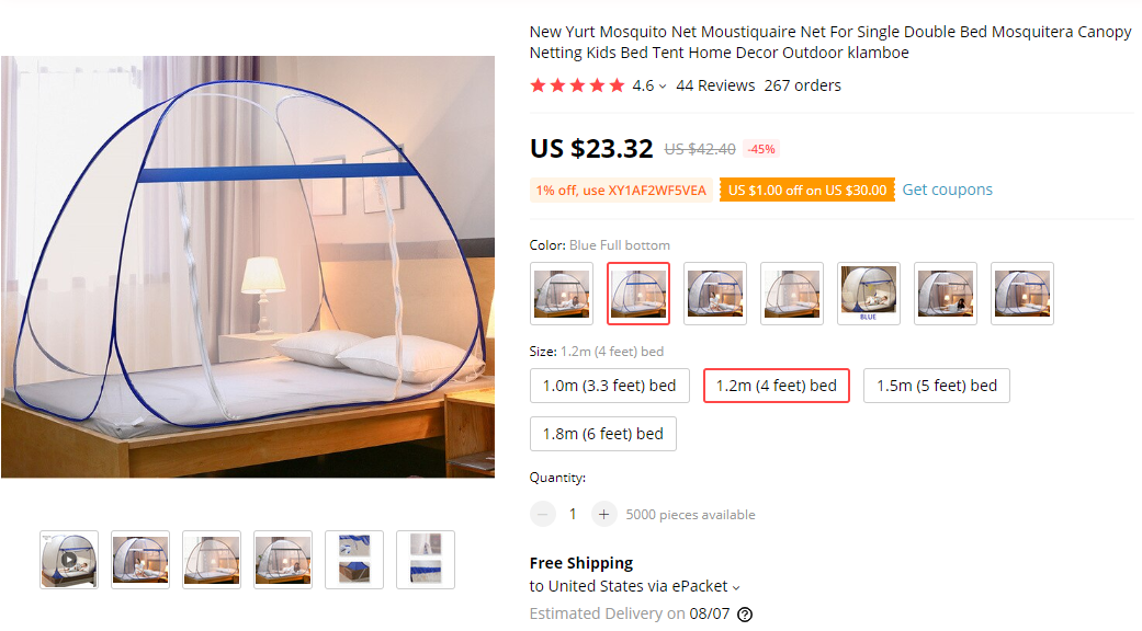
As you can see in the picture above, this product has A LOT of variants – It has different color option, different styles, and four different sizes. But the seller who’s making bank right now is offering only a single style with no color option, and only 2 different sizes.
This is a very smart move!
If the seller imported this product as it is and offered all the available styles and sizes, his conversion rate would be much lower than what it is right now. When offering too many options, people tend to think too much and some of them eventually leave without buying a thing.
On top of that, this isn’t just a color you need to pick but also the correct size, so it’s a bit more complicated than choosing a t-shirt color. So by offering only 2 sizes and one style, this seller made his and his customers life much easier.
If you want to know more about how too many options can affect your customers, watch the TED Talk video “The Paradox of Choice” by Barry Schwartz. Trust me, watch this 20 minute video and you’ll thank me later 😉
The product description:
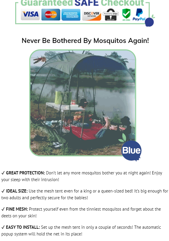
The product description has everything the customers need to know about the product. It has two GIFs and one picture and I think it looks pretty nice. Just remember that if you use GIFs in your product page, make sure it doesn’t slow down your store.
One thing the product page is missing are the guarantees – Refund and Shipping guarantees to make the customers trust your store a bit more. There’s a short line about shipping there but it’s only about the time it will take to receive the product. So if you plan on selling this product, or any other product, add some guarantees at the bottom of your product page.
3. Product Reviews
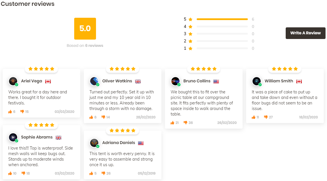
Only 6, text only reviews for this product is a pretty big mistake… I believe there are enough reviews you can import from Aliexpress, both text and pictures too, so I see no reason to display only 6 reviews.
Reviews have a HUGE impact on the conversion rate so I guess it’s a mistake from one of their employees maybe? I usually import at least 20-30 reviews and do my best to find ones with pictures in them. Also the best looking one will be pinned at the top.
The dates on these reviews are also a problem because customers tend to look more for recent reviews – All of these are 4 to 6 months old and it needs to be changed ASAP to more recent ones! Another mistake you should avoid doing.
And the final issue with these reviews are the amount of dislikes on them which again really hurt the conversion rate. With reviews like these, it’s better to not display them at all and sell the product with 0 reviews.
4. Pages
All the necessary pages are in place with a nice 24/7 support email message too. I would’ve been truly perfect if they had a tracking page which I think is a must for every online store nowadays. Save a lot of trouble and support emails 🙂
5. Cart Page
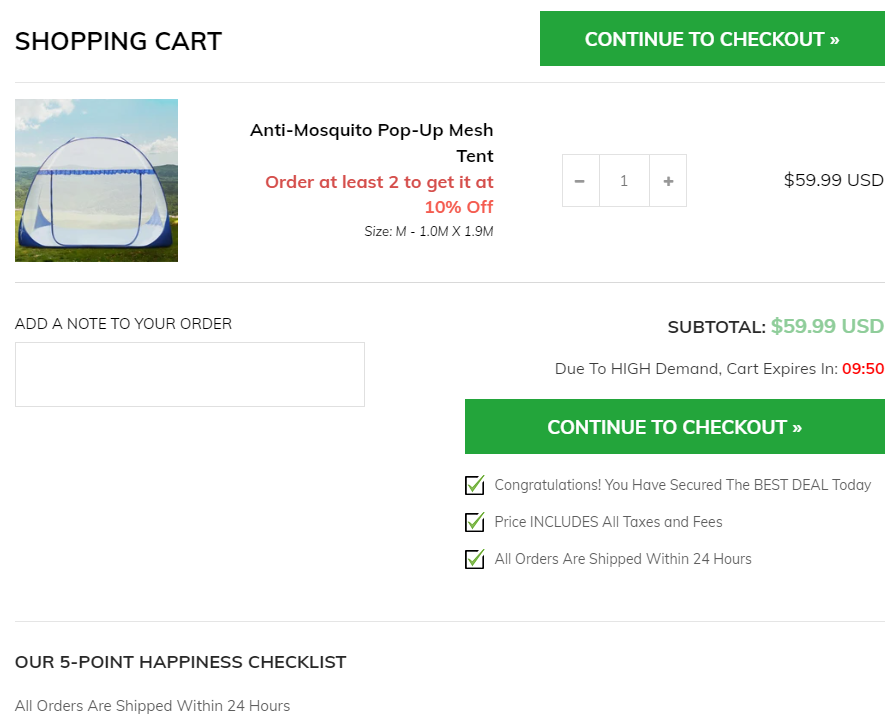
Probably the best Cart Page I have ever seen on a Shopify store ever! I really hope an app is responsible for such a great looking and optimized cart page(and not some custom coding), because I’m saving this page and will look how to do the same as they did here. ABSOLUTELY GORGEOUS!
They have a cart timer, guarantees, discount reminder(for the quantity-based discounts), 2 buttons on top and bottom(on mobile, you have to sometimes scroll down to see the button), and more. I really love this cart page haha.
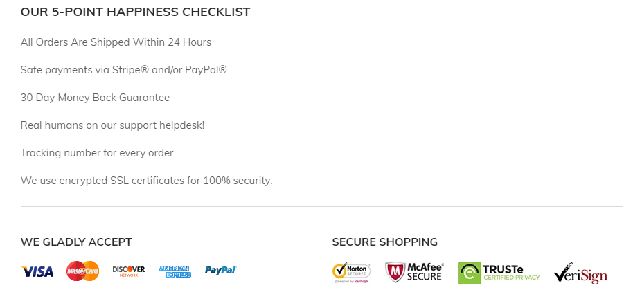
Note:
These guarantees below the cart page is what I was missing on the product page but at least it’s on the cart page 🙂
6. Checkout Page
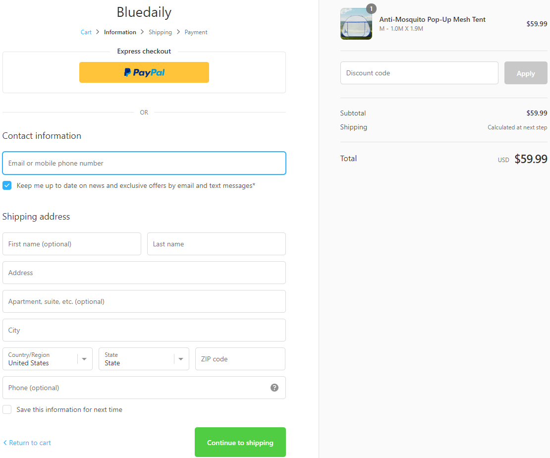
They forgot to add their logo so Shopify displays it as a text logo by default. Again, this is something I repeated A LOT of times already, the best thing is to have a logo + trust badges next to it on the checkout page.
On top of that, at the bottom of the checkout page they don’t have the policy and refund page links. They usually appear there if you create them on that page creation automatic tool, so it’s probably not there because the pages were created without using that automatic tool.
I usually create these pages by using Shopify and edit the information inside so I always have these links displayed on my checkout page.
All the rest like Phone which is optional are good.
7. Shipping Page
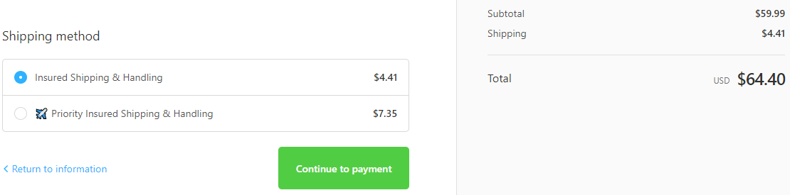
If it was me, I wouldn’t charge shipping at all and offer free shipping for this product but it’s their decision so they probably have a good reason for that. I like that it doesn’t just say “Standard Shipping” by default and they changed it to “insured shipping & handling”. A small psychological trick on the customers that always work 🙂
What I didn’t like is the Priority shipping option – The price is good BUT you have no idea how much time it takes to arrive. People want to know how faster the shipping will be by choosing the priority option and unfortunately it doesn’t answer their question.
8. Payment Page
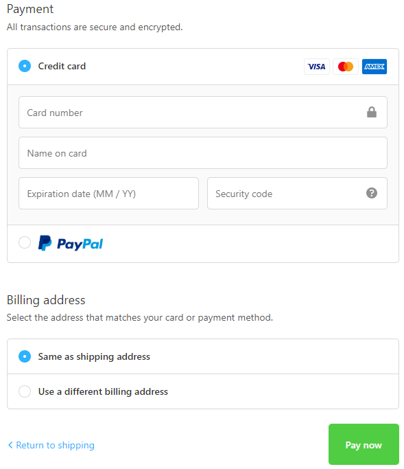
PayPal and Stripe are both active which is great! Always try to offer multiple payment options to get the maximum possible conversion rate. What I don’t like is the button text “Pay now” which is a bit too aggressive and I usually change it to “Complete your order”. Sounds better than “Pay now”.
To Sum It Up:
Almost a perfect store but they missed a few things here and there so it’s your chance to take this product and create a truly perfect product page for it. I also think this product can sell only with photo ads so try it out if you have hard time creating video ads.
Take some time to think about new marketing strategies, new audiences that may like this product, etc, to have a better chance to sell this product and scale big time.
Let me know if you have any questions in the comments and I’ll do my best to answer you all 🙂
Good Luck!
Struggling to find good products to sell? Not sure who’s your target audience? Tired of losing money on products you were sure were “winners”?
Then Ecomhunt is what you need! Find hot winning products that are added daily, spy on their ads & stores and import them into your store in 1 click and Start Selling Today!
Must Read Articles:
- Ecomhunt Store Reviews – A General Store With LOTS Of Products
- 5 Small Changes To Your Shopify Store You Probably Forgot Doing – Part 2
- How To Design Your Shopify Store Almost For Free

Daniel Aloni is one of the leading mentors in the Ecomhunt family. Daniel is a highly experienced Print On Demand seller with multiple 6 figures successful launches.


