")


If you’re looking for a hot product to dropship right now, then you must check out this product that’s currently exploding in sales on Facebook!
In this week’s article, I’m going to review the Facebook ad, the store, and basically everything there is about this product. On top of that, I will also provide tips and tricks on how you can take this product and sell it too.
From my experience, there ain’t a perfect store or ad out there so there’s always room for improvement.
Follow the tips shared in this article and take this product to new heights!
1. The Product
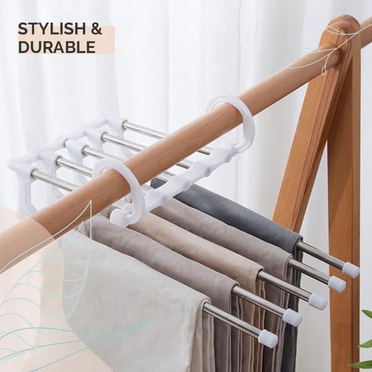
The product is this cool multi functional pants rack which can be easily found on Aliexpress. The product is quite cheap and costs only about $5 so there’s a good profit margin to make, and you can also bundle it up and offer extra units for a discounted price.
It’s a problem solving product which frees a lot of space in a regular closet and because of that it does really well on Facebook. The main target audience are probably women but I can also see men buying it.
This product is definitely a winner with a HUGE audience so make sure to jump on it right after reading this article and make some bank too.
Now let’s see what the original seller is doing and review the ad, the store, and everything around it.
2. The Ad
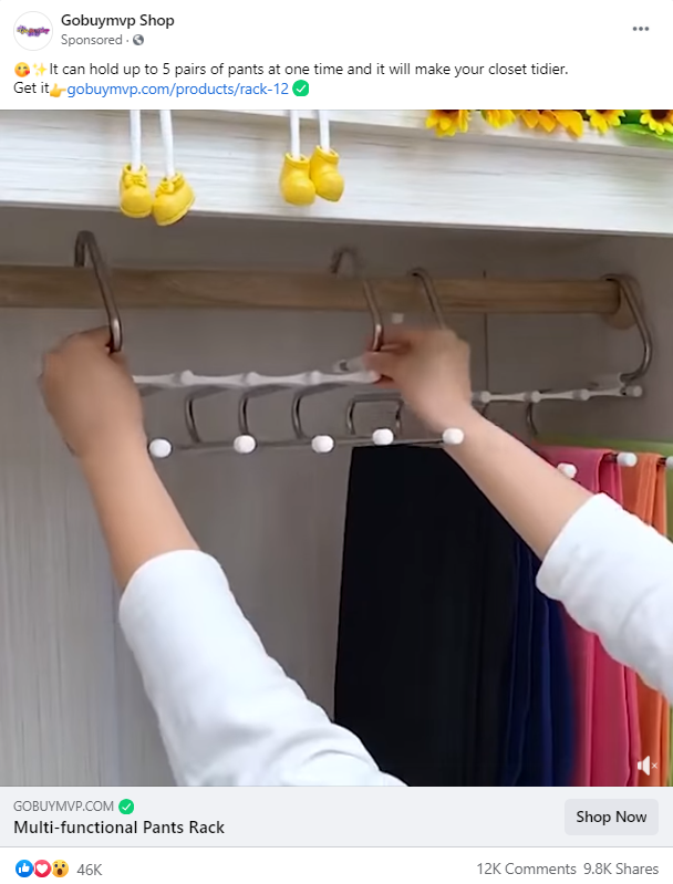
The product is pretty-much self explanatory and just by showing how it works can be a good ad.
There’s nothing really special about this ad: Standard music and a few shots of different people stacking pants. There’s a black & white shot of a wrong way to arrange pants but it’s not really needed and just a waste of time.
What I would do differently:
1. Use some text in the video ad – It’s a really simple product but I still think there needs to be some text in it. You can add a few words to explain about the product durability maybe, it’s weight, how it works(even if that’s obvious), and maybe advertise your current deal on this product.
2. Add a call-to-action text – There’s no call-to-action text at the end of this video and it’s very important to have one. A simple “Order now and get 50% OFF + Free Shipping” text is enough to make more people click on your store link.
3. Change the call-to-action Shop Now button text – There’s absolutely no need to repeat the product’s name here so just write something like “Order Yours Now – 50% OFF + Free Shipping” to get more people to click on the button.
4. Speed up the first seconds of the video – The first 2.5 seconds of the video show a person hanging the rack with no pants on it. I think it will be much better to speed it up so after the first second you can already see the pants hanging on it. Or just get to the part where he puts the pants instead of showing 2.5 seconds of the rack being hanged.
The first seconds of the video are what we call the scroll stopper – It’s important to have the best part of the product shown to stop people from scrolling their feeds and focus on our ad.
5. Add some text or animation on the black & white video part – It shows us the wrong way to organize our pants so a few words about how annoying it can be or just an animation of a red “X” on it will emphasize the existing problem a bit more.
Ad Copy:
The ad copy is just too simple for me and I don’t really like the style. It probably works great for this dropshipper but I would go with something like this:
“This amazing multi-functional pants rack can hold up to 5 pair of pants in one go! Save more space and make your closet tidier with our amazing pants rack.
Grab yours here => LINK
Order now and get 50% OFF + Free Shipping – Stocks are Limited!”
This ad copy tells a bit more about out product and makes it feel more “premium”, the call-to-action is clearer and we also advertise our current deal + some fake scarcity text about limited quantities to hopefully make more people to buy our product.
3. The Product Page
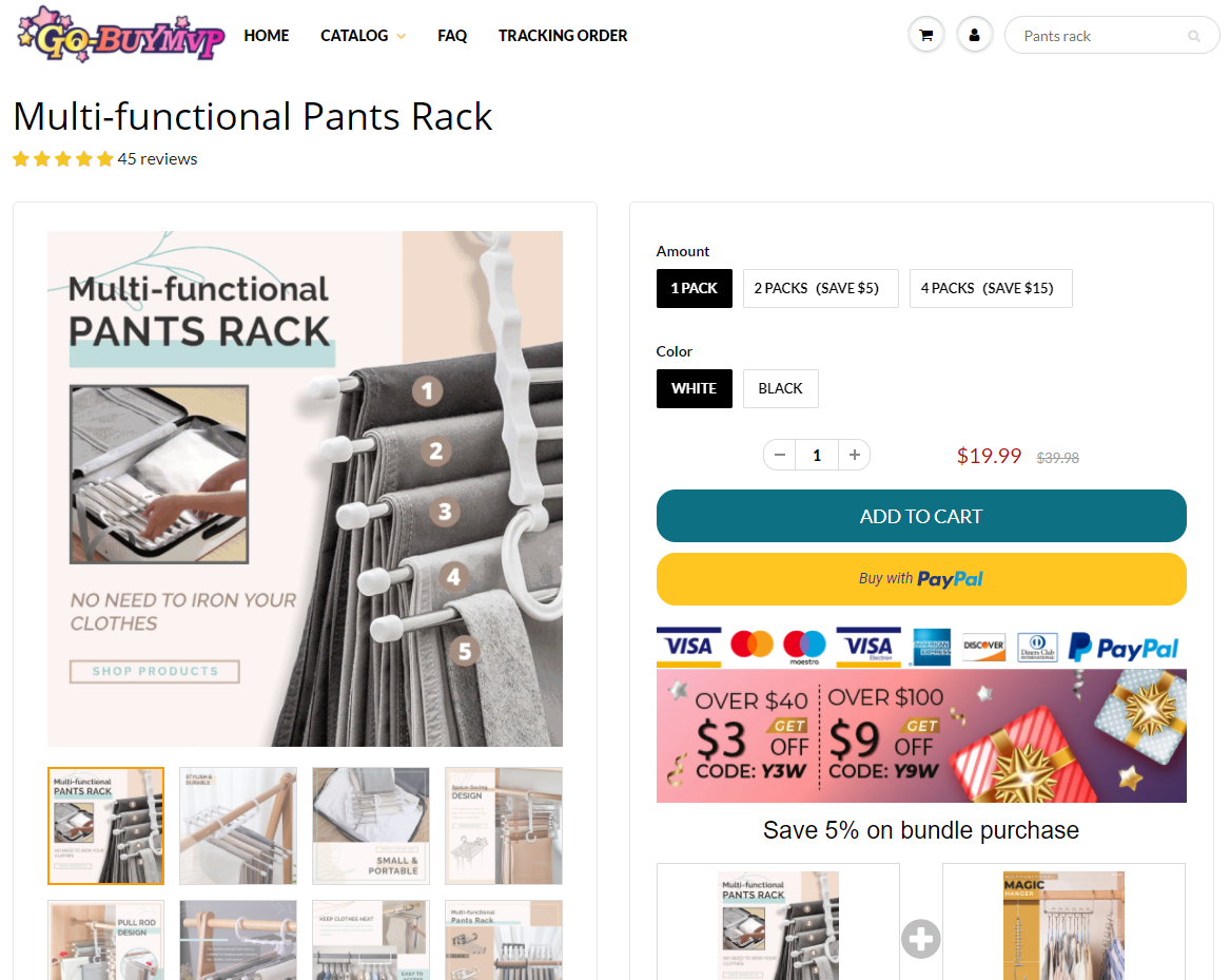
Their product page is pretty decent and I don’t see any major flaws that can negatively affect the conversion rate. The product pictures they use are great with text on them. The description product details, shipping info, and guarantees.
They also have the usual must have stuff like trust badges and a great review section about the product with good pictures.
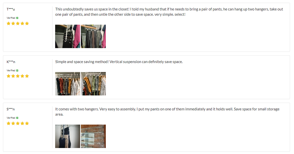
The text in the reviews is not some kind of gibberish which is usually what I see when people import random auto-translated reviews from Aliexpress. But even with a proper English in them, it still feels a bit forced to me as a lot of the reviews explain too much about the product. Some customers can catch that and wonder if the reviews are real.
Usually reviews are just about how happy the customers are and sometimes you find a long review from like 15% of the customers where they take the time and really review your product. Faking reviews is not allowed, but if you already fake it then do it properly ?
Note:
I’m not saying they faked their reviews, it could be all 100% genuine but it just doesn’t feel that way.
What I don’t like about the product page:
1. Lack of GIFs or extra pictures in the description – I think the description is a bit short and it could be much better if it had an extra GIF or a few more pictures with explanation about the product. This product doesn’t need too much explaining but I still think the description is a bit short.
2. The manual discount codes:
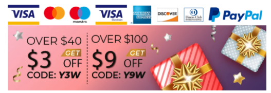
Customers tend to have a short term memory so manual discounts like these doesn’t really work that well. A customer could remember seeing he will get some kind of discount if he orders products for more than $40, but he would never remember the code.
This can hurt you more than help because instead of proceeding with the checkout process, he will return back to check again the discount code and waste more time on your store instead of checking out. Or worse, he can leave without buying a thing because he feels “scammed”.
If you’re offering discounts, make sure to auto apply them on checkout and let your customers know about that.
3. The low bundle discount:
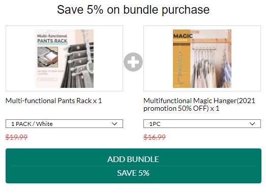
The bundle is great and it offers a product with a real connection to the one they already sell. I’ve seen plenty of stores out there that offer a random product bundle which has no chance of actually selling, so the seller did a good job here choosing the correct product.
What I don’t like is the 5% discount which is just not tempting enough. If you offer a bundle, go with a normal discount of at least 10% to get people to actually take it. 5% is too cheap, and in my opinion, a bundle with such a low discount is just a waste of space.
Their quantity discounts, on the other hand, have a decent discount of more than 10% which is great!
4. The related products section:
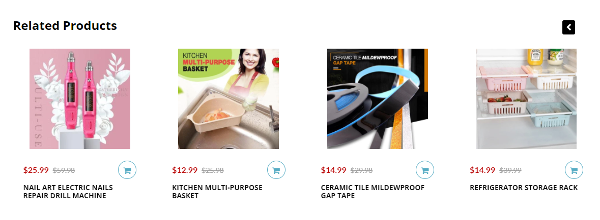
As dropshippers, you have to remember that your store isn’t a marketplace like Amazon where people go and shop for multiple products. You pull people from Facebook where they had absolutely no intention of buying anything so you have to make sure to close the deal as fast as possible.
Bundles, upsells, and quantity discounts are welcomed and help you make more money but keeping the related products section is not advised. It can only pull people from the product you’re currently advertising and make them waste more time on your store without actually buying.
In most cases, people end up buying only one product and there won’t be any shopping sprees happening on your store. Work on closing a sale as quickly as you can and after it’s done, you can then start working on selling more stuff to your already existing customer.
4. Checkout
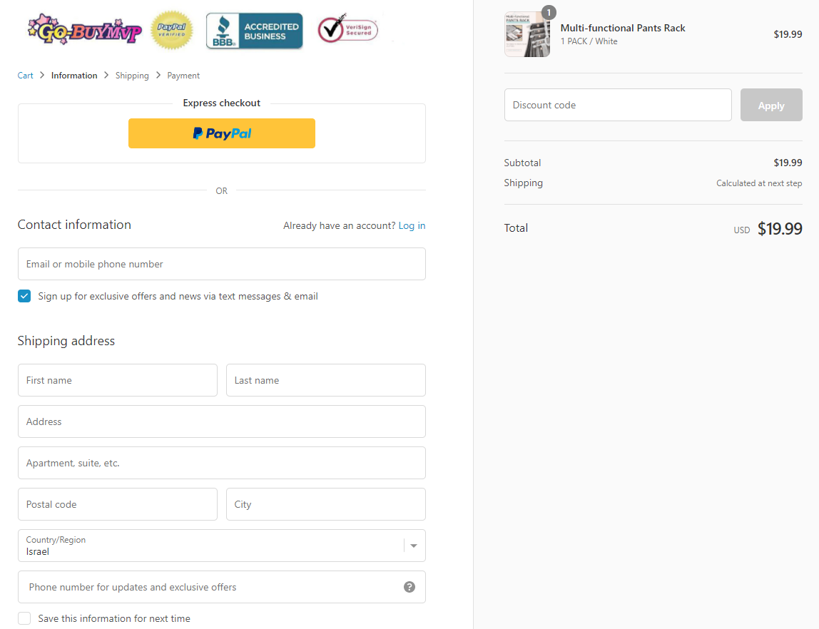
First of all, I would like to say that finally I see another seller that doesn’t forget to add his store logo on the checkout page as well. Many dropshippers forget about it and the logo on their checkout page is just plain text.
On top of that, he went one step ahead and also added trust badges to the right side of his logo which is just awesome! Most of the stores I reviewed, like 99% of them, had just their logo in the best case scenario. Having trust badges makes your store look more professional and adds more trust to it.
Now let’s go to the bad stuff:
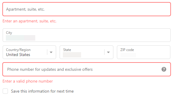
I don’t know why but for some strange reason, the secondary address field which is always optional is mandatory here. There are plenty of people out there that don’t have anything to write here so it may cause a bit of confusion which just prolongs the checkout process. It can also lead to some customers abandoning the checkout as well.
You have to make it as simple as possible for your customers to checkout and this move is not helping at all!
On top of that, the phone number is also mandatory but in this case, it looks like the store owner is planning on marketing via SMS:
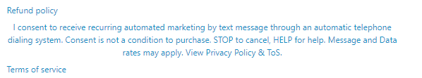
I know for a fact that some people absolutely HATE giving their phone numbers, even if it’s just for the shipping company to contact them if there’s something wrong with their order, so you either make the phone number field optional or you should have a damn good plan with what you’re going to do with the phone numbers you get.
Is getting phone numbers really worth it over losing sales? Do you have a plan on how you’re going to use these phone numbers to squeeze more money out of your customers? You got to ask these questions before making such a move.
Personally, I don’t use SMS marketing so the phone number field is always optional on all of my stores. I prefer getting a higher conversion rate and maximizing my sales at first – I can worry later about how I can make more money from my already existing customers.
Shipping page:
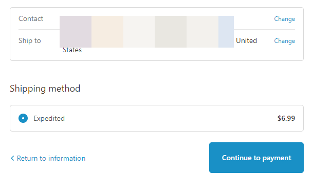
Nothing really special here except the high shipping price. It’s good that they wrote “expedited” as a shipping option and not just “regular shipping”, but I still think the price is a bit too high. I would charge no shipping at all just to test it OR maybe increase the price a bit and charge less for shipping.
For example:
Instead of selling this product for $19.99, we could price it for $22.99 and charge only $3.99 for shipping.
Payment page:
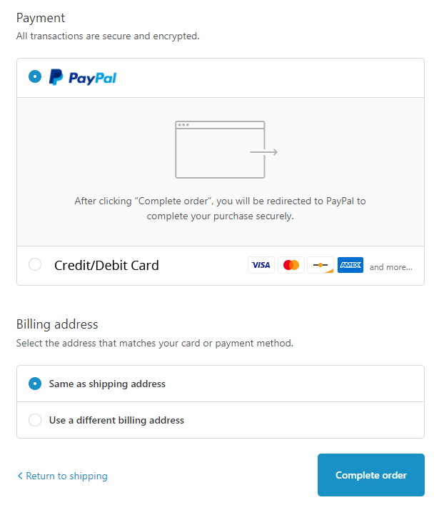
Standard payment page with both PayPal and Credit Card options present which is great. Nothing really to add here except maybe changing the button color to green(and same with all the button color on the checkout pages).
To Sum It Up:
As you can see, the original seller did a pretty good job with this product and his store BUT he still made some mistakes so there’s plenty of room for improvements. The store’s conversion rate is probably below average and this means that a good amount of sales were lost.
On top of that, the market for this product is HUGE so there’s still plenty of sales to be made! Go through my review and implement my tips to make a perfect ad and store around this product so you can make some sales too.
Good luck!
Struggling to find good products to sell? Not sure who’s your target audience? Tired of losing money on products you were sure were “winners”?
Then Ecomhunt is what you need! Find hot winning products that are added daily, spy on their ads & stores and import them into your store in 1 click and Start Selling Today!
Must Read Articles:
- [New Feature] Ecomhunt Extension – Hunt Down Your Competitor Facebook Ads And Shopify Stores With A Click!
- 10 Ways To Increase Your Online Store’s Sales – Part 1
- Why You Shouldn’t Scale With Aliexpress

Daniel Aloni is one of the leading mentors in the Ecomhunt family. Daniel is a highly experienced Print On Demand seller with multiple 6 figures successful launches.


really good product and great blog post. Only downside, I have no idea at all how I should target this on facebook