Hey there!
We’re once again back with another store review article and this time it’s a cat niche store. This store is clearly made by a new dropshipper so I thought it would be nice to point some of the mistakes he did for you to learn from it.
The cat niche store I’m going to review is FurBabies Meow – https://furbabies-meow.com/
If you plan opening a niche store in the near future, this store review article is for you!
1. The Front Page
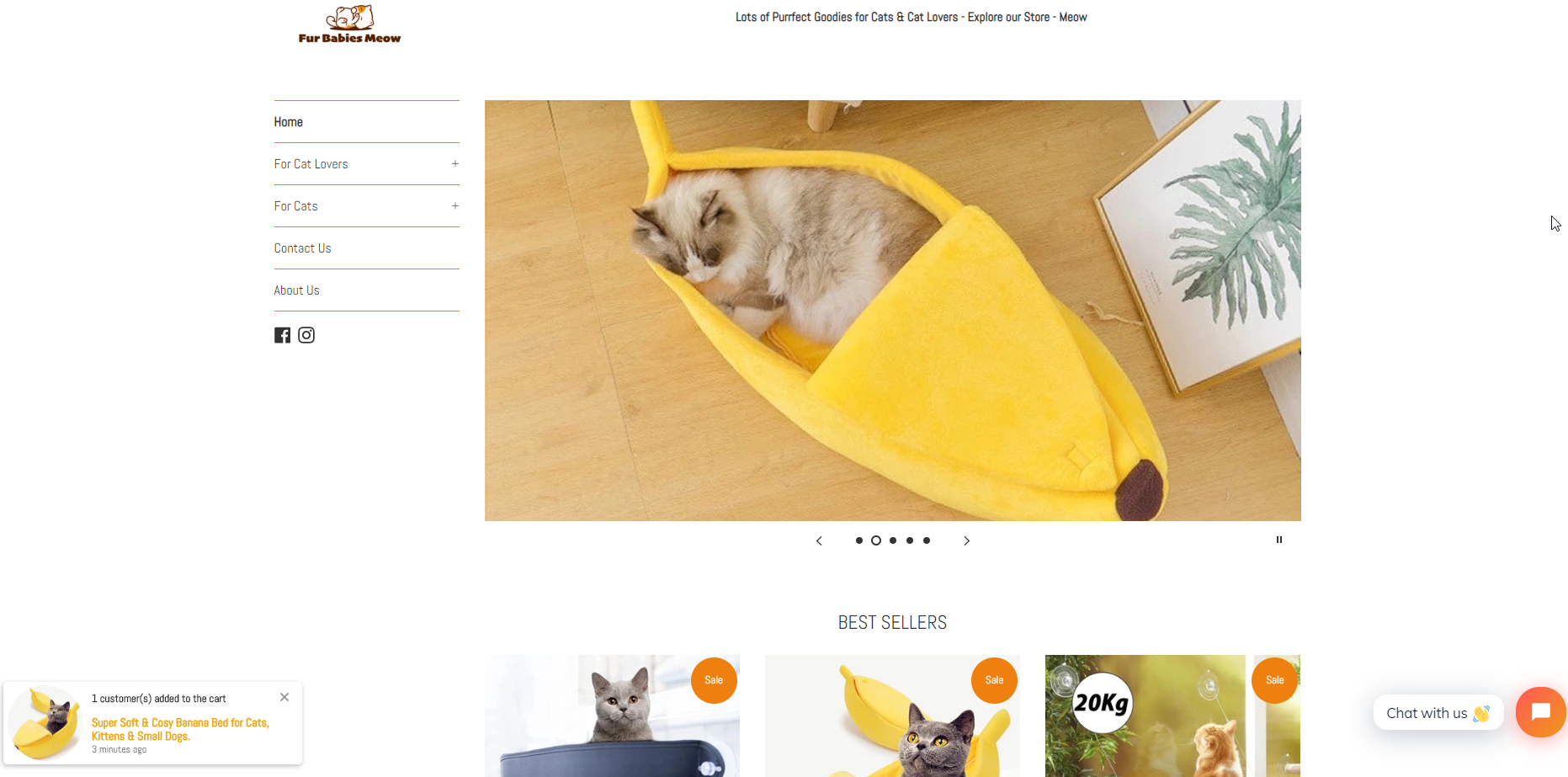
First of all, I’ll start with the banners as it’s the first thing I see when visiting the front page. Both on Desktop and mobile, the banners are simply pictures with no text or call-to-action button on them. If you’re including banners in your store, make sure to add a button & some text as well.
You can’t even click on any of the photos so it’s just a waste of space… If you don’t have anything good to display, it’s better to remove the banners completely and just start by showing your products. We had and still have stores with no banners at all on the front page and we have no problem getting sales.
The next thing I want to talk about is the logo – It’s a bit small on desktop so I would make it a bit bigger. On mobile, there’s too much space between the announcement bar, the logo, and the rest of the site so you should have less spaces.
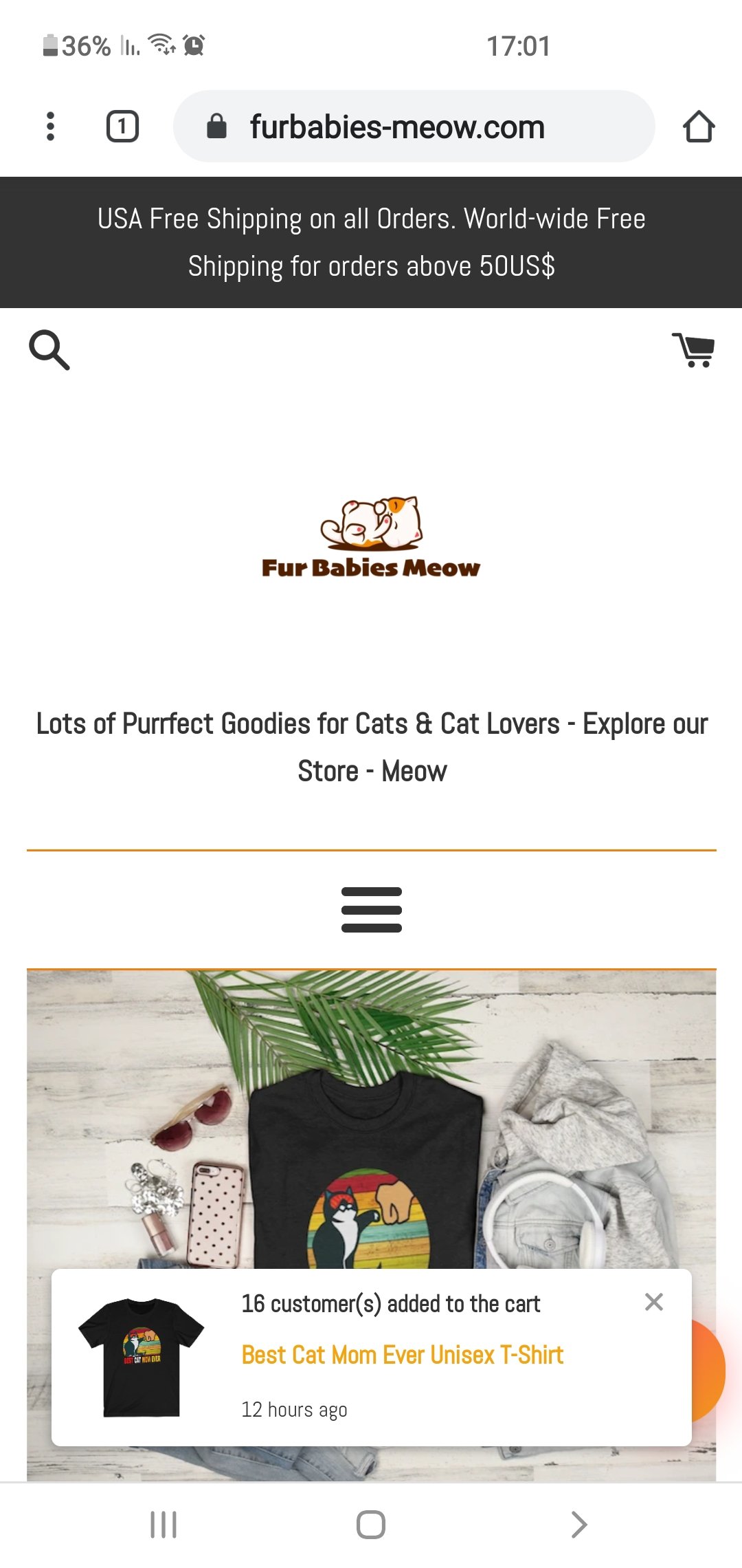
Removing the text below the logo can fix the spacing issue and you can then make the logo a bit bigger on mobile too.
On top of that, there’s the random “someone added to cart” notification which I think doesn’t really help with sales when you don’t have a good amount of traffic. With new stores, I prefer keeping it clean because these notification can be a bit annoying and can drive some of your customers away.
If you’re starting a new store, it doesn’t matter if it’s a general or a niche store, just keep it clean and focus first on the product and your ads.
This random product notification brings me back to the next issue which is the newsletter popup.
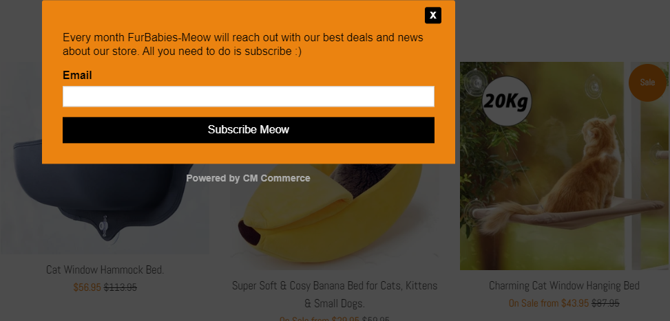
The 3 main issues with this newsletter popup are:
- It’s a popup – Customers hate popups and they just want to browse a clean store for once. If you want popups on your store, go for exit popups because these can actually help you recover some lost sales. Once you have enough traffic each month, you can think about ways to signup people to your newsletter.
- Bad design – If you’re already including a popup on your store, then at least make sure it looks good. Include a funny picture or some cool design… You need to grab you visitors attention with something cool for them to subscribe to your newsletter.
- Colors – Know your colors! An orange background with black text on it doesn’t look good. If you’re not sure what colors to use, then just check other online store and copy from them.
The next issue with the front page is that every product you see in “on sale”:
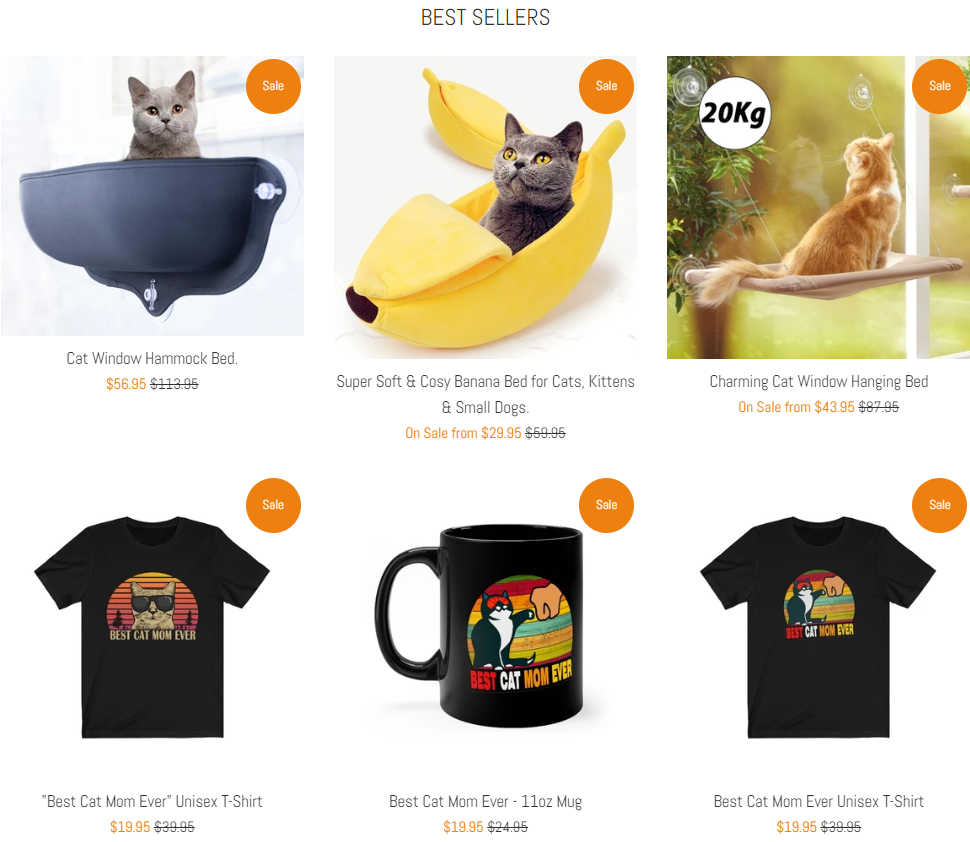
When every product on your store in on sale, it just makes it look cheap. Consider removing the sale notification from some products so it looks a bit more legit.
Store links:

There’s no need for Account Login or Cart links so remove them from your store’s footer. All the other links and the text inside them are good and well written, the only thing which I’m missing is the “Track Order” page.
You need to have a Track Your Order page for your customers to quickly track their package. This page will make your customers trust you more and you won’t have to deal with too many support emails about order tracking.
Things to consider changing(optional):
- The domain name – In my opinion, it’s a bit weird. Maybe even a bit childish… Something like furbabiesshop.com is much more solid than furbabies-meow.com. I know this niche has a lot of competition which makes it super hard to find a normal domain name. But still, consider changing the name or at least remove the “-“(furbabiesmeow.com) from it.
- The theme – There are much better free themes out there, like Venture or Debut, so consider using one of them instead of the Simple theme.
2. The Product Page
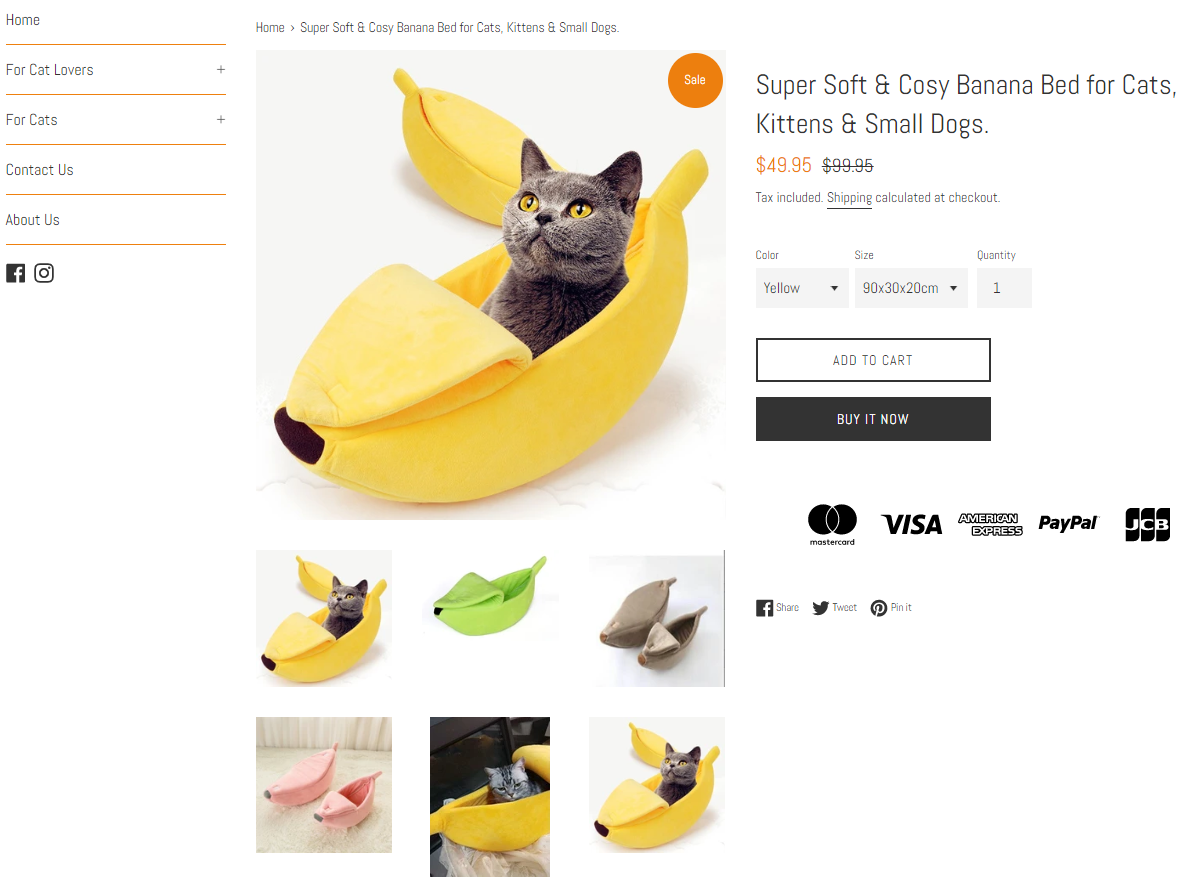
Things are a bit better here but there are still some stuff missing:
- Pictures in the description – The description text is well written with all the necessary information about the product BUT there aren’t any pictures or GIFs in the description. When scrolling, it’s always best to display relevant product pictures in the description. Pictures that show how the product works, different colors, different features, etc.
- Secure checkout icons – The secured checkout is displayed as text at the bottom of the product description which is fine but it’s better to display it as icons.
- No product reviews – You can’t have a dropshipping store without any reviews. I explained the reason in a lot of my past articles so please install a review app and import at least 20 reviews from aliexpress for each product you sell.
Also remove the product suggestions at the bottom of your product page:
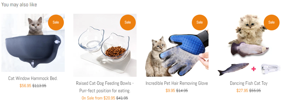
Our mission is to convert our visitors into customers as fast as possible. Why? Because we’re not Amazon and the customers aren’t going to add a bunch of products to their cart and continue to checkout. This is why we first have to convert them fast and later we can get them back to buy more stuff.
Remember that it’s much easier to convert an already existing customer than getting a new one.
The next issue is with having too many variants for a single product:
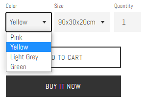
Take for example the banana bed for cats – It has 4 colors and 3 available sizes which is totally unnecessary. Having too many options will hold your customers from proceeding to checkout because they will have a hard time choosing.
Instead of 4 colors, keep only 2(yellow + green). And instead of 3 sizes, just stick with 2 or even 1(I believe there’s an average bed size every cat can fit). Less options = faster checkout.
3. Cart Page
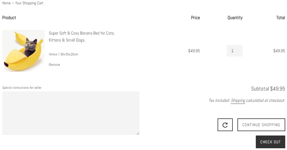
Before I review the cart page, there’s a much bigger issue and that’s the cart notification. When a customer clicks on the add to cart button, the theme’s default is to keep the customer on the same page instead of transferring him to the cart page.
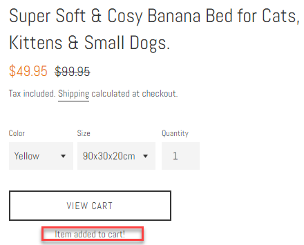
Go to your theme settings and make sure the cart notification is no longer active in the cart theme settings. The checkout process needs to be fast so we need to transfer the customer straight to the cart page and not keep him on the same page.
The cart page is fine and I would only remove the “special instructions” box. With this text box on the cart page, customers will have to scroll a bit to find the checkout button which isn’t something we want to happen.
4. Checkout Page
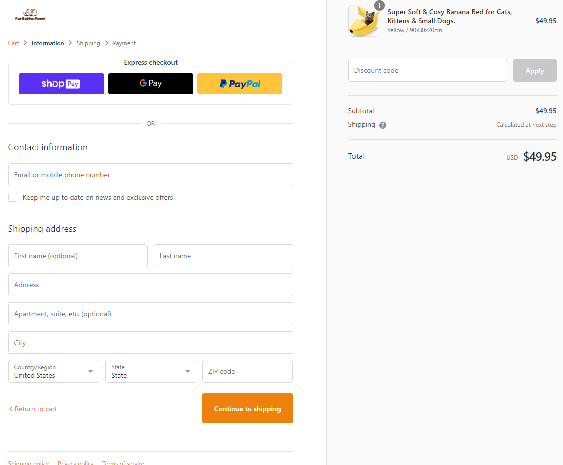
The checkout page needs some trust badges displayed near your logo.
Like this:
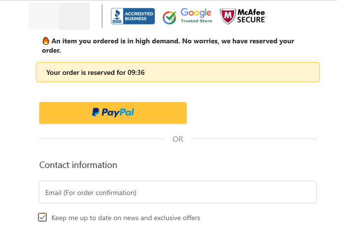
Other than that, everything is perfect.
5. Shipping Page
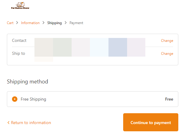
I checked to see if the “free shipping over $50” promotion works and it did. Everything’s good here.
6. Payment Page
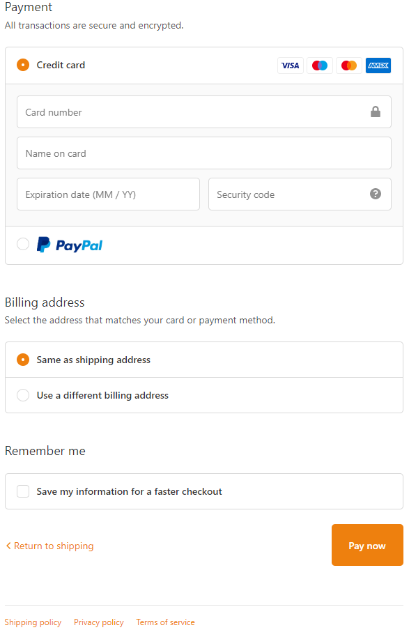
Both PayPal and Credit Cards are accepted which will keep your conversion rate at a maximum. The only thing that needs to change is the button text which is a bit aggressive. Instead of “Pay now”, change it to “Complete your order”.
Also change the colors of your checkout buttons from orange to green.
To Sum It Up:
I wrote this review article to show you just how many mistakes can be made in a single dropshipping store. Even if you have the perfect product with a perfect ad, with a store like this it would be hard to get sales going.
I hope you liked this review and if you want your store reviewed then let me know in the comments. Maybe your store will be the next one I review 😉
Good luck.
Struggling to find good products to sell? Not sure who’s your target audience? Tired of losing money on products you were sure were “winners”?
Then Ecomhunt is what you need! Find hot winning products that are added daily, spy on their ads & stores and import them into your store in 1 click and Start Selling Today!
Must Read Articles:
- 3 Important Things You Can Learn & Discover From A Viral Facebook Ad
- Ecomhunt Trending Products – 3 Products You Should Dropship Right Now!
- 5 Shopify Apps Every Dropshipper Must Have In 2020

Daniel Aloni is one of the leading mentors in the Ecomhunt family. Daniel is a highly experienced Print On Demand seller with multiple 6 figures successful launches.









Thank you for notes
My web :
https://sindbad-toys.com/
Hi Daniel,
I seriously appreciate your reviews and tips and tricks. Very helpful. I am an old man (lol) who is teaching himself e-comm. I just started during lock-down (lost my job) and my site was launched a couple of weeks ago. My new journey has started…Woohoo!!
I would be most thankful if you had a look and let me know what you think?
My store is MediMe in the health and wellness niche.
And please don’t hold back haha,..I’m a newbie but keen to get this right. Bring it on!
Take care – and thanks again Daniel.
Pete
If possible please review my store.
It will be great if you make a review for my store before I close it.
Number of orders is zero until now !
great job.
Hello, I really liked the way you did a really thorough review of the store. I hope that you could do the same for my one. Keep it in that way. ?