Another week and another amazing winning product recommendation!
This time I found you a great product in the kitchen niche which is blowing up on Facebook. If you don’t leave under a rock, chances are you’ve seen a lot of kitchen product ads on Facebook and that’s because this niche is SUPER HOT right now.
This is why I decided to specifically search for a kitchen product for you and review everything about it so you can sell it too. In this article, I’ll review the ad, the store, and give you some additional tips like sales strategy so you can take this product to the next level.
Spoiler:
The original seller used a pretty interesting method to sell this product on his Shopify store, but he didn’t quite know what he was doing. Make sure to read the whole article to see what he’s done and what I had to say about it.
Enjoy.
1. The Product
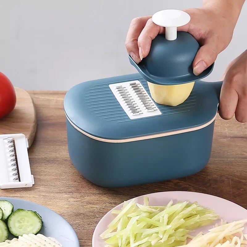
Today’s winning product is this must have multifunctional chopper. Kitchen products are selling great all year round and there’s always plenty of new stuff and inventions coming out, so you can always find something cool to sell.
Also the market for kitchen products is HUGE with plenty of interests you can target and the audiences just keep getting bigger. It’s safe to say that you don’t have to worry about competition too much and just make sure your ad is good enough to make people stop on your product.
I will tell you a secret: We’re currently testing out a really cool kitchen product and this one right here is definitely on our “to test next” list. I recommend not wasting too much time and testing this product right after you finish reading this article ?
2. The Ad
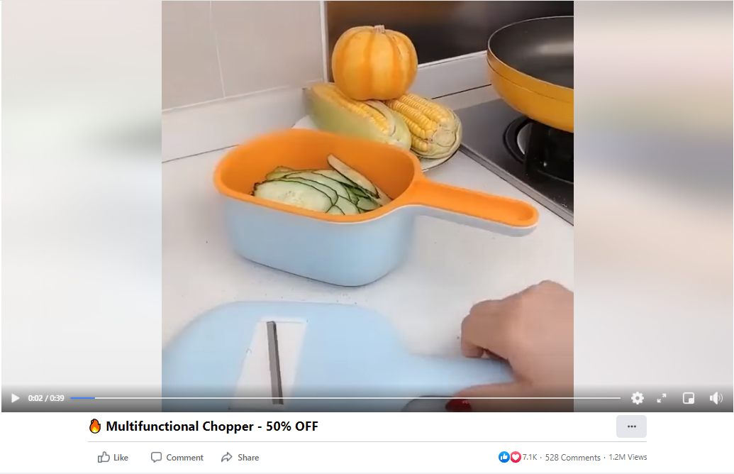
The ad just shows the product in action with a nice background music… I wouldn’t say it’s a bad ad but you can make something much better in no time.
This product should get wives(and husbands too) excited for all the cool dishes they can prepare for their family so I think the music should be a bit more jumpy. Other than that, you should always use text in your video ads to explain a bit more about the product.
Like what kind of meals you can prepare, how many options does the product have, etc. And of course, there needs to be a call-to-action in the end of the video + some kind of promotion text telling people about the deal you’re running.
You can place an order for no more than $20 on Fiverr and get a much better video than this one with description texts, cool transitions, new better footage, and more suitable music. Or you can do it alone for free which shouldn’t be hard if you know how to make video edits.
Pro tip:
If you make your own video ads, then look for successful video ads on Facebook and copy their structure. It’s much easier to copy what others are doing than doing it all alone. You also leave much less room for mistakes.
The ad copy:
Simple line of text which is enough for this type of product. I have nothing bad to say about their description although adding a call-to-action text in the description could make it better.
When the product was first posted on Ecomhunt, it had almost 5k likes:
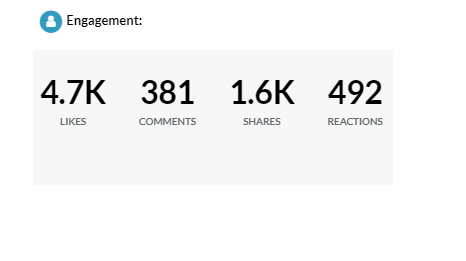
Since then, it had gained another 2k+ likes but looks like it stopped. The reason it stopped isn’t the product and I will explain all about it when we reach the store review part. The seller made plenty of mistakes by choosing a pretty “special” way to sell this product.
Their ad library:
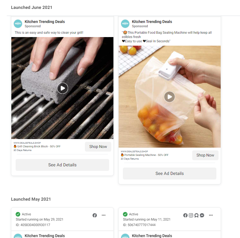
They are still testing plenty of other products so keep an eye on their ad library to see the new products they test. Although I don’t think it will go so well for them if they stick to that special selling method…
3. The Store
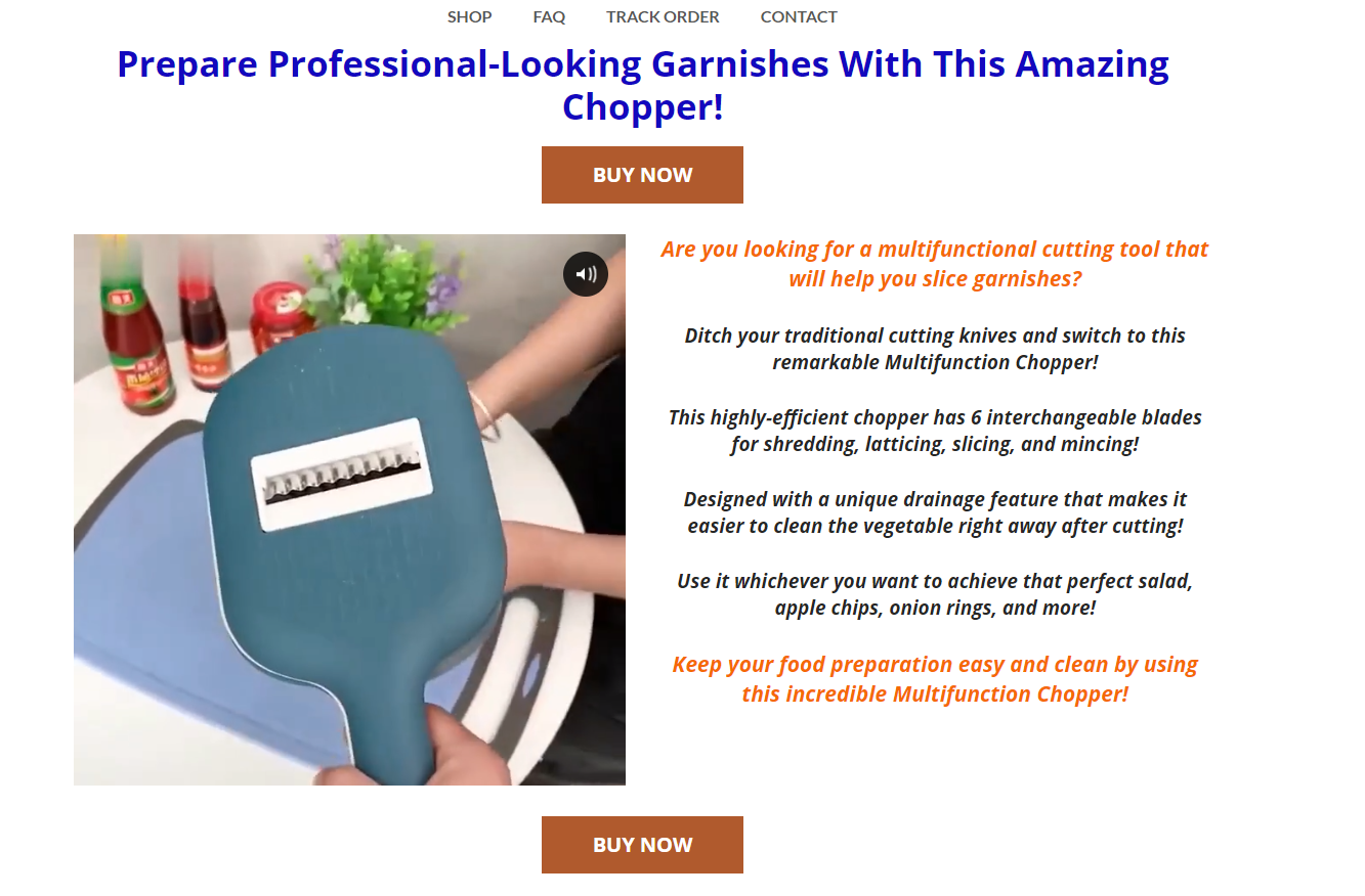
This is where stuff get a bit more complicated… Instead of sending their traffic to a regular product page, they are sending their visitors to a custom page that looks like a sales funnel. It looks like the original seller tried to spice it up by creating a ClickFunnels type of sale page instead of going the regular way.
I don’t see a problem with this method, and even think it’s pretty creative, but if you go this way then at least do it right… The overall design is bad, there are no sections, the buttons are looking bad, the packages design is too big, and plenty of other stuff I don’t have time to list.
This sale page looks like a 6th grade HTML project and he should just create a regular product page with GIFs and pictures and get done with it. If you can’t do things the right way, then just don’t…
If you still want to build a custom sale page for your product, then I suggest using a sales funnel app which at least allows the user to customize and build much better land pages than what we see here.
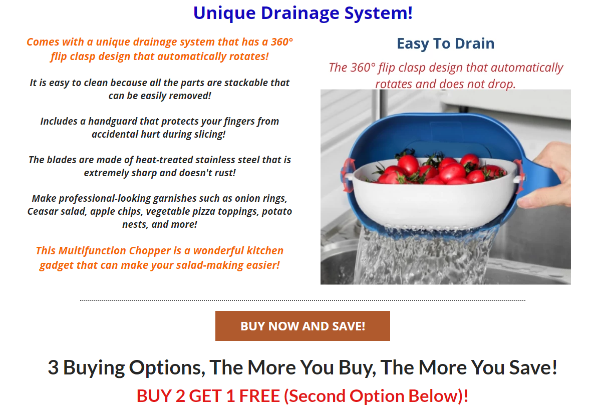
At least the product description is somewhat okay. And like I already said, the packages are too big on mobile and you have to scroll way too much to check all the deals. It’s a shame because his deals are pretty good and I can imagine people buying more than one piece.
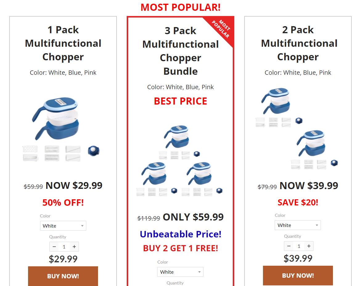
If only he had a normal product page…
Other than that, there are no reviews when there’s plenty of reviews available for us to import from Aliexpress.
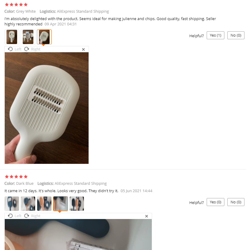
Having reviews on your store is MEGA important as a big percentage of your customers will decide on buying only after reading them. It will also help your customers to trust your store a bit more so don’t be lazy and always import reviews.
Also, there’s absolutely no need to offer more than 2 colors. If it were me selling this product, I would offer only the white option. This isn’t a fashion accessory so just offer the standard color option and get your customers to checkout faster.
At least he gives his customers information about shipping times which some dropshippers forget to mention.
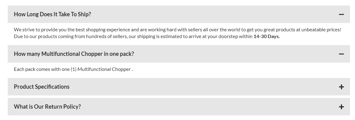
Overall he tried to do something new but his sales page is lacking and the design is hideous. Before trying a new technique, always do some research or ask someone who understands and has experience in the field.
The product was gaining a lot of traction on Facebook and he could’ve done so much better if he just stuck to the basics and perfected them.
4. Checkout
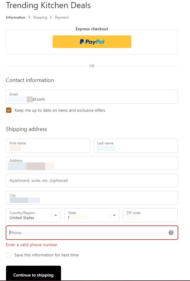
There’s no logo both on his store and on the checkout page. It shouldn’t take more than 5 minutes to design a quick logo on Placeit for this store or cost no more than $20 to get one from Fiverr.
On top of that, the phone number field is mandatory which could drive some customers away. Some customers simply HATE giving out their phone numbers and if you don’t have any use for the numbers you collect, then make this field optional.
Shipping:

The shipping page looks normal to me with a flat shipping rate of $7.99 for one item. I think the shipping price is a bit too high but it’s for you to decide on your own and choose how much to charge for it.
What really concerns me here is the additional taxes he charges which can be illegal if he doesn’t operate from the states(the address I specified is USA).
Based on the location of the people who manage this page(you can find it in the Page transparency section on any FB page)

It looks like none of them are from the USA to charge sales tax from US residents and that’s illegal. It could be an honest mistake which happened when the owner first created a store and used a USA address, but you can still control it by not charging taxes.
Please be careful when charging taxes and make sure to follow your local and global tax law.
Payment page:
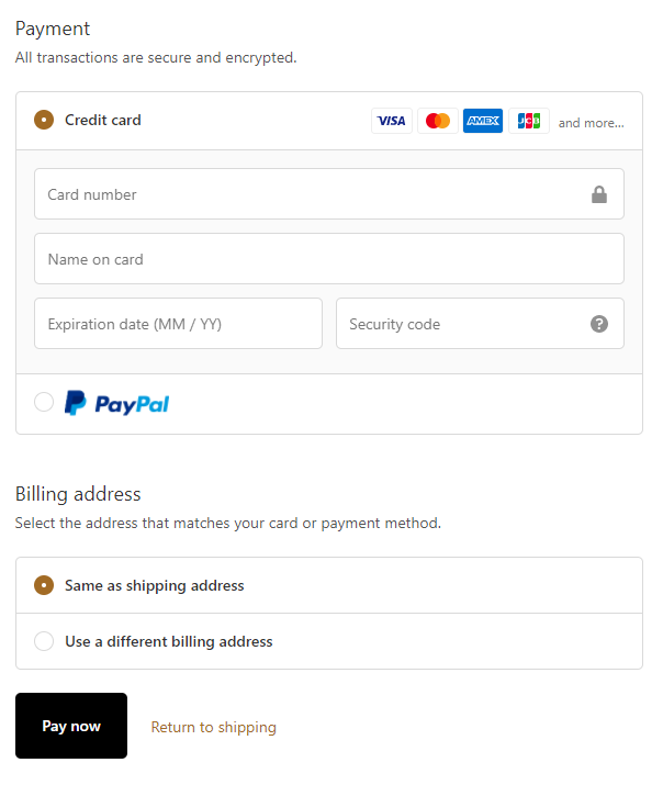
Nothing wrong with the payment page. Both credit cards and PayPal are accepted and these options are what most customers prefer.
5. Sale Strategy
The product comes in 4 colors and costs $15 with free shipping included in the price. You should offer no more than 2 colors(white and blue) and you can easily sell one for $29.99 with a small shipping fee or $34.99 + free shipping.
Consider testing a $39.99 price tag with free shipping – This product has that premium look, there’s a chance it will sell at this price if you just market it correctly.
Quantity discounts are a must!
People will definitely consider buying more than one piece for themselves or as a gift, so make sure you have good discounts lined up for your customers. A 10% discount for 2 pieces and an additional 5% discount per each extra piece should work well.
You can spice it up even more and offer people 10% discount for 2 pieces + Free Shipping(if you charge shipping). This way your customers will feel like they’re winning much more and you can increase both your AOV and your conversion rate.
Pro tip:
Find a Fiverr review gig and send them this product to review for you so you can use the video as an ad. Legit review videos work amazingly well in the Kitchen niche so it’s worth a try! You will also get original footage no one else can copy or use.
To Sum It Up:
Don’t wait too much on this product and start testing it right away. As you see, this product has a huge potential and it only failed because the seller didn’t advertise it correctly. On top of that, he also suffered from a low conversion rate because of his bad store.
Create a better ad, test this product from a normal looking store, and watch the sales coming in!
Good luck!
Struggling to find good products to sell? Not sure who’s your target audience? Tired of losing money on products you were sure were “winners”?
Then Ecomhunt is what you need! Find hot winning products that are added daily, spy on their ads & stores and import them into your store in 1 click and Start Selling Today!
Must Read Articles:
- [New Feature] Meet Adam – Your Aliexpress Product Research Virtual Assistant
- 4 Small Tweaks You Can Do On Your Shopify Store To Build More Trust And Increase Sales
- 5 Reasons Why Your Dropshipping Store Is Failing

Daniel Aloni is one of the leading mentors in the Ecomhunt family. Daniel is a highly experienced Print On Demand seller with multiple 6 figures successful launches.


