So I found a winning product on Facebook that makes TONS of sales right now. It was first posted first on Ecomhunt 2 months ago and since then this product has really grown and probably made at least 6 figures in sales. I judge it based on the traffic the store was getting which is 150k visitors in December and 110k in January(Taken from SimilarWeb). So if we take the average conversion rate, there’s thousands of sales each month and it’s getting us to 6 figures a month.
For this week’s article, I decided to review the ad and the store to see what they did right. But having a winning product and ad doesn’t mean everything the seller has done is perfect so I’m also going to see what they did wrong.
So let’s jump in and analyze this winning product!
1. The Ad & Ad Copy
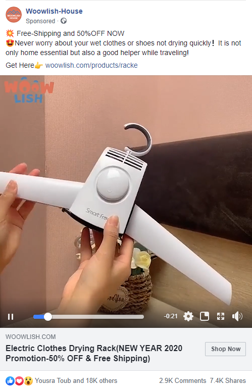
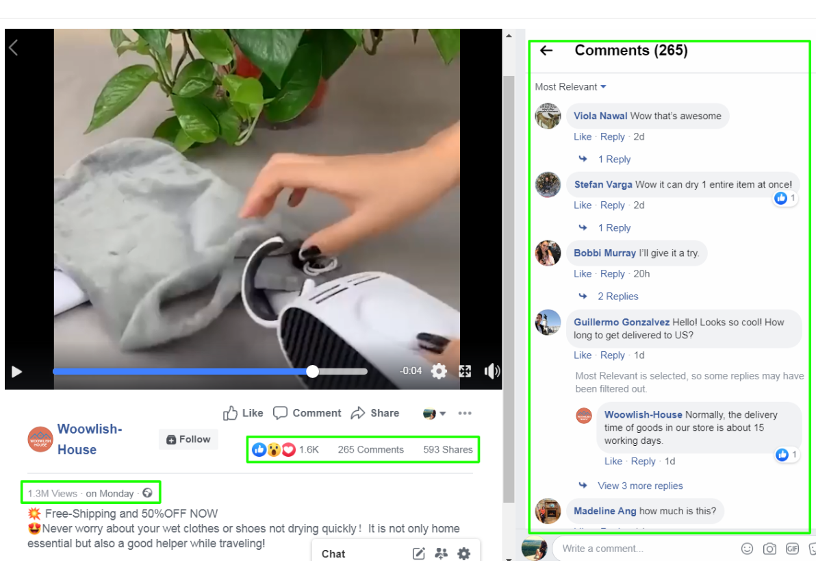
This is the ad as seen on Facebook and I have almost nothing bad to say on it.
The ad copy is fine – It starts with their 50% off + free shipping deal and the second line lets customers know the problem this product is solving. Some good emojis and a call to action at the bottom. The only thing I would change here is first start with the “never worry…” and then below that give them the link so they see it right away without having to click on the “See More” button. The finish it with the 50% + free shipping deal. They have the same promotion displayed again in the headline text near the “Shop Now” button so people won’t miss the deal.
The headline text – Good! Nothing to change here.
The video ad itself – Fast-paced video ad made from a combination of couple of old videos. It looks good and shows how the product works for clothes and also for shoes. It’s not boring and pretty short(only 21 seconds) so overall they did a great job on the video. They also have their logo on the top left side of the video which adds more credibility to their store.
Branding – This is the only thing I think is missing and that’s a cool name to the product. “Electric Clothes Drying Rack” sounds ok but if it had a cooler name, I think people would look at it more line on brand and it could’ve increase the overall conversion rate. For example: QuickDry – Electric Clothes Drying Rack.
2. The Product Page
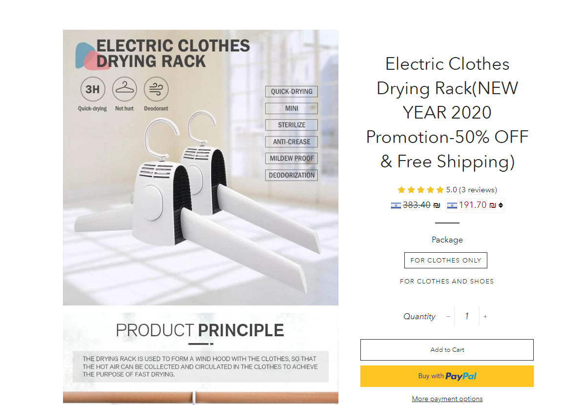
Let’s start with what they did right:
The title has the product name + the promotion – It’s good they display their promotion again as a reminder. Customers have to be constantly reminded about the offers on our store and one of the best ways is to display it in the title.
Currency Converter – They’re targeting worldwide so a currency converter is a must! You don’t want your customers to waster their time and manually convert the price from USD to their local currency. Make it easy for your customers!
Product description – They didn’t forget any detail and everything is there. Product photos are there to show how to use the product and it’s structured in a logical way. Some disclaimers about how the product itself isn’t the same as in the photo due to different color displays, etc. Overall, a good product description.
And here’s what I think they did wrong:
The reviews:
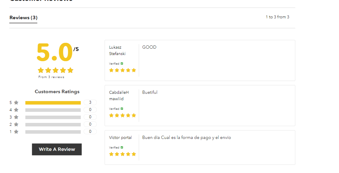
They have only three, 5 stars reviews there without any photos. The text reviews are not very helpful because they just say “Good” and that’s it. The reviews on our product page need to be with rich text and photos. If there are no photos we can use, at least have normal text reviews that will help you sell the product. For example: “Fast shipping and well packaged. Already used the product once and really happy with the results. Worth every penny!”.
The bundle:
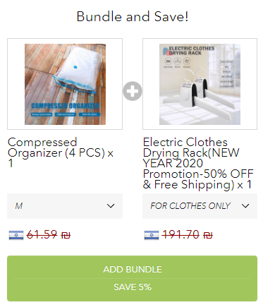
The problem isn’t in the offer itself. I think the compressed organizer is a good offer(although I would just offer one size only) and people who buy the dryer can will be interested in it. But the 5% discount is just cheap… I have no idea why they offer only a 5% discount but if it was me, I would give my customers 10%.
Quantity discounts:
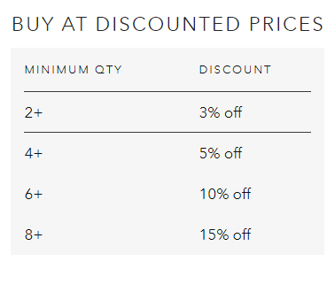
Quantity discounts are needed in this case because there’s a chance someone would want to order more than one dryer. But a 3% discount… Really!? There’s enough profit to make here so just give a better discount. A 10% discount would’ve worked wonderfully here.
Add to cart button + sticky cart button:
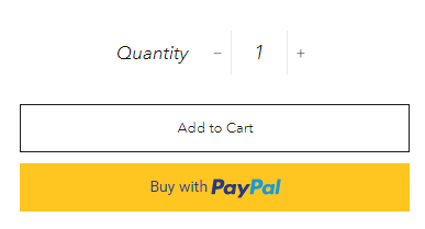
Weak colors and the same colors are used for the sticky cart button too. The add to cart button needs to have more presence! A small change but it can significantly increase the amount of people who will click on the Add to Cart button and proceed to checkout.
Offering 2 options to make more money:
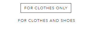
The clothes + Shoes option on aliexpress costs $3 more and in the store it costs $10 more. I think that customers who see the ad, believe the product works both for clothes and shoes. They visit the store only to see the shoes option cost $10 more and I believe some of them are a bit disappointed because of that. It eventually leads to them not ordering anything…
If they just offered the combo option for the same price or even $59.99, I think they could make much more sales.
Trust badges on product page:
There are no trust badges on the product page and it can hurt the conversion rate a bit. It takes less than 5 seconds to add some trust badges to the product page with an app or manually.
Some typos and auto Chinese-to-English bad translations:
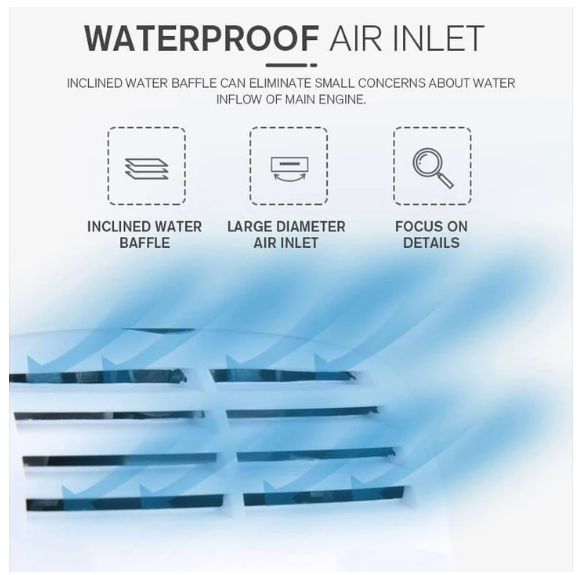
Some sentences in the photos make absolutely no sense. It’s not new aliexpress sellers use auto translations so sometimes the texts you get make no sense at all. Some customers may find typos and illogical sentences a turnoff and they won’t proceed with the checkout because of that. Make sure the photos you upload make sense and you have no typos in the description – It can lower the credibility of your store.
3. Checkout Process
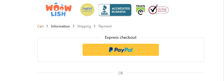
The checkout process is Shopify’s regular 3 page checkout and it looks good. They have their logo + trust badges on top which is great and I recommend you do the same thing on your stores. But when filling the details, there’s something I didn’t like which can really hurt the conversion rate:
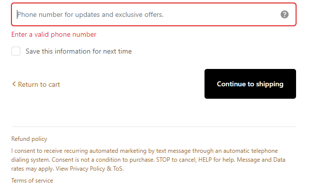
The phone number field is mandatory. Some people hate giving their phone even if it’s only for the shipping company in case they need to contact the customer.
Here it’s mandatory and they also use it later for SMS marketing. SMS marketing is really powerful and the beauty of it that it lands straight in the customer’s phone and there’s no way he’s not going to see it. It’s not an email that ends up in the promotions or in the spam folder…
SMS just pops up on your phone and you see it whether you want it or not. The problem is when people who don’t want to receive any of this can’t really complete the checkout without giving their phone so they just leave and never come back.
It could be that these guys tested it our and prefer losing some customers because they’re going to gain much more with the SMS marketing. It could also be that their credit card processor requires customers to enter their real phone.
On my stores, the phone field is optional and I let my customers know that too. I believe it lowers the conversion rate and if I’ll use an SMS marketing app, I’ll first A/B test my checkout to see if it’s really worth it.
The rest of the checkout is normal and there’s really nothing to add.
To Sum It Up:
They’re making some good sales that’s for sure but with that, they made some crucial mistakes I believe stopped them from getting MUCH more sales. This product was posted on Ecomhunt more than 2 months ago when their engagement was good but nothing compared to what they have now:
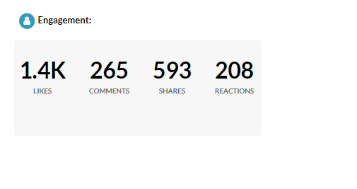
Here’s another screenshot taken from Ecomhunt of the early engagement they had:
Now what stopped you from making a better video ad and following the tips we have on our Blog and Youtube channel? The mistakes and the points I gave in this article is something I talked about in my articles(Mistakes online store owners make [4 parts available on the blog!!]). Taking this product 2 months ago and perfecting everything around it could made you some crazy sales for sure!
But it’s not the end because there’s still plenty of room and time to still crush it:
- Make better video ad
- Perfect the product page and follow my instructions
- Market it the same way or try a new marketing angle
- Profit!
Hope you liked this week’s article and feel free to leave a comment if you have any questions. Good luck!
Struggling to find good products to sell? Not sure who’s your target audience? Tired of losing money on products you were sure were “winners”?
Then Ecomhunt is what you need! Find hot winning products that are added daily, spy on their ads & stores and import them into your store in 1 click and Start Selling Today!
Must Read Articles:
- How To Create The Perfect CBO Campaign On Facebook – Facebook CBO Campaign From A to Z – Part 3
- 5 Dropshipping Youtube Channels You MUST Follow
- Learn To Read And Understand Facebook Ad Results

Daniel Aloni is one of the leading mentors in the Ecomhunt family. Daniel is a highly experienced Print On Demand seller with multiple 6 figures successful launches.














Hello,
I read your articles regularly and I really appreciate what you do. I have an Ecomhunt account where you publish winning products daily.
I would like to know how to add confidence badges, confidentiality policies at checkout ?
Thank you in advance
Hi Herve! Sorry for the late reply.
To add trust badges to your checkout, you simply need to choose CHECKOUT at your theme editor and there you can edit stuff like your logo, background colors, etc…
So instead of just uploading the same store logo you use, edit it and add trust badges to it’s left.
See this article(point number 2) to see how we’re doing it – https://blog.ecomhunt.com/2019/12/10/mistakes-online-store-owners-make-part-4/
Simple as that 🙂
The links to policies at checkout are the policies you create in Shopify settings. They’re pre-built so once created once, they’ll auto-appear on your checkout page. Choose one policy and choose the pre-built option to create it then hit “save”. Then check your checkout page and you’ll see it below.
Hope it helped!
thank you so much
I would like to know which shopify apps do you use as a currency converter and bundle ?
Thank you in advance
I use the Unlimited Bundles & Discounts app for bundles. I like that it’s not just a table and actually clickable so it adds the products straight to cart with a discount 🙂
And I use BEST Currency Converter app for my currency conversions. Easy to install and use – I guess it’s a bit expensive so take a look around maybe you’ll find cheaper one.
Thank you very much
Hello, your every article is very helpful and interesting to read.
By the way, I have a question.
You said we need to add some reviews with the great sentences and photos,but for beginner like me doesn’t have enough reviews. How should I post them on my store? Is it ok to copy the review from the other seller who sell the same products?
Hi Fumiko!
Simply import them from Aliexpress and that should be fine. This is what everyone does and as long as you don’t edit them, it should be fine. I always fix spelling mistakes and that’s it.