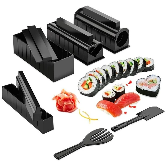
This Sushi maker is the perfect product to dropship this Christmas 2020 – It makes a perfect gift for Sushi lovers and can be used as an all family fun activity.
The Sushi maker was posted on Ecomhunt about 2 months ago and it had made some decent sales but not even close to its real potential.
At first I thought maybe it was advertised at the wrong time? Or maybe the target audience picked by the original seller wasn’t the best? After checking out the ad and the store, I realized the seller did some pretty big mistakes that hurt his sales.
So for this week’s article, I decided to review the ad + store to show you exactly what went wrong AND how can you upgrade it all to get this product selling for you this Christmas.
1. The Ad
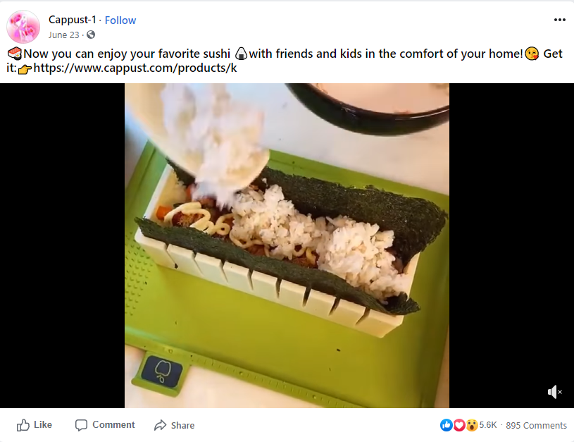
The ad video:
Sometimes you get lucky and there’s really good footage you can use for the product you’re about to sell. This doesn’t mean you should upload it as it is to Facebook, with no editing at all, and launch ads hoping for sales…
This video is nice but it’s too simple! There’s no text explaining about the different shapes and sizes, there’s no call to action at the end of the video, no mention about any “deals”, etc… If I was selling this product, I would at least add a call-to-action text at the end of the video AND a random shot of people enjoying a sushi meal. A quick 5 minute editing which could upgrade the video by a lot!
Even in the ad copy they mention you can enjoy a sushi meal with your friends so invest 10 more minutes to show it in your ad…
The ad copy:
This product doesn’t require a long description so a single line + a call-to-action is enough.
2. The Store
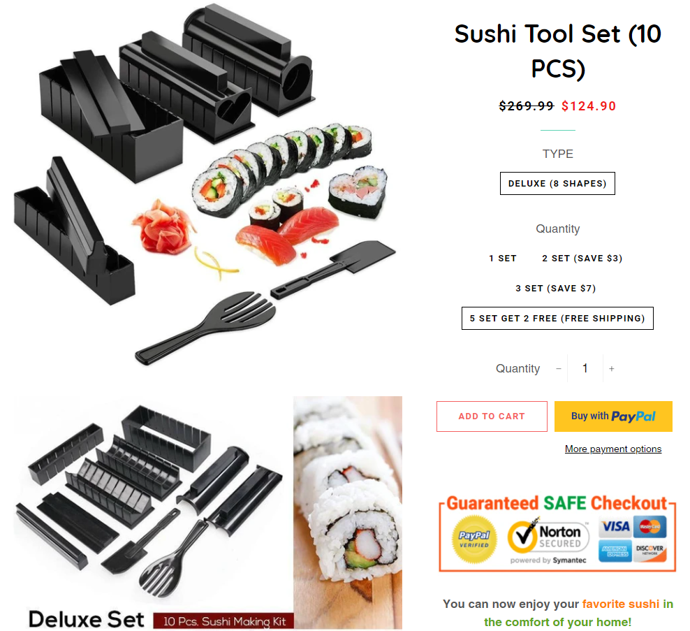
The product page:
The first thing that bothers me is the lack branding… It would’ve looked so much better if they just fake branded the product by using their store name or just a random name. Instead of just “Sushi Tool Set”, a better name could’ve been “Perfecto Sushi Tool Set”.
Make sure to be a bit more creatives with your product names the next time you sell an Aliexpress product.
Other than that, the description looks great and they got everything covered. They have great product pictures and stull like trust badges(which are a MUST) can be seen on the product page. Even the guarantees are there and this is something a lot of dropshippers forget adding to their product page.
But there’s a big NO-NO mistake they did here when they decided to skip on the review section for this product.
You have to understand that adding reviews to your product page is an absolute MUST because people who shop online rely a lot on reviews. A consumer review survey conducted by BrightLocal showed that the average consumer reads 10 reviews before able to trust a business.
Don’t be lazy – A few clicks and the reviews on the Aliexpress page can be imported to your store:
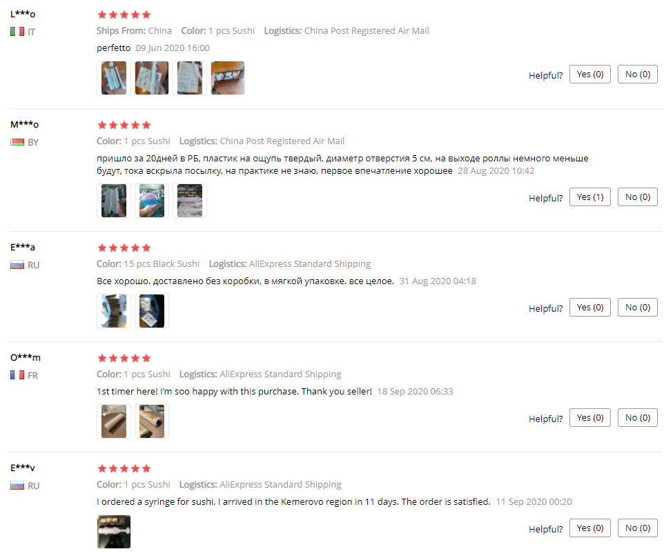
If you want to get more sales, then boost your average conversion rate by showing product reviews.
Another mistake, which some people won’t agree with me here, is keeping the “you may also like” product suggestion feature active on your product page:
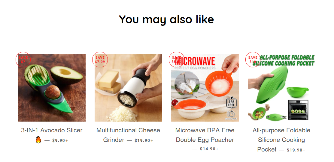
When I’m selling stuff online, no matter if it’s a general store or a one-product store, I want to make a sale as fast as possible. This means I do my best to keep my customer focused on that single product I was advertising on Facebook.
My plan is to convert my visitors as quickly as possible without any interruptions. In order to do that, I disable features like product suggestions so my customer doesn’t waste his time browsing different products.
It’s important to understand that we’re not Amazon – The chances of a customer coming to our store, adding a bunch of products to his cart, and then checking out is very low. In most cases, he’ll just browse a bunch of products and forget why he was on your store in the first place…
What I liked the most:
I liked it that he named the sushi set deluxe which makes the product sound more high quality, and the sushi set quantity discounts to increase his AOV(Average Order Value). He didn’t use a quantity discount app for this – He manually created 4 new variants and priced them accordingly.
He decided to go with free shipping only on the 5 set deal which I think is a mistake as he could get much more sales if there was free shipping already on the first set. Instead of $24.99 + shipping, $29.99 + free shipping would’ve sold much better.
IMPORTANT:
If you’re not sure about the price, you can always A/B test it – Duplicate the existing product page for the product you’re selling and make the change you want(like price, discounts, etc). Then when launching your campaigns, make sure you have another ad that points to the duplicated product page. Compare the results and keep the best one active.
The Main Page:
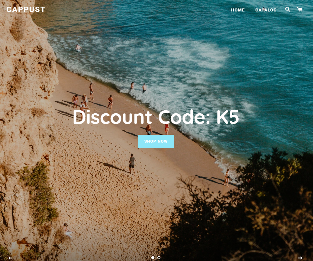
There’s not really much I can say about the main page… The logo is just a font, there’s this banner with a random code in it, and some products + product collections displayed. It’s a perfect example of a general store that drives traffic straight to a product page.
We do the same exact thing for our general stores too but we give a bit more attention to our store than these guys. A better logo is a must here and the banner needs to be replaced or better just removed from the front page.
Even if you drive traffic straight to the product page, a small portion of the customers will still visit your front page to see if you’re legit and to read some stuff like your F.A.Q. So invest a bit more time into making your front page look better and make sure to have all the necessary links & pages.
Important Links & Pages:

It looks like they have it all on their store but I don’t see a tracking page. I think that in 2020, a tracking page is a must have on every dropshipping store to make your customer feel safe ordering from you by showing them you actually deliver. It’s also easy and free to have one on your store by simply installing one of the free tracking apps found on the Shopify App Store.
3. The Checkout
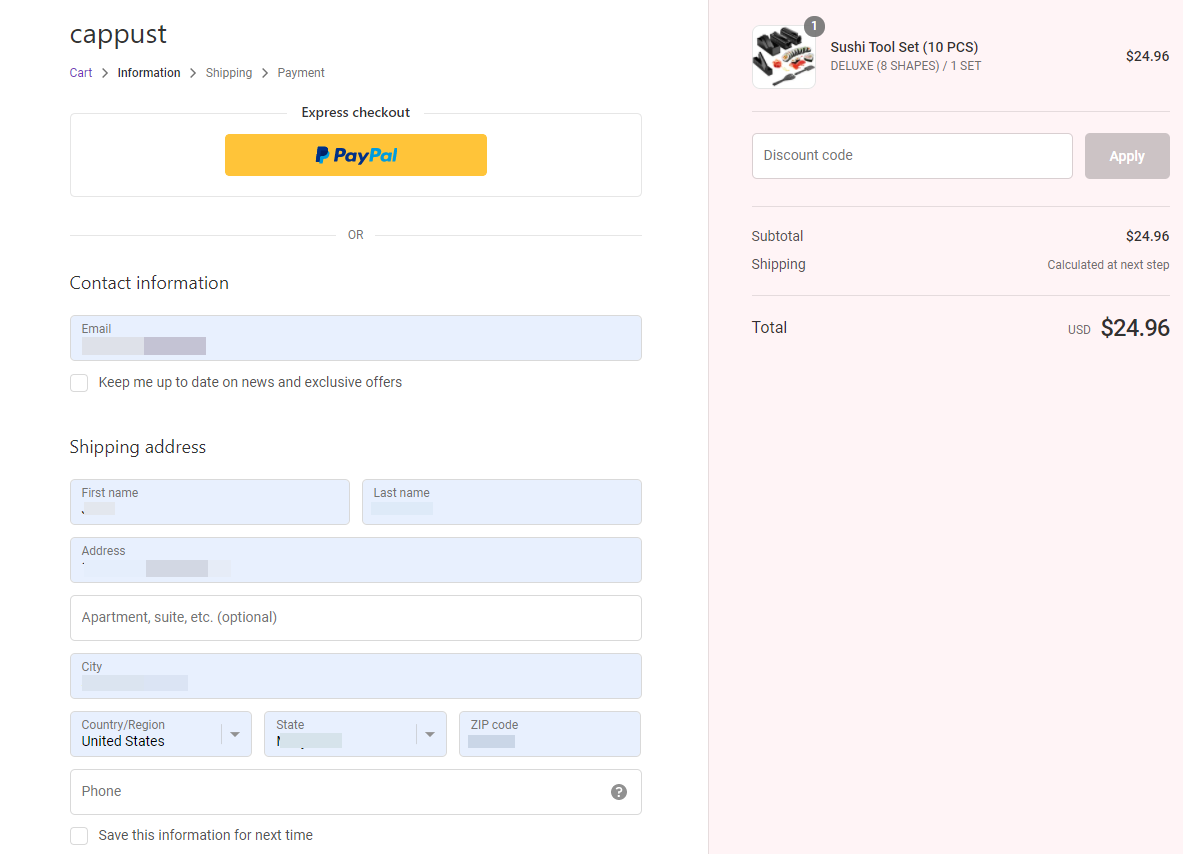
The Contact Information page:
Standard contact page with that bad logo on the top again – As always, I recommend having a normal logo on your store and adding trust badges to your logo on the checkout pages. Your customers will feel much safer to buy from you if they see a logo like that on your checkout pages:
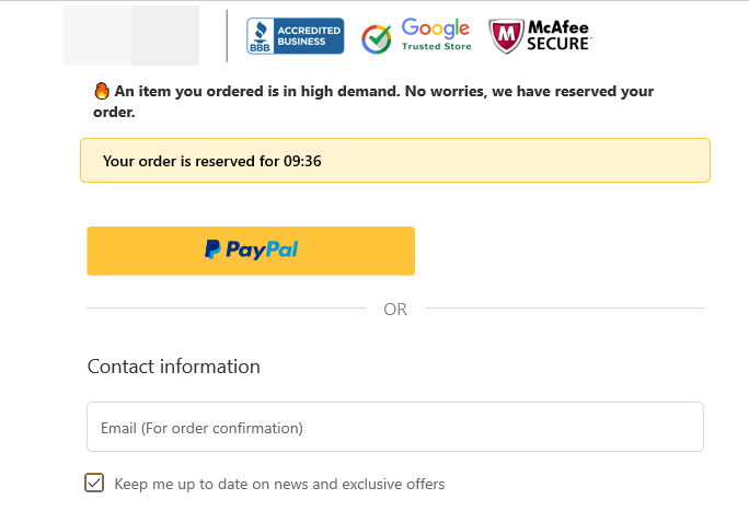
The blurred section is where you should put your logo.
Another mistake is making the phone number mandatory instead of optional:

Some customers don’t like giving out their personal phone number, so insisting on that can make you lose sales. I can understand a situation where a store owner has a plan to use SMS marketing to get more sales from his existing customers – In this case, and if you have a good SMS marketing plan, losing a few customers is worth it because you’ll be making much more money from the ones who gave you their numbers.
But if you don’t do that then why force your customers into giving their personal phone number? Let your customers decide if they want to leave their phone or not… In my experience, all packages arrive safely with or without a phone number.
The worst case-scenario – An attempt was made to deliver the package but no one was home so the delivery guy left a note saying it’s in the local post office or he will retry later. And there’s a phone number the customer can call to get more details.
The Shipping page:
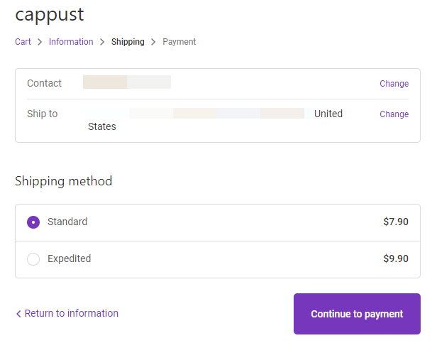
If you’re offering expedited shipping options, then you must let your customers know how much time it will take. I guarantee that most customers don’t bother checking the shipping page on your store, and even if you wrote it on your product page they already forgot about it.
Treat your customers like you treat small children – You have to chew up everything for them because they will keep asking the same questions again and again.
For example:
If there’s a FREE SHIPPING deal on your store, then you must display it everywhere: On the announcement bar, the product page, the product page title, the cart page, and checkout pages.
If there’s an expedited shipping option, then you must display it on the shipping page(information), product page, and checkout page(checkout: shipping section).
The Payment page:
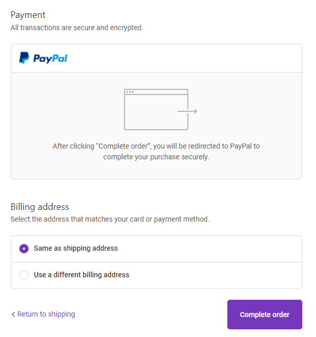
It looks like they’re only accepting PayPal which is fine and we already had good working dropshipping stores running on PayPal only. My only advice here is to let people know they can checkout as a guest with their credit cards without having an actual PayPal account.
This should be added as text on the Payment page right after the “All transactions are secure and encrypted” text, and you should also mention it on your product page.
To Sum It Up:
As you can see, this product wasn’t advertised the best way possible – There were a lot of tiny mistakes that definitely hurt their sales, and some big mistakes that made them stop advertising this product. All this leads me to believe the product hasn’t reached a fraction of its full potential.
So if you’re looking to make sales this Christmas, then get to work by creating a better ad, a better store, and start selling it now!
Good luck 🙂
Struggling to find good products to sell? Not sure who’s your target audience? Tired of losing money on products you were sure were “winners”?
Then Ecomhunt is what you need! Find hot winning products that are added daily, spy on their ads & stores and import them into your store in 1 click and Start Selling Today!
Must Read Articles:
- 4 Tips To Make Sales This Q4 – Get The Most From Christmas 2020
- [New Feature] Ecomhunt LIVE – Catch Trending Winning Products Before Anyone Else!
- How To Design Your Shopify Store Almost For Free

Daniel Aloni is one of the leading mentors in the Ecomhunt family. Daniel is a highly experienced Print On Demand seller with multiple 6 figures successful launches.




![Winning Product Alert - Sell This Sushi Maker This Christmas! [Full Ad + Store Review & Tips]](https://blog.ecomhunt.com/wp-content/uploads/2020/10/youtube-thumbnail-maker-with-triangle-graphics-933c.png)
