Another week and another amazing winning product recommendation!
This time it’s a Summer product for women and based on the engagement the ad receives on Facebook, they really LOVE this product and want to purchase it. If you’re looking for a Summer product to sell, this is the winner you’re looking for!
This product’s original seller has done ALL the possible mistakes with his ads and store, but he was still able to make some sales. Unfortunately for him, he is probably going to shut his ads really soon because of his mistakes.
Fortunately for you, I’m here to help you sell this product by pointing all his mistakes and how to fix them. I’m going to review the ad, the store, and basically everything there is about this product and give you valuable tips so you can take this product to the next level.
This product’s potential is HUGE so be quick about it and launch you ads to get the sales this product really deserves.
Enjoy.
1. The Product
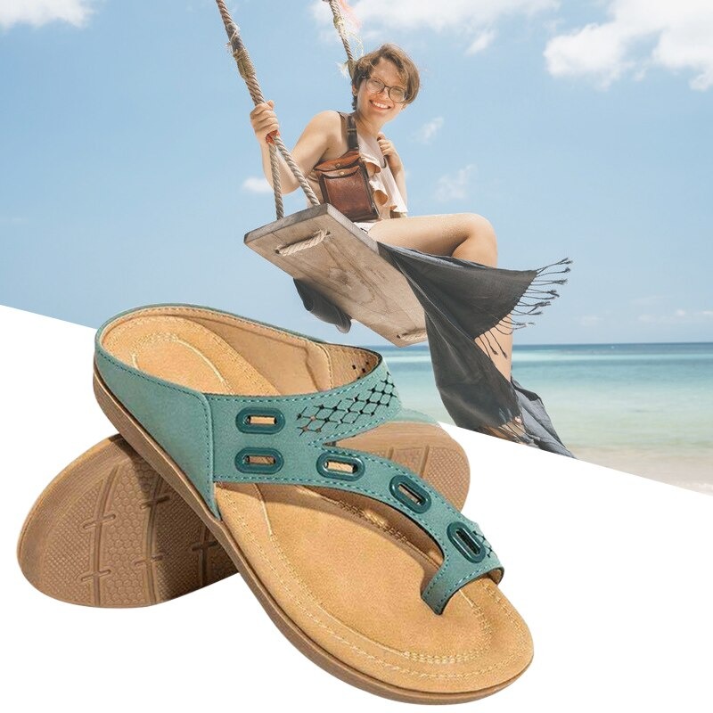
Today’s winning product are these super comfortable Summer sandals for women. The cold season is almost over and a lot of Summer products are beginning to trend worldwide. One of the trending products are these cute sandals I spotted on Ecomhunt and it looks like a hit amongst women.
These sandals are orthopedic(probably?), breathable, nice looking, and come in a variety of different colors so there’s nothing not to love about these. If you’re looking for the perfect Summer product to sell, make sure to jump on this product right now and launch your ads!
2. The Ad
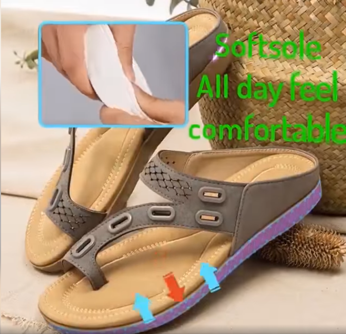
The ad isn’t really the best… It shows a few good shots of the sandals with some nice animation but the text description is really bad. It’s the Aliexpress style English which I hate the most and in some parts of the video, it doesn’t really make any sense.
There’s also no shots of women wearing/walking in these sandals which is a shame. If you want your target audience to feel more connected to your product, then make sure to put a person using the product in your ad.
There are also really bad shots that should be removed/edited like this one right here:
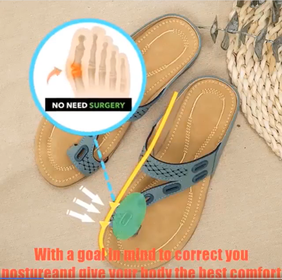
The text in this part of the video is horrendous and needs to be changed ASAP. It’s better to just skip a shot if you don’t know how to explain it to your audience.
And you also have the weird ending which I didn’t really like:

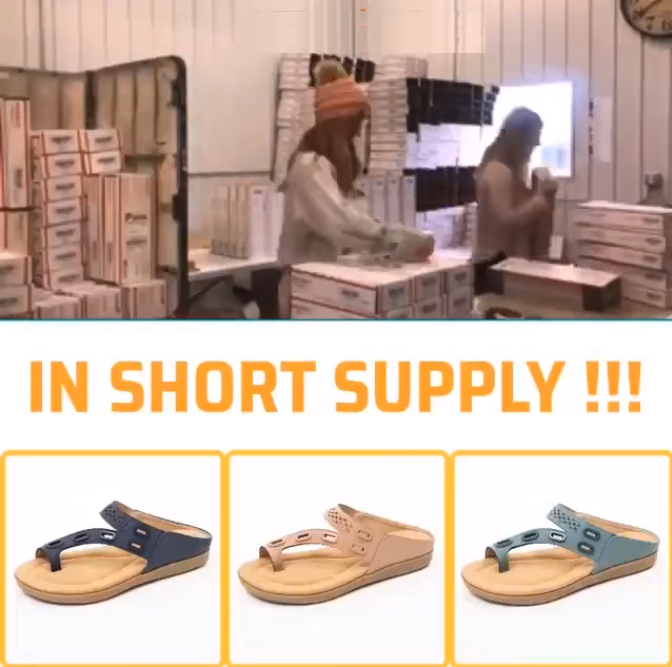
There are better ways to show you’re on sale than showing 3 loop shots of a woman moving her lips. And a simple call-to-action text would be better than showing random warehouse workers shipping out their stuff.
The ad copy:
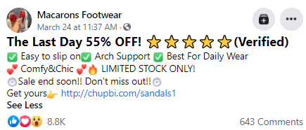
Too many emojis and bad English. This ad copy is a mess! And the link should be in the first 3 lines for your target audience to always see it. In this case, the link is only visible when clicking on the “see more” button.
Here’s an example of a better ad copy:
version #1:
“These orthopedic sandals are exactly what your feet need this Summer ?
Get yours here => *store link*
Super comfortable, stylish, and the first 200 customers get 50% OFF + Free Shipping!”
version #2:
“These orthopedic Summer sandals will make you feel as if you’re walking on clouds ?
Get your pair now => *store link*
Order yours now and get 50% OFF + Free Shipping – Limited stock, act now!”
Overall, the ad is pretty bad and you can easily create something much better. And if you don’t know how to create video ads, a simple $5 gig on Fiverr will do a better job for sure!
Photo ads work well too, so you can try that instead of video ads. ?
3. The Store
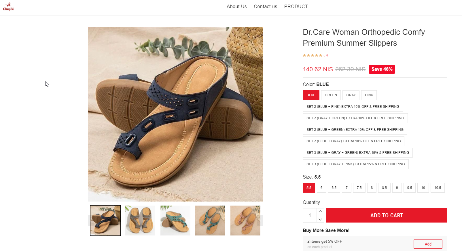
If you thought the ad looked bad, wait till you see the store…
The original seller made A LOT of mistakes here and I’m going to show it all so you don’t follow the same path. I am almost 100% sure his conversion rate is much lower than the industry’s standard, so he’s barely making any profit.
Pay attention to what I’m about to say here and you will be able to do a much better job.
1. Custom quantity discounts – Made by adding custom variants(not an app)
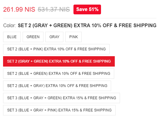
The first problem with these custom variants is that you can’t choose 2 of the same color and you can only choose from the options he gives you. The second problem, which is worse, is the same size for both sandals.
Imagine if a customer wants to buy these sandals for herself and another pair for her mom who wears a different size. No chance this discount will work and it only confuses the customer or makes her angry she can’t pick this deal.
Quantity discounts are better made with an app to allow your customers choose different variants for each extra product they pick.
2. Quantity discounts – Made using a Shopify app

Right below the Add to Cart button, we have yet another quantity discount offer and this time it’s made by using a Shopify app. If it were me, I would start with 10% discount on 2 items and add 5% for each additional item. I think a 5% discount for 2 pairs is a bit cheap and not tempting enough.
But the problem here is that you can’t control the size or the color which makes this quantity discount useless. Yet another useless add-on to confuse the customers…
3. Frequently bought together bundle
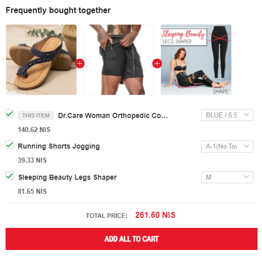
I always say that you must keep your customers focused on the product you sell by removing unnecessary distractions. Why? Because we’re not Amazon where people come to do their shopping sprees on. Your best bet is to get a sale as fast as possible and later you can try and sell more stuff to your already existing customers.
But if you still want to test some bundles and upsells, then at least do it the right way. Make sure the products you offer has some sort of connection to the one you’re selling. Try offering simple products with 1-2 variants max(like a mug).
And always keep an eye on how it affects your sales and if the bundle is worth it – A clean offer, with no interruptions, will make the checkout process much faster for your customers.
Back to our store review – In this case, the bundle is useless. We have men products in the mix and every product has it’s own unique size chart.
The bundle is also completely random and this was the second suggestion I got:
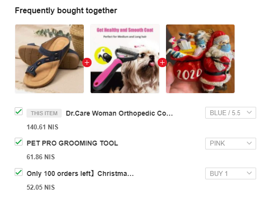
Completely random products. This just makes the store look unprofessional and no one is going to take this bundle! And this is even before we get to read the description – Think how much you have to scroll on your phone just to get to the product description. Terrible.
4. “People who bought this” product suggestions
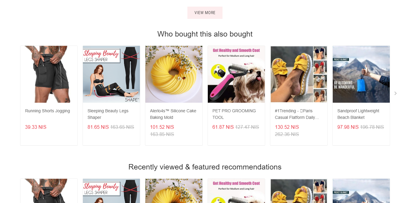
Another distraction from the product you’re selling – Like I already said, it’s best to keep customers focused on the product that brought them to your store. Stuff like this will take them away from your product and they will eventually exit your store without buying.
And another example is the collection list:

I have never reviewed a dropshipping store with so many distractions.
5. Reviews
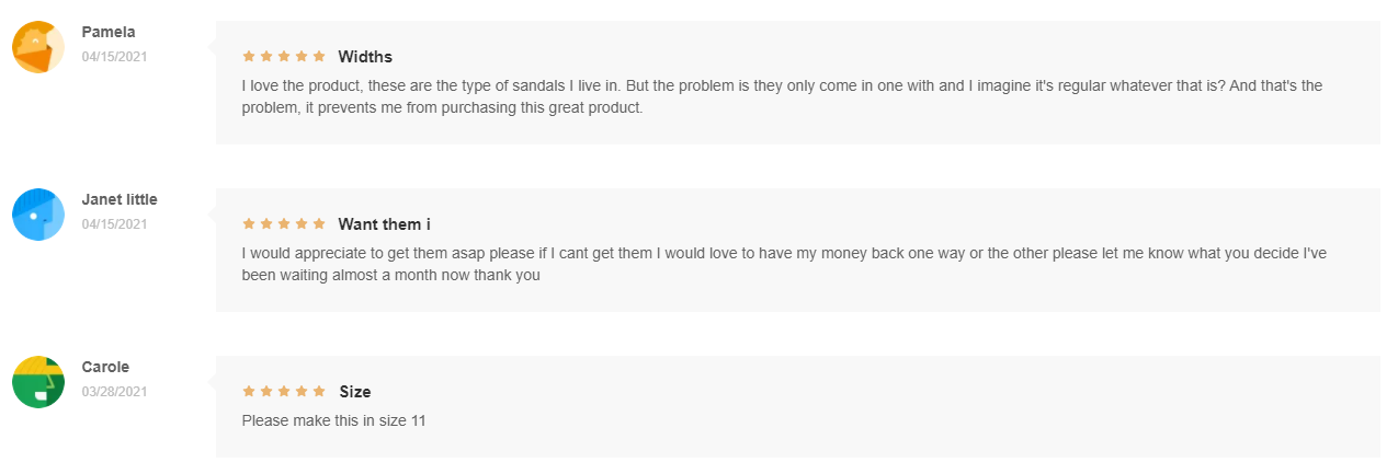
Reviews are your store’s social proof and its purpose is to show your customers that you are a legit business that delivers the goods. A nice looking review section with photos and good comments will boost your conversion rate, thus landing you more sales.
So a good looking review section is a must for each product you launch and you have to make sure it looks good and import reviews with as much photos as you can.
In this case, the seller has only 3 reviews which are not imported from Aliexpress. It looks like real customers actually left a review on his store and some of them are really not helping, like the one woman asking where are her sandals.
This is a really bad review section and it would be better for the seller to just completely remove it and keep it clean.
6. Description

The description has that Aliexpress English I hate and some really weird texts like the one you see above. Nothing to explain here as you all understand this isn’t good.
7. Footer

The footer is really dull and it could use a bit more personalization. A bit more text in the Get in touch section, deleting the default text in the newsletter section, and editing the spacing to make it even. The footer looks really bad…
4. Checkout
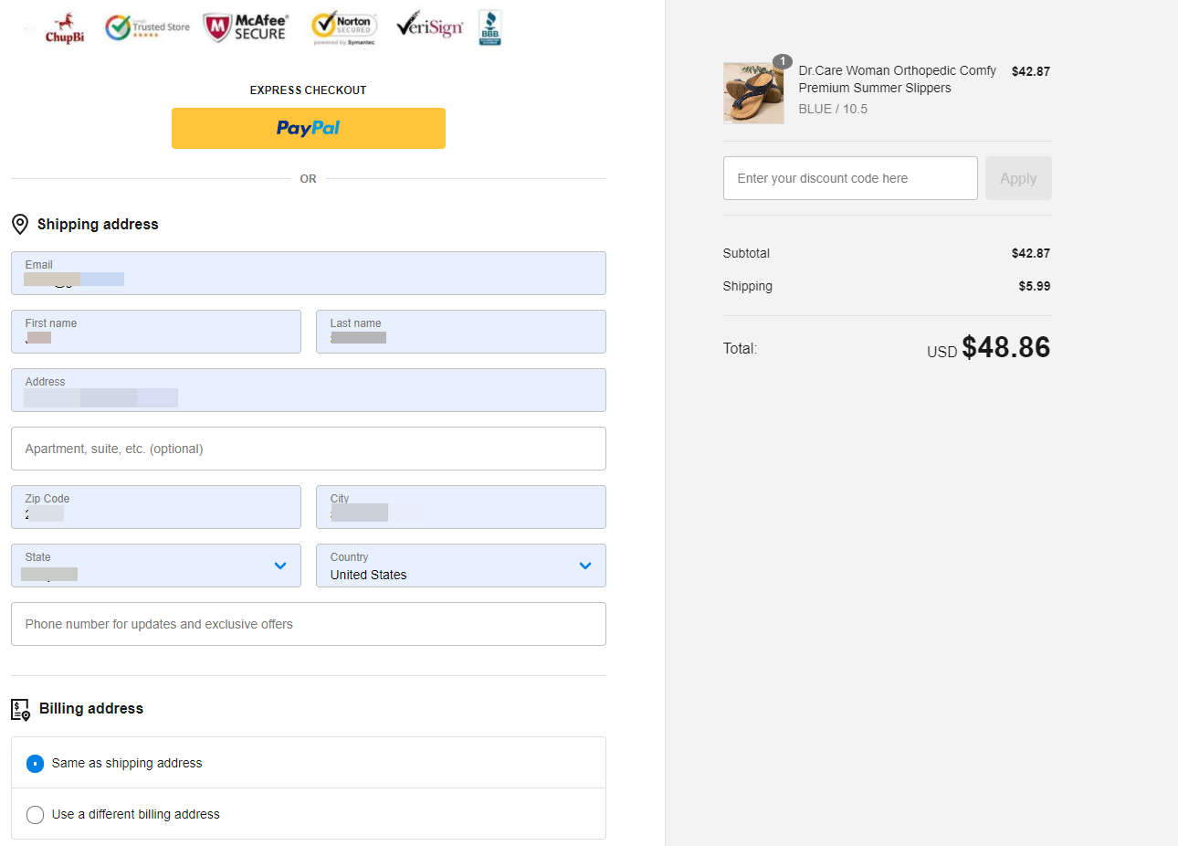
The checkout page is possibly the only thing that saves this seller and makes him not lose as much sales as he should. What we see right here is a custom one page checkout and not the regular 3-page Shopify checkout.
It’s no secret that Shopify checkout process could be much better and because of that some sellers move to custom one-page checkout to get more sales. One page checkout will always have a better conversion rate because there’s no need to constantly click NEXT to move to the next stage.
It’s all done in the same page and saves a lot of time for our customers.
If you ever land on a good selling product, consider moving to a one-page checkout to increase your conversion rate. It will require you to make some custom editing but it’s definitely worth it!
So our seller decided to use a one-page checkout and I couldn’t really find any big issues.

The only issue I had with this seller is the mandatory phone number which should have stayed optional. Some customers don’t like giving their phone numbers, even if it’s only for the shipping company, so they will leave your checkout if you force them to give you their phone number.
It looks like the seller only accepts PayPal:
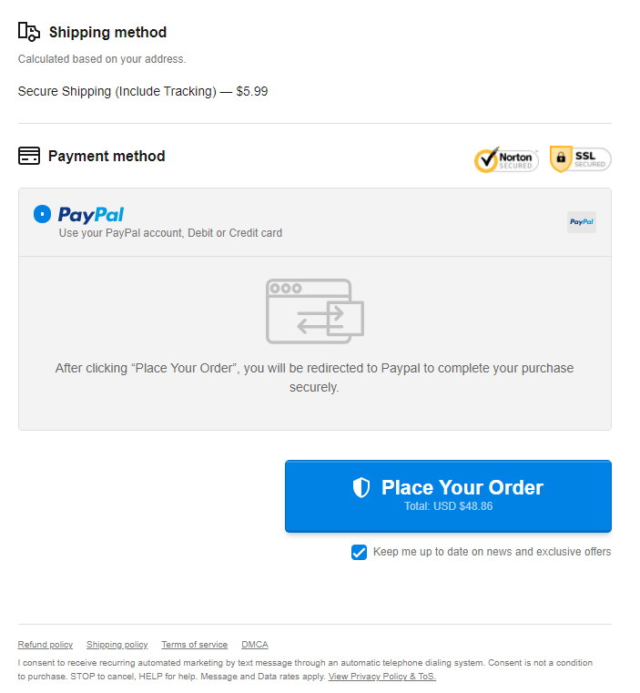
It reduces even more his conversion rate because there’s not stripe and some people don’t know you can checkout as a guest on PayPal. It would be better if he added extra text right under the Place your Order button where he explains that you can pay with your Debit or Credit card on PayPal too(without having an account).
To Sum It Up:
This seller could easily scale this product real big if he didn’t hurry with his store and actually took some time to make a good ad. His ad is receiving a lot of love on Facebook but that’s just about it and he’s probably close to shutting his ads.
Take this opportunity and launch this product on your own store with better ads and without making the same mistakes as this seller. This is a crazy winner waiting for someone to explode with it and make some real bank!
Good luck!
Struggling to find good products to sell? Not sure who’s your target audience? Tired of losing money on products you were sure were “winners”?
Then Ecomhunt is what you need! Find hot winning products that are added daily, spy on their ads & stores and import them into your store in 1 click and Start Selling Today!
Must Read Articles:
- How To Import Winning Products From Ecomhunt To Your Shopify Store
- 5 Reasons Why Your Dropshipping Store Is Failing – Part 2
- 3 Amazing Products I Found On Aliexpress That You Should Dropship Right Now!

Daniel Aloni is one of the leading mentors in the Ecomhunt family. Daniel is a highly experienced Print On Demand seller with multiple 6 figures successful launches.









but this product do not have a wow feature plus the problem solved by this can be solved by any other normal sandal. I’m little unsure about this product please guide me….
Not every winning product has a wow feature, sometimes it needs to be just seasonal like these sandals. The point is that you can never know before you test it and this product right here has already been tested by someone else.
It could be successful but you saw how many mistakes he did…
I strongly suggest testing this product 🙂
How to customize shopify’s one-page checkout? I can’t change my shopify
Hi Lelinta!
This only works with an external app as Shopify don’t have a 1-page checkout option built-in. You will have to probably install an external app and follow their installation guide to activate it.
I suggest doing so only if you already getting sales and looking to get a better conversion rate. If you’re just starting, it’s better to stick to the regular checkout and learn things. You can still get AMAZING results with the regular 3-page checkout flow.
Very good