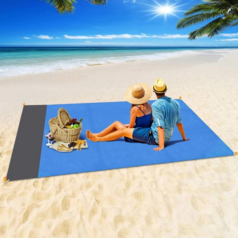
If you’re looking for a hot product to dropship right now, then you must check out this sand free beach mat which is selling like crazy on Facebook!
In this week’s article, I’m going to review the Facebook ad, the store, and basically everything there is about this product. On top of that, I will also provide tips and tricks on how you can take this product and sell it too.
From my experience, there ain’t a perfect store or ad out there so there’s always room for improvement.
Follow the tips shared in this article and take this product to new heights!
1. The Product
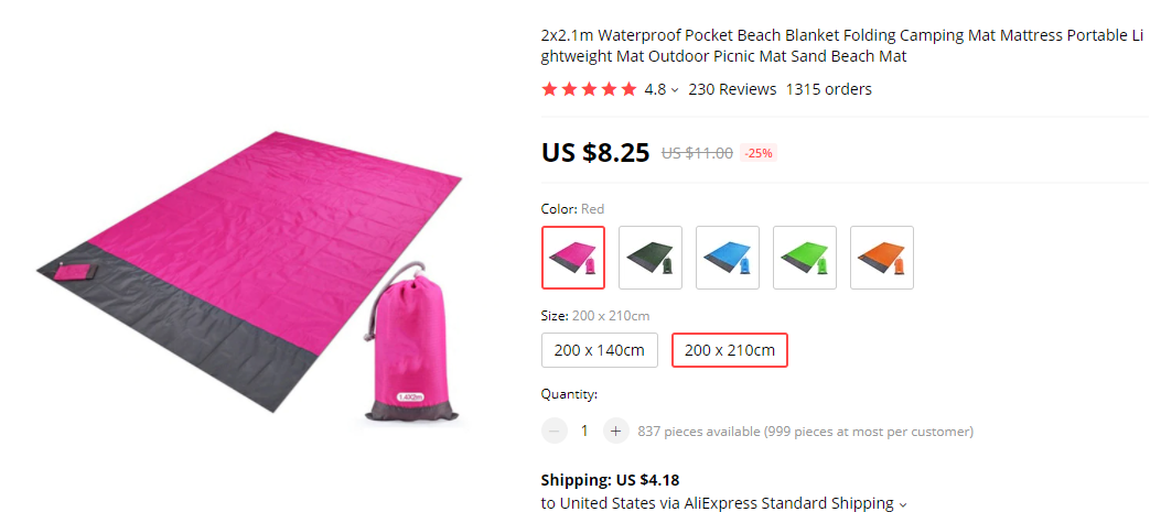
This week’s product recommendation is this awesome sand free beach mat I found on Ecomhunt. I guess people are getting excited for the Summer and hopefully there won’t be anymore harsh restrictions so people can freely enjoy the beach at least.
It’s a really simple product that kind of solves a problem by keeping the beach mat people sit on sand free. Looks like this product is cool enough for people to buy it and the best part is the pretty high profit margin.
Like I already said, people really want Winter to be over and Summer to come so this is probably what drives people to buy this product. Help them find this product more easily by running paid ads and start making sales too!
Now let’s see what the original seller is doing and review the ad, the store, and everything else around it.
2. The Ad
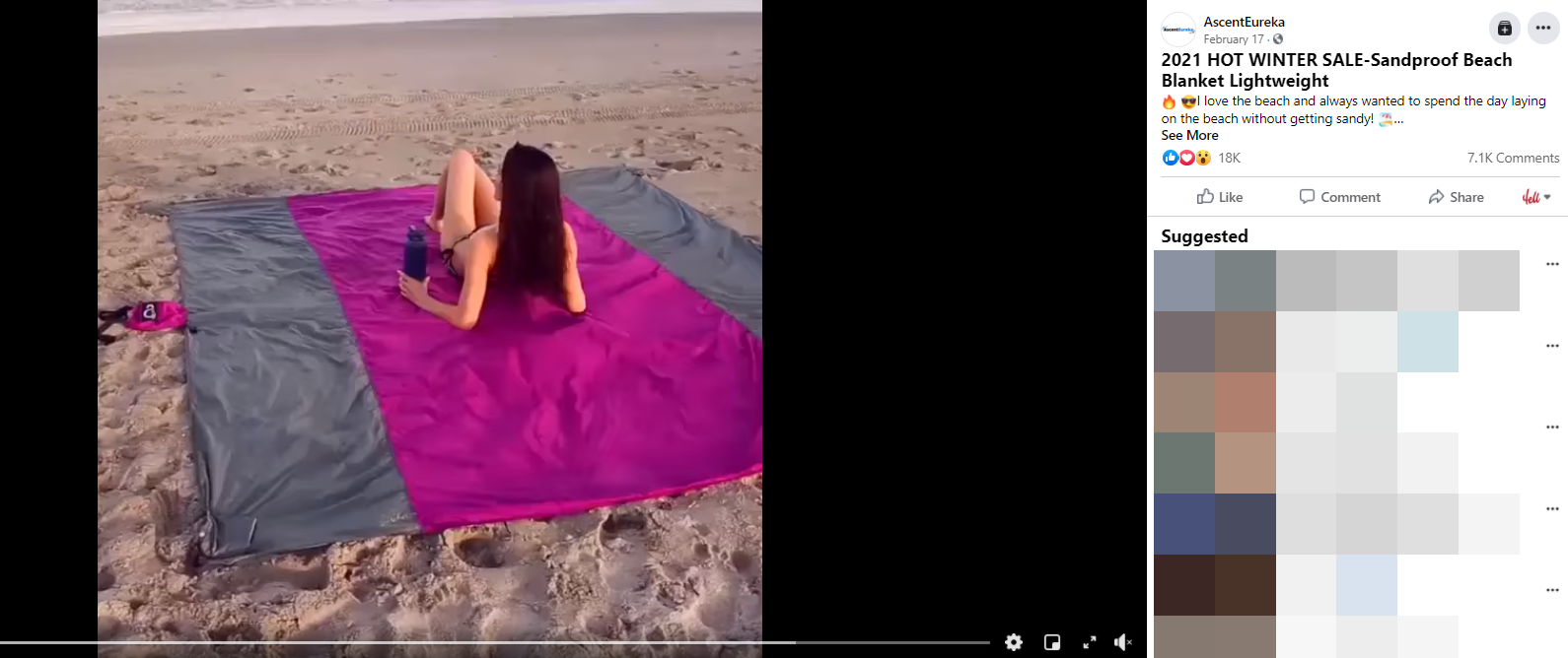
As you can see, the ad has an insane amount of engagement and people are really digging this beach mat. This product was posted on Ecomhunt about a week ago when it had 12k likes and now it has more than 18k likes and 2k more comments(from 5.1k to 7.1k)
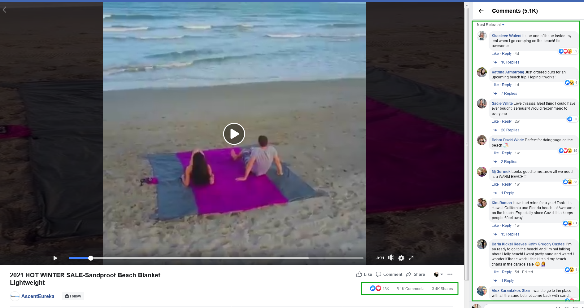
The ad itself is really basic with no special effects or any cool tricks. The music, the background, and everything else is done by the book, although there are still some things I would change. In my opinion, these changes might improve even more the CTR so feel free to use my tips if you decide to sell this product.
1. Start the video ad from the sand free part – The original video ad starts with a couple chilling on a windy beach and then shows a different shot of a woman securing the towel in the sand so it won’t fly off. Only after that, which is about 10 seconds into the video, we finally see the sand free feature of this beach mat.
I think this could’ve been shortened by at least 5 seconds and the video could begin either from the woman securing the beach mat or right away from the sand free footage. It’s a bit more “exciting” from the couple sitting on the beach and should bring more people to stop and watch the ad.
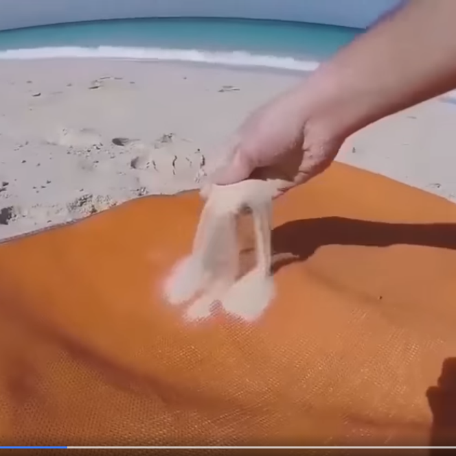
But who knows, maybe the first shot is what brought people some nostalgia and that’s why they stopped to watch the video. You decide ?
2. Add a call-to-action text – There’s no call-to-action text at the end of this video and it’s very important to have one. A simple “Order now and get 50% OFF” text is enough to make more people click on your product link.
BONUS:
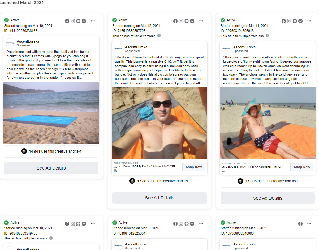
If we look into the ad library, we’ll see plenty of different ads the original seller is running and he/she are doing a great job! These simple photo retargeting ads are awesome and based on the number of active ads, it’s bringing a lot of sales to the seller.
Make sure to check out the ad library of every page you visit to see every active ad they run.
Ad Copy:
A standard review type ad copy where instead of explaining about the product, you just copy-paste an existing review and a call-to-action text. The review should be both short and have an explanation about the product, and it’s exactly what the seller did.
Some sellers like to add star emojis(to the ad copy or call-to-action button text) to make it stick out even more.
My only problem with this ad copy is that you have to click on the “see more” text to see the link that leads to the store. Even if there’s a SHOP NOW button, I still prefer the link to be visible all the time in my video description without having to click on “see more”.
3. The Product Page
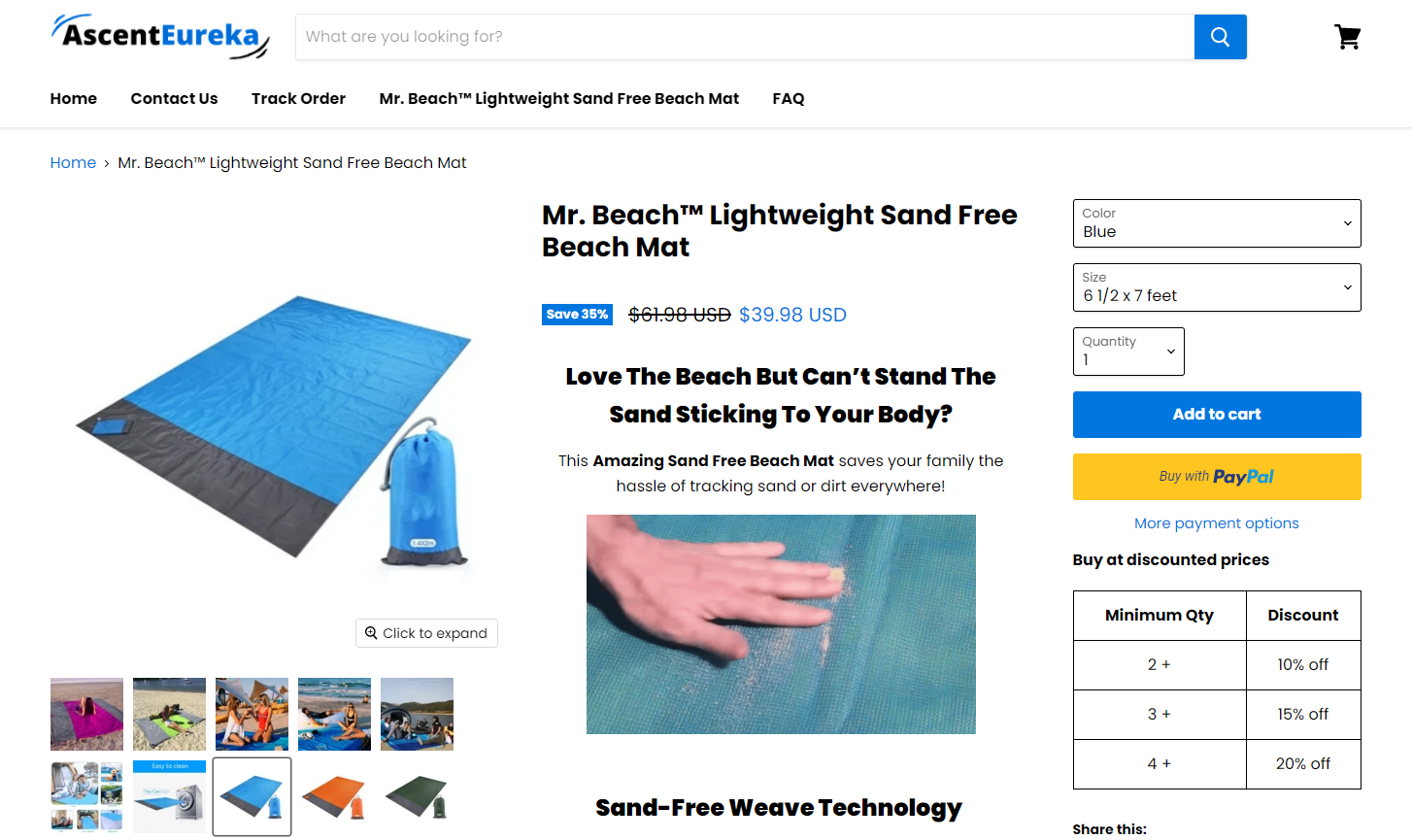
Their product page is almost perfect and I found almost no issues at all. They imported great product pictures, and there’s a picture/GIF for every feature this mat has in the description. The description is well written unlike the descriptions we find on Aliexpress.
But like I said, there’s still some tiny issues to fix:
1. Quantity discount:
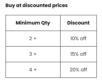
The discount itself isn’t the problem and the discounts offered are good(not being cheap), the problem is in the app/add-on the sellers is using. This app requires customers to manually add the number of products they want and you can’t just click on one of the options and go straight to the cart.
This doesn’t hurt the sales but it could potentially lower the AOV(Average Order Value). I believe the seller could’ve made a bit more money if he had an app installed that automatically adds the number of chosen products to the cart page together with the discount.
2. Frequently bought together bundle:
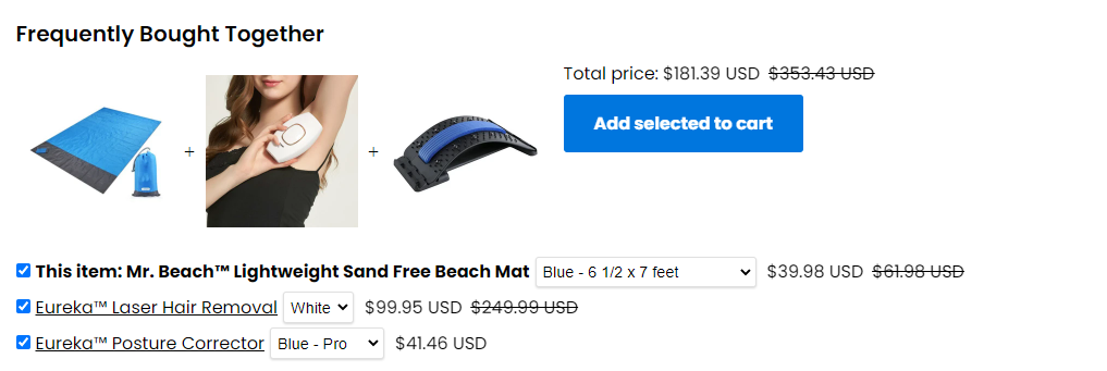
In order for these bundles to work and to increase your AOV, the products you offer MUST have some kind of connection. The laser hair removal product might be a bit connected(not really…) to our product as it’s needed for the Summer, but the posture corrector is completely random.
NO ONE is going to take this $181 bundle! It’s better to remove it entirely from the product page so it doesn’t interrupt the checkout process. It can only hurt your sales because now the customer’s focus is on a different product and not on your beach mat.
All these small interruptions can make you miss a sale so it’s better to close the initial deal as fast as possible and later you can sell them other stuff by using email marketing or more paid ads.
Remember: It’s much easier to re-sell to an existing customer than getting a new one.
3. Variants:
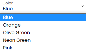
This is a beach mat we’re talking about and not a piece of clothing where offering more colors can help you make more sales. Offering too many options, especially on products like these, will make the checkout process slower because some of your customers will have a hard time choosing there preferred color.
This product doesn’t really need this variety of color and you can keep only the simple ones which is Blue, Pink(for the ladies), and Orange – 3 colors is enough with this product and it will be much easier for your customers to choose there color and proceed.
4. The sizes:
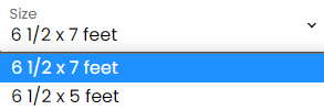
My problem with these sizes is not the same as with the colors… I just don’t see any reason to offer a shorter or a longer version of this beach mat, especially when there’s almost no difference between them.
I don’t want my customers to waste extra 20 seconds figuring out if they really need the 2 feet difference and if they should pay an extra $7 for it.
Just offer one size option and get done with it.
5. Trust badges & guarantees:
It’s not that big of a deal but it can still hurt your conversion rate if you don’t have payment/shipping trust badges, and if you don’t add any guarantees at the end of your product page. I usually add a small trust badge picture right under the Add to Cart button, and shipping information + guarantees at the end of my product description.
Other than that, everything looks great and they really did a fantastic job!
One more thing I want you to pay attention to is the review section where not only almost all of them have pictures and normal English, but they also made sure it looks legit by showing also 4 & 3 star reviews too.
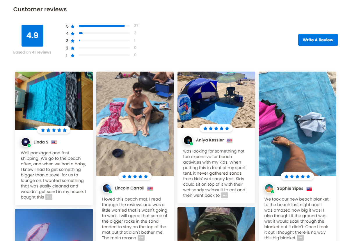
There review section is super inviting! I bet it adds a lot of trust to their store and increases the conversion rate.
4. Checkout
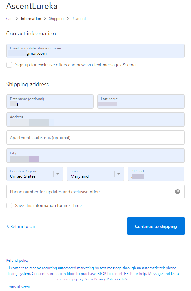
It’s a shame the owner of such a beautiful store forgets to update the logo on the checkout pages too. Here’s a quick example of a store that didn’t forget to add a logo to the checkout pages:
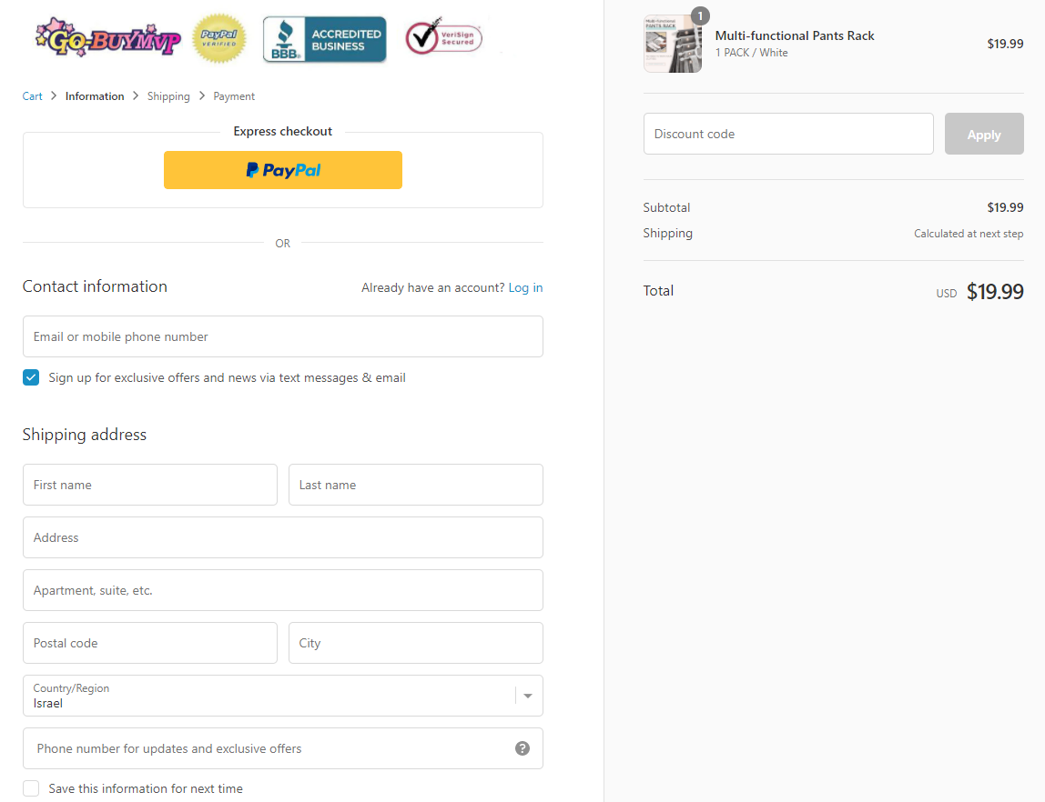
They even went one step further and added a few trust badges to make it look even better. You can follow this example and do the same thing on the next store you open ?
Other than that, there are no other issues but I did find a problem on their cart page.
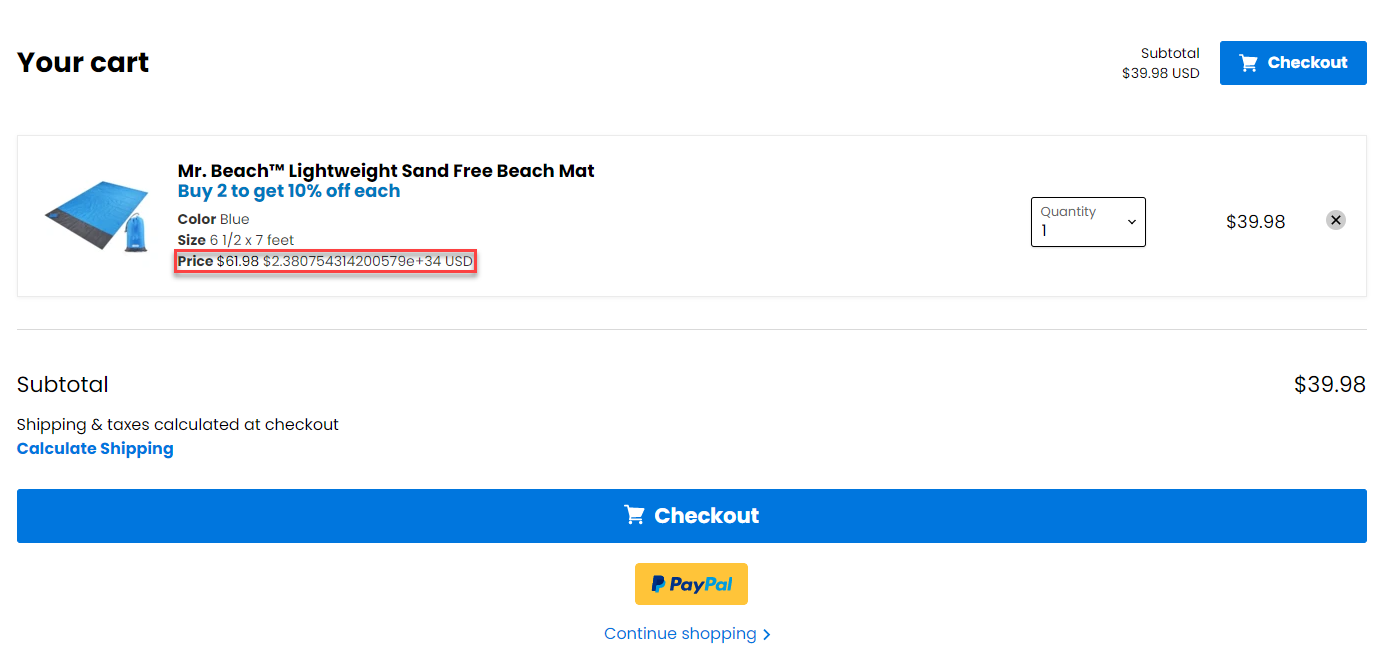
There are 2 issues here:
- When clicking on the “Buy 2 to get 10% off each” text, it transfers you back to the product page instead of adding another product on the spot. I have no idea if this is how the app actually works of if it’s just a bug – One thing I know for sure is that it shouldn’t happen.
- The price text(marked in red) has some random numbers going on there and it can confuse some customers and possibly drive them off. This is definitely a bug they missed that should be fixed ASAP.
Shipping page:
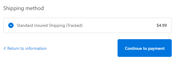
A standard shipping page with no real issues. It’s cool they added “insured” to make the customers feel more secure, but I think they could’ve just offered free shipping.
This product has a good profit margin so they should at least test the free shipping option to see if it’s working better.
Here’s a simple trick to A/B test a product on your store without editing it live:
You can take the current product you’re selling and duplicate it on your store. This way you can set up different settings to it like making the shipping free or changing the price so you don’t have to test it live and possibly ruin a good selling product.
Once you have a copy with different settings, you can simply run the same traffic to it(cold traffic or retargeting) and see which product page converts better.
Payment page:
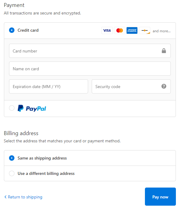
Payment page looks fine with both payment options being active. The one thing that could be changed here is the “Pay now” text on the button which is a bit too aggressive in my opinion. I would change it to something like “Complete your order” and maybe even change the color to green instead of blue.
To Sum It Up:
In this case, there weren’t too many mistakes done with the store so their conversion rate is definitely good. But the ad can be easily upgraded to look much better AND the audience is just huge so there’s enough room for everyone to get in and start selling now.
You also don’t have to sell to the USA and can go for sunny countries as well so make sure to jump on it right now and make some bank.
Good luck!
Struggling to find good products to sell? Not sure who’s your target audience? Tired of losing money on products you were sure were “winners”?
Then Ecomhunt is what you need! Find hot winning products that are added daily, spy on their ads & stores and import them into your store in 1 click and Start Selling Today!
Must Read Articles:
- 5 Facebook Ad Mistakes You Should Avoid Doing
- Top 5 Niches To Dropship In 2021
- Why You Shouldn’t Scale With Aliexpress

Daniel Aloni is one of the leading mentors in the Ecomhunt family. Daniel is a highly experienced Print On Demand seller with multiple 6 figures successful launches.


