Another week and another amazing winning product recommendation!
This time I found a product that went viral on Facebook and to my surprise it runs a single photo ad and that’s it.
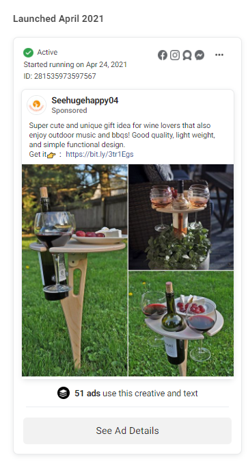
No video ads or story ads, just a single good quality photo ad that was taken from Aliexpress with no edits at all. I love this product not only because it’s really cool, but also because it shows that photo ads still work and you shouldn’t just launch video ads for all your products.
On top of that, the original seller didn’t launch a video ad for this product so it’s your chance to launch one and see if it explodes even more!
In this week’s article, I’m going to review the ad, the store, and basically everything there is about this product and give you valuable tips so you can take this product to the next level.
Although the ad is pretty much perfect, I found the store to not be in a good shape so this product isn’t getting the REAL sales it deserves.
I’m also giving you 3 targeting suggestions to help you out even more with your campaigns!
Enjoy.
1. The Product
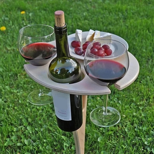
Today’s winning product is this chic wine table which is perfect for the Summer! It’s a really cool product for people who love outdoors wine-cheese picnics, especially now when it’s basically the only way you can eat outside with all the COVID-19 limitations.
Wine lovers are going crazy about this product so make sure to test it right after you finish reading this article!
2. The Ad
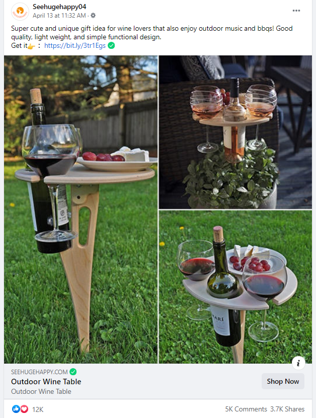
I’ve always been a fan of photo ads and I still believe a lot of products you see on Facebook, even the complicated ones, can sell really well if you have a good photo of a product you’re selling. This product is an example of a great working photo ad and I’m glad I have the chance to show it to you.
The good things about photo ads is that it doesn’t take too much time to prepare one and you can almost instantly run your ads after importing the product. It also require minimum editing skills to work unlike with video ads.
The seller of this product just used the photos provided by the Aliexpress seller and launched his ads – Just like that and he was able to generate a lot of buzz around this product and the engagement is pretty insane. Also the amount of comments on this product are much higher than average which makes me believe this product is doing really great.
Still, this doesn’t mean you should run only photo ads – Make sure to test all possible creatives because you can never know which one will perform better. I believe this product can also work really well with a video ad so prepare one if you decide to test it.
Ad review:
There’s not much I can say about this ad… The photo ad is almost done for you and you can find a copy of it on the Aliexpress sale page. I love that it shows 3 pictures in different settings and it’s also the same way I use to prepare my photo ads.
The quality is great thanks to the Aliexpress seller so for me it’s just perfect.
Ad copy review:
I absolutely LOVE the ad copy! A single like of text explaining exactly what this product is about with a call-to-action. No bullsh*t, no emoji spam, just how I like it. 9.9/10 only because I expected to see a wine glass emoji somewhere in the ad copy or in the title of the product ?
3. The Store
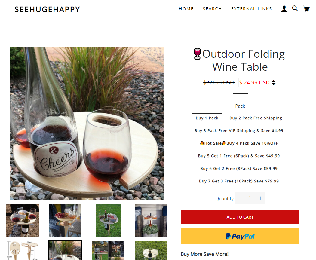
This is where things get a bit more tough and from a perfect ad we go to a store with some conversion killing mistakes. The store in general isn’t bad and he’s definitely getting sales, but there are some things that could be confusing the customers and making it harder for them to order.
Here are some of the mistakes I spotted:
1. The packs
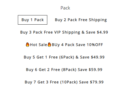
In my opinion, these packs are really confusing and there’s too much of them. The first two packs are standard with a free shipping discount if you buy 2 tables, but the rest of them will make it difficult for the customers to choose from.
You have a VIP shipping option with a $5 discount, a 10% OFF if you buy 4 tables and no mention about shipping, then a buy X get Y free promotion, etc. It’s just too much and I don’t really see someone picking 7 tables just to get 3 more for free.
I would just go with the first 3 packs and editing the last pack to show it as Free shipping(not vip) + 10% discount. Don’t make it too hard for your customers to choose because they can end up not buying anything at all.
2. The quantity discounts
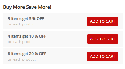
Right below the packs and the Add to Cart button, there’s a new quantity discount table which offers completely different discounts from the packs. Again, this is confusing and I don’t see any need in this table when he have already the packs to choose from.
The discount are also pretty lame(only 5% for 3 tables really?) so this section should be removed. Or you can remove the packs and keep the quantity discounts live.
3. The bundles
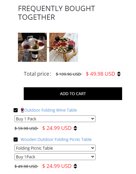
Let’s confuse our customers even more by offering a bundle, on top of the discount packs & the quantity discounts, and place them all before the product description. The customer didn’t have the chance to read more about the product and he’s already bombarded with a bunch of super random discounts. On top of that, these products almost look the same and the picnic table has packs too with the same discount style.
By now their customers are losing their mind and I bet my money on it that some of them just walk out because they don’t have the time to think what discount to pick. This bundle is useless and I would remove it completely.
They have no reviews but nothing they can do about it because I didn’t find any to import on Aliexpress. The logo though needs a normal design as it’s text only. I also don’t like the name of the store but it’s my personal preference.
Other than that, the product page looks fine with a nice description.
4. Checkout
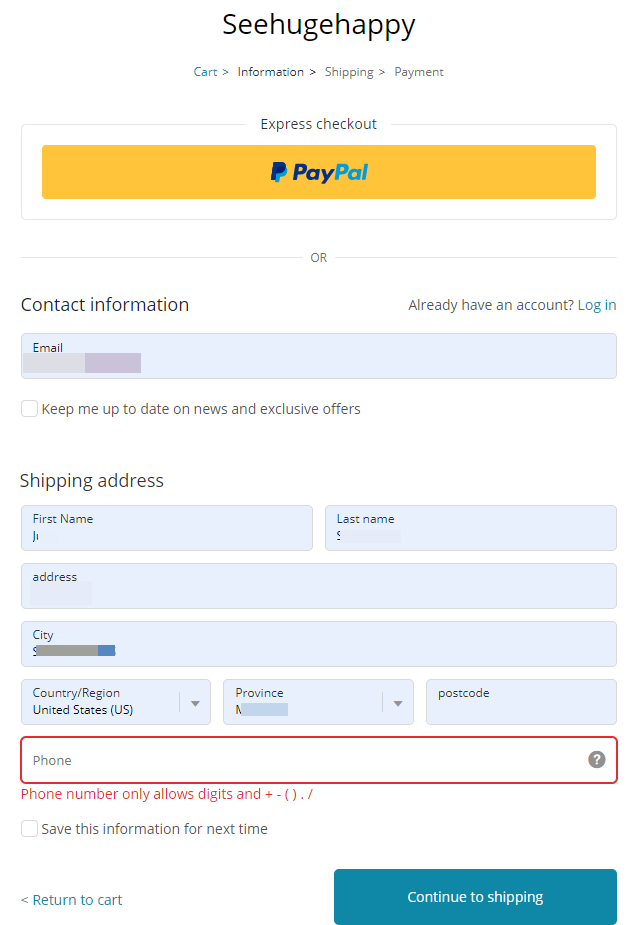
Well the store doesn’t have a normal logo so the checkout page will not have one too. A logo is not a big investment and every dropshipper out there needs to make sure he has a decent one designed and live on the store. And of course, upload it both on the front page and the checkout pages.
The phone number is mandatory for some reason which isn’t a good thing unless you plan on doing SMS marketing. Some people don’t like giving their phone numbers, even if it’s only for the shipping company, so make sure it’s set as optional.
Shipping:
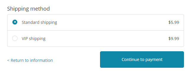
I didn’t find any information on their store about shipping times and here they offer 2 shipping methods with not even a clue about the time it will take to arrive. They probably see it as a method to get more money, but what I see again is a confusion obstacle which can make customers leave your store without buying.
If you offer different shipping methods, then at least let people know about the shipping times both in the shipping information page and your product description. You can also add the shipping times for both methods in brackets so it will also appear again on the shipping checkout page.
If it was me, I would just go with a Free Shipping option on all of my orders and be done with it. Gives my customers less to think about and gets them faster to the payment page ?
Payment:
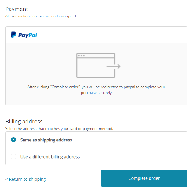
PayPal is the only way they accept payments so they should at least add a short line of text that you can checkout with your Debit or Credit Card without having an actual account on PayPal. So people who only have credit cards know they can pay without creating an account. This should increase the conversion rate a bit.
5. Targeting
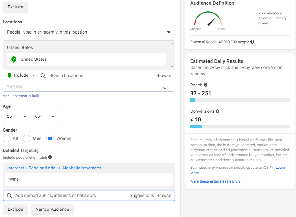
I decided to help you out even more by adding 3 targeting suggestions – Targeting wine lovers isn’t difficult and there are PLENTY of interests to choose from on Facebook. The first option is just to target a big interest such as Wine(see picture above) and let Facebook do its job.
I always have at least one big general interest in one of my adsets, and for the rest I like to mix it up a bit.
Targeting example #2:
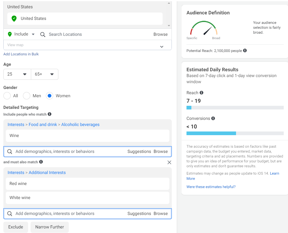
I layered it down and added 2 wine types to make my targeting a bit more precise and help Facebook pick up the real wine lovers.
Targeting example #3:
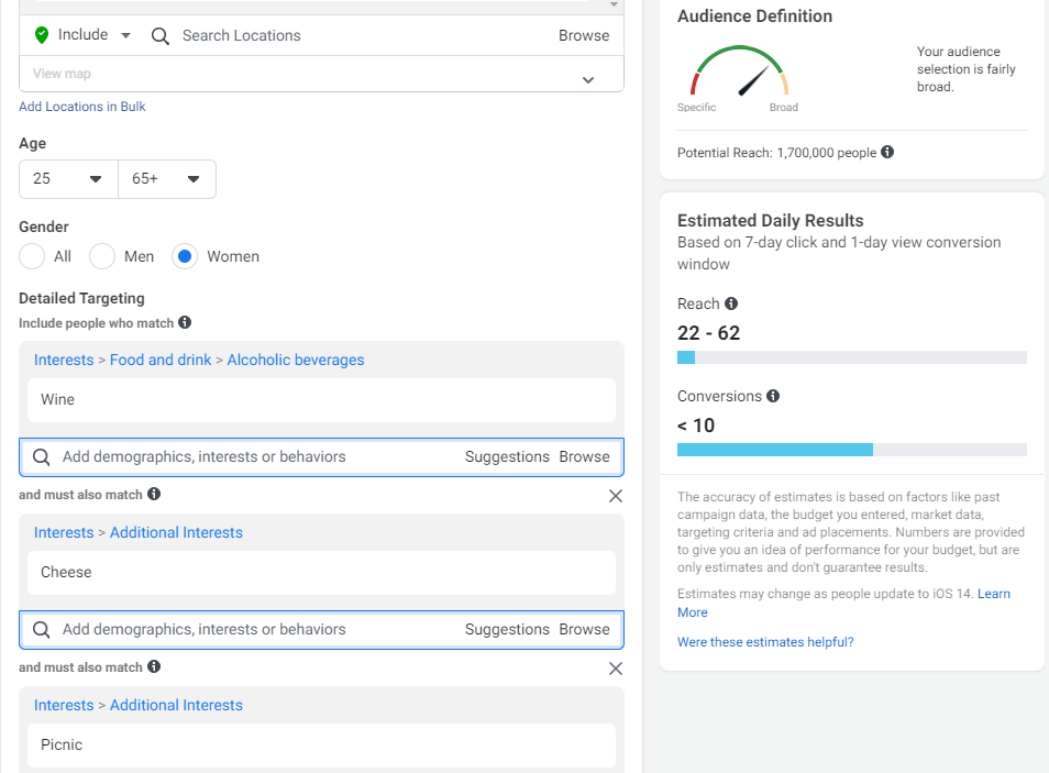
Here I decided to mix it up a bit and add cheese and picnic into the mix. Facebook will definitely find the right people from this audience who will like my product. I think this targeting option is the best one!
I also think targeting women 25+ is the right choice for this product and I will move to men only if I get good results with women first.
To Sum It Up:
As you can see, photo ads work really well so don’t test product only with video ads. This is a great product with a great ad, but the store isn’t the best so I believe the original seller lost a bunch of sales because of these mistakes.
And even if his store was perfect, the audience is HUGE and there’s a room for everyone to make money here. Create a different photo ad or a video ad, don’t do the same mistakes as this seller, and start making sales!
Good luck!
Struggling to find good products to sell? Not sure who’s your target audience? Tired of losing money on products you were sure were “winners”?
Then Ecomhunt is what you need! Find hot winning products that are added daily, spy on their ads & stores and import them into your store in 1 click and Start Selling Today!
Must Read Articles:
- 4 Small Tweaks You Can Do On Your Shopify Store To Build More Trust And Increase Sales
- How To Import Winning Products From Ecomhunt To Your Shopify Store
- 5 Reasons Why Your Dropshipping Store Is Failing – Part 2

Daniel Aloni is one of the leading mentors in the Ecomhunt family. Daniel is a highly experienced Print On Demand seller with multiple 6 figures successful launches.






I really appreciate you guys and you motivate me to redo my Shopify store.