We probably reviewed thousands of dropshipping stores here on Ecomhunt and it’s always the same stuff people forget. Some of these changes are small but each and everyone of these will make your life much easier! If it’s to increase your overall conversion rate by making the checkout process much faster, or by saving you some money along the way.
In this week’s article, I’m going to show you 5 changes a lot of new and even advanced dropshippers forget doing.
So make sure to read it so you don’t make the same mistakes 🙂
1. Setting The Phone Number As “Optional” On The Checkout Page
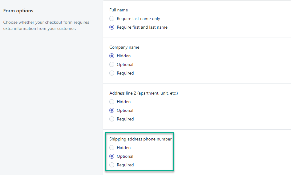
The last time I checked, Shopify default option for the phone number on your checkout page is still “Required”. This means customers cannot proceed with the checkout process without a phone number. It may seem as a logical thing to do because in most cases, the phone number will be used for shipping only purposes.
If the package couldn’t be delivered, the shipping company can always contact the customer and decide on a different delivery date or ask him to pick it up from the local post office. So it’s a really good thing to have a working phone number just in case something goes wrong.
But what if the customer doesn’t want to give his phone number?
Telemarketers, SMS messages, etc, are considered to be the worst type of spam you can receive so there are A LOT of people that prefer keeping their phone number private. And if you force them and they really don’t want to give up their number, then they will simply leave your store without buying.
It’s not like they’re buying something they can’t live without… In most cases, it’s just some casual stuff that costs $30 so they’re not going to risk their phone number for it. They’ll just leave your store without buying and search for a different store that doesn’t require a phone number(if they really want that product).
Having explanation texts that the phone number is only used for shipping updates can help, but it won’t help you if they don’t like giving their phone number away. So make sure change the phone number field from “Required” to “Optional”.
Important:
Some payment processors require a working phone number in order to process payments so you don’t really have a choice, and you have to set the phone number field as required. I know this isn’t the case with PayPal or Stripe and I only use those two so I have no idea which ones actually require a phone number.
If your payment processor is requiring a phone number then:
- Try switching to a different payment processor that doesn’t require a phone number.
- Don’t panic! Let people know it will only be used for shipping updates and they’re not going to receive any spam messages. If your product is good, people will buy from you even with a required phone number. Keep it up and make sales!
So if you can change to a better payment processor like Stripe it will be great! If not and you’re stuck with a payment processor that requires a phone number, then just keep selling as usual and don’t worry too much about losing customers. A good store with a good product will deliver sales with no issues 😉
Note:
Some sellers keep the phone number for SMS marketing and it’s for you to decide if you want that. In this case, make sure you test things out and see which option is better. You may receive less sales with a required phone number BUT the sales SMS marketing will bring you in the future will be worth it.
2. Changing Button Text & Colors On Checkout Page
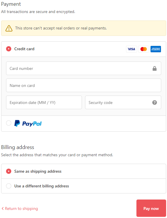
This may seem like small thing and you can even call it nitpicking but the buttons color and the text they have REALLY do matter. A lot of new dropshippers often do these mistakes and I’ll divide them right now into 2 parts.
Buttons color:
Every color means something – It’s not by chance that when companies advertise a deal, they use a bright red color. Or decide their logo will have only 2 colors in it. They do it because it has influence over us. We see colors as emotions and each color brings a different emotion in us.
Most of the “Add to Cart” buttons you will see are green so it will be smart to follow the same strategy and use the same color. Even if your logo is orange and it goes against your theme, green button will always work better than an orange one.
So remember to choose the right color AND have the same color everywhere(some sellers forget to edit the button color on their checkout page).
Buttons text:
The button text is important too – Take a look at the screenshot above I took from a random Shopify store I found. For some reason, the default text on the last checkout button on Shopify is “Pay now” and it’s a bit aggressive. I have no idea why Shopify does that but this button text sucks…
Instead, you should rename it to something that sounds much better like “Complete your order”. You button text and color needs to express a positive vibe and not sound like some sort of order “pay now!!!”.
3. Mentioning Your Deals Everywhere Possible On Your Store
Most of the dropshipping stores I reviewed offered Free Shipping on every order, but the issue is when I found some contradictions when I was trying to checkout. You visit the product page and there’s an announcement bar saying shipping is free. On the product page, there’s a small text saying free shipping for a limited time only.
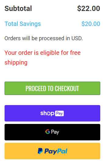
BUT then you add the product to the cart and on the cart page, there’s a completely different text! Instead of “Free shipping is applied” or “Your order is eligible for free shipping”, there’s the default Shopify text “Taxes and shipping are calculated at checkout”.
Now what do you think the customer who received a promise for free shipping only 10 seconds ago is thinking?
He’s probably a bit confused that’s for sure! You need to treat your customers like you treat little kids and that’s by keeping things as simple as possible. If you offer free shipping, check every page on your store to ensure there are no contradictions. Mention your deals everywhere, don’t let them doubt for a second they will not get the deal that was promised!
So instead of the default “Taxes and shipping are calculated at checkout” text, change it to the text in the screenshot above. There’s also the default text on the checkout page which says “shipping – calculated at checkout” which you can change too. Change it to something as simple as “Free Shipping” so they don’t get confused 🙂
4. Manually Capture Payments For Orders

I think the default option on Shopify is still automatic capture so do yourselves a big favor and change it to manual. This option is to save you some money in case you’re out of stock or you can’t process the order.
As you probably heard, Once you refund a customer, PayPal, Stripe, and other companies no longer return back the commission they have taken from you. So if you capture payment automatically, you’re going to lose a few dollars.
Now imagine you’re scaling and suddenly your supplier is out of stock so you have to cancel 50 orders? That’s a lot of money in commissions which you’re about to lose. But if you capture the payments manually, you can just cancel the orders and you’ll lose nothing.
5. Disabling The Add to Cart Notification
On my general dropshipping store where I test products, my sole focus is to get sales and fast! I don’t have dreams about being Amazon and thinking people will add the product I advertise to their cart and continue shopping. Then proceed to checkout with 10 products in their cart page…
This is a dream and unfortunately a lot of new dropshippers think this is how customers will behave on their store. So instead of transferring the customer straight to the cart page, they just notify the customer the product was added to their cart thinking he’s now going to continue shopping and spend more money.
In reality, it gives your customer more time to think if he wants to buy this product while he checks other products on your store. And this is a big NO-NO because thinking is BAD. Your customer needs to checkout as fast as possible without any interferences.
Remember:
It’s much easier to convert an already existing customer than a new one.
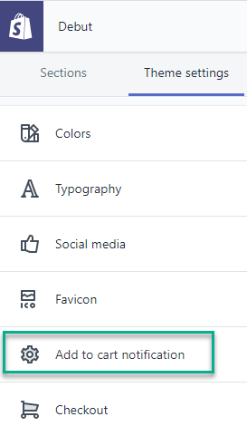
Focus on getting that first sale and worry later about increasing your AOV or selling other products on your store. To transfer the customer straight to the cart page, go to theme settings like you see in the screenshot above and click on “Add to cart notification”.
There just un-check the notification box:
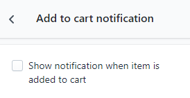
That’s it! Now your customers are going straight to cart after clicking the “Add to Cart” button.
To Sum It Up:
To get sales, your product, ad, and store need to be perfect! As small as some of these changes are, I guarantee that doing these will increase your conversion rate and save you some money.
I hope you liked this week’s article and let me know if you have any questions in the comments below.
Good luck 🙂
Struggling to find good products to sell? Not sure who’s your target audience? Tired of losing money on products you were sure were “winners”?
Then Ecomhunt is what you need! Find hot winning products that are added daily, spy on their ads & stores and import them into your store in 1 click and Start Selling Today!
Must Read Articles:
- Ecomhunt Store Reviews – A Pawsome Pet Niche Store Review
- How Much Ads Money Do You Really Need To Start Dropshipping?
- Use These 2 Methods To Get Traffic And Sales For Free – Zero Investment Dropshipping

Daniel Aloni is one of the leading mentors in the Ecomhunt family. Daniel is a highly experienced Print On Demand seller with multiple 6 figures successful launches.






Very powerfull blog, Thanks for that!
Can you give me a quick review about my store please! I will appreciate that so much.
http://www.heragoods.com
Have a good week.
Kind regards,
Thep
Hi Daniel,
I followed all your advise, thank you!
Stay safe and God bless!
Charelle
PS. Can you also please check my store if I’m missing something? Thank you!
https://www.freshhomeandkitchen.online
Hi! New subscriber here! Thanks for posting the post! I always find them really helpful as a new dropshipper!
I tried to make the changes that you mention in this post but I can’t see how to implement them, for example, changing ‘add to cart’ button color as it’s tied to the overall theme and the ‘add to cart’ notification. Can you make another post on how to do these? Thanks!
Ótimo artigo, parabéns. Ainda estou finalizando a minha loja.