You know how we always recommend to test old winning products found on Ecomhunt? Well looks like a very old winner you probably all know about is back selling again!
Some of you probably heard about Gabriel St-Germain, he’s a famous Youtuber mostly known for his awesome educative videos and his free dropshipping courses. Back then he also released a paid course about a winning product he picked up on Ecomhunt.
The product he advertised was the posture corrector and he made over $1,000,000 in sales!! Some time after that, another person picked up the same product again and managed to make 6-figures in sales.
And surprise, surprise, a few days ago the same posture ad appeared on my Facebook feed and it looks like it’s selling REALLY well. Why now? Because everyone is sitting home on their computers and the sellers realized it’s time for a comeback!
So for this week’s article, I decided to review the ad and the store to show you how a 6-figure ad and store look. If you’re a beginner, this article is super important so you can understand how a winning ad and an optimized store should look like.
So let’s jump in and analyze this winning product!
1. The Ad & Ad Copy
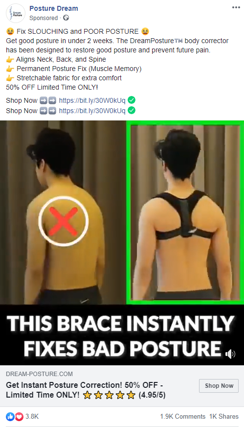
This is the ad as seen on Facebook’s feed and I’ll analyze both the ad copy and the video itself:
The ad copy – The first line shoots straight to the point and talks about fixing bad posture. Then there’s the quick explanation about the product, how it works, and some of it features. Then you have the limited “50% deal” text which everyone uses and at the end we have the store links.
In this case, I would do things a big differently:
- I like to show the links in the first lines before the “see more” text. I know there’s a call-to-action button below but I still prefer the link to be visible in the description too.
- The ad copy says “get good posture in under 2 weeks” which is going against Facebook’s new policies. Especially when it comes to medical products, you can’t go and promise stuff like that. Facebook will eventually stop this ad because of this text. Refrain from using facts like “The best in the World”, “Get results in 1 week”, etc.
- Same thing when we look at the button text… They wrote “Get instant posture correction”. Instead, you can write “Get a better posture”, or something similar which doesn’t sound like a medical fact.
The video ad – The first few seconds showing the guy going from slouch to normal stand and it’s quite catchy. So the first few seconds are good to stop people from scrolling to check what’s the video about.
The texts fonts are good and they use red and green colors to show the difference – Red for bad posture examples and green for good posture. They even add a little “ding” sound to it which is a nice addition. They show the product in action in many situations and explain all it features.
It’s important to show how the product works and give examples like they did it in this video: In front of a computer, at work, casual walk outside, etc.
One thing is the text at the end which again guarantees results in under 2 weeks… Again, do not guarantee anything when it comes to health and beauty products. Do this to avoid Facebook shutting down your ad or in some cases the ad account.
Also this ad looks like an exact copy of the previous ad, so if these are the same guys then it’s ok. If not, they’re stealing the original ad and I don’t recommend doing the same. Always create your own ad to avoid copyright strikes.
Since then the product gained even more likes, shares and comments.
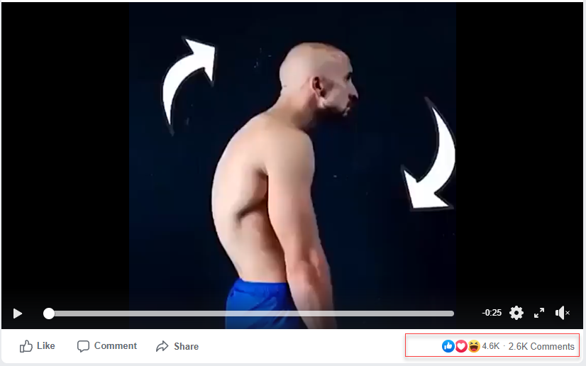
Looks like it’s going super strong for these guys!
2. The Product Page
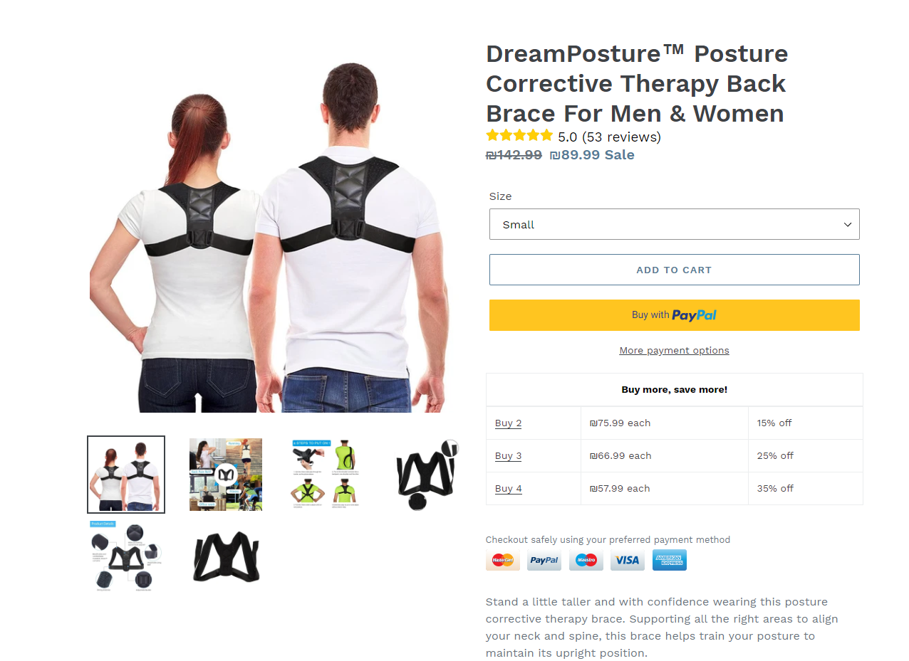
From what I see, everything looks perfect here!
They don’t waste time and show right away the sizing instructions so that people don’t have to scroll too much. If someone is looking to make a quick purchase, it’s the right decision to show sizing instructions right away.
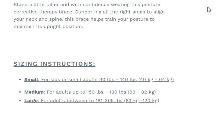
It’s just below the opening paragraph which is written nicely and sums up what the product is about. Right after that, they write the product features and display some product photos, a drawing, without any gifs.
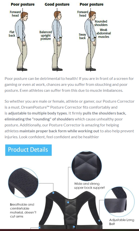
I like that the photos have a normal English in them with no typos like some photos people import from Aliexpress. I think that gifs are cool but sometimes they can make your product page load much slower so I personally don’t use gifs on my product page.
If you don’t know how to optimize your gif files, then use only pictures on your product page like here – When a good video ad is running, there’s no need to show gifs again on the product page 😉
At the bottom, you have Frequently asked questions and some shipping/satisfaction guarantees + budges. Everything is done by the book, not missing any important information.
They end it of course with reviews:
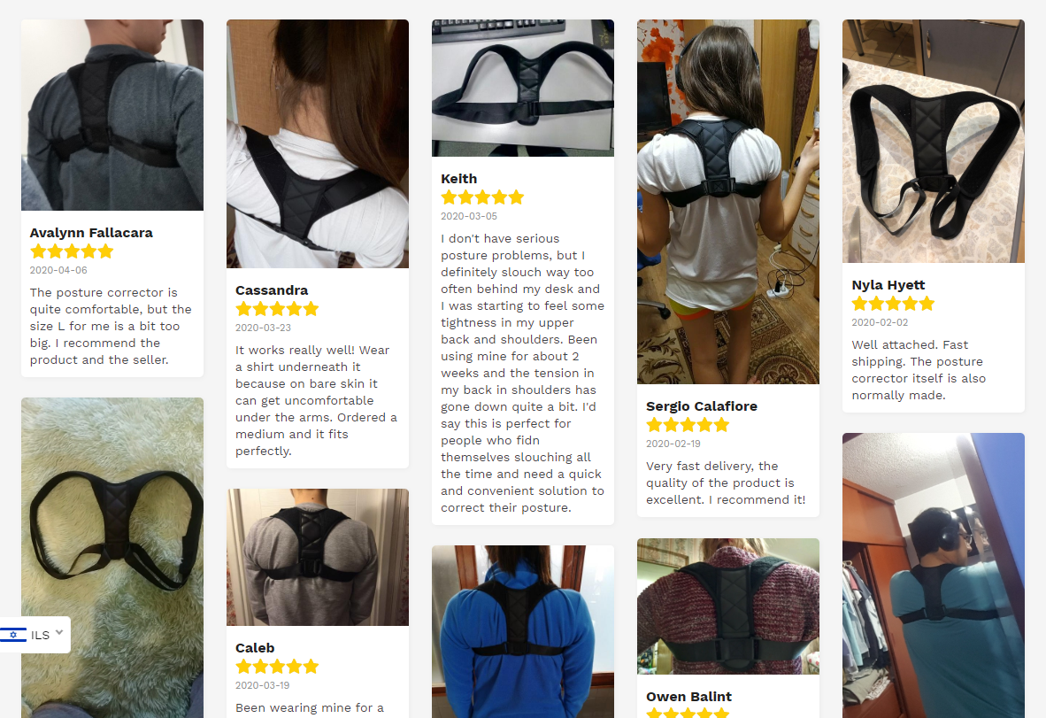
Reviews are super important to have on your store if you want to increase your conversion rate. And if you import reviews, make sure to use the ones with a normal English on them without any typos. Their reviews are just perfect!
Things I would change:
1. Logo – The logo is too small and it could use a little tweak in size and position. Even investing $20 on a designer here to make it look more professional.
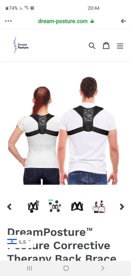
On mobile the logo just looks bad… But people don’t care about it so much because the ad, product, and product page are great!
2. The bundle look – They probably went for the clean look but in my opinion, the buttons should be more clear. Not everyone will understand that clicking on the underlined text will add it to their cart.
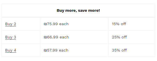
I prefer using bundles that look like this:
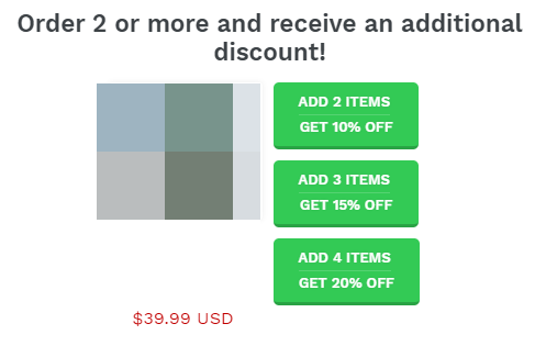
You can clearly see these are buttons and I bet they would’ve clicked more on a bundle that looks like this. A big chance that some of their customers manually increase the amount on their product or cart page without clicking on the underlined texts. This extends the time it takes them to checkout, thus increasing the chance they will leave without buying anything.
The next step is adding the product to your cart:
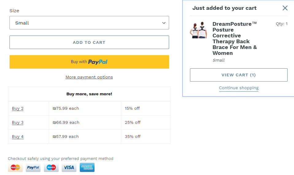
And here they don’t automatically transfer their customers to the cart page, but show the cart again both on desktop and mobile. In my opinion, this is a mistake because it just prolongs the checkout process.
Our advice is to always transfer customers to the cart page after the first click to get them to buy as fast as possible. Without any holdups or doubts, you clicked on the Add to Cart button, now you are transferred to the cart page!
So once clicked, they should’ve transferred the customers here:
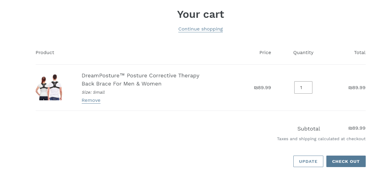
It’s much easier to convert an existing customer again than getting a new one, so this is why we focus on converting our customers quickly.
The Checkout Page:
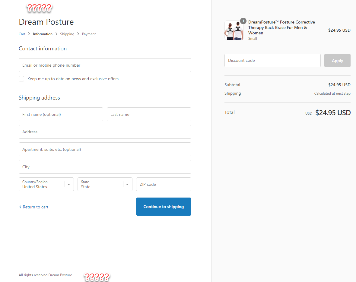
Absolutely no effort was put into the checkout page…
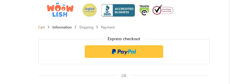
No trust badges with the logo on top and no policy links at the bottom – The checkout page is for sure lowering their conversion rate!
It’s a five minute work to make the checkout page look perfect so it’s sad to see something like this.
Here’s an example of how the top of the checkout page should look:
Shipping Page:

I love the fact they changed it from the regular “Free Shipping” text to what we see here – A good decision to also write they can track their order in their tracking system. A lot of customers are getting a bit scared about their orders and how the tracking works, so this message will calm them.
A good tactic which I will probably use myself someday 🙂
Payment Page:
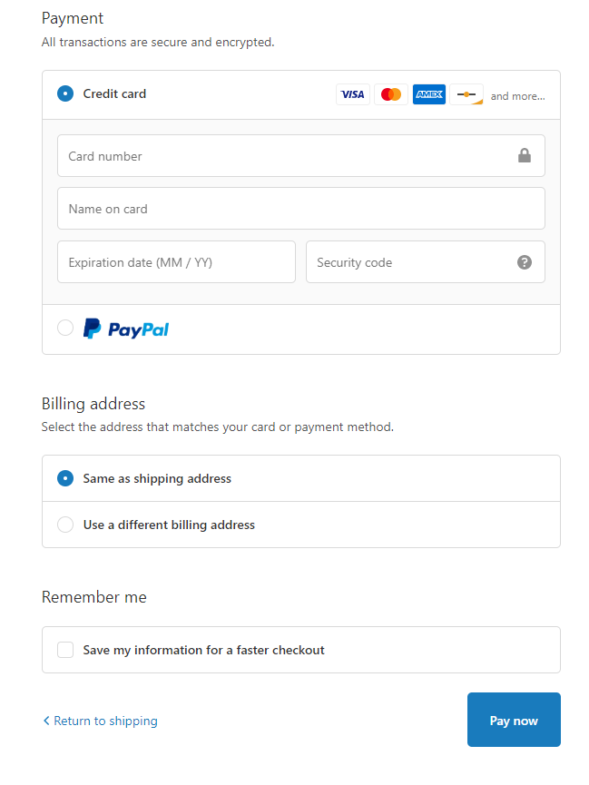
They accept both PayPal and credit cards so nothing really to add here. I would change the button name from “Pay now” to “Complete your order”.
Sounds better than “Pay now!”…
To Sum It Up:
They’re making some good sales that’s for sure but with that, they made some mistakes I believe stopped them from getting even more sales. This product was posted years ago on Ecomhunt and look how much money it made to some people.
Now what stopped you from making a better video ad and following the tips we have on our Blog and Youtube channel? Is this seller smarter than you? Is he some kind of marketing magician?
NO. He just knows that old winners can make a big comeback again and again. This time, the seller understood the need for this product because everyone are on their computers right now.
The mistakes and the points I gave in this article is something I talked about in my articles(Mistakes online store owners make [4 parts available on the blog!!]) so nothing basically stopped you from taking this product and selling it.
But it’s not the end because there’s still plenty of room and time to still crush it:
- Make better video ad
- Perfect the product page/checkout page and follow my instructions
- Market it the same way or try a new marketing angle
- Profit!
Hope you liked this week’s article and feel free to leave a comment if you have any questions. Good luck!
Struggling to find good products to sell? Not sure who’s your target audience? Tired of losing money on products you were sure were “winners”?
Then Ecomhunt is what you need! Find hot winning products that are added daily, spy on their ads & stores and import them into your store in 1 click and Start Selling Today!
Must Read Articles:
- Get Sales Going Again – How To Revive Old or Dead Facebook Ad Campaigns
- How To Dropship During COVID-19?
- From Video Games To A 6-Figure Shopify Store: The Success Story Of A Young Entrepreneur Who Refused To Give Up

Daniel Aloni is one of the leading mentors in the Ecomhunt family. Daniel is a highly experienced Print On Demand seller with multiple 6 figures successful launches.











A good article, I got a lot of it from him. Thank you.
Thank you for such great and detailed explanation. How your website looks, how the product pages look, that matters alot. I have worked alot on this to fix it. You can have a look at my website. And, Surely gona try sell this product . Cheers.
Hey Daniel, great article. Can you explain which app to use to create the big buttons for bundles?
Thanks
Irena
Hi Irena!
You can use the “Unlimited Bundles & Discounts by Revy Apps” Shopify app to get the buttons which I explained here. It’s also what I personally use and find it to work the best 🙂
Ho w we can get their FB ad specifications like….
what are their target audiences?
what they put in interest ?
location?
age group etc..etc….
Is it possble to get these details from others FB campaign?
Hi Gangadhar!
I wish we could get this information from FB but the only thing we can see is the ad itself and that’s it. All the rest is hidden from us.
You can check the comments to just understand the general audience. Then even visit some profiles and see what pages they like if their profile is public.
This can give you a good indication of what the original seller is targeting
I love the way you broke down his page piece by piece, prasing where you saw potential, and constructively criticizing where they needed help. I’ll be sure to test this product with the tips that you have given in this blog! Thank you!