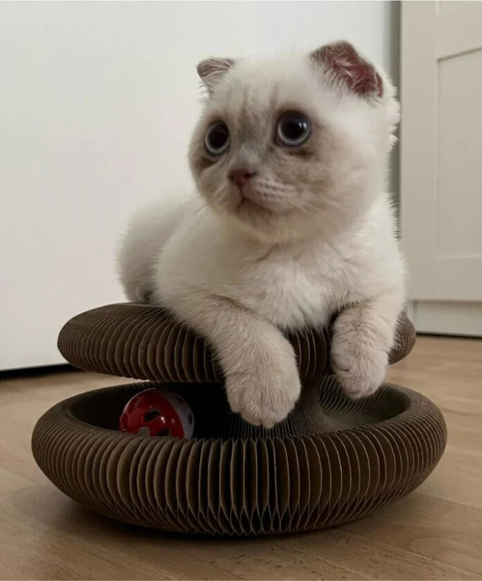
If you’re looking for a winning product to sell this Christmas, then this cat niche product is exactly what you’re looking for!
With the right ad and a conversion optimized store, cat owners everywhere will be flowing into your store and buying one or multiple pieces of this super cool product.
And that’s not it because the store selling this product and its video ad are perfectly done, so you don’t have to look anywhere else to take inspiration from.
Don’t miss out on this product and make sure to read the whole article – There’s plenty to learn from the original Dropshipper selling this product!
Enjoy.
1. The Product
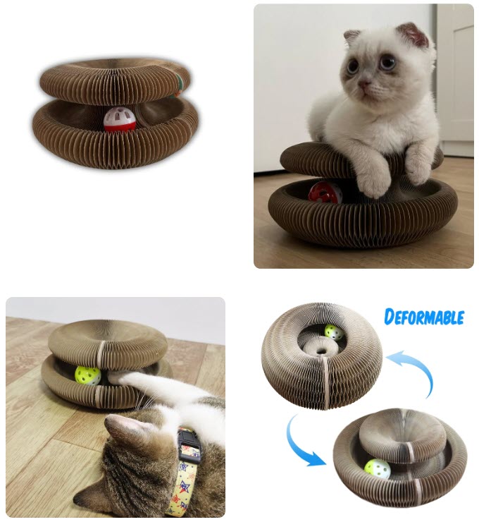
This week’s winning product is this super cool toy for cats I have found on Facebook. It popped up on my feed while I was working, and I just couldn’t ignore it.
As a cat owner myself, I’m a sucker for cute cat toys and I tend to spoil my cats a bit more than the average cat person – So it wasn’t that hard to grab my attention.
And after seeing the ad and the amazing job the original seller did, I just had to recommend it for you to sell as well.
This product can be a crazy winner if you play your cards right, so don’t sit out on this product and start selling it right now!
2. The Ad
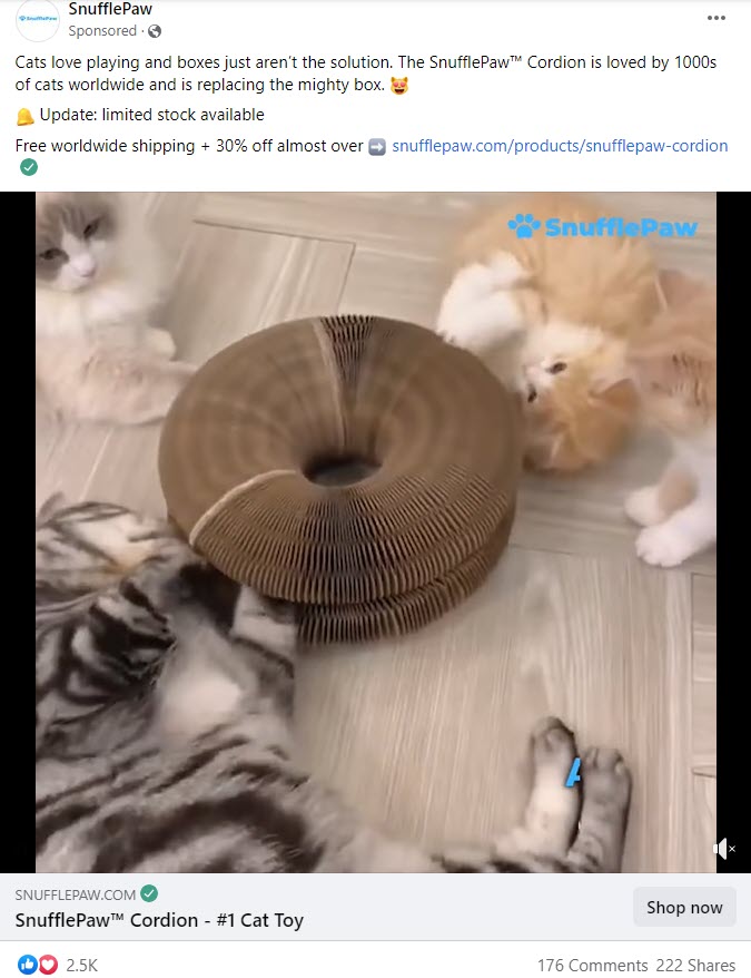
The original ad that popped up on my feed has pretty good engagement and it looks like people are genuinely interested in this product.
As for the ad itself, I see no issues there as they have it all – Text descriptions, nice music, a call-to-action text, and the first 3-4 seconds of the video are interesting enough to get people to stop and engage with the ad.
If you’re going to sell this product, then take inspiration from this ad to increase your selling chances.
But that’s not all…
The engagement on this ad isn’t “crazy” so I decided to see if there’s more to it that what eye sees.
And so, I decided to take a look at their ad library:
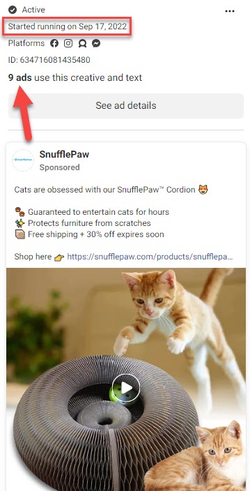
It looks like this product is doing well for them and each day they’re adding more new ads.
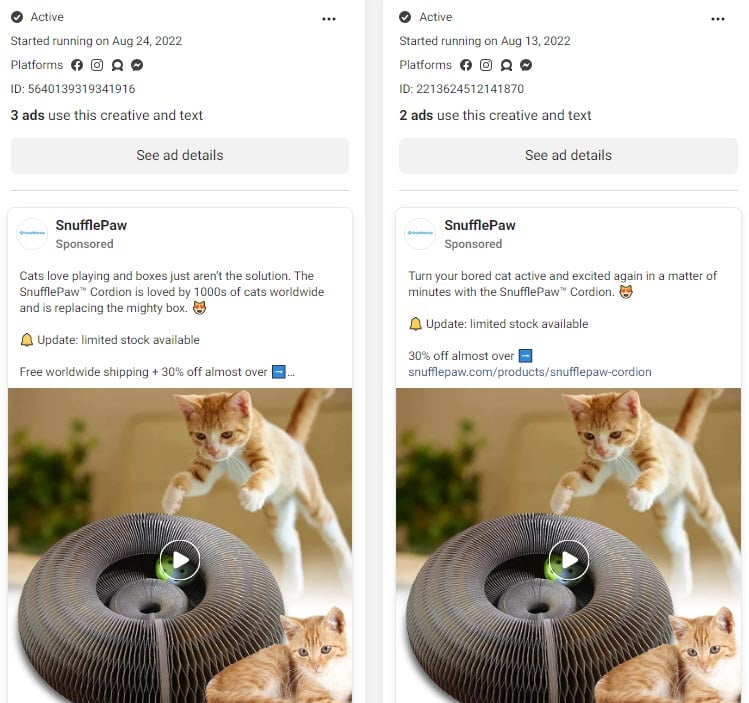
They have ads that run since July and new ads that were added in the same day of writing this article.
They do use the same thumbnail for each of their videos, but each video starts differently.

From videos where they show a bored cat to guilt trip cat owners
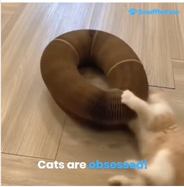
To videos where they start right away with a happy cat playing with this toy.
I absolutely LOVE what they have done here as it’s very important to refresh your creatives to get more people to notice your ad. The thumbnails could’ve been different as well, but this isn’t Youtube so it’s not that of a big issue.
Ad copy:
The ad copies are pretty well done with different variations used depending on the first 3-5 seconds of the video.
You have 2 lines explaining about the product, a bit of scarcity text, and a promotion on the current deal they run. As I already said, job well done and nothing to fix here as well.
3. The Store
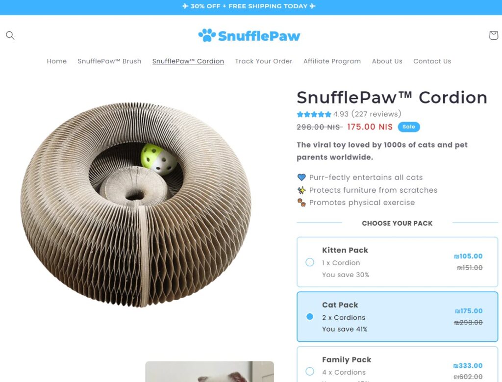
Now this is where it gets a bit more interesting…
When I first saw this store, I was sure this is a one-product store which sells only this cat Cordion toy scratcher. But it looks like there’s another product they’re selling which is a cat brush.
So I guess at first this was a one-product store for a cat brush or this scratch toy, but eventually they just added one more product and decided to brand it all under the same name.
And I got to say, this is a pretty good idea!
Instead of focusing entirely on a single product, they are re-branding each product under the same name, doing it really well, and this turns the vibes of this store from a regular general store to look like it’s a real brand.
If you ever thought about opening a one-product store but didn’t want to invest that much on each product, then just do the same as these sellers right here and it should get you the same results.
Ok back to the product.
The first thing you see is the quantity discounts bundle on this product:
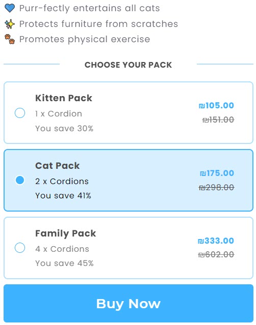
I have to admit that this is probably one of the better looking bundles I have seen in a long time. It’s pretty big so you can’t miss it and the design is quite inviting and I bet it is working pretty well for them.
The quantity discounts is a really good call because there are a lot of people out there owning more than one cat so they’ll probably need more than one toy.
That’s extra money in your pocket and you should do it too.
Product description:
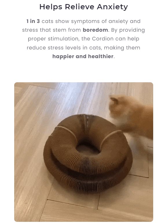
The description for this product is PERFECT – You have GIFs, pictures, and even a FAQ section about the product. The original sellers know exactly what they’re doing here and sales must be flowing in!
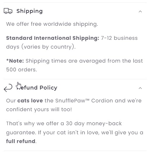
And of course, you also have the shipping and refund policy which are really well written.
Product reviews:
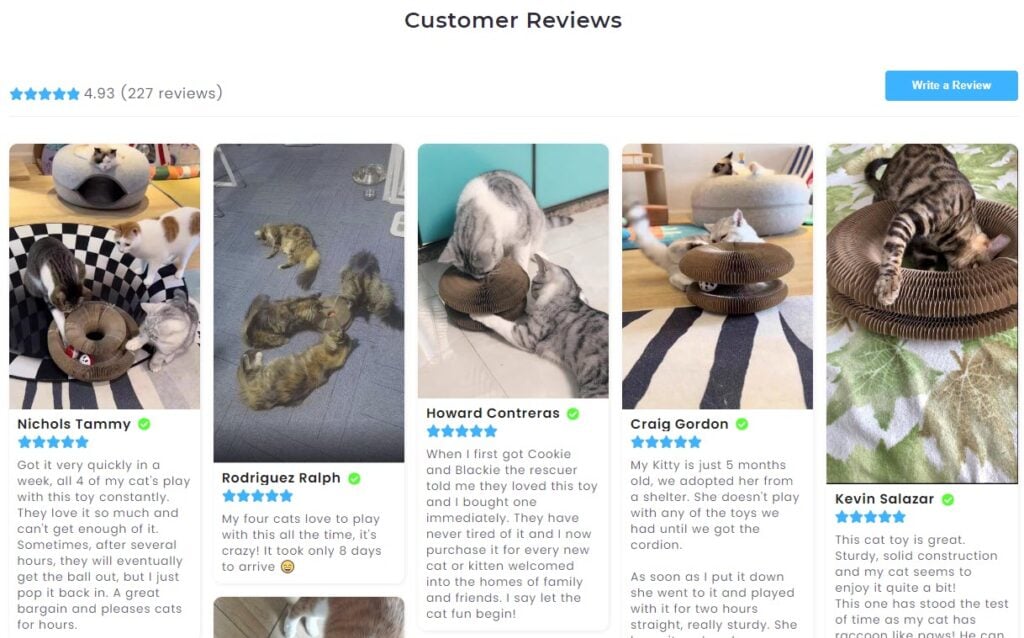
And last but not least, the perfect review section which has it all – From high quality review photos on to an understandable English and not some gibberish auto-translated text.
This is how a review section should look like so do exactly the same on your stores when selling this product or any other.
4. The Checkout
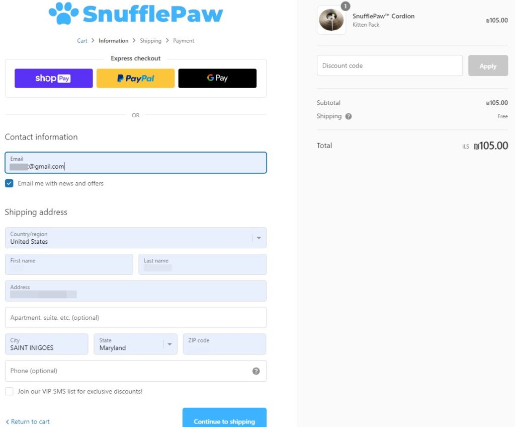
We have here the standard Shopify 3-page checkout with the first one being the customer information page. As you can see in the picture above, they didn’t forget to upload their logo on the checkout page as well so it’s a pretty good start.
On top of that, the Phone number field is OPTIONAL which means people don’t have to add their phone number in order to proceed with the checkout process.
I absolutely love this because some people hate giving their phone numbers because of spam and other reasons. This definitely increases the conversion rate!
Shipping page:
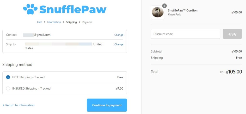
Nothing unusual with their shipping page… Both options are trackable and the paid option costs on an extra $2 which is for insurance. It’s a pretty small sum so I think a good percentage of customers might actually take it.
That’s extra $2 in your pocket – Good for them!
Payment page:
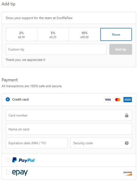
My only problem with the payment page is the tipping section. I know it’s $0 by default, but I do think some customers might find it a bit annoying.
Tipping should be asked when it’s a handmade product(or at least a product that looks like it was handmade)… When it comes to products like this cat toy, I don’t think there’s need to be any mention about tipping.
But who knows… Maybe customers are so happy about this product they’re willing to leave a tip. Worth the test I guess.
To Sum It Up
If you’re looking for the perfect winning product to sell this Christmas, then this is definitely the one. And if you’re not sure how your ad & store should look like, then you have the perfect example right here.
This product can make some serious bank for you this Christmas so don’t sit out on this and start selling it right now!
If you have questions, feel free to ask me in the comments.
Good Luck!
Struggling to find good products to sell? Not sure who’s your target audience? Tired of losing money on products you were sure were “winners”?
Then Ecomhunt is what you need! Find hot winning products that are added daily, spy on their ads & stores and import them into your store in 1 click and Start Selling Today!

Daniel Aloni is one of the leading mentors in the Ecomhunt family. Daniel is a highly experienced Print On Demand seller with multiple 6 figures successful launches.


