In this week’s article, I’m going to show you 4 quick tweaks you can do on your Shopify store to build more trust and to increase your sales. Some of them will require a bit of custom coding but it’s definitely worth it because it will increase your overall conversion rate.
Hope you like this week’s article and let me know if you have questions in the comments.
Enjoy.
1. Optimizing The Cart Page
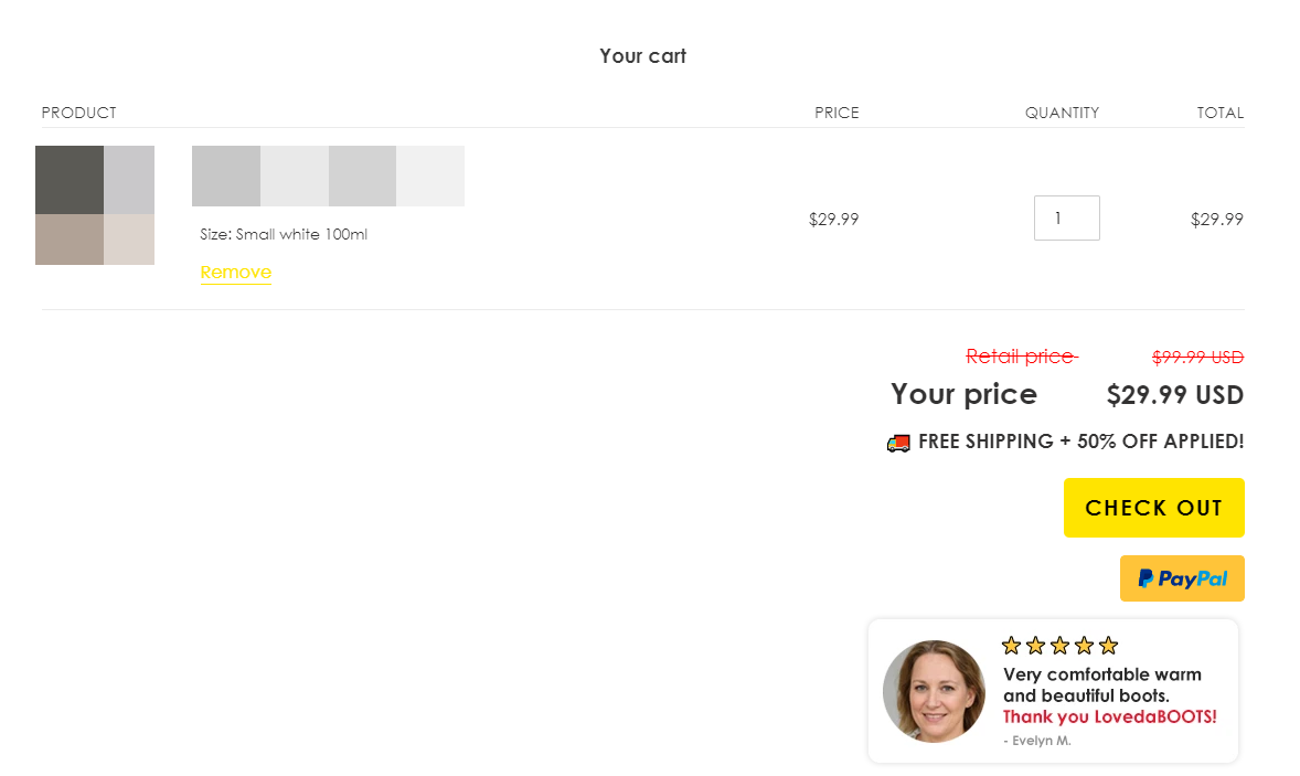
The cart page on free themes are usually very simple… It’s just a page showing the current product you added to your cart, with your customer’s total price and a default text(“taxes and shipping calculated at checkout”) just below it. You will have only one checkout button to continue to the shipping details and a quick link to pay with PayPal or quick payment methods.
And yes it works out well and if your ad and everything else on your store are good, nothing is going to stop you from getting sales. So don’t worry too much about this tweak if you don’t have the time or money to do it. Maximum, get back to it later after you get sales and you’re looking to make more.
Like I already said, the cart page is too simple so we usually tweak it a bit to improve our store’s conversion rate. It will require custom coding or an app/theme that already has that included – I don’t know about an app offering it all so custom coding is what we use.
IMPORTANT:
It’s a really simple job for someone who knows his way around Shopify, so don’t overpay on Fiverr. I think this gig shouldn’t cost more than $50 and it’s very important for you to understand exactly what he did.
Make sure to ask for a detailed report on the custom code in your store’s design, so you can later edit it yourself on any new store you open. It’s really simple and this way you won’t need to hire another Fiverr professional for the same job.
Here’s our usual cart page optimization:
1. Adding a single review window – This is a static review window that doesn’t change. It is the same for every customer who goes to the cart page, including the photo. As you can see, it is located just below the Checkout button.
2. Mentioning our current promotion – This one works best if you have the same promotion for any product on your store. In this case, it’s 50% OFF + Free Shipping on our one-product store so it’s also a static text. A really simple edit with a small shipping icon just to make it look cooler.
3. Price compare – We show the old price and the new price after the discount(ignore the wrong original price, it’s a new store we’re working on which is not finished yet). It’s a great way to show our customers again just how much they save shopping with us.
4. Adding trust badges or store guarantee icons
![]()
Another way to build more trust with your customers. We usually don’t put these in our cart page but I think we’ll actually do it on the new store we’re building. These look really nice, but you should use a different icon for each guarantee.
5. Adding a second checkout button – Sometimes you have to scroll a bit down to find the checkout button on the cart page. You can avoid it by either making the cart section smaller, or by adding another checkout button.
Two checkout buttons, Top & Bottom, will be always seen by your customers without the need to scroll down just to find one. This guarantees a much quicker click on the checkout button ?
2. Optimizing The Checkout Page
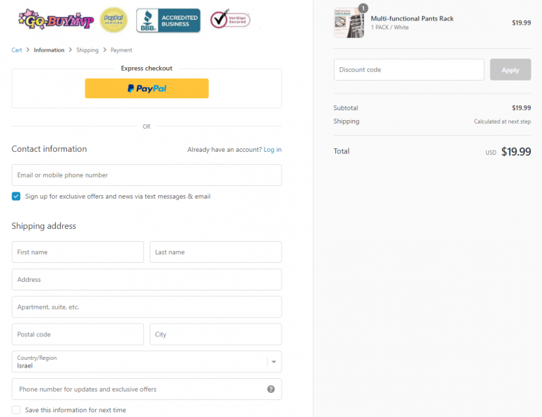
People tend to forget that there’s a checkout section on Shopify you can edit and optimize. You can add your logo or even a banner, change the texts, button colors, and more. Leaving the checkout page at default settings is possibly one of most common mistakes done by new dropshippers.
And Shopify’s checkout is three page long so it’s even more troublesome if you leave it untouched… So before sending any traffic to your store, make sure your checkout page is 100% prepared and optimized!
Here’s a few things you can do to make your checkout page more appealing and increase your conversion rate:
- Add your logo + trust badges – Your store logo will appear as text only on the checkout page and you need to upload it the second time in the theme’s checkout settings. Having your logo on the checkout page is already better than having just text, but we always add a few trust badges next to it(see picture above). It looks more professional and helps you build more trust with your customers.
- Change the default texts – You can edit the default texts on the checkout pages to anything you want. We usually change it to fit our current deals – If we’re running a Free Shipping deal, the shipping text “calculated at next step” will be changed to just “Free” in order to not confuse our customers. We sometimes do the same for our buttons texts and instead of the regular “Continue to shipping” text, we will have something like “Continue and Apply Free Shipping”. In my opinion, this sounds much better and it definitely increases the amount of clicks!
- Change your checkout button colors – Your checkout button colors will stay at default if not changed in Checkout theme settings. Make sure to change the color to fit your store’s theme or just go with the safe Green option which always works.
- Add policy links to your footer – Go to Shopify’s Legal settings and use their automatic tool to create a Refund policy, Privacy policy, and Terms of Service pages. Once created, these will automatically appear in your checkout page footer. Looks more professional and customers will trust you more when you have these pages displayed in the checkout.
These 4 quick edits are a good beginning and should help you get more sales! You can also add icons to your buttons using a custom HTML code or a countdown timer using a conversion boosting Shopify app.
3. Adding Links To Your Product Everywhere On Your Store
The third point is more focused on one-product stores than general or niche ones. One-product stores sell only one product(DUH) so the only there’s no other product to link to or multiple discounts.
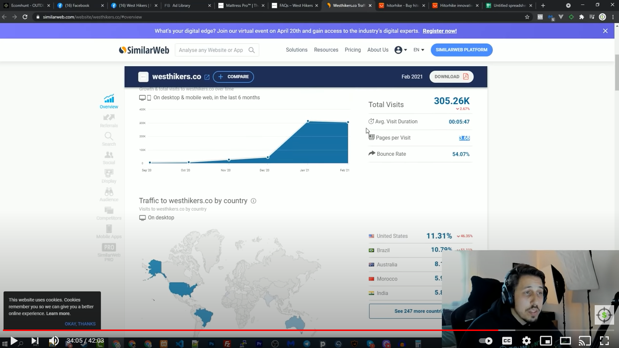
Your job as a one-product store owner is to “close the loop” which basically means that no matter where your customer goes, he will always find his way back to your product. Here’s a quick example from the latest product review video done by Mordechai Arba, the CEO of Ecomhunt:
In this video, Mordechai checks the stats of the store selling the product on SimilarWeb to see how many visits the store gets and other statistics. He notices that the stores gets an average of 3.68 page views which is pretty high for a store that gets 300k monthly visitors.
And the first thing he recommends doing is to have links to your product everywhere on your store. About Us page, FAQs, Tracking pages, etc – add a link or a promotional banner anywhere you can so your customers can jump right back to your product and continue with their purchase.
P.S
I recommend watching this video because it has tons of value and a lot of really amazing tips to help you get more from your customers!
4. Adding Extra Buy Buttons In Your Product Description
I guess most of you know about ClickFunnels or at least heard about them. Basically it’s a platform that helps people build their own sales funnels. You can build a sales funnel to sell almost any product you want, collect leads, sell courses, and a lot more.
These sale funnels are usually long and there’s a lot of scrolling to do, so you need to place buttons in strategical places to convert your visitors. Now the same thing can be done if you have a long product description on your Shopify store.
Your customers end up scrolling down quite a lot sometimes to read the whole description, getting to the reviews, and to buy the product they have to scroll back up to get to the Add to Cart button. Make it easier for them by adding buttons in strategical points so they don’t have to scroll all the way up to purchase your product.
A Buy Now button in the middle of your description and another one at the end is all you need to boost your conversion rate a bit more.
Note:
This also requires custom coding but it’s a really simple task! A Fiverr gig shouldn’t cost more than $15 for this job and it will be easy to replicate on the next store you open.
To Sum It Up:
It’s the small things that really count and as small as these seem, it’s important to implement them on your store to get more out of your customers. Don’t send any traffic to your store before implementing the first 3 points!
Good luck!
Struggling to find good products to sell? Not sure who’s your target audience? Tired of losing money on products you were sure were “winners”?
Then Ecomhunt is what you need! Find hot winning products that are added daily, spy on their ads & stores and import them into your store in 1 click and Start Selling Today!
Must Read Articles:
- Ecomhunt’s Trending Product Suggestion – Sell These Women Summer Sandals + Store & Ad Review, And More!
- How To Import Winning Products From Ecomhunt To Your Shopify Store
- Why You Shouldn’t Scale With Aliexpress

Daniel Aloni is one of the leading mentors in the Ecomhunt family. Daniel is a highly experienced Print On Demand seller with multiple 6 figures successful launches.


