This week’s winning product is in Home Décor niche and it’s going to be the next best seller this Christmas & Winter season.
It is simply the perfect product this Season when it’s becoming darker much earlier in the day and the price of this product allows us to sell it for a pretty cheap price and still rack up a nice profit out of it.
But the best thing about this product is probably the option to enter into 2 super lucrative niches. Yes, not just one niche but two top selling niches!
The niches I’m talking about are Home Décor & Home Appliances – This product not only upgrades the look of the home but it is also a kind of utility that is needed during the Seasons with much less light.
You’re not limited to selling art pieces and products that upgrade the look of people’s home, but you can also sell some cool home gadgets as well.
This is a Huge win for us Dropshippers as it gives us an infinite amount of products to sell!
In this week’s article, I am going to review everything there is around this product, including the original video ad that runs on Facebook right now and the Shopify store that sells this product as we speak.
On top of that, I’ll give you an example of a quick ad that you can use to start running your ads right now without waiting for a video ad to be prepared.
This product is going to be a HUGE winner this Christmas and there’s a lot of crazy tips in this article that will help you make sales with this product.
So if you want to make bank this Christmas, make sure to read the whole article and pay attention to every detail!
The Product
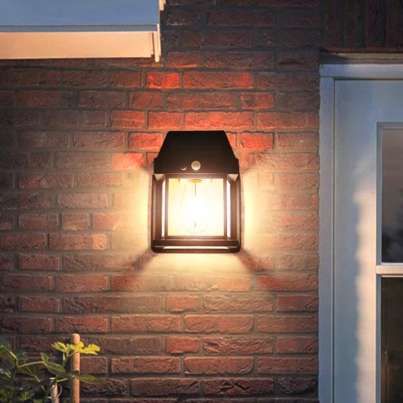
This week’s Winning Product is this amazing Home Solar Wall Lamp that is going to sell like crazy this Christmas and during the whole Winter season.
Now… Here are the main reasons why I like this product so much and picked this one instead of something more Christmassy:
- This isn’t your typical Christmas product that people buy as a gift for family or friends, but it’s more of a product that you buy for yourself when you have extra money to spend. Why is it good? Mainly because you don’t have to meet any deadlines. You can advertise a Christmas sale with a nice discount without worrying about customer emails asking if the product will arrive in time for Christmas.
- You can keep on selling this product during the whole Winter season which means that your sales don’t have to end on December 24th-25th or a week before that(which is what happens when selling typical Christmassy products). And in case you didn’t know, ad costs are always lower during this time because many advertisers pause their ads. This means you will have less competition to worry about and better CPAs.
- There’s a high chance your customers will be looking to order more than one piece of this product and this means more sales if you play your cards right. If you wonder how to achieve that and increase your Average Order Value(AOV) then keep reading this article.
The Ad

The ad is your typical Instagram Reel/TikTok product display you find when scrolling the feed in these platforms. Though it’s not a single video that is being used for this ad, but a video montage that was made using multiple clips showcasing this product.
Personally, I am not a big fan of using such clips as video ads on Facebook and I like more detailed videos with more text description on them. And if possible, add a clip of someone reviewing the product and saying a few good words about it.
But on the other hand, these clips seem to work well on Facebook right now… And this video ad definitely works and brings sale so I can’t really judge it too much and say bad things about it.
All I recommend doing is testing this out and prepare a few video ads to launch for this product. One of them can be in the same style as the video ad found on the Ecomhunt product page, and the others can be a bit more detailed and in the style I recommended.
You can order such video ads on Fiverr – Here’s a Fiverr seller I personally recommend that has done a great job with our most recent product tests. (Use code ECOMHUNT to get 10% OFF on your first order)
Ad copy:
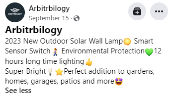
The ad copy is something I’ve been seeing a lot recently and it looks a bit like a list of features which isn’t that compelling. Instead you should tell a short story about the product or write a simple explanations about it with a call-to-action text.
Here’s a quick example of such ad copy:
“Light up your home & garden and bring some warmth to Winter with this amazing Solar Wall Lamp ?
Grab yours now => *store link*
Order yours now and get 50% OFF + Free Shipping!”
Also use less emojis… The original ad copy has way too many emojis.
The Store
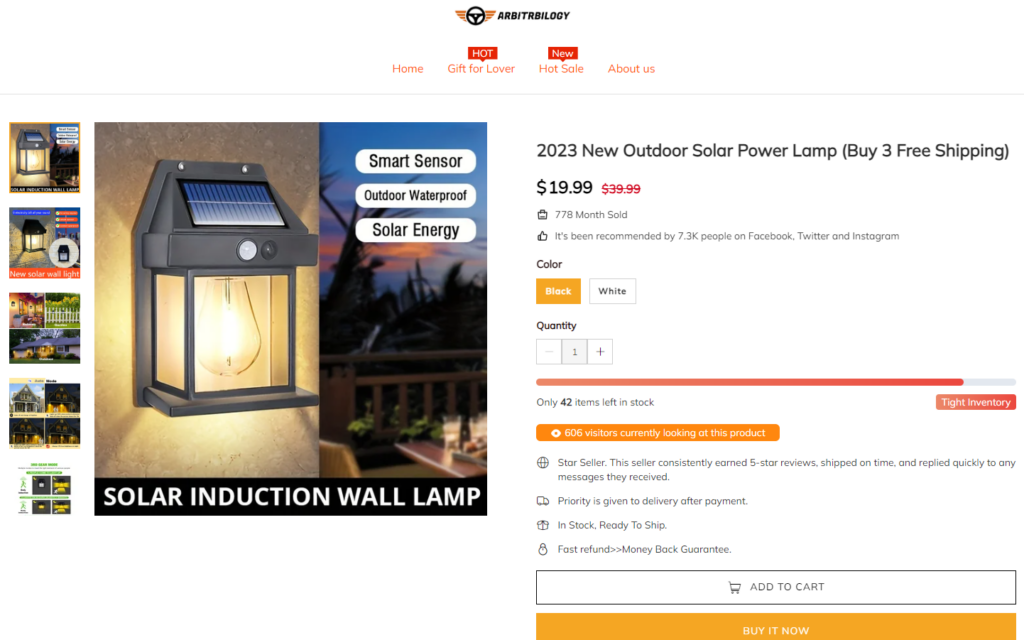
The Shopify store selling this product is pretty good and they’re definitely making sales, but there are a few mistakes the original seller has made that hurts his sales.
With a better product page and with better optimizations, the store selling this product can easily get a 2.5%+ conversion rate. Instead, this store probably gets around 1%~1.5% and makes less sales because of that.
This right here, the 1% difference in the conversion rate, can be the difference between a profitable campaign and a losing one… Pay good attention to this part so you can avoid doing the same mistakes and hurting your store’s conversion rate.
1. A bit over the top scarcity
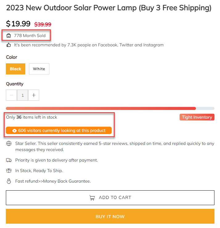
There’s no problem with using scarcity tactics in your online store to drive more sales and decrease the time it takes for the customers to reach the checkout.
But before activating all these timers, fake stock numbers and fake live visitors count, at least make sure to setup the whole thing and make it believable…
Today’s customers have grown accustomed to these scarcity tactics and they can identify between real ones and fake ones. Having over 600 people viewing the same product page right now is unreal. Especially when they never see such numbers on eBay, Etsy, and other marketplaces.
So all this store has accomplished with their scarcity tactics is making it look spammy and less legit. They’re still getting sales but this is the one thing that makes them get less than what they actually deserve.
So before adding countdown timers and stock counters, at least make sure it looks real enough. And always start with a clean store and test one scarcity tactic at a time. Test it out to see if sales actually increase or not.
2. Too many pictures in the product description
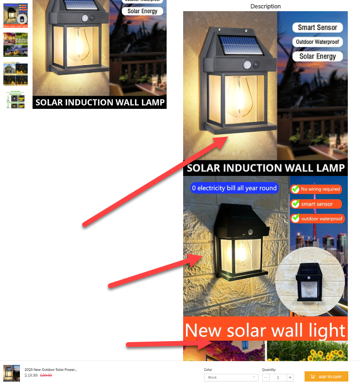
If you follow my articles, you probably know that having pictures/GIFs followed by a few sentences explaining about them is a must have on any product page. The product page must act like a selling Funnel that explains in more detail about the product you dropship.
In this store’s case, the product description has it all – Great descriptions + relevant pictures & GIFs but then you get to the part where you see only pictures and too many of them.
So many actually that you have to scroll pretty far down to get to the important messages about this store’s guarantees and shipping information.
This is simply an overkill… The description can be easily shortened and make it easier for customers to scroll down and get to the store’s guarantees.
3. The ‘You Might Also Like’ section
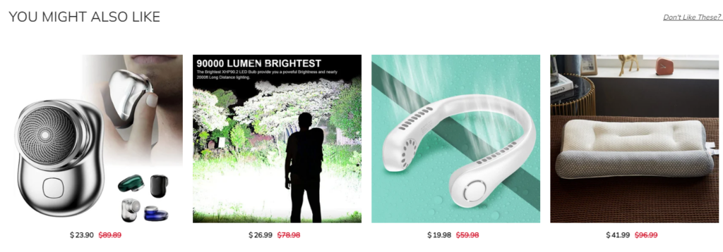
This is clearly a general store so having a section like this one, a section that recommends more products to buy, is quite logical right? False.
When driving traffic to a specific product on your online store, no matter if it’s a general store or a niche store, it’s ALWAYS better to keep the focus of your visitors solely on the product you currently promote.
Why? Because you don’t want to redirect your visitors attention from the product you sell and have them wonder your store. It’s the opposite of that, you want them to stay on the product you sell and get them to checkout as fast as possible.
It’s really simple – You’re not Amazon and you won’t be seeing customers checking out with 10 different products in their cart. This only happens on Amazon and other marketplaces, where people go to buy stuff.
In this case, the ad pulled potential customers from Facebook where they just browsed stuff mindlessly. They didn’t think about buying anything but saw the ad which was cool enough for them to click it.
Time is of the essence… Our job as Dropshippers in this case is to close the deal as fast as possible without wasting any time. And once we have that sale, then we can advertise other products we sell.
Remember that it is much cheaper to keep an existing customer buying than getting a new one.
4. Missing tracking page

This one isn’t a big issue but it is still recommended to have in order to increase your online store’s trust. Whenever a potential customer visits a store, there’s always a few seconds where he/she looks around and even visit some important pages like the About Us, Shipping Information, Refund Policy, etc.
One of the pages potential customers like to see is the Track Your Order page, where they can pull out information about their order using an email or their order id.
It’s great to have such page on your store as it reduces the amount of support emails you get regarding order status and it calms down people as they now understand that you actually ship the product.
And the best thing is that you can install such apps from the Shopify App Store for free and in a few clicks you’ll have a branded tracking page.
5. Missing reviews
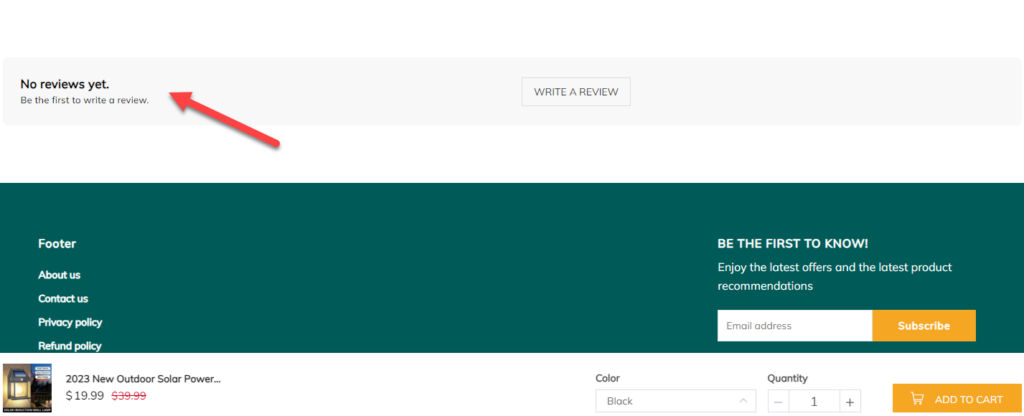
Unlike the 4th point I just talked about above, this one is a big issue as it can drastically reduce the store’s conversion rate. It’s been analyzed by dozens of companies and proven that reviews have a huge impact on the store’s conversion rate.
Meaning that if you keep your review section empty, it might drive away a big chunk of your customers. Yes, even if you’re product is as good as this one, it can still happen.
That said, it looks like they have a review widget on their store but they simply forgot or were lazy to actually upload some reviews. It’s a shame really, as all it takes is a few clicks and you can import dozens of reviews from Aliexpress.
Reviews like this one where you can see 4 pictures of the product and how it actually looks when turned on.
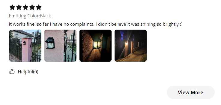
A few reviews like the one above and a few more in text format would have a huge impact on this store’s conversion rate, getting the store owner many more “free” sales.
6. No quantity discounts
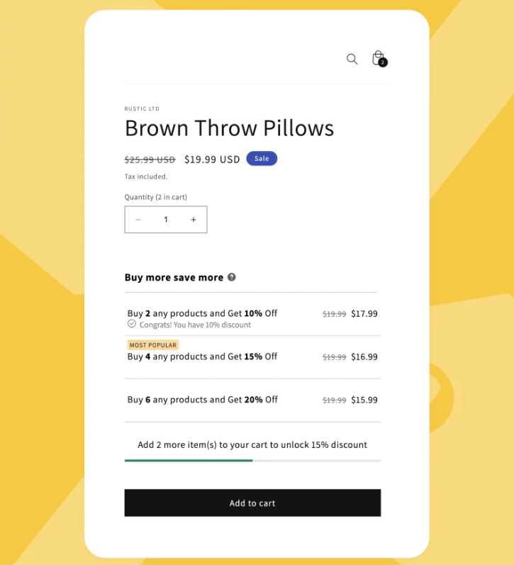
This mistake doesn’t affect this store’s conversion rate as it’s simply a miss on their side… A missed opportunity to easily make extra sales and increase their AOV, thus getting more profit from each order.
Always check for an option to increase your AOV before launching your product. It can be using quantity discounts, bundles, or something else entirely.
This product screams “buy me in bulk” and it’s sad to see that they didn’t do a thing about it. Especially when there’s plenty of available apps you can use to create quantity discounts and bundles in minutes.
The Checkout
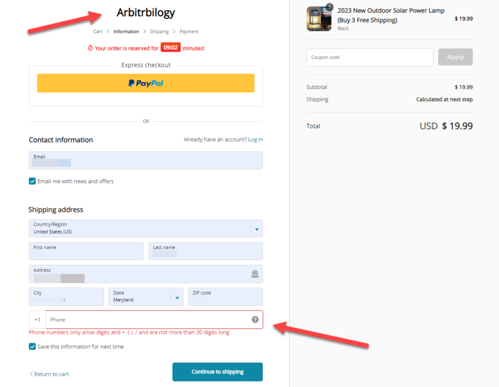
The checkout is also a bit problematic – The store owner forgot to upload the same logo to the checkout page as well and the phone number is not optional.
As for the logo, there isn’t much to explain here… You want your logo displayed on every page and that also includes the checkout pages. It is simply unprofessional to not have your regular logo on the checkout page.
Though the phone field being mandatory is a bit more troublesome because it requires customers to enter their phone number if they want to or not.
Some people absolutely hate giving away their phone numbers due to all the spam they can possibly get because of that, so when they see something like that from a random store they just leave it without completing their order.
If you plan on using the phone number later for SMS marketing then there’s logic behind asking for phone numbers. But if you don’t, then make sure this field is set to optional.
By the way, just recently Shopify has introduced their one-page checkout and pushed it to almost all their stores. It’s an amazing addition that replaces the long 3-page checkout to a single page checkout.
This reduces the amount of time it takes for customers to complete checkout, thus increasing the conversion rate. If you don’t have this page activated by now, I suggest you do it now because you’ll be losing money.
Shipping page
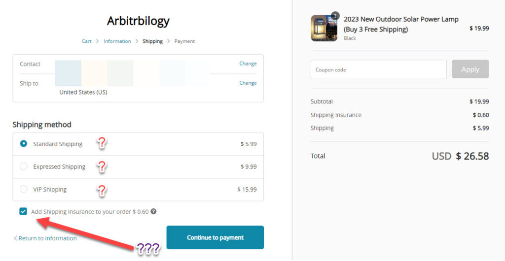
Next in line is the shipping page where are a few issues I must address.
The first one being the different shipping options which are fine to have but you must add the time it will take for the product to arrive next to each option. You can’t expect customers to remember the shipping times as seen on the product page or to leave the checkout to visit the Shipping Details page.
These are some extra steps you don’t want happening on your store because it prolongs the checkout process and may even lead to checkout abandonment.
Next in line is the shipping insurance which is pre-selected… In my opinion, 60 cents aren’t worth scaring your customers who now have to second guess what happens if the insurance isn’t added to the order.
Offer regular shipping options and write the time it takes for the product to arrive for each of them. And add “Insured” next to each shipping option to increase your conversion rate and make your customers more happy.
Payment page
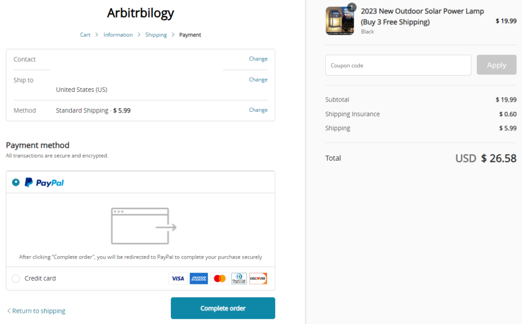
Standard shipping page with both PayPal and Credit Card options available. Nothing to criticize here, looks good.
Selling Strategy
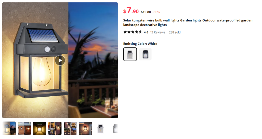
First of all, I suggest you offer Free Shipping by default with this product no matter the amount ordered. It sucks seeing a $4.99 shipping fee for a product that costs $19.99.
With Free Shipping, you should sell this product for at least $24.99. I trust you can even price it for $29.99 and have no issues selling it, especially when available quantity discounts.
Quantity discounts:
Make sure to create at least 3 quantity discounts bundles for this product. The bundles should be for 2 pieces, 3 pieces and 4 pieces in the same order.
As for the discounts, start from a 10% discount and add an extra 5% for each level. This means a 15% discount for 3 pieces and 20% discount for 4 pieces.
Pay close attention to the performance of the quantity discounts to see which package performs better. Play with your prices, with your discounts, and always optimize to get the most out of your customers.
Ad Example
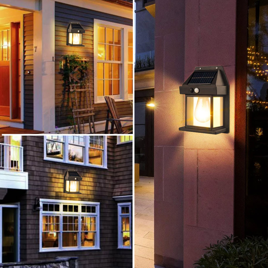
The beauty of this product is its self explanatory aspect – It’s a solar lamp you can mount on wall and it lights up if you touch it or if you get close enough to it.
This means that we can sell it using photo ads and get great results. The example above is one of the ready pictures you can find on Ecomhunt and on the Aliexpress product page, and you can use them for your ads.
So if you’re eager to run ads for the product and you don’t want to wait for the video ads to be ready, I suggest starting out with some simple photo ads and see how it goes.
Though I always suggest to try it all and this means that video ads are a must as well ?
To Sum It Up
If you’re looking for a product to sell this Christmas, then this solar wall lamp can be the difference maker and make you some good sales in no time.
And it’s even better when you don’t have to stop running your ads a week before Christmas and you can just keep on running them and keep getting sales.
This article has everything you need to take this product and run it on your online store successfully, so don’t sit out on this product and start selling it now!
Happy Selling!
Struggling to find good products to sell? Not sure who’s your target audience? Tired of losing money on products you were sure were “winners”?
Then Ecomhunt is what you need! Find hot winning products that are added daily, spy on their ads & stores and import them into your store in 1 click and Start Selling Today!

Daniel Aloni is one of the leading mentors in the Ecomhunt family. Daniel is a highly experienced Print On Demand seller with multiple 6 figures successful launches.


