If you’re looking for a winning product to sell this Christmas, one that Parents everywhere will be lining up to buy it, then check out these super cute Sock shoes for babies!
This product has a HUGE need during the Cold season and with the right ad and an optimized product page, you have a good chance to really crush it this Holiday.
So if you’re serious about making some bank this Christmas, then make sure to read the whole article because I will be reviewing the product, the ad that currently runs on Facebook, and the Shopify store selling it.
I’ll point out the mistakes made by the original seller so you can avoid them and do a better job when testing this product on your store.
Don’t miss out on this product and start selling it now!
1. The Product
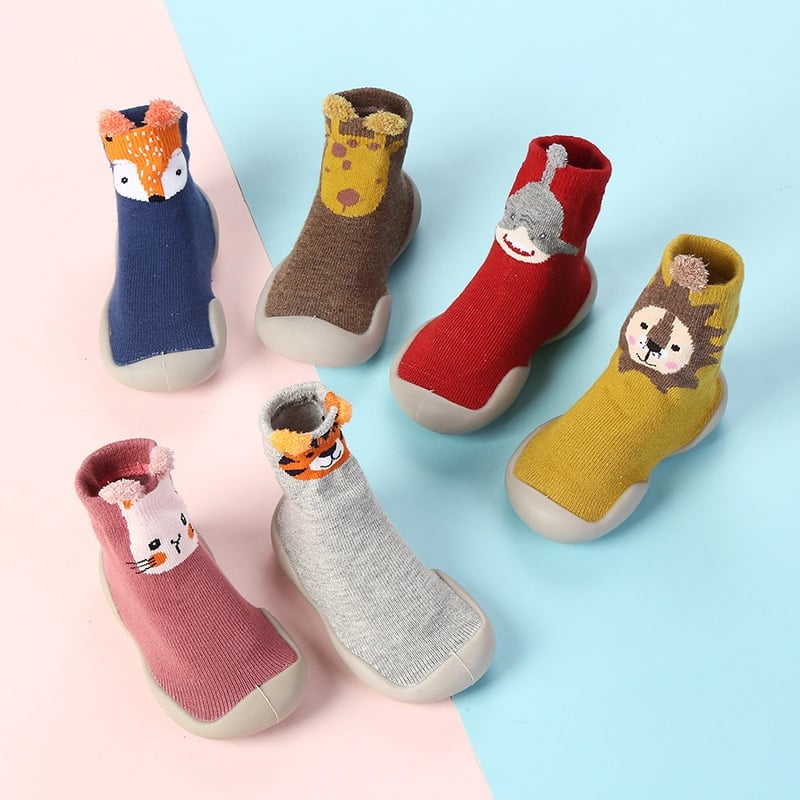
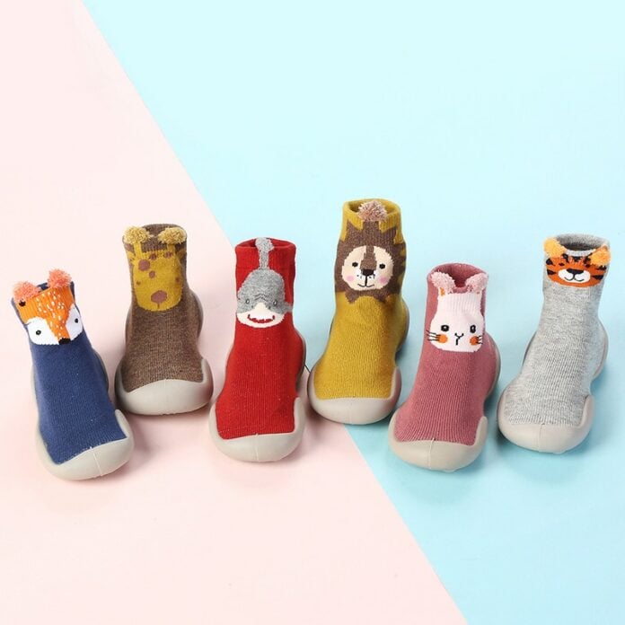
This week’s winning product are these super cute sock shoes for babies. With the right ad and the right targeting, this product is going to sell like crazy because parents simply cannot resist not buying stuff for their little ones!
But the product above isn’t really the product I am going to recommend you this week…
Why? Because these ones are a bit more suited when it’s still warm outside and we’re now approaching the Cold season so we’ll have to adjust our product choice a bit.
So instead of these exact baby sock shoes, I’m going to recommend a different product but quite similar.
This “new” product is simply the warmer version of the sock shoes for babies:
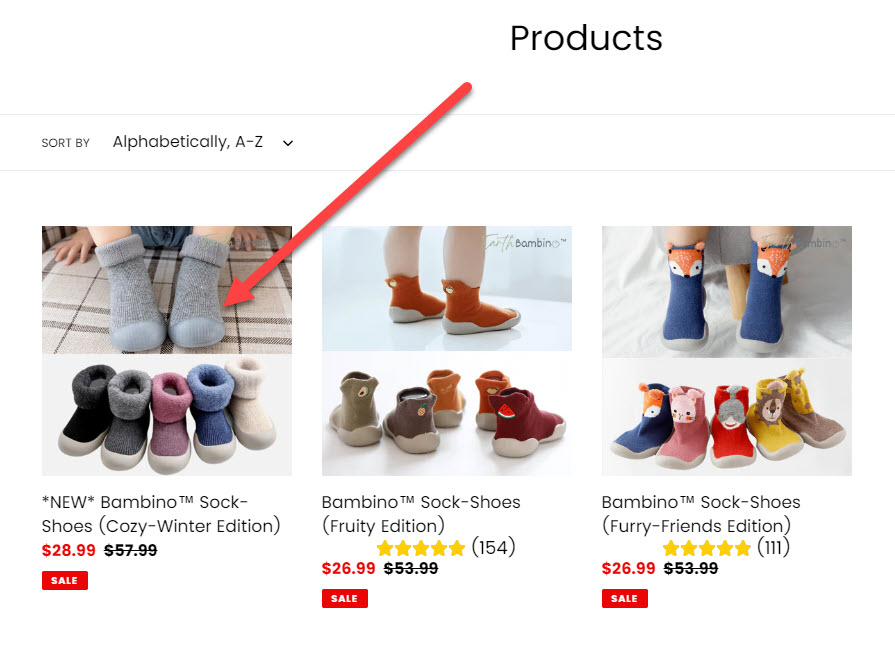
And I’ve found this product simply by clicking on the original Facebook ad that brought me(as you can see in the picture above) to this collection page with different variations of the same product.
So for this week’s trending product, I decided to do a bit of my own research and find you the perfect Warm version of the baby sock shoes on Aliexpress myself.
And here’s the real product recommendation for this week:
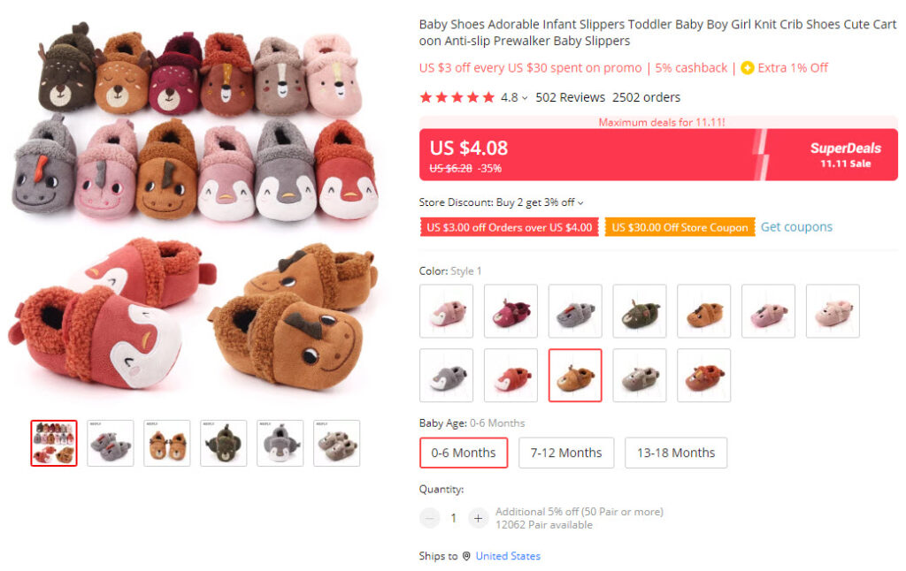
These winter baby shoes warm, adorable, and cheap which will let us price these shoes for an affordable price for our customers and still have a great profit margin!
We have plenty of styles we can pick from, although we’re not going to include all of them(will be explained later), and the reviews for this product are amazing which makes it safe to dropship this product.
Note:
I know that these shoes aren’t “sock shoes” but I still think these can sell really well this Winter. Feel free to pick up your own style to sell – There are plenty of great styles to choose from on Aliexpresss.
2. The Ad
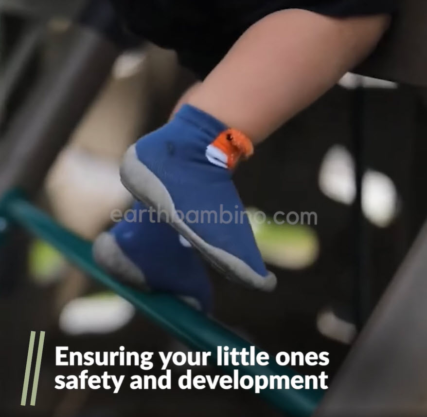
The product I recommend to sell is the warm version of these shoes, but we’re still going to review the original ad that is linked in the Ecomhunt product page.
It’s basically the same product so you can take inspiration from this ad and “COPY-PASTE” it but with your style and different scenarios(Winter, snow, etc.).
Video ad review:
In my opinion, I think the video ad is pretty well done…
If I were to order a video ad for this product and this was the final result, I would’ve approved the order and move on to creating my Facebook ad campaigns.
Although, I think the first 3-4 seconds of this video could use a couple of different variations. The baby walking down the stairs is cute but I would recommend testing a few more variations.
Maybe if we take the part where the sock is being put on on and put it at the beginning, we’ll see a better CTR and get more clicks. It’s definitely worth the test so make sure to do that with your video ads.
Other than that, there’s nothing else I would change or fix.
Ad copy:
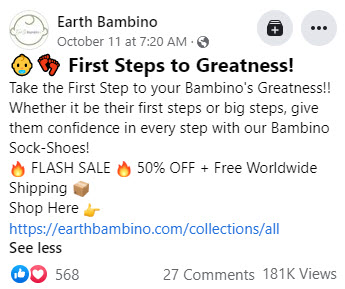
The ad copy is fine but it isn’t great… I think there’s too much emphasis on the “brand” and instead of that they could’ve explained a bit more about the product or simply have a shorter ad copy.
Go with something simple for your ad copy and don’t use too many emojis.
For example:
“Keep your little one’s feet warm this Winter with these super cute and warm baby shoes ❤️
Get yours here => *product page link*
Order today and get 50% OFF + Free Shipping!”
That’s it – Short and to the point.
3. The Store
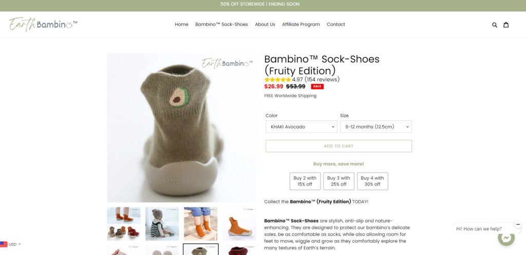
First of all, before I start reviewing the product page and everything that comes next, I want to talk about to where they transferred their store visitors when the link was clicked.
They advertised these baby sock shoes but transferred their customers to a collection page:
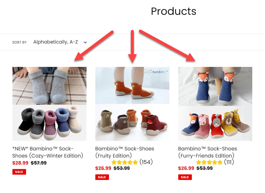
The reasoning behind this move is to offer more options for their customers to choose from. But the problem with this strategy is that you increase the number of clicks needed to actually purchase the product.
The customer sees the ad for the regular baby sock shoes, he likes this version and proceeds to click on the link. Right after that, instead of seeing the advertised product, he sees a collection page with different sock shoes.
We have the Fruity version and the Furry-Friends version and even a Warm version… And when you finally choose a version, you have an enormous amount of styles and colors to choose from.
From my point of view, this is just MEGA confusing for the customer!
There’s a big chance the customers are having a hard time choosing the shoe they want and they just leave the store without buying.
On top of that, one of the versions doesn’t even have reviews which makes it look bad – Imagine a customer who actually wants a warm version but it has no reviews while other shoes have tons of them.
So if you want to advertise a different version, then do it as a different ad that points to a different product. The customer should always see the product advertised when he clicks the link.
Back to the product page review…
First of all, like I already said, there are too many versions of the same product which should be reduced:
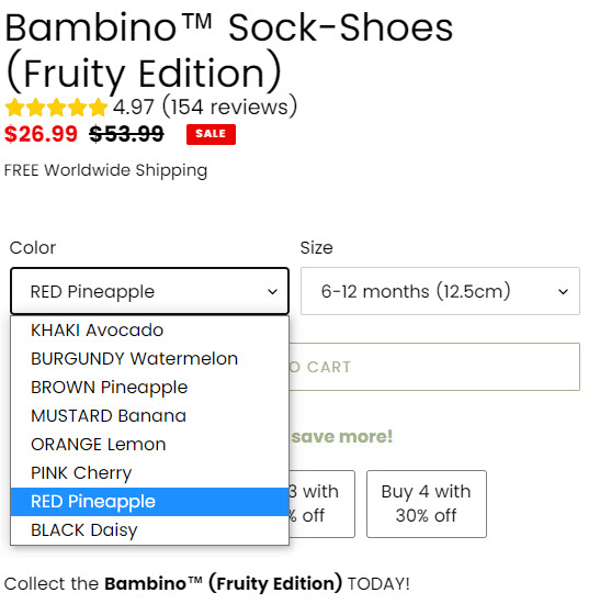
You can easily offer up to 5 variations and this will be enough – Do some research on the Aliexpress product page to see which variations sell best and offer the top 4-5 of them and that’s it.
Your customers will have an easier time choosing the option they like the most and you’re going to see faster checkouts.
Product description:
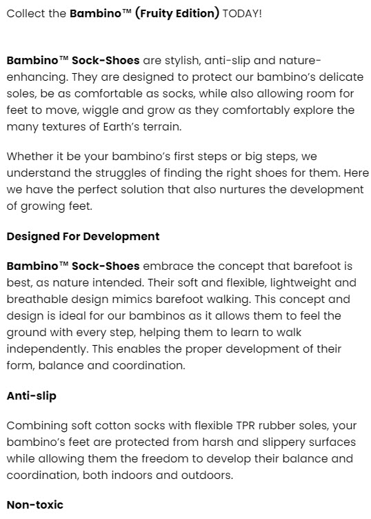
The description could definitely use more pictures and GIFs.
Remember that the product description is here to make the customer fall in love with your product, so there’s need to be a story with pictures and GIFs.
Text only isn’t going to cut it out… You have to play on your customers emotions and show them just how awesome this product really is!
Reviews:
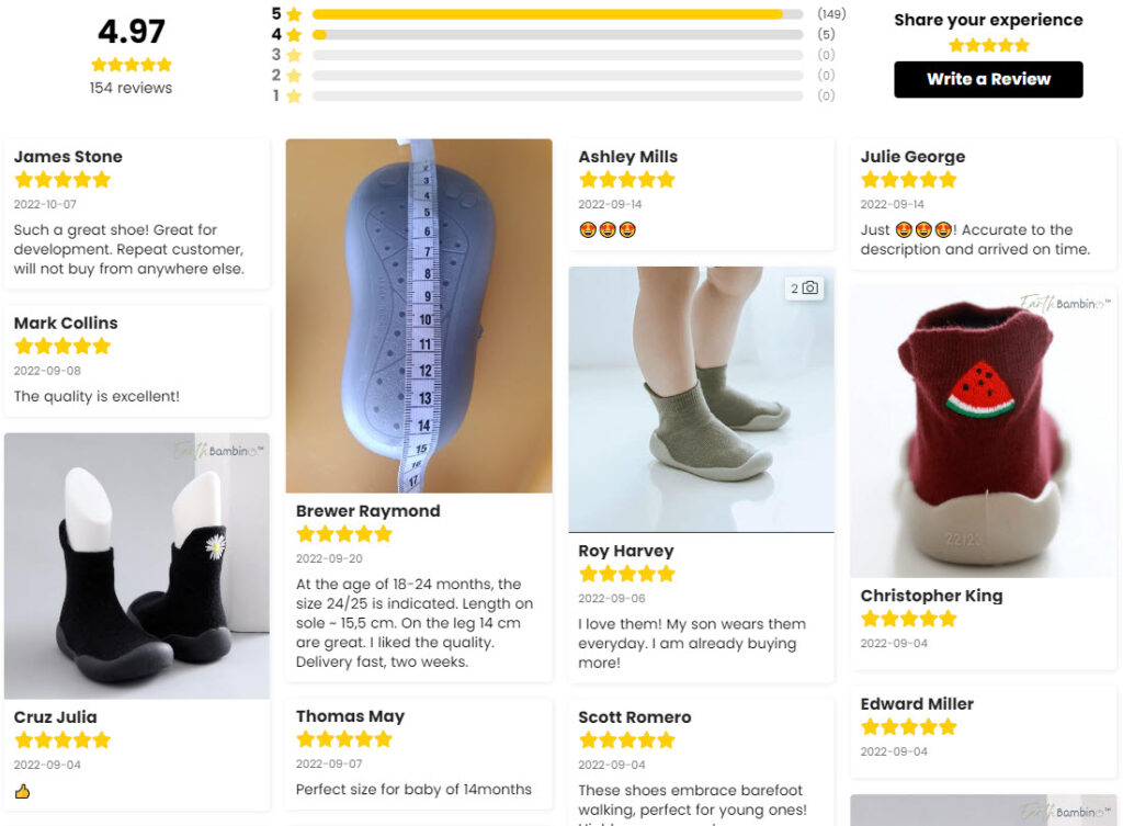
The reviews for this product look fine to me and the only thing I would’ve changed is having more picture reviews at the front instead some of the text reviews.
Also, for the fruity version sock shoes, I would advise importing real photo reviews and not the ones that look like they were taken by a photographer(The furry version has real photo reviews).
4. The Checkout
Before reviewing the checkout page, let me first show you how the Add to Cart button works on this store.
So instead of transferring the customer straight to the cart page, there’s a simple cart notification popup:
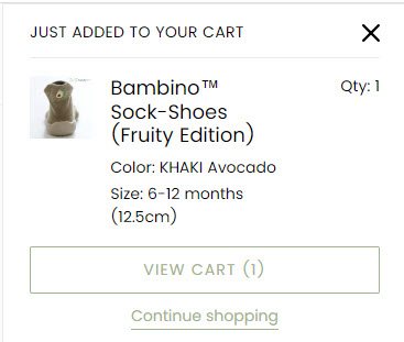
Now don’t get this confused with a slider type of cart where the button there actually transfers you to the checkout page.
In this case, the customer need to basically click twice in order to move onto the cart page… And this, my dear readers, reduces the store’s conversion rate which eventually gets you less sales.
So when selling on your own store, make sure the Add to Cart button transfers your customers straight to the Cart page.
Let’s get back to the checkout review:
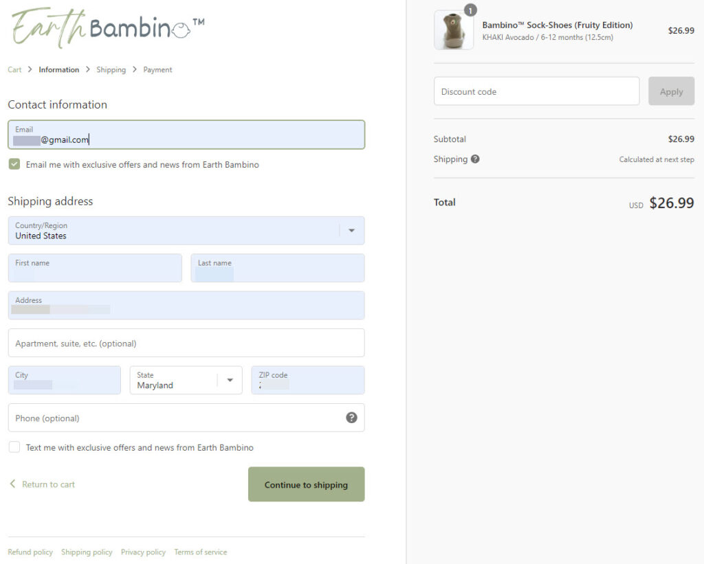
We have a logo, TOS links, and the phone number is optional which is perfect.
One small thing that needs a change is the text that says “shipping calculated at next step” beside the price.
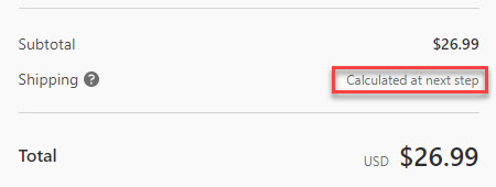
If you offer Free Shipping by default, this text should say that shipping is free to not confuse your customers.
Shipping page:
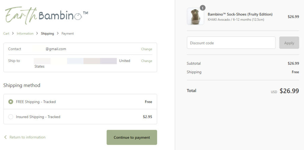
On the shipping page, we have the usual “insurance” upsell trick to squeeze a few extra bucks from the customers.
In my opinion, this is a double edged sword – On the one hand, it’s free money, but on the other hand, this could scare away potential customers who now fear about the product being damaged or not arriving at all.
If you feel like testing this insurance trick, then pay a good attention to your conversion rate to see if it’s really worth it.
Payment page:
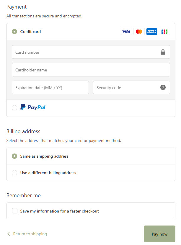
Both Credit Card and PayPal are available and the annoying tipping section is disabled. There’s nothing wrong with the Payment page so there’s nothing to fix.
To Sum It Up
When it comes to kids and there’s an actual need for that product, parents will do everything in their power to buy it. And this product is definitely needed!
So choose your preferred Baby Winter Shoes, create a good video ad, and make sure to not the same mistakes on your store as this seller right here.
Implement the tips in this article and start making some sales this Christmas!
If you have questions, feel free to ask me in the comments.
Good Luck!
Struggling to find good products to sell? Not sure who’s your target audience? Tired of losing money on products you were sure were “winners”?
Then Ecomhunt is what you need! Find hot winning products that are added daily, spy on their ads & stores and import them into your store in 1 click and Start Selling Today!

Daniel Aloni is one of the leading mentors in the Ecomhunt family. Daniel is a highly experienced Print On Demand seller with multiple 6 figures successful launches.


