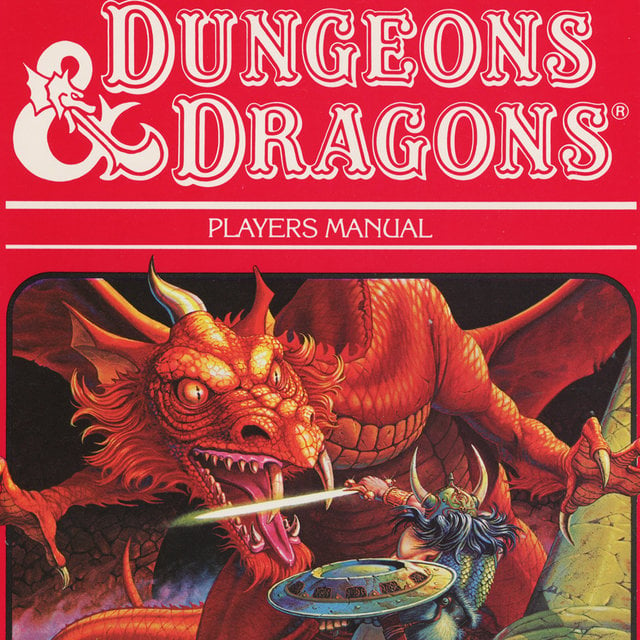
If you’re looking for a great product to sell to DnD fans, then this awesome looking Dragon Dice Set is exactly what you’re looking for!
This Dice set is exploding on Facebook as we speak and it has the potential to make some crazy amount of sales if you decide to test it right now.
In this week’s article, you’ll also get a full product review including the store selling this product and a review of the original Facebook ad + some additional Pro tips that will help you even more when selling this product.
So don’t sit out on this product and start selling it right now!
Enjoy.
1. The Product
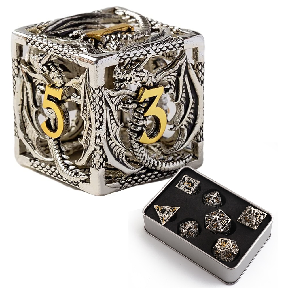
This week’s trending product is this awesome Dungeons and Dragons Metal Dice Set that is going Viral on Facebook as we speak! It was posted less than 2 months ago on Ecomhunt, and since then it has gained quite a lot of traction!
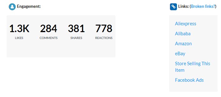
As you can see from the picture above, the first time this product was posted on Ecomhunt it had “only” 1.3k likes, 284 comments, and almost 400 shares.
A couple of weeks later, this product has almost 9k likes and more than 1.6k shares!

And that’s only from running a single photo ad…
DnD fans everywhere absolutely LOVE this Dragon Dice Set so make sure to jump on this product and make some bank too!
Oh… And with the new Dungeons and Dragons movie coming up soon, there’s a chance your ad will explode and gets viral(it’s all about timing).
2. The Ad
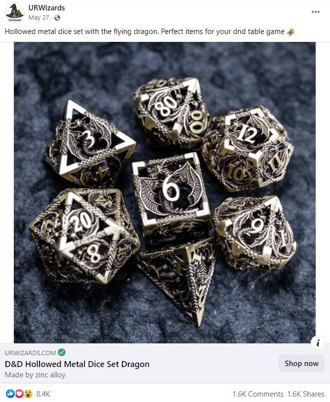
The original seller is running Facebook ads using a simple photo of the Dice Set and nothing else. Not even a video ad or a product photo collage ad.
Of course, running a photo ad isn’t at all the issue here… For certain products, photo ads can perform much better than video ads so if not every product has to be advertised using a video.
The only issue I have is that the same photo ad is being run for weeks now and it seems like there’s no real attempt to freshen it up a bit with more ad creatives.
When advertising on Facebook(or on any other platform) it’s important to get new creatives out there for your target audience.
After some time your audience gets tired from seeing the same ad again and again, so it’s important to give them something new to see.
You can easily create a much better looking photo ad from the ad example above OR try and make an engaging video ad. And it doesn’t have to be professional.
A simple video ad that is filmed with your phone is sometimes more than enough to get sales going!
Just take a look at the first comment in the ad post(the link to the ad is on the product’s page on Ecomhunt):
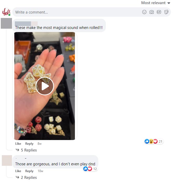
Someone filmed a different DnD Dice Set with their phone and posted it in the comments and it can work really great as an ad.
Either order this set yourselves or send this product to someone on Fiverr, and get the same type of video done. Then use it for your Facebook/TikTok ads and it should work great!
By the way, you can see even more Dice Sets ads the original seller is running if you check the ad library:
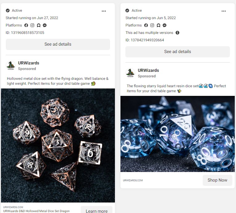
Make it a habit and always check for the ads a page is currently running on Facebook. There’s a good chance you’ll find a hidden gem that can make you crazy sales Dropshipping ?
3. The Store
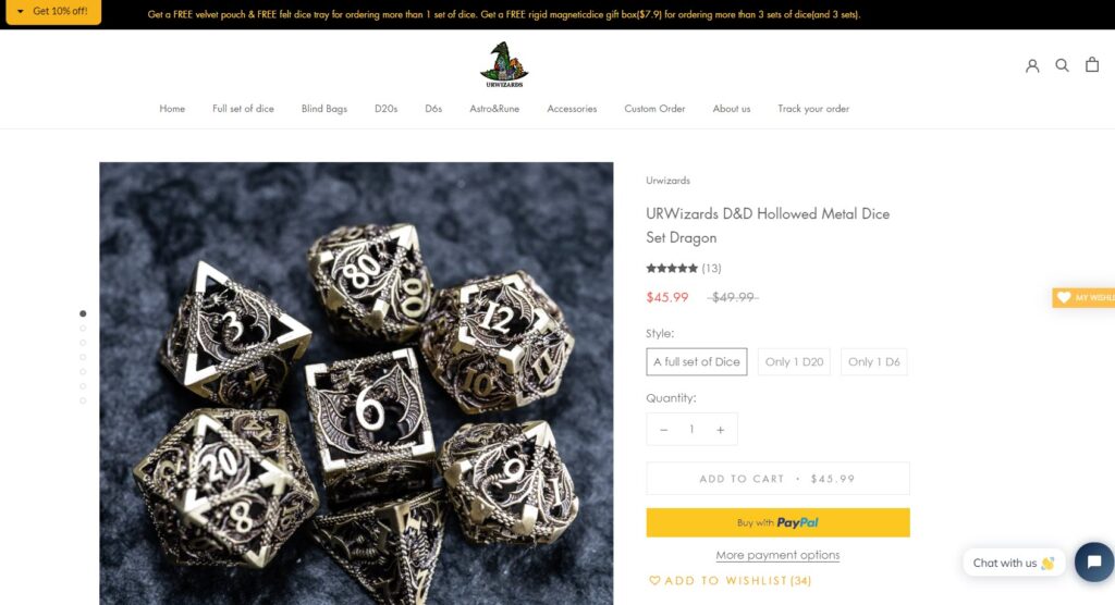
Before I begin with the store review, here’s quick tip:
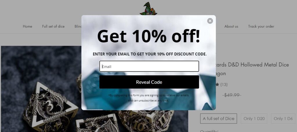
Getting people to signup to your newsletter by giving them a discount is a good strategy, but please give your customers some time to at least check the product page before blasting them with popups.
Pop ups are super annoying and displaying them the moment a customer enters your store isn’t going to help you make sales. Show popups like these on exit intent to keep your customers calm and happy.
Back to the store review:
I know that this product is self explanatory but you can still make some effort and create a less boring product page from what we have here.
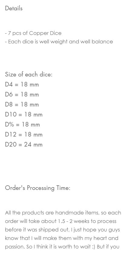
The product description is just text, without any pictures or GIFs, and it’s pretty boring if I’m being honest. Give me 10-15 minutes and I can transform this boring product description to something MUCH more engaging.
Tell a story, add some GIFs, do everything possible to make your target audience connect to this product. This way you increase your chances of making a sale.
It’s just sad to see such a boring product description for such a great product. All it takes is a bit of work and they can increase their conversion rate in no time.
Product reviews:
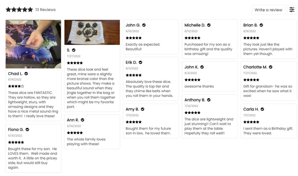
It looks like the original seller didn’t forget about the importance of reviews and he has 13 of them displayed right below the product description. But again, unfortunately for the original seller, the review section is pretty low effort…
First of all, you want more than 13 reviews displayed – I would say something between 30 to 60 is the magic number here.
Second of all, there’s just one single photo review and this isn’t good at all…
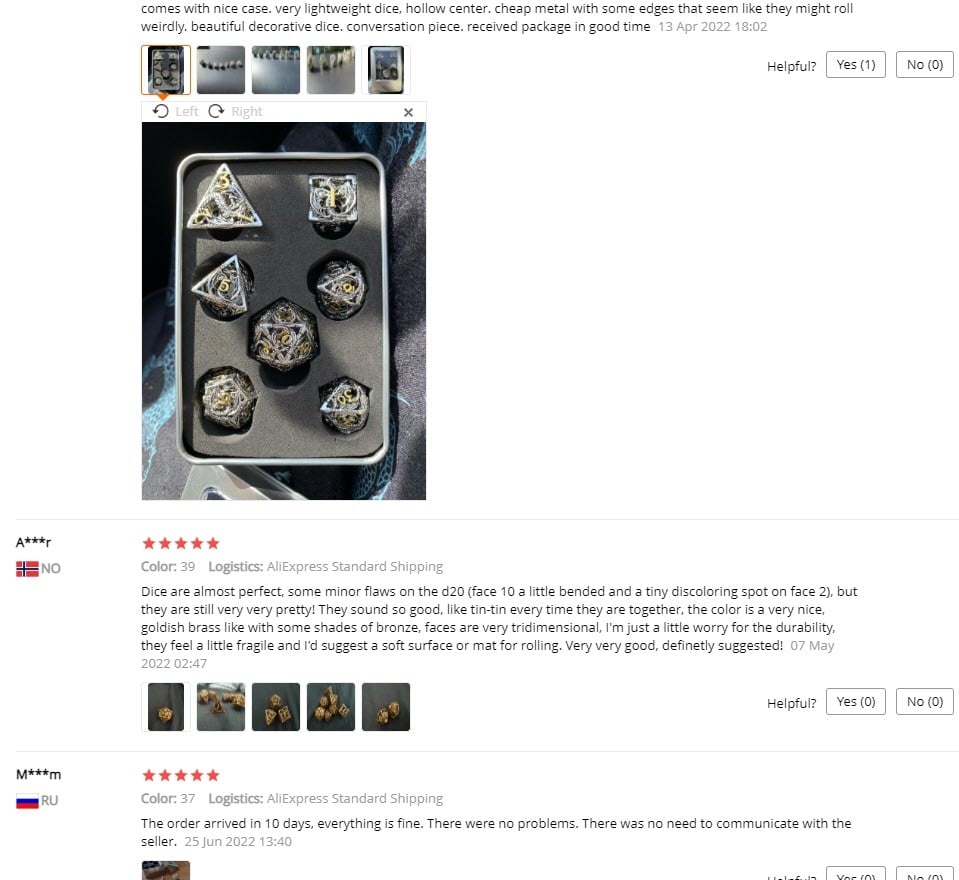
I understand that sometimes there aren’t any photo reviews on Aliexpress, so you can only import text reviews. But for this product, I have found at least 4 photo reviews and it was just by checking ONE listing on Aliexpress(see picture above).
If I were to search on Aliexpress, I’m sure you can find much more photo reviews that you can import. So please don’t be lazy and put some work into your Product review section!
You May Also Like section:
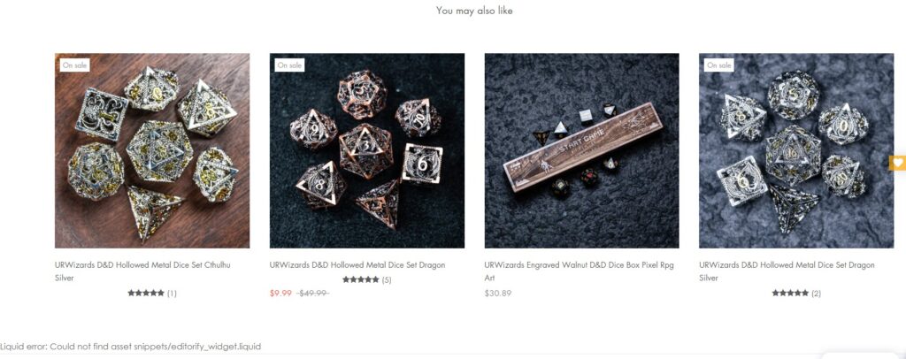
Last but not least, make sure to remove the “You May Also Like” product recommendations from your product page. Focus on making a sale as fast as possible and don’t let your customers stroll around.
Even if the products are connected to the one you’re currently advertising, it’s best to first get the customer to buy and later you can sell him other stuff once you have him in your pocket.
4. The Checkout
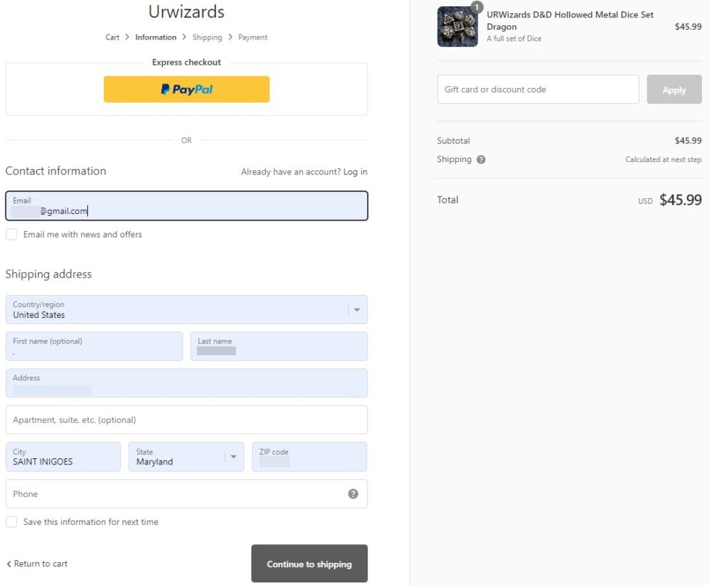
The store’s checkout is the basic Shopify’s 3-step checkout flow, starting as usual with the customer & shipping information page.
As you can see, they forgot to add their logo in the checkout page so it’s just text and not a picture. And another problem is the phone number field which isn’t optional.
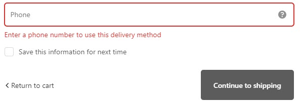
Now if you plan to use the phone numbers you collect for other stuff, then making this field mandatory is fine.
Some customers who hate giving their phone numbers will skip your checkout, but you’ll have the potential to make much more sales now with SMS marketing.
But if there’s no plan like that, then why to keep this field mandatory and scare some customers away? So make sure to remember that when setting up your checkout flow.
Shipping page:
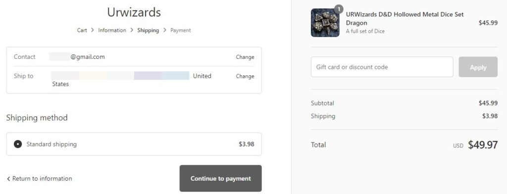
A regular shipping page with a standard shipping fee of $3.98 – My only issue here is that there’s no mention about the delivery time. It could’ve been nice to write something like “Standard Shipping(7-12 business days)”.
Let your customers know how much time it takes you to ship their items to reduce the amount of support emails.
Payment page:
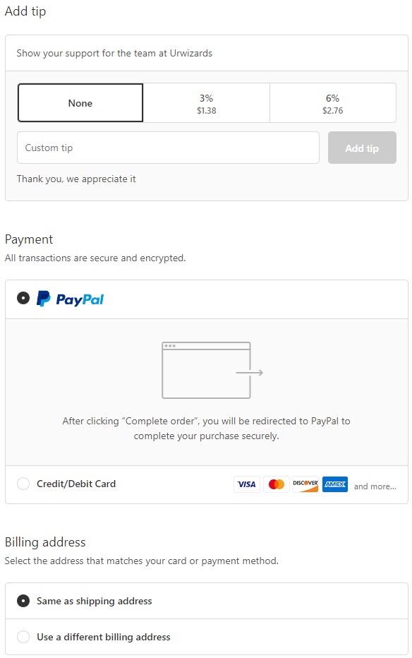
A payment page with only PayPal available – In this case, make sure to let your customers know they can still pay with their Credit Cards as guests on PayPal.
And the other issue I have is the tipping option. I’m not a big fan of the custom tip section on the Payment page, especially on products that aren’t handmade.
I think this can annoy some customers so it’s better to remove that option and keep the Payment page clean.
To Sum It Up
With the increasing Hype around Dungeons and Dragons, now’s definitely the best time to sell this product on your Dropshipping store.
And as you’ve seen, there’s plenty of stuff you can actually upgrade to make this product work MUCH better for you and make you some bank!
Prepare multiple ad creatives to test, create a better looking product page for this product, and sales will roll in!
If you have questions, feel free to ask me in the comments.
Good Luck!
Struggling to find good products to sell? Not sure who’s your target audience? Tired of losing money on products you were sure were “winners”?
Then Ecomhunt is what you need! Find hot winning products that are added daily, spy on their ads & stores and import them into your store in 1 click and Start Selling Today!

Daniel Aloni is one of the leading mentors in the Ecomhunt family. Daniel is a highly experienced Print On Demand seller with multiple 6 figures successful launches.


