This week’s winning product is in the sports niche and it’s the right time to sell it right before the Summer.
It’s also a great product to sell because it is not that expensive so you have a good chance to enter into the Fitness niche with plenty of products you can sell and a huge hungry and passionate audience.
Now this product review is a great example of how to take a perfectly good product and ruin it with a mediocre ad and a terrible looking online store.
So before you go on selling this product, make sure you read the whole article to avoid making the same mistakes!
Enjoy!
The Product
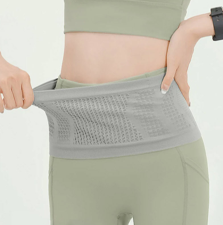
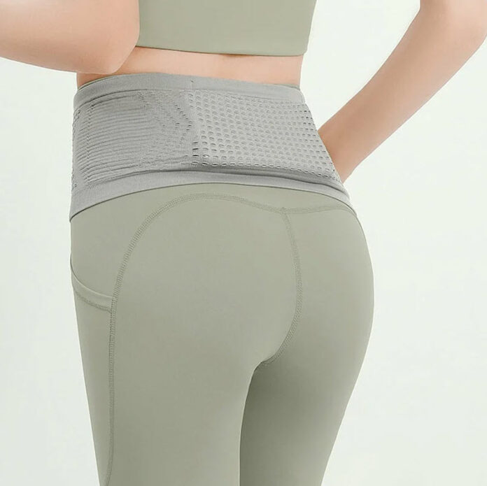
This week’s Winning Product is this awesome Sport Waist Bag that is going to crush it this Summer. Now… There are 2 main reasons I am recommending this product:
- It’s been a while since I recommended a sports product to sell so it’s about time I get you a good one to sell. With Summer approaching us fast there will be more people doing sports outside, and that almost always includes running or just walking. So now’s a good time to start promoting this product slowly and increasing the budget once we get closer to Summer.
- This product is pretty cheap and you can easily sell it for $29.99 and pocket in a nice $20+ profit. And it can open for you the door into the lucrative Fitness niche where you have plenty of products you can pick up and dropship.
The Ad
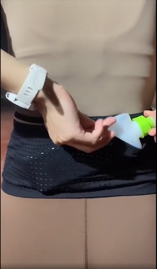
The ad for this product is a simple one and looks like it was taken straight from Aliexpress. I personally don’t like this kind of ads because it’s just a copy video taken from Aliexpress and used for an ad.
There’s no description text, the music is the one that was originally used on Aliexpress, and there’s no call-to-action. I understand that it works for some sellers but it will work MUCH better if there was some effort put into it.
I can’t really review this ad because it isn’t an ad so all I can say here is to not take videos from Aliexpress as they are. That’s basically it…
Find a winning video ad that has a good engagement on Facebook, copy the same build(don’t just copy-paste), and create an ad in the same style to make this product really fly!
Ad copy:
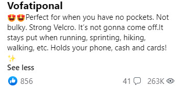
The ad copy is simple enough, explains a bit about the product(although there isn’t too much explaining to do), and there are too many emojis to my taste.
An ad copy with 1-2 lines is enough with a link at the end of it.
For example:
“This Sports Waste Bag is the perfect product for when you go running!
Get yours here => *store link*
Order now and get 50% OFF + Free Shipping!”
With this ad copy and a good video ad that actually explains a bit more about this product, you should receive plenty of clicks!
The Store
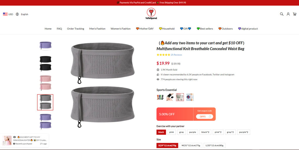
Now this is where the problems begin… If by now the ad was “okayish” and it could potentially bring decent clicks, the store is where it ends but without the actual sales.
The store is PACKED with unnecessary stuff and it’s super confusing for the customers! It’s not cheap to bring clicks so it’s sad to see such a good product not reaching it’s maximum potential ?
I’ll start by reviewing everything wrong with this product page so you can learn what not to do on your online store.
1. The scarcity addons & fake numbers
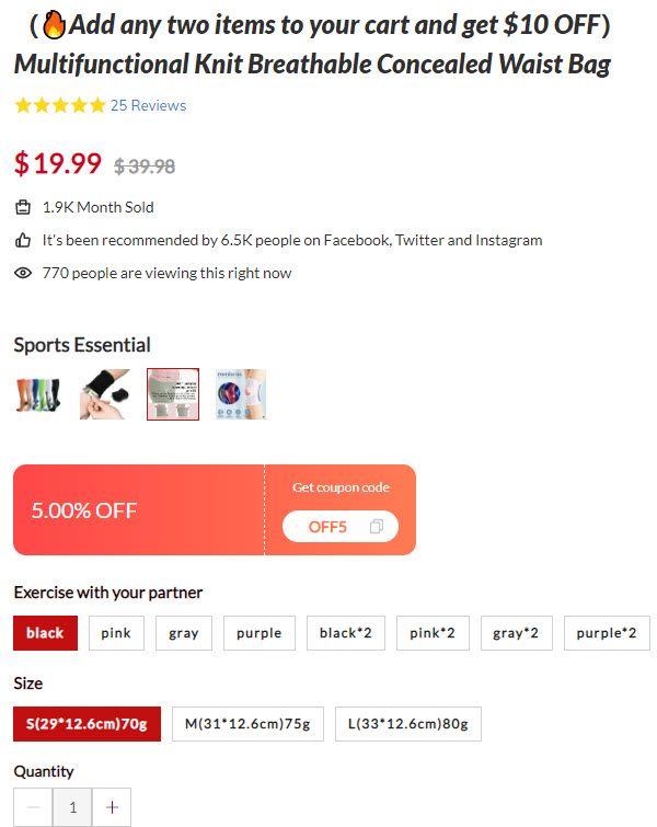
Right off the bat, there are huge fake numbers being thrown into the open like the crazy amount of people viewing this product, the fake engagement which isn’t the same on the original ad, and so on…
This could’ve worked well if we were in the year 2015, but nowadays it’s considered as spam and customers are not suckers anymore to believe this.
It’s easily recognizable as cheap sale tactics and all it does is make your store look a lot less professional.
And if you scroll down a bit, you’ll notice a totally different number of current viewers and now it’s obviously a fake.
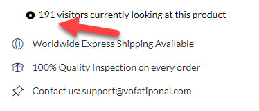
No idea what’s the point behind these cheap tricks… One thing for sure – It doesn’t help them get more sales.
2. Too many discounts
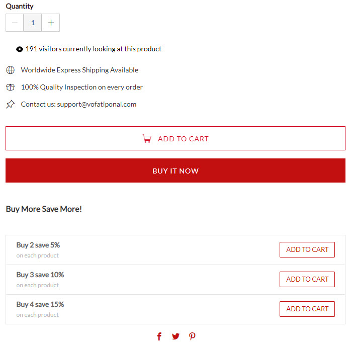
So we have $10 off if you add 2 items to your cart (Discount on title), a random 5% off coupon code just sitting there in the middle, and quantity discounts which give you a 5% discount on each additional item you take.
It’s just too much… I guarantee that it doesn’t help at all in getting sales and all it does is just confuse the already confused customers. It’s not even 5 minutes into the review and the conversion rate is already lower than the industry’s average.
3. You Might Also Like Section
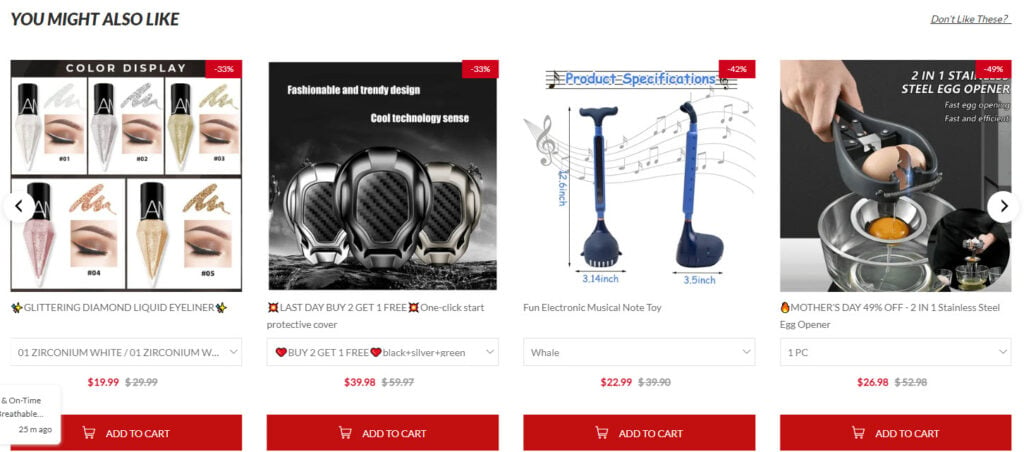
Instead of focusing on a single product and getting your customers to checkout as fast as possible, there’s this section that shows them super random products.
Now if you were Amazon, where people are visiting with a clear intention of buying something, then it’s not a bad strategy because it increase the AOV.
But you’re not Amazon so all you do is prolong the checkout process by pushing your customers to browse different products which they will not buy.
And in worst case scenario, they’ll forget why they initially visited your store and leave without buying a thing!
4. Review section
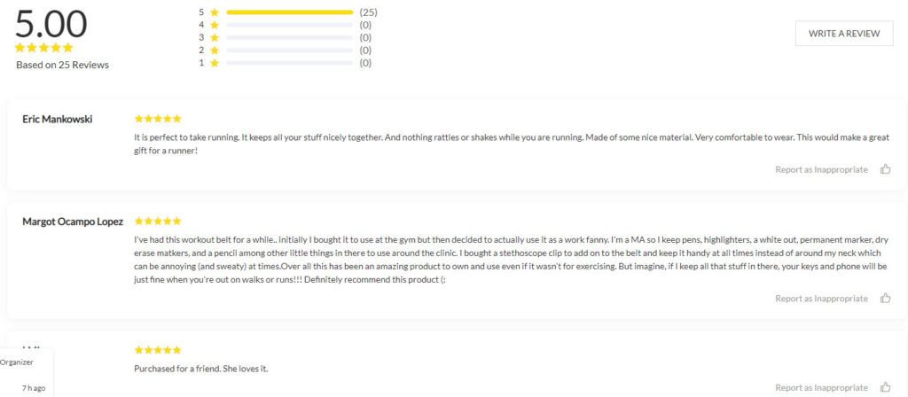
Now this section isn’t entirely bad because the reviews exist and they seem to be fine(5 stars, nothing negative about the product), but there aren’t any photo reviews.
Photo reviews are super important because they show your customers the product they’re about to buy LIVE. And if you already import reviews from Aliexpress, then why not also import photo reviews?
Especially when such exist on Aliexpress…
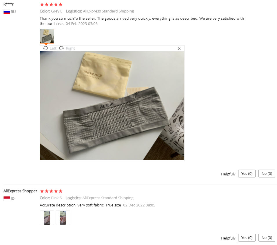
Additional 10-15 minute of work and the review section could’ve looked much better than it is now and potentially get more sales for the original seller.
Other than these 4, everything else is fine. The title could be better but it’s not entirely bad and the product description is pretty good with nice GIFs and pictures.
There are no guarantees and information about shipping which also isn’t good, but it’s a small issue when compared the the 4 big mistakes I wrote about.
If you’re looking for a store to take inspiration from, then this store isn’t it. Browse through my other articles and find one where there was a store that really stands out!
The Checkout
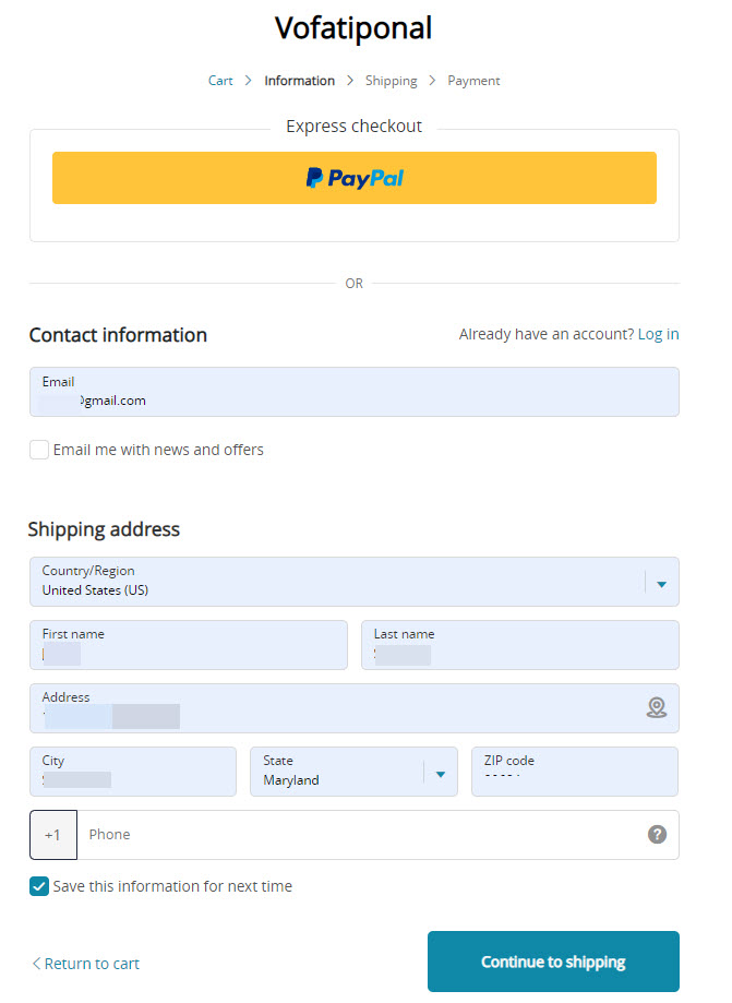
We have here a standard Shopify checkout page and as always the first thing I notice is no logo. Always remember to upload your logo to the checkout page.
It will make your store look more professional and it also increases your store’s trust.
The phone field:
In this case, the phone field is again mandatory and not optional as I always advise. If your doing SMS marketing then be my guest and make this field mandatory.
SMS marketing is a very good way to sell more so a few angry customers won’t be a problem because you can make a lot more money.
But if you don’t plan on doing SMS marketing, then why keep this field mandatory? It will only drive customers away… People who hate telemarketing will not proceed with the checkout process.
Shipping page:
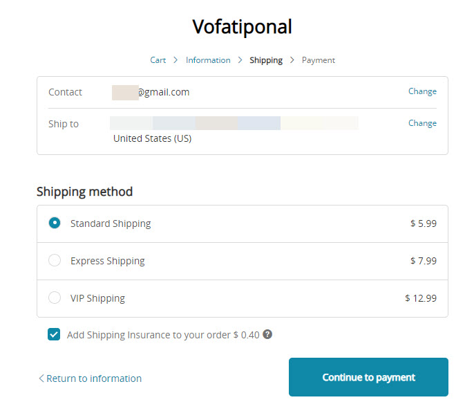
Instead of selling this product for $24.99 or $29.99 and offering Free Shipping, they’re instead selling it for pretty cheap($19.99) and charge quite a lot for shipping.
And what you see in the screenshot above is another great way to lose customers and further decrease your already low conversion rate…
First of all, why is the shipping so costly? About 30% of the product retail price is too much! Second of all, how much time does it take for the product to arrive?
It’s nice to have faster shipping times but where can I see the actual time it takes for the product to arrive? The only way is to go back or click on a different link to read it in the store’s FAQ.
And by doing that you delay the checkout process and risk losing customers(which is what happens for sure on this store, believe me).
And last but not least – There’s a cute 40 cent shipping insurance to further irritate the already confused and tired customers who can’t understand why the prices are so frickin high and how much time it takes for the delivery.
This store is losing customers left and right…
Payment page:
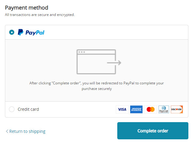
I kind of expected to see something wrong on the Payment page as well, but it looks standard to me. Both PayPal and the Credit Card options are available so nothing wrong here.
Shame though that not many are getting to this step…
To Sum It Up
Another great example of how to take a perfectly good product and ruin it completely with a mediocre ad and a terrible looking store with a super low conversion rate.
If you’re about to test this product then make sure you read my whole review to avoid doing the same mistakes.
With a standard video ad and a conversion optimized store, this product can become your next big winner and potentially take you to the next level in your Dropshipping career.
Good luck 🙂
Struggling to find good products to sell? Not sure who’s your target audience? Tired of losing money on products you were sure were “winners”?
Then Ecomhunt is what you need! Find hot winning products that are added daily, spy on their ads & stores and import them into your store in 1 click and Start Selling Today!

Daniel Aloni is one of the leading mentors in the Ecomhunt family. Daniel is a highly experienced Print On Demand seller with multiple 6 figures successful launches.


